Habitica: User Icon menu can't be reached on smaller screens / with some languages / when zoomed in
It's not possible to reach the User Icon menu if the browser window isn't wide enough. This depends on your screen size, resolution, zoom level (i.e., users will poor eyesight can't use the menu if they've zoomed in to see the text), and language (i.e., users with a language that has long words can't use the menu).
Reports from the Bug guild:
Aerilita ( 3b724a41-48d3-4048-ae27-70b258cf5a72 ):
I kept wondering why some people have issues reaching the user icon even after the latest header fixes... until I switched from English to Russian.
It seems the space taken by worded headers (Tasks ... Help) isn't set, they just take however wide they take, only the distance between the words is predefined, and it's been more or less optimized in English for various screen resolutions. Problem is, some languages have lengthier words for those headers, Russian being one example. (I'm pretty sure Chinese is no problem in that regard.) So the worded headers part takes a wider space, and everything else (gems, gold, refresh button, notifications, user icon) gets pushed to the side.
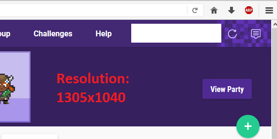
Screen resolution is 1280x720.
Had to scale my browser to 75% to reach the user icon again so I could switch back to English.
Praxis Arete ( 0ce6d43b-efa2-45a3-acaa-59daad7d658d )
I've been meaning to add this: As Aerlita mentions, the user icon IS harder to reach now. This changed when they did the last major update (a week or so ago) to the site. Now instead of the icon being fully visible, part of it is hidden behind the sidebar. I can still click on it (although it's more difficult) but it's marginal. So they did change something in the header code that made it not quite fit on the page now. My monitor is not a brand new behemoth, so it's important that the page code not assume that we all have a couple feet of width to work with! :D This happened at the same time that they changed the code so that you have to actually click on the user icon to see the menu, rather than having it pop down when you hover the mouse over the user icon. Hope this helps to get it back in place!
 Alys
Alys
All 22 comments
Labels updated. I've made this priority important because it's an accessibility issue and vital functions are unusable when you can't get to the User Icon.
@Tressley if you want to do an improved design, post here and I'll change it from help wanted to needs design. Otherwise a contributor could try to improve how the menu shrinks / wraps.
Alys
on 18 Nov 2017
I have some CSS knowhow, I could look into this (as a welcome break from my implementation related issues). I can't seem to get my local install to run properly, though.
 LunarGem
on 18 Nov 2017
LunarGem
on 18 Nov 2017
I really hope that Habitica institutes better control over revisions because this issue WAS fixed (at least in English) after the initial redesign in one of the early fixes ... and then has become progressively more broken as more fixes to the site that are instituted. That should not happen. The mobile site should have no problem fitting a 12.9" tablet and yet it does not fit even in English with no zoom.
 Anysia
on 18 Nov 2017
Anysia
on 18 Nov 2017
Not 100% sure this is the same issue but I can brute force the icon not to show just by shrinking my browser to a certain width. So it's easy to repro, no need to change languages or zoom in or anything. Now an optimal fix obviously would take all that into account=)
 joedragons
on 18 Nov 2017
joedragons
on 18 Nov 2017
@LunarGem Thanks! I've marked this as in progress for you to fix. Comment here if you have questions. For your local install problems, have you described them elsewhere? If so, post a reminder for us to look at it, otherwise let us know what errors you're getting.
Alys
on 20 Nov 2017
@TheHollidayInn -- You were working on some updates to padding/margins for smaller browsers/other languages. Would those updates address this issue as well?
 Tressley
on 20 Nov 2017
Tressley
on 20 Nov 2017
@Alys I mentioned them in the Aspiring Blacksmiths guild but didn't get a response (doesn't seem like you guys hang out there much anymore, busy I assume).
LunarGem
on 20 Nov 2017
@LunarGem Ah, you're Celestine, Rogue Lady of the Moon. I'm really sorry, I've had your message there marked for the past week as something that needs answering but I haven't looked at it in detail yet. :( I'll do my best to get to it tomorrow.
Alys
on 20 Nov 2017
Is it important to mention large sums of gold can also force the icon offscreen? (Granted, I'm not sure the exact number of digits needed, just that the amount in my test account is high enough that there are enough characters to push the icon partially/totally offscreen.)
 citrusella
on 21 Nov 2017
citrusella
on 21 Nov 2017
@citrusella I'll make sure that the menu scales so that no amount of text pushes things offscreen. I used to do my web design tests with long things like "Celestine the most wonderfully awesome programmer the world has ever seen" so that I could be sure that things wrapped when stuff like that got put in. :)
LunarGem
on 21 Nov 2017
@Alys Did you forget? Thought I'd bump you.
LunarGem
on 27 Nov 2017
@LunarGem You mean about your message in the Blacksmith's guild? I replied to that about six days ago. :) Or was there something else?
Alys
on 27 Nov 2017
@Alys Hmm. I must have dismissed the notification, I'll check it, thanks!
LunarGem
on 27 Nov 2017
@LunarGem How are you going with the local install troubles? Did the advice in Aspiring Blacksmiths help?
Alys
on 29 Nov 2017
@Alys I'm applying to college so my life is crazy. I haven't had time to code at all in ages, I'll get on it as soon as I can.
LunarGem
on 29 Nov 2017
Is this the fix? Seems you traded one issue for another?

joedragons
on 18 Dec 2017
Yea, kind of. The issue did already exist where we need to fix the currency display over 1 or 10k.
 TheHollidayInn
on 18 Dec 2017
TheHollidayInn
on 18 Dec 2017
@TheHollidayInn Ah thanks, I'll track that down and follow there.
joedragons
on 18 Dec 2017
Thank you!
TheHollidayInn
on 18 Dec 2017
FYI, I do recall the large gold issue, however, I looked thru ~8 pages of open issues, and did a keyword search of gold (open and then closed) as well as 10k and 1k and didn't see it. Wondering if I saw it in guild and it didn't make a ticket. I'll add to my list of items that I've been meaning to report in case that's not intentional and keep an eye out for a ticket.
joedragons
on 19 Dec 2017
Ah, sorry, I misunderstood you. I though you wanted to do a PR. If not, I didn't see an issue either, but was going to create one.
TheHollidayInn
on 19 Dec 2017
@TheHollidayInn Ah, sorry=) My trade is Quality Engineer, so while I do want to do PRs, I'd be looking for intro ones if I even had time=) I've been trying to contribute through docs and bug reports. I'll watch for the ticket.
joedragons
on 19 Dec 2017
Related issues
 ericbaum
·
73Comments
ericbaum
·
73Comments
 tomtangent
·
34Comments
tomtangent
·
34Comments
 hairlessbear
·
39Comments
Alys
·
36Comments
hairlessbear
·
39Comments
Alys
·
36Comments
 bTackt
·
61Comments
bTackt
·
61Comments
Most helpful comment
@citrusella I'll make sure that the menu scales so that no amount of text pushes things offscreen. I used to do my web design tests with long things like "Celestine the most wonderfully awesome programmer the world has ever seen" so that I could be sure that things wrapped when stuff like that got put in. :)