Habitat: Provide more visual distinction between public and private keys
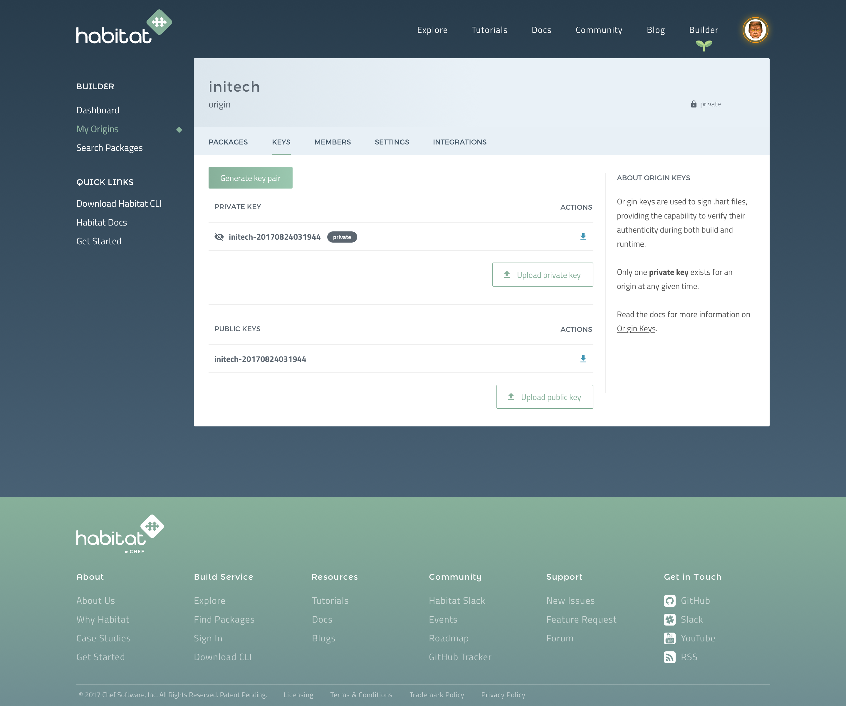
Currently, private and public keys are only visually distinguished by a subtle slash through the "eye" icon. It would be nice to provide more visual distinction (e.g., putting private keys behind a "show private keys" button, put them under a big "🚧 WARNING 🚧" banner, etc.)
To-do
- [x] Add 'private' tag/label to private key row
- [x] Align both upload buttons to the ride side of the tables
- [x] Remove the eye icon from the public key rows
- [x] Remove the
<hr>between the private and public sections - [x] Set the spacing between the private and public sections 60px
Mockup
https://chef.invisionapp.com/share/TSEGSW52H#/250295491_origin_Keys_Download
 christophermaier
👍1
All 3 comments
@christophermaier How does this feel? I've tweaked a few things to provide more visual clarity:
- added a 'private' tag
- removed the eye icon on the public keys so that the eye with line has more prominence
- moved the upload buttons to the right, making it easier to scan the keys and to make the table headers/titles more obvious
https://chef.invisionapp.com/share/TSEGSW52H#/250295491_origin_Keys_Download
 ryankeairns
on 14 Nov 2017
ryankeairns
on 14 Nov 2017
👍2
❤1
@ryankeairns Big improvement!

christophermaier
on 14 Nov 2017
👍1
@cnunciato this is a smaller one that I wanted to bring to your attention.
ryankeairns
on 8 Dec 2017
Was this page helpful?
0 / 5 - 0 ratings
Related issues
 tashimi
·
4Comments
tashimi
·
4Comments
 ShalokShalom
·
3Comments
ShalokShalom
·
3Comments
 smacfarlane
·
5Comments
smacfarlane
·
5Comments
 reset
·
6Comments
reset
·
6Comments
 apriofrost
·
6Comments
apriofrost
·
6Comments
Most helpful comment
@christophermaier How does this feel? I've tweaked a few things to provide more visual clarity:
https://chef.invisionapp.com/share/TSEGSW52H#/250295491_origin_Keys_Download
