Hi everyone!
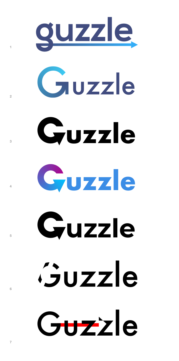
Guzzle 7 is going to be released soon and we thought this would be a great opportunity to create a new logo for the project.
We came up with a few versions and narrowed them down to four which you can see bellow.
Please vote with 👍 if you like a version, or share your thoughts as a comment.
Thanks!
 sagikazarmark
All 14 comments
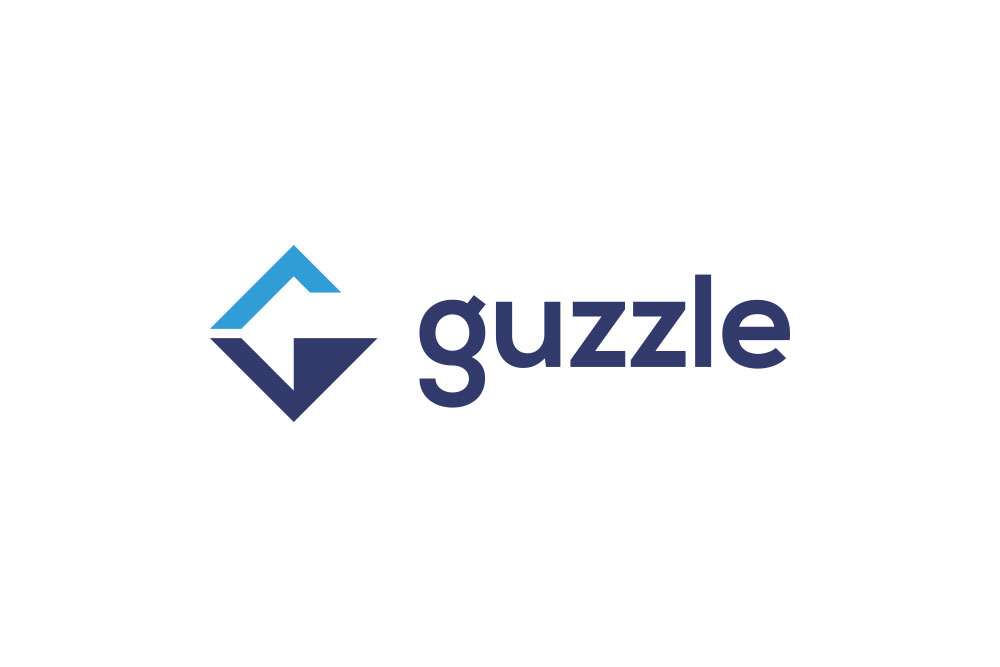
Candidate 1
sagikazarmark
on 16 Feb 2020
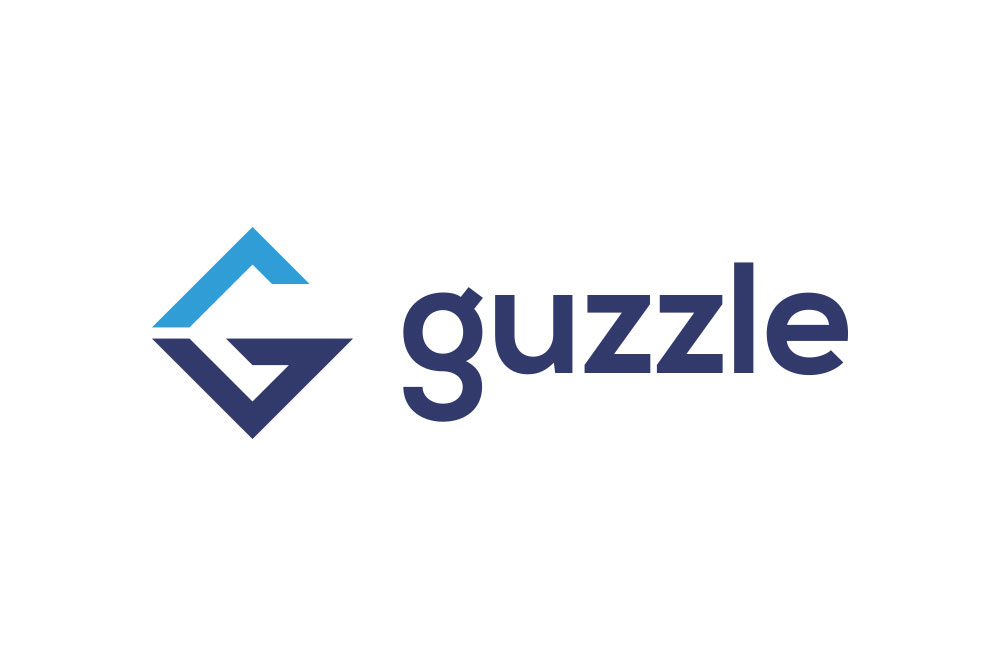
Candidate 2
sagikazarmark
on 16 Feb 2020
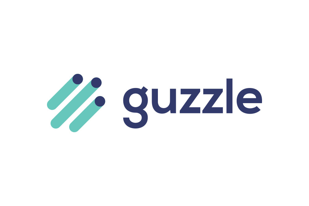
Candidate 3
sagikazarmark
on 16 Feb 2020
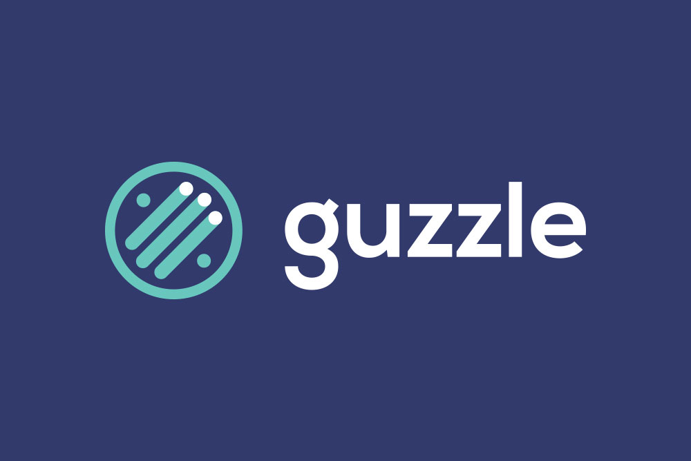
Candidate 4
sagikazarmark
on 16 Feb 2020
Why not using the G as an arrow ?
Some drafts, to give some ideas:
Number 6 represents the 2 / (for example http://)
 BafS
on 17 Feb 2020
BafS
on 17 Feb 2020
@BafS thanks a lot for the suggestions. We will take those into consideration.
sagikazarmark
on 17 Feb 2020
May I submit reddits candidate logo design

 JABirchall
on 18 Feb 2020
JABirchall
on 18 Feb 2020
May I submit reddits candidate logo design
I lolled very hard, sorry for the noise here 😄
 mfn
on 18 Feb 2020
mfn
on 18 Feb 2020
2 or 4 from @BafS, with some minor tweaks.
 Bilge
on 19 Feb 2020
Bilge
on 19 Feb 2020
None of them makes me feel what Guzzle does... More logos? :)
 csimpi
on 20 Feb 2020
csimpi
on 20 Feb 2020
We are open to ideas, but representing "HTTP" and "client" in a logo is not easy, that's why we decided to have a more abstract icon and "G"s as candidates. We are past 20 something versions now, and a little bit out of ideas.
We've received a few suggestions here and on other channels, but none of them brought us closer so far.
sagikazarmark
on 20 Feb 2020
Yes, I see I just wanted to tell, give it more time maybe the perfect candidate will come a bit later :)
The Candidate 4 looks good, but the logo should represent the request-response directions maybe with arrows or one of the lighter dots should be on the other side of the line.
Maybe playing around the recycle logo could give a good starting point:
https://hu.pinterest.com/pin/142356038196697293
Some helpful links for brainstorming:
https://hu.pinterest.com/pin/789467009658941373/
https://hu.pinterest.com/pin/369576713165837367
https://hu.pinterest.com/search/pins/?q=logo%20G&rs=typed&term_meta[]=logo%7Ctyped&term_meta[]=G%7Ctyped
This is convertible to a G:
https://i.pinimg.com/originals/d6/7d/53/d67d53369ca6d095005b17d60a97ffdb.png
csimpi
on 20 Feb 2020
Thanks for all the ideas and feedback. We decided to go with Candidate 3.
sagikazarmark
on 3 May 2020
OK, but that's wrong.
Bilge
on 3 May 2020
Related issues
 skovmand
·
5Comments
skovmand
·
5Comments
 anaspk
·
4Comments
anaspk
·
4Comments
 tbergeron
·
4Comments
tbergeron
·
4Comments
 gmponos
·
5Comments
gmponos
·
5Comments
 SharkIng
·
3Comments
SharkIng
·
3Comments
Most helpful comment
Candidate 3