Gutenberg: View Post toast is difficult to click
Describe the bug
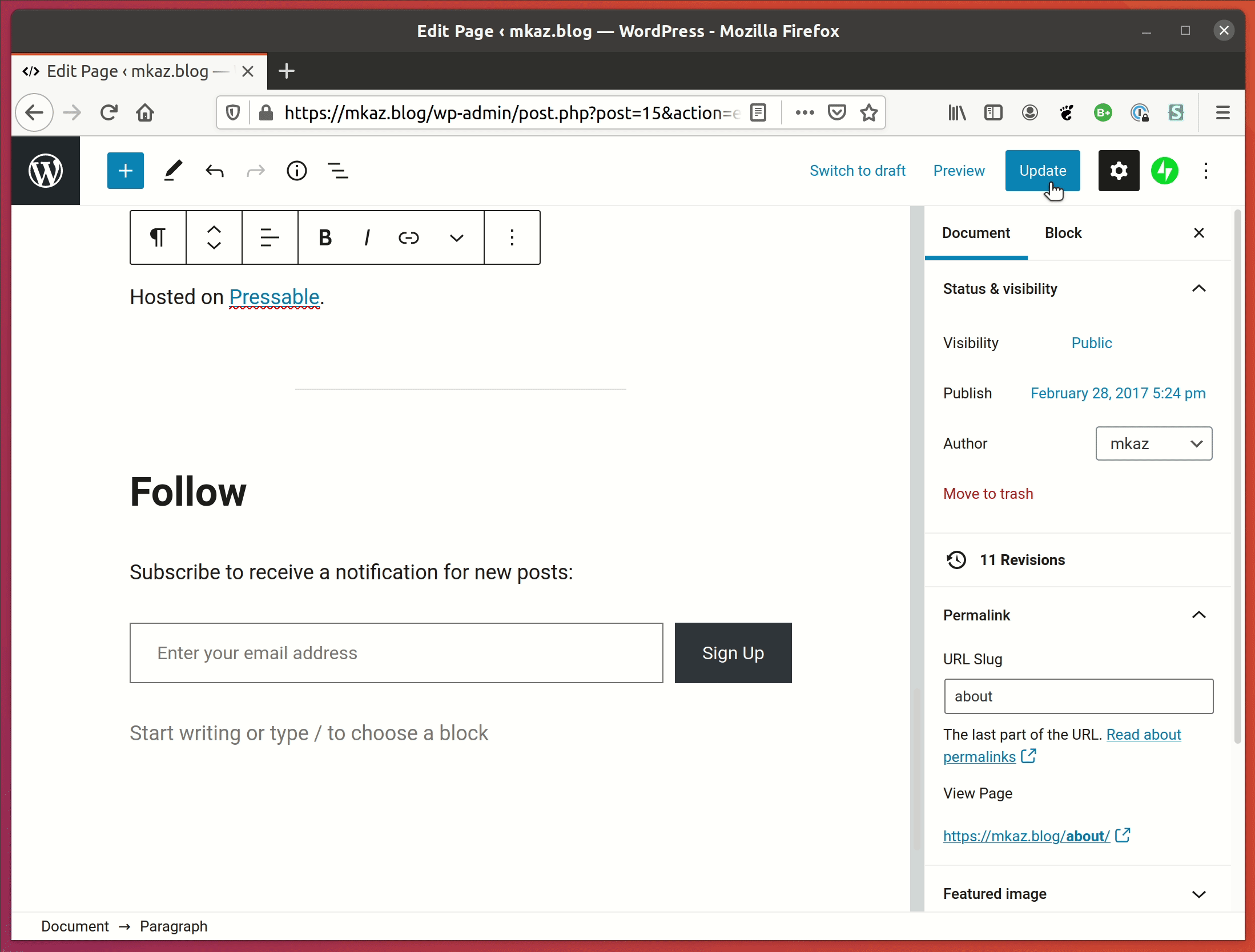
After updating a post, the View Post toast pops up, far away from the Update button.
This requires moving the mouse to the toast and I invariably always miss the "View Post" link directly and end up clicking the box, by clicking the box it dismisses the toast and does not navigate.
I see various ways to solve, but my most expected behavior is clicking close to the link should navigate towards it, so the whole toast should be clickable.
Moving it closer or other methods to preview the link, showing permalink, etc... could be alternate solutions.
Screenshots
 mkaz
mkaz
All 7 comments
@mkaz this seems related to this recent issue: https://github.com/WordPress/gutenberg/issues/24915 Can you confirm and close out if so? I agree this definitely needs to be improved!
 annezazu
on 2 Sep 2020
annezazu
on 2 Sep 2020
@annezazu It is quite similar but it depends on the solution, the other issue is advocating for a link near the publish button, if that is done than there would not be a need for the toast.
If the toast is the preferred solution, then my suggestion is to make the whole area near the link clickable.
mkaz
on 3 Sep 2020
Just my 2c: I'd prefer having the permalink near the publish button.
Right now the publish button is on the top right, and after clicking it what most authors want to do is to view the post they just published. The toast appears on the bottom left corner, so the opposite of where I had my eyes and it's easy to miss. I was focusing on the publish button so it's outside my line of sight.
That being said, if we do decide to keep the toast, it should be easier to click.
I find myself constantly clicking the preview button because it's hard to find the post's link without going through hoops.
 aristath
on 3 Sep 2020
aristath
on 3 Sep 2020
Let's keep this open in that case :)
annezazu
on 3 Sep 2020
The toast appears on the bottom left corner, so the opposite of where I had my eyes and it's easy to miss.
While this is true and a bit troubling at times (myself included for the specific use case), the place the toast appears is the same for all toast for any other action as well (such as copy action etc..). So I believe it should be consistent and an active/a bit trained (that has some experience writing posts) would know that the toasts are there. Of course this is a bit subjective :)
 ntsekouras
on 9 Sep 2020
ntsekouras
on 9 Sep 2020
I agree that after a while my eyes keep glancing at the borrom-left corner of the screen to see if there's something there I may have missed. But that doesn't make it a good pattern... It's something that I had to get used to (as opposed to something that would have been more natural).
aristath
on 9 Sep 2020
It's not really clear what's the path forward proposed here? Should we add some design thoughts?
I know these notices have been discussed at length and there seem to be a decision that they are useful for secondary notices where missing them is "ok".
 youknowriad
on 15 Sep 2020
youknowriad
on 15 Sep 2020
Related issues
 jasmussen
·
3Comments
jasmussen
·
3Comments
 wpalchemist
·
3Comments
wpalchemist
·
3Comments
 franz-josef-kaiser
·
3Comments
franz-josef-kaiser
·
3Comments
 BE-Webdesign
·
3Comments
BE-Webdesign
·
3Comments
 JohnPixle
·
3Comments
JohnPixle
·
3Comments
Most helpful comment
Just my 2c: I'd prefer having the permalink near the publish button.
Right now the publish button is on the top right, and after clicking it what most authors want to do is to view the post they just published. The toast appears on the bottom left corner, so the opposite of where I had my eyes and it's easy to miss. I was focusing on the publish button so it's outside my line of sight.
That being said, if we do decide to keep the toast, it should be easier to click.
I find myself constantly clicking the preview button because it's hard to find the post's link without going through hoops.