Gutenberg: Preview feels disconnected from Block inserter
I slept in class. I know Joen @jasmussen and I also believe @enriquesanchez worked on what I am going to mention below. Anyhow here goes.
The gap between selecting the Columns block and the preview makes it feel disconnected.
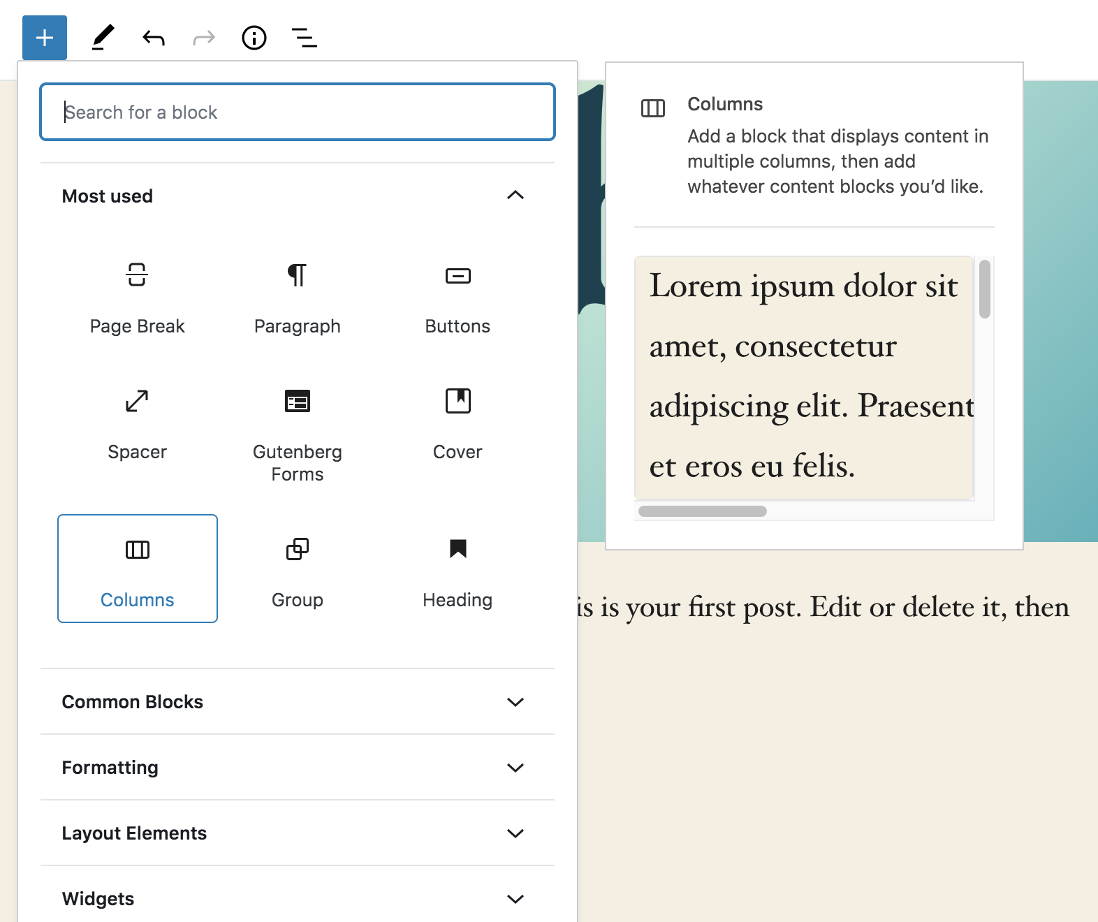
Here is one where I placed the preview right next to the Most used area.
It is right up to the Blocks area. It covers the full Most used area. Not background gap is seen between Block icons and the preview. They feel tight and they should be tight...:)
 paaljoachim
All 5 comments
I personally disagree :) — I think of it as a tooltip, and tooltips are disconnected. However, I noticed a lack of border radius and shadow on the preview which I'll look into fixing!
 jasmussen
on 10 Mar 2020
jasmussen
on 10 Mar 2020
It is kind of floating out there. I don't know, maybe it's simply a reaction to entrenched patterns, but that small arrow that tool tips have does a great job of connecting the information. Just my 2 cents :) It reminds me of those floating windows of Gimp and other software ported from Gnome to OSX.
 draganescu
on 10 Mar 2020
draganescu
on 10 Mar 2020
The gap could certainly be reduced, but I think an important part here is the hover interaction. To me, the fact that when you hover a block the preview popover appears is enough to communicate that the two elements are related.
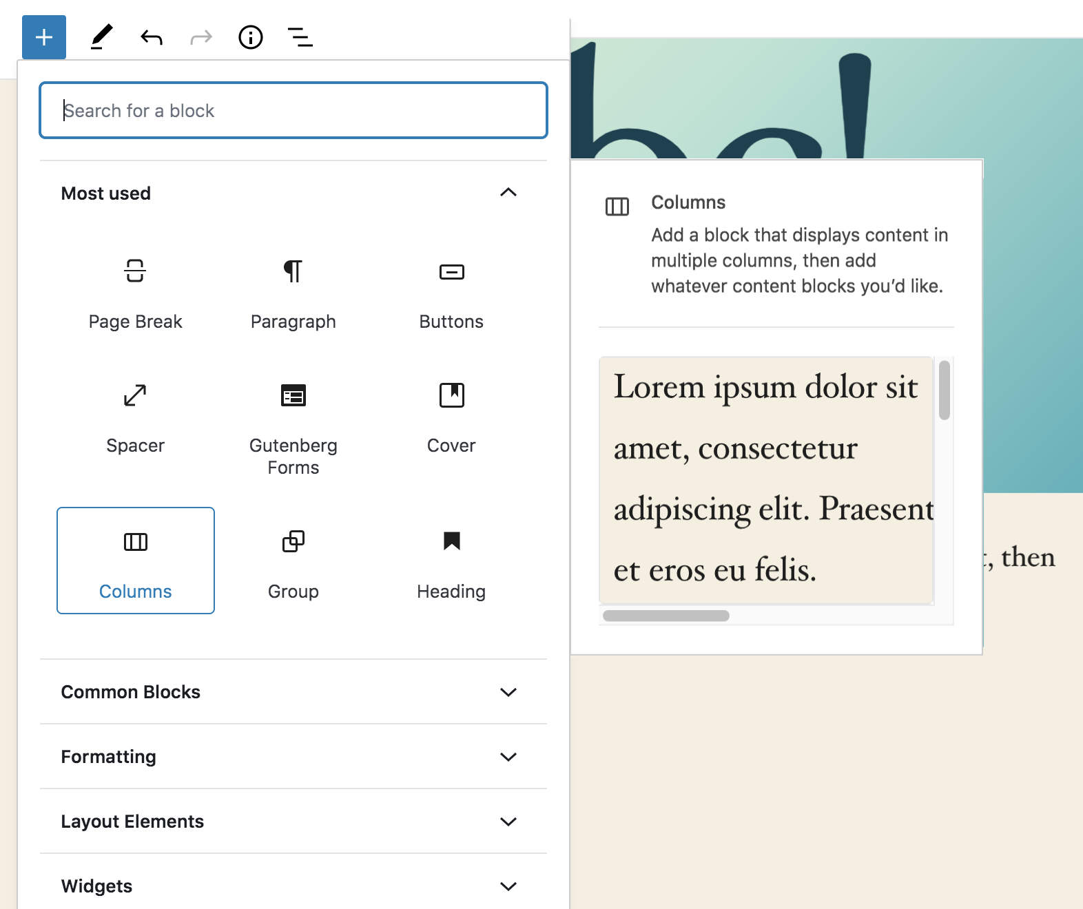
I did a quick attempt at reducing the gap size. It currently is 20px wide.
Here's at 12px:

And here's at 16px:
Both feel good to me.
 enriquesanchez
on 10 Mar 2020
enriquesanchez
on 10 Mar 2020
Hey Enrique
Good idea!
Having it closer really helps. It creates a proximity association between elements.
I liked the 12 px gap the most. Then Joen can add some shadow and round the corners.
paaljoachim
on 10 Mar 2020
@jasmussen I attempted a quick PR to reduce the gap and also add the missing border radius and box shadow. I'll appreciate a review.
enriquesanchez
on 10 Mar 2020
Related issues
 nylen
·
3Comments
nylen
·
3Comments
 davidsword
·
3Comments
davidsword
·
3Comments
 wpalchemist
·
3Comments
wpalchemist
·
3Comments
 JohnPixle
·
3Comments
JohnPixle
·
3Comments
 aduth
·
3Comments
aduth
·
3Comments
Most helpful comment
@jasmussen I attempted a quick PR to reduce the gap and also add the missing border radius and box shadow. I'll appreciate a review.