Gutenberg: Improve the "Back to WP Button" in full-screen mode
When switching the editor to full-screen mode we are currently rendering an arrow button in the left-most part of the header to let people navigate away from the editor and back to the dashboard. This has been debated a few times (notably the discussion in #18387, which proposed adding some options to clarify the action a bit more). It was generally agreed upon that the default state could be a bit confusing but a solution that relies on options for such a prominent part of navigation won't be great.
With site editing on the horizon, there's more of a need for using the full-screen option and it'd be worth working out a better solution to bridge the general admin experience with the editor experience.
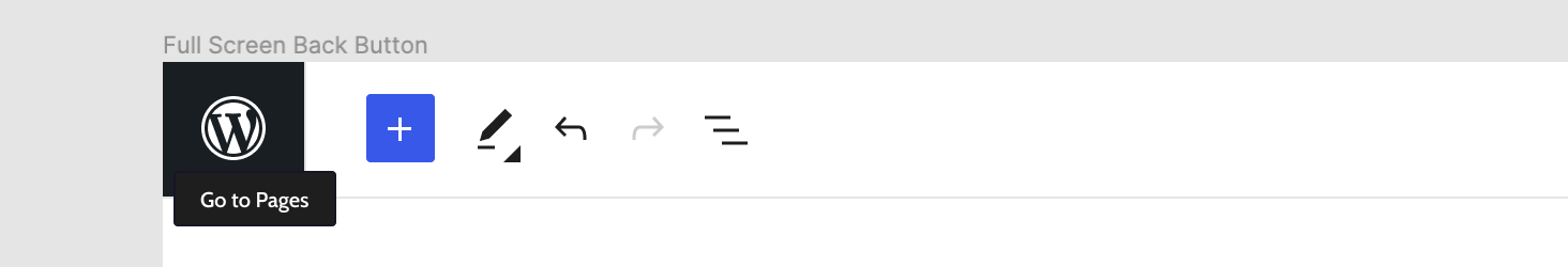
This proposal looks at separating the action a bit more from the other editor toolbar buttons (the < blends too easily) by using the WordPress logo as a familiar anchoring point but without compromising the length of the header.

Note this addition would only happen when in full-screen mode (effectively replacing the back arrow). The behaviour of navigating away would remain unchanged.
On focus / hover, we would either show the regular tooltip (like the back arrow does now):
Or we could try something more involved, such as expanding the container:

If it works well, I could imagine this action eventually bringing the main WP sidebar in by pushing the editor aside but that is a story for another time. Thoughts?
 mtias
mtias
All 8 comments
This may not work, but here's a quick riff on your design to see if we might be able to increase context ("Back to" vs. "Go to" since technically it feels like we'd be taking them back) while also trying to preserve valuable horizontal space:

 davemart-in
on 2 Mar 2020
davemart-in
on 2 Mar 2020
I think part of the reasoning for not using "Back to ..." was because you could have landed in the editor through a direct link, favorites, front-end admin bar, etc.
mtias
on 2 Mar 2020
If it works well, I could imagine this action eventually bringing the main WP sidebar in by pushing the editor aside but that is a story for another time. Thoughts?
That could be cool, something like this:

Its a little much, but there might be a better way to do the transition to help it be a little less jarring.
--
I was curious how a dropdown could look:
I like the way it looks visually, but its disconnected from the wp-admin navigation.
--
Also, I wanted to see how it might look if we used the Site Icon:

I _kinda_ like the personalization aspect, but again, without the WP logo it feels disconnected from wp-admin.
 shaunandrews
on 2 Mar 2020
shaunandrews
on 2 Mar 2020
I really like the idea of improving this area and iterating on the experience of the toolbar. The hooking in of an icon feels right for me, it feels grounding and that it brings back to the origin. I also prefer the 'W' logo over having a site specific. That said, if this can be overwritten I can see network sites preferring their own.
I think as a starting point the tooltip makes sense. I slightly feel less keen on the container expanding on hover, that feels like it could distract more than guide.
I would like to observe what the feedback is on this before we jump right into changing the menu also. Saying that, I lean towards a drawer animation over having yet another drop down menu and trying that with some users to see reaction.
 karmatosed
on 4 Mar 2020
karmatosed
on 4 Mar 2020
I think the Fullscreen mode should just collapse the admin bar, not remove it altogether. Then no new icon or interaction is needed, since Collapse is already part of the menu.
 joyously
on 5 Mar 2020
joyously
on 5 Mar 2020
I think part of the reasoning for not using "Back to ..." was because you could have landed in the editor through a direct link, favorites, front-end admin bar, etc.
Considering this, and @shaunandrews concepts, the behaviour here is pretty much identical to the "Navigation Icon" affordance in the Material App Bar spec.
- For situations where folks navigate into the Editor from another WordPress screen you'd employ the back arrow which takes them back to the referring screen.
- For direct links into the editor (when there is no referrer) you'd employ a menu button that reveals the main nav.
This is a pattern that works well outside of the editor as well (navigating through different levels of hierarchy within settings screens, for example), and one we've been utilising to some success in our designs for WooCommerce.
I know we're not beholden to Material in any way, but I thought it was useful to note their implementation of a very similar UX component.
 jameskoster
on 5 Mar 2020
jameskoster
on 5 Mar 2020
A filter to change the logo would be a really nice addition 👍
 morganhvidt
on 12 Mar 2020
morganhvidt
on 12 Mar 2020
Agreed. We should probably make the whole component filterable, so that the link / behaviour can also be customized.
mtias
on 12 Mar 2020
Related issues
 maddisondesigns
·
3Comments
maddisondesigns
·
3Comments
 cr101
·
3Comments
cr101
·
3Comments
 nylen
·
3Comments
nylen
·
3Comments
 aaronjorbin
·
3Comments
aaronjorbin
·
3Comments
 moorscode
·
3Comments
moorscode
·
3Comments
Most helpful comment
I think part of the reasoning for not using "Back to ..." was because you could have landed in the editor through a direct link, favorites, front-end admin bar, etc.