Gutenberg: Replace nav-menus.php with interface based on Navigation block
With Full Site Editing and the Navigation block, users will have a very intuitive interface for creating and editing menus. Not everyone will be able to access this, however, because some may not want to or may not be able to install a theme that supports Full Site Editing.
We should therefore investigate replacing the menu interface in nav-menus.php with a new interface built using the same components that the Navigation block uses.
This is closely related to the work in upgrading widgets.php to support blocks.
Consideration should also be given to replacing the menu interface in customize.php.
nav-menus.php screen:

Navigation block:

cc. @mtias
 noisysocks
All 46 comments
Would we want to display something very similar (if not exactly the same) as the Site Navigation block's UI? Or would we consider adding additional or different UI to this screen?
 shaunandrews
on 16 Dec 2019
shaunandrews
on 16 Dec 2019
Would we want to display something very similar (if not exactly the same) as the Site Navigation block's UI?
Yes, that's the idea. The main addition would be the aspect of locations, which should only be handled in this screen.
 mtias
on 17 Dec 2019
mtias
on 17 Dec 2019
I wanted to clarify a few things in sketches before moving into mocks. Right now there are a few things going on within this screen:
- Creating a menu
- Assigning menus to locations
The assignment comes in a few places:
- Tab section for locations.
- Assigning based on each menu itself.
I would like to propose going to a 2 screen format and have a couple of considerations for this in sketch format (neither I think is there yet but good to consider what would is ok to move around):
- This removes the location tab completely and has the only allocation on existing menus. Each menu would be listed once made at the side with opening to allocate:
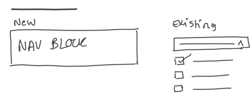
- Over specific menus and going in to add location, this version has locations listed at side you then select the menus.
 karmatosed
on 17 Dec 2019
karmatosed
on 17 Dec 2019
What's it gonna take to deprecate menu locations?
(edit: I say this aspirationally as someone with no authority on the matter)
 melchoyce
on 17 Dec 2019
melchoyce
on 17 Dec 2019
I am not suggesting we deprecate as much as pick one way to add locations. I might be missing a reason but having 2 ways to do this feels excessive. The same duplication is also in the customizer:

karmatosed
on 17 Dec 2019
There is potentially a sensible flow here where once you've made menu, choosing location makes a lot of sense. However, what I am not convinced of is that you need a totally different screen or place to then change locations.
karmatosed
on 17 Dec 2019
Having menus and locations separate is one of the single most confusing aspects of working with menus in WordPress. I've seen this in usability testing, and heard this from support folks. It's super common for someone to create an entirely new menu when they mean to add a page to an existing menu. The difference isn't at all clear. Regardless of how we tackle this issue, it needs to be fixed in any future iteration of menus, IMO.
melchoyce
on 17 Dec 2019
I spent some time with this and started at the work that's been done to bring widget into wp-admin by @mapk in #3204 after he recommended unifying with that. It's worth noting these are still early ideas and not full mocks or prototypes yet. Once feedback is given I will work into a prototype each section as there are flows that need visualising.
Version 1
My first point was to take a more literal approach, taking what was in the widgets screens and applying the navigation block.

This doesn't work because the navigation block needs a bigger space to interact with; it doesn't reduce well. Similarly, there are additional flows to the widget screen in navigation on top of adding to a location.
- Creating a navigation block (you don't create a widget).
- Editing navigation (you don't edit a widget).
Version 2
The wider canvas to the side solves the space issue so I moved into that for the second version. This version keeps the '+' though and has the problem of multiple versions of those still that the widgets screen has. It does divide actions more into 'editing/creating/locating'.
Version 3
Taking the past version, I iterated a little. Worth noting here is to create and edit there is a moving of the navigation block and arrow indicator to connect to the side panel. I also forced adding only in the one place so there are clear, distinct flows.

With a frame:

Version 4
This version takes it all back a little to what is there currently, the text brings in menus and there is a button over the '+'.

It's worth noting this also brings back 'live preview' which I am not at all sure we need anymore but we might if looping back to Customizer. Here is what that looks like not there. I also made it a link over a button, which might be something to discuss.
Next Steps
There are a few options. I would love some feedback but if we can keep it to the context of:
- This screen has to be done.
- What can we create as a minimum here and build up from? This screen might go over time and is needed sooner over later.
- What existing patterns can we use?
- How much can we soothe this experience over create a jarring new one?
- Whilst everything is 'open' in these screens could there be a more locked down flow? Would that cause issues or would that be easier?
My feelings are that version 3 or 4 are the ones we should look at deciding between.
karmatosed
on 20 Dec 2019
What existing patterns can we use?
Is it a common occurrence that one menu is re-used in multiple locations?
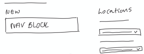
If _no_: Perhaps we could re-use the existing Block Areas pattern and simplify this screen to show a Block Area containing a Navigation block per location, e.g:

If _yes_: Perhaps we could riff off the Block Areas pattern and show one Block Area per Navigation block along with checkboxes that associate the Navigation block to one or more locations, e.g:
noisysocks
on 20 Dec 2019
Is it a common occurrence that one menu is re-used in multiple locations?
I think this really depends on what use a site is for. Typically I think we might be able to say no.
Your mocks are interesting, a more literal take and stepping even further from what there is now.
I do wonder though if those using this screen aren't expecting an experience that's more building? I also notice seeing multiple navigation blocks is causing me to have quite a reaction against it. Similarly, a giant '+' space is.
Copy wise deciding on what language we use here is key, I went for navigation but we could in this case use menu.
karmatosed
on 20 Dec 2019
Copy wise deciding on what language we use here is key, I went for navigation but we could in this case use menu.
It probably makes sense to move away from the word _menu_ as it has so many meanings. Those poor restaurant owners who are using WordPress! 🤯
noisysocks
on 20 Dec 2019
Not at all a final version but iterating on from your visuals @noisysocks:


If we had them 'inside' then lengthening the menu locations makes sense:

karmatosed
on 20 Dec 2019
What if all new menus became reusable by default? If you want to reuse a menu in a different location, you could have the open of selecting an existing menu within the placeholder.
Side note: I don't think "a Navigation" works, grammatically — I think "Navigation Menu" would be more clear.
melchoyce
on 20 Dec 2019
Spent some time exploring, and wound up with this:
shaunandrews
on 8 Jan 2020
Interesting exploration @shaunandrews. I have a few thoughts about it so going to just list those.
- What are the cog and ellipses for if this is in wp-admin?
- How would you add a new menu? I have a feeling the above might lead me to knowing that....
I feel that we need to be careful in wp-admin based on conversations and feedback so far to not remove existing functionality, which means a balance. I am also not sure this looking like an editor works, that might be because I need to think about this mental model though.
There are also going to have to be some technical thoughts around how we bring styling in here.
Overall I feel the zoom in to focus is a little jarring as an experience. Perhaps that's a case of iterating the animation though.
As the original v1 of this was to bring in close alignment to widgets, its worth consider do we then iterate widgets if we go in a different direction - we just might.
karmatosed
on 8 Jan 2020
What are the cog and ellipses for if this is in wp-admin?
It reuses patterns from the editor. The cog opens the sidebar inspector pane, with options (shown below) for the currently selected Navigation block or the Navigation Area settings (not shown/designed). I haven't given too much thought to the ellipsis icon, but I imagine it could expose similar options as the editor's more menu, like full screen mode, help and others.

How would you add a new menu?
In an effort to simplify, I decided to try working around the need to create a menu in isolation. Instead, you'd create a new menu but selecting an empty Navigation Area (showing the normal Navigation block setup state), or when changing a menu assigned to an Area.

shaunandrews
on 8 Jan 2020
I wonder if it would make for an easy start to simply replace all the drag and drop things with the new navigator which shows us navigation hierarchy:

This will not be a permanent solution, as the point is closer to what @shaunandrews explored above where we'd get nice previews of "locations", but instead a nice intermediary step.
 draganescu
on 9 Jan 2020
draganescu
on 9 Jan 2020
@draganescu as we are close to a design solution I wouldn't suggest that approach right now. It is a bit of a complicated mixture of interfaces in your screenshot, whilst I understand the motivation this would cause some experience issues. I think we can come up with something and just follow that over have this step which I don't think is of a benefit in this case for usability.
Now, if you would have to code it anyway, then you can, of course, begin that, but having it exposed to anyone to interact with would be something I'd advise against.
karmatosed
on 9 Jan 2020
I wanted to raise this thought... 🤔
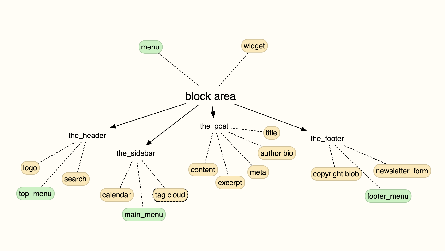
Do the Gutenberg Widgets screen and the Gutenberg Menu screen _need_ to be different at all? It's really just adding blocks to block areas that the theme has registered.
Why not just call the experimental widgets screen that currently exists in the plugin: "Block Areas" (as it's titled in the page) and utilize that for adding _any_ block to any other part of the website that is not currently registered in the Editor?
PROS:
- Saves us major development time on screens that will deprecate in the future anyways.
- Already got the Widgets screen designed.
- Covers most areas that a Navigation block may need to exist (ie. Footer, Sidebar)
CONS:
- The current Widgets experimental screen does not cover the Header so we'd most likely need to add that.
- Same Nav block in multiple areas can get a little tricky.
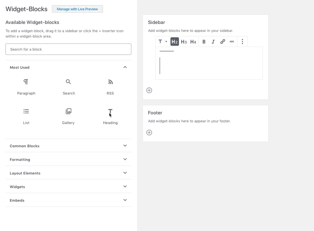
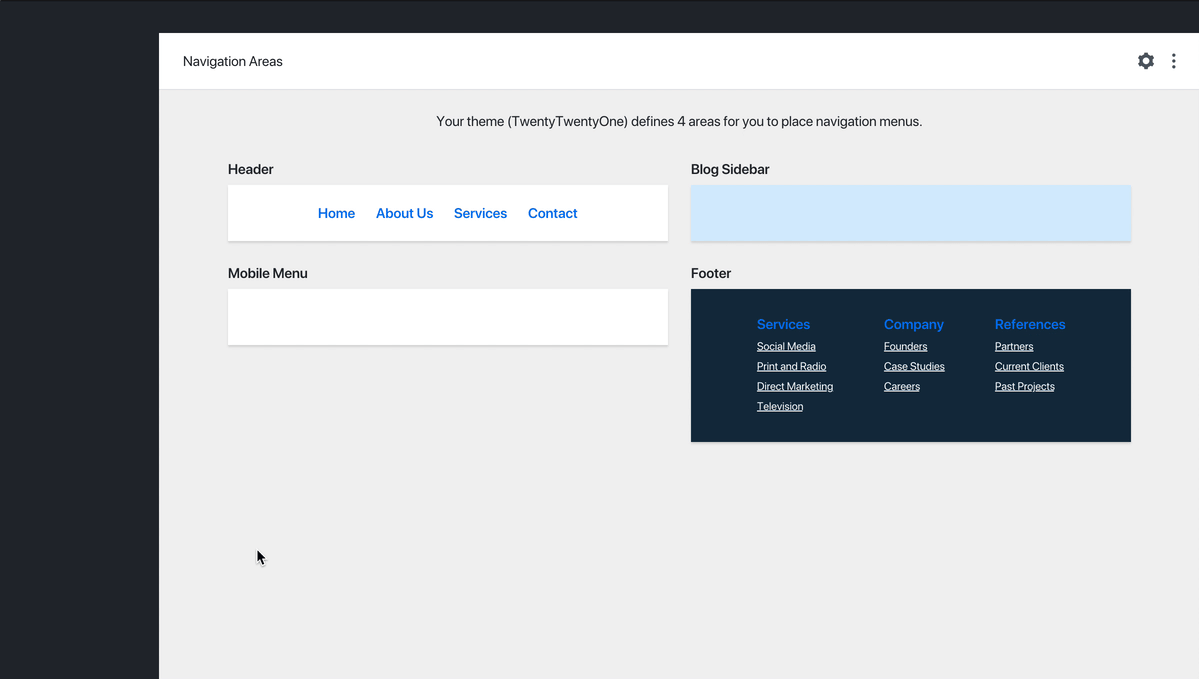
Example of adding a Navigation block to a Block Area

_The color is pretty washed out, but I think it still gets the point across._
If I've missed any of this in the discussion, please forgive me. I just wanted to share this thought while it was ripe. 🥝 _There may be additional factors I've not anticipated with this solution causing it to become moot._
 mapk
on 9 Jan 2020
mapk
on 9 Jan 2020
This is just some feeling feedback right now but I think the more these look like editors the more awkward I feel. That's possibly fixable by some distilling back but worth considering as we work on this.
Do the Gutenberg Widgets screen and the Gutenberg Menu screen need to be different at all? It's really just adding blocks to block areas that the theme has registered.
This isn't an easy question to answer and might come down to mental models. For example, there might need to be a middle point where people get to still do both. A good conversation to have though as this is explored and get feedback on.
I do think the current widgets have a few repeating UI elements the recent explorations are distilling away from, which is great. Whilst I know it has a design, I think we could simmer that a little, which is of course easier than starting from zero.
karmatosed
on 9 Jan 2020
Why not just call the experimental widgets screen that currently exists in the plugin: "Block Areas"
I think we're on the same page here. Whatever UI we come up with should be able to handle Widget and Menu area — which are really just "Block Areas". My biggest concern there is that we need a better way to list all the areas.
Also, I don't think its going to be feasible to let people update/save multiple areas at once. At least, not from a UX standpoint — I really worry about multiple entity saving and how we expose that in the UI. The designs I posted above separate the two actions; Listing areas and editing an individual area. I have more thoughts/work to share on this soon.
shaunandrews
on 10 Jan 2020
I think @karmatosed has a point with mental models as this separation between menus, widgets and "content" has been central to how WP organizes content.
It is also true that menus are basically a particular widget in a sea of widgets, so @mapk 's idea of having one place to manage both makes a lot of sense:
Also with FSE widgets will have an uncertain use, while menus will remain central to making a website no matter what.
I personally like @shaunandrews 's take on editing one area at a time and adding the sidebar to the mix helps with one problem I have, that when I am building a website's menu it doesn't feel like a visual activity, more like a structuring process so I would love an easy way to use the new navigator and see the full tree of the menu.
draganescu
on 11 Jan 2020
I think the mental models argument is a total valid. It's been brought up here more than once. And for that reason, I think it's safe to say that the legacy widget and menu screens won't be going away anytime soon.
But then we have Gutenberg full-site editing that brings much of this together into a unified interface where the mental model may not change in context to screen changes. Maybe the screen changes to show a particular Template Part separately, but it doesn't have to.
So looking at this as a way to bridge that gap, we can align with the Gutenberg principal, all blocks are created equal, and structure this one screen as a way to add any and all blocks to other areas of a site that aren't yet supported in the Block Editor.
mapk
on 14 Jan 2020
What I like about a lot of these mockups so far is that we're trying to de-emphasise the really unintuitive UI where one has to assign a menu to a location 🙂
Do the Gutenberg Widgets screen and the Gutenberg Menu screen need to be different at all?
I like this line of thinking but it will require some technical exploration to see what's possible. My concern is that existing themes have been built in a way that assumes that only menu markup will ever appear in navigation areas. We may need to restrict "navigation block areas" so that only the Navigation block can be added to them.
- Saves us major development time on screens that will deprecate in the future anyways.
I don't think the second part of this is true. I anticipate these screens will stick around forever because it is how sites that run older themes that don't support Full Site Editing will access the benefits of using blocks.
noisysocks
on 16 Jan 2020
Noting this is in spot where needs decision on the direction so swapping out labels.
karmatosed
on 22 Jan 2020
@mtias I'd like to hear your thoughts on using ONE wp-admin screen for these blocks as opposed to creating two different wp-admin screens for blocks.
mapk
on 7 Mar 2020
I'd rather doing incremental changes (adopting blocks in the existing screens with minimal changes) for this part of the roadmap (widgets, menus, customizer). The interface that merges all the "block areas" together is really the edit-site one. We should avoid pursuing another one trying to do the same.
mtias
on 7 Mar 2020
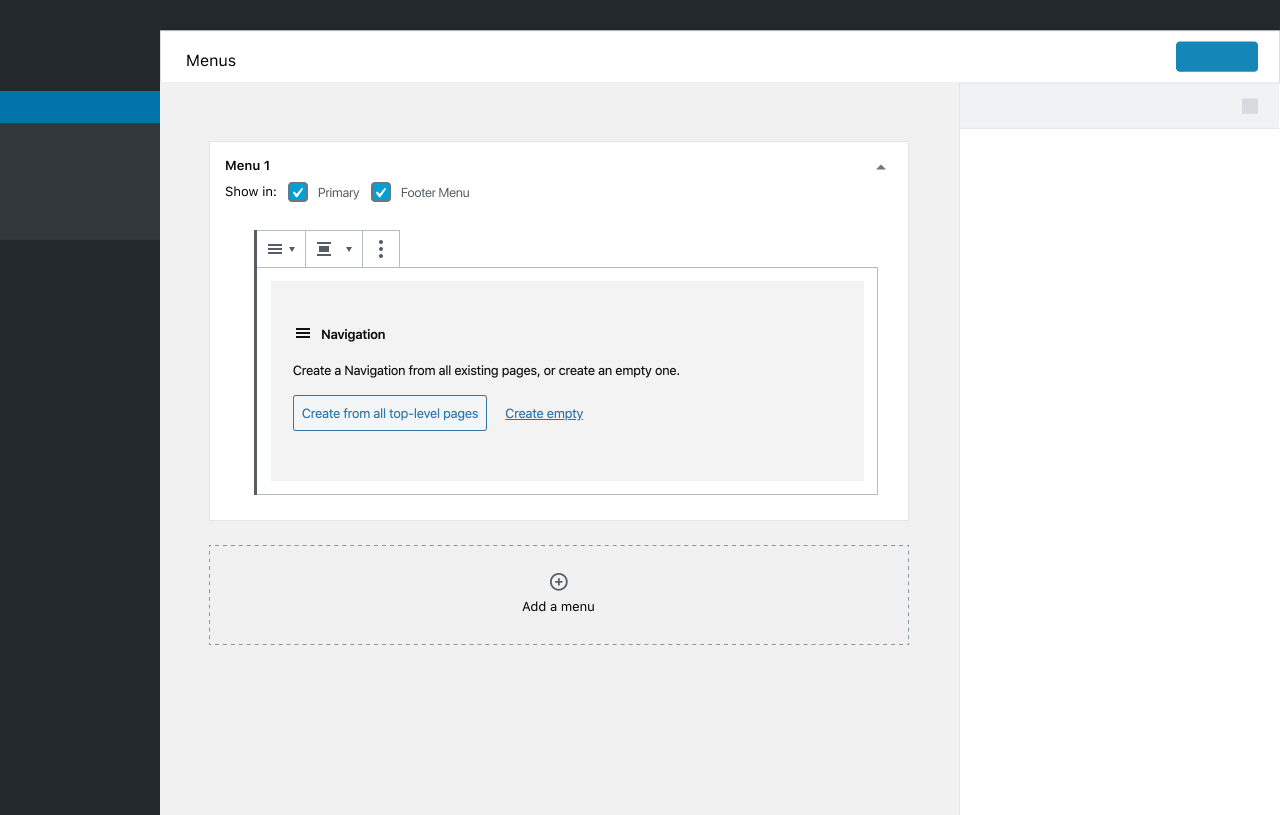
Now there is a PR for recieveing ( create, edit and delete) existing menu / menu locations / menu items via the REST API ( https://github.com/WordPress/gutenberg/pull/20292 ). This means the menus screen ( nav-menus.php ) can be rewritten using existing data with no need to migrate / reformat data. I think we should avoid migration of data where possible for BC reasons.
 spacedmonkey
on 7 Mar 2020
spacedmonkey
on 7 Mar 2020
@shaunandrews @mapk there is one thing that exists in the current navigation menus page that we need to account for: unassigned menus. These menus that do not belong to any location need a place where they are listed in the new UI.
In @shaunandrews 's mock- up the menus are listed in the dropdown that selects which menu is assigned to each location. However, inverts the current UX where you first find the menu then adjust it, to first select the location you want to change and then find the menu. Also it makes it impossible to edit an unassigned menu without assigning it to a location.
draganescu
on 16 Mar 2020
I have looked back over this and tried to get us back to basics with what could be a minimal version. I do have other suggestions based on iterations but will include them in another comment. I think it is worth in isolation to see what the most minimal could be.
This simply replaces the existing interface with a block, nothing more and locations remain. This doesn't iterate anything regarding this interface. There is a question arises from this though. Should we also iterate live preview (Customizer)? It is beyond this issue as this focuses on menus.php, but @mtias it felt right to raise this now.

The save would change to a primary button once in the menu building interface.

There are a few issues here to work out if we go in this direction, I would make a prototype.
Getting this in allows us to at least start using the block and therefore would be my suggestion.
Feedback
I would love initial feedback on how this could work from a development view. If we are holding true to getting just the block in, this is what it looks like visually, so how can we start getting there?
karmatosed
on 17 Mar 2020
Let's next as noted in my earlier comment, look at what could be beyond just adding the block. There is already work on widgets that could be taken into account, similarly, perhaps the interface could be simmered down a bit.
I wanted to say, in exploring this I tend to lean to the 'just get the block in' as a start, I see these as next steps if we choose to go. I don't see them as needed to get the navigation block at least released in a version of WordPress. The key is we can use navigation blocks in menu.php, which my above mock delivers.
Single column
This one takes away the location tab and has a little more interface...


As widgets
This screen was explored previously and brings into alignment with widgets.


Feedback
I think all of these are a step too far right now, for me I think whilst it's maybe not iterating the interface the literal placing of the block does what the objective here is, that of getting the block working in menus.php. I'm open to any feedback on these alternative options, I shared to show where we could go if we take things in steps. We might, however, decide to skip these steps and dive from the block in my earlier comment right into full site editing - which would be very ok.
karmatosed
on 17 Mar 2020
One thing to keep in mind is that the Navigation block is designed with a horizontal menu in mind, but the WP menus system can be used for vertical menus as well. It seems very odd to have a WYSIWYG interface for editing menus where the visual aspect is completely irrelevant to how the menu looks on the front-end. I'm confused... how will this even work? The current interface is designed around editing a menu as an abstract thing; the block comes with specific markup and styling. What's the goal here?
 ZebulanStanphill
on 17 Mar 2020
ZebulanStanphill
on 17 Mar 2020
@ZebulanStanphill there is an issue for vertical menus, so it will be coming in with this screen #16829
karmatosed
on 17 Mar 2020
@karmatosed Okay, but still: why use a WYSIWYG interface for editing menus when the WYSIWYG part is irrelevant? The wp-admin menus system only uses menus as a data structure, not a complete set of markup. I don't see how this attempt to bring blocks into this screen makes sense. The full site editing screens will provide a WYSIWYG interface for creating templates like headers and footers including menus. But the wp-admin Menus screen is an abstract menu structure creator, not a template editor. It seems like it would make more sense to deprecate the wp-admin Menus interface if we're moving towards a block being the source of truth for a menu.
The same menu can be used in different places in completely different styles. (Not just standard horizontal/vertical menus.) That's why the current Menus interface is so abstract. You're not editing a single block that gets reused across the website; you're editing the structure of a menu which exists purely as data that can be shared across many completely different sets of markup and styling.
ZebulanStanphill
on 17 Mar 2020
I would love initial feedback on how this could work from a development view. If we are holding true to getting just the block in, this is what it looks like visually, so how can we start getting there?
Thinking about development complexity for a moment.
I suspect that adding the block to the existing nav-menus.php UI (shown in https://github.com/WordPress/gutenberg/issues/19170#issuecomment-600063532) is complicated because it involves having a jQuery-based interface interact with a React-based interface. Bridging these two worlds can be troublesome.
Replacing the entire screen a la what we've done with the block-based Widgets screen is more straightforward. The entire interface would be a React application which uses the REST API and @wordpress components.
noisysocks
on 18 Mar 2020
I added #20981 as an overview of things that are not clear yet about how this replacement should happen. It is also a bit of splitting this issue into a heading per problem. Would it be nice to have one issue for design and more issues for each technical challenge?
draganescu
on 18 Mar 2020
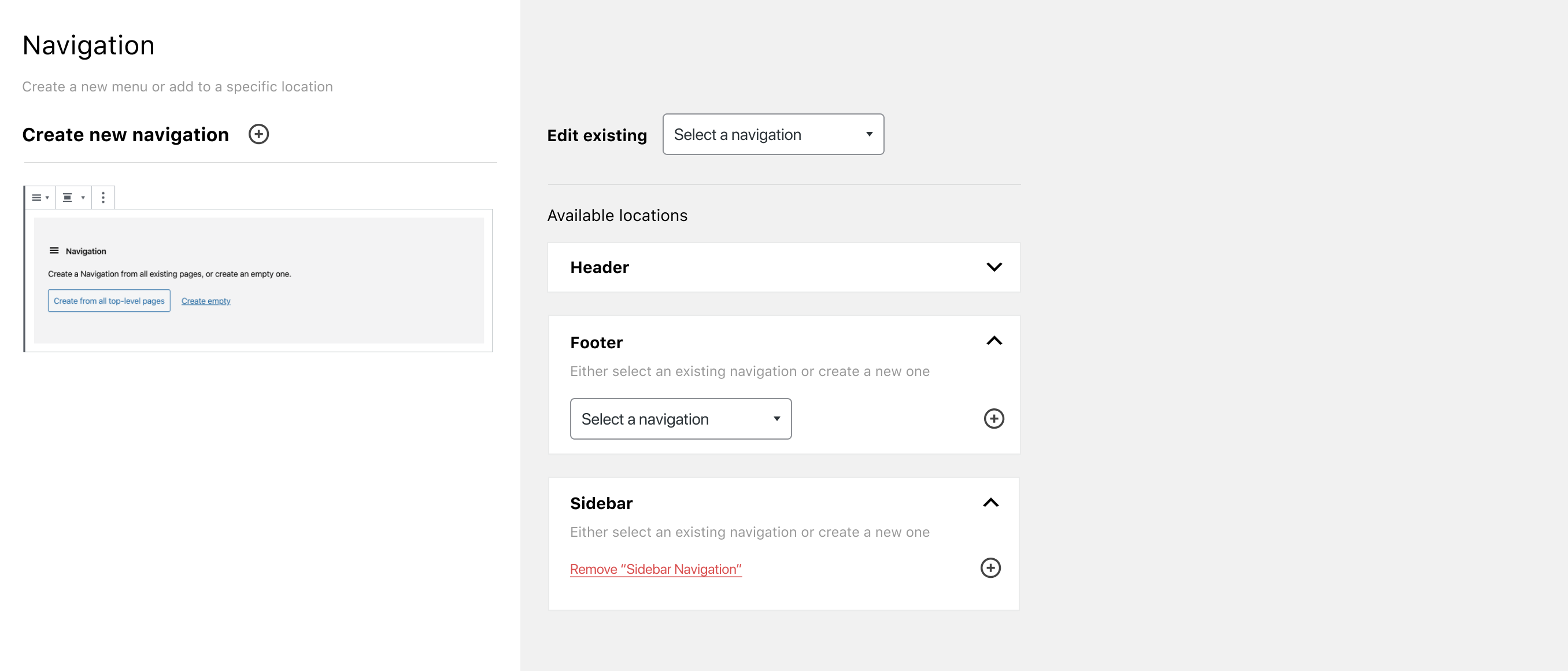
I took some time to imagine what bringing in the navigator could look like. There are a few points here to think about:
- The empty state of the navigator might just mean it doesn't show, I left it empty for now as the sidebar is in menus.php.
- We might want to bring in some settings from the sidebar below each block, I have kept existing ones to show that.
- Where we refer to menus, we should refer to navigation. As we get to a deciding point, I am merging new and old context here.
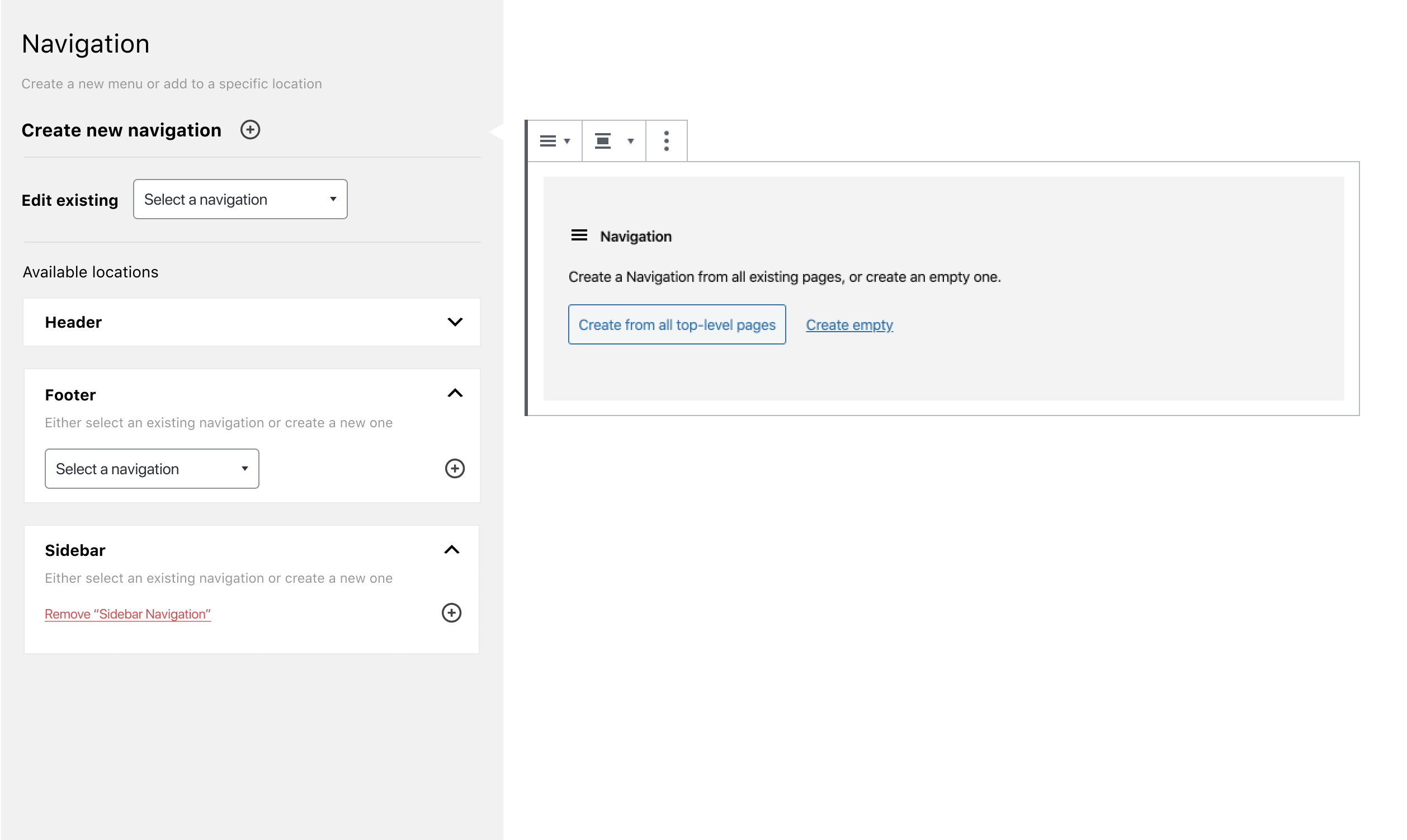
Create new navigation
This is the first screen you get on selecting 'create new'.

Editing existing

Feedback
If agreed, I will as a next step create a screen by screen state mock and prototype, including changing language. However, for now it would be great to get feedback on anything missing and what options should come from sidebar.
karmatosed
on 18 Mar 2020
For what is requested in the goal, I believe this fulfills it. Thanks for mocking this up @karmatosed!
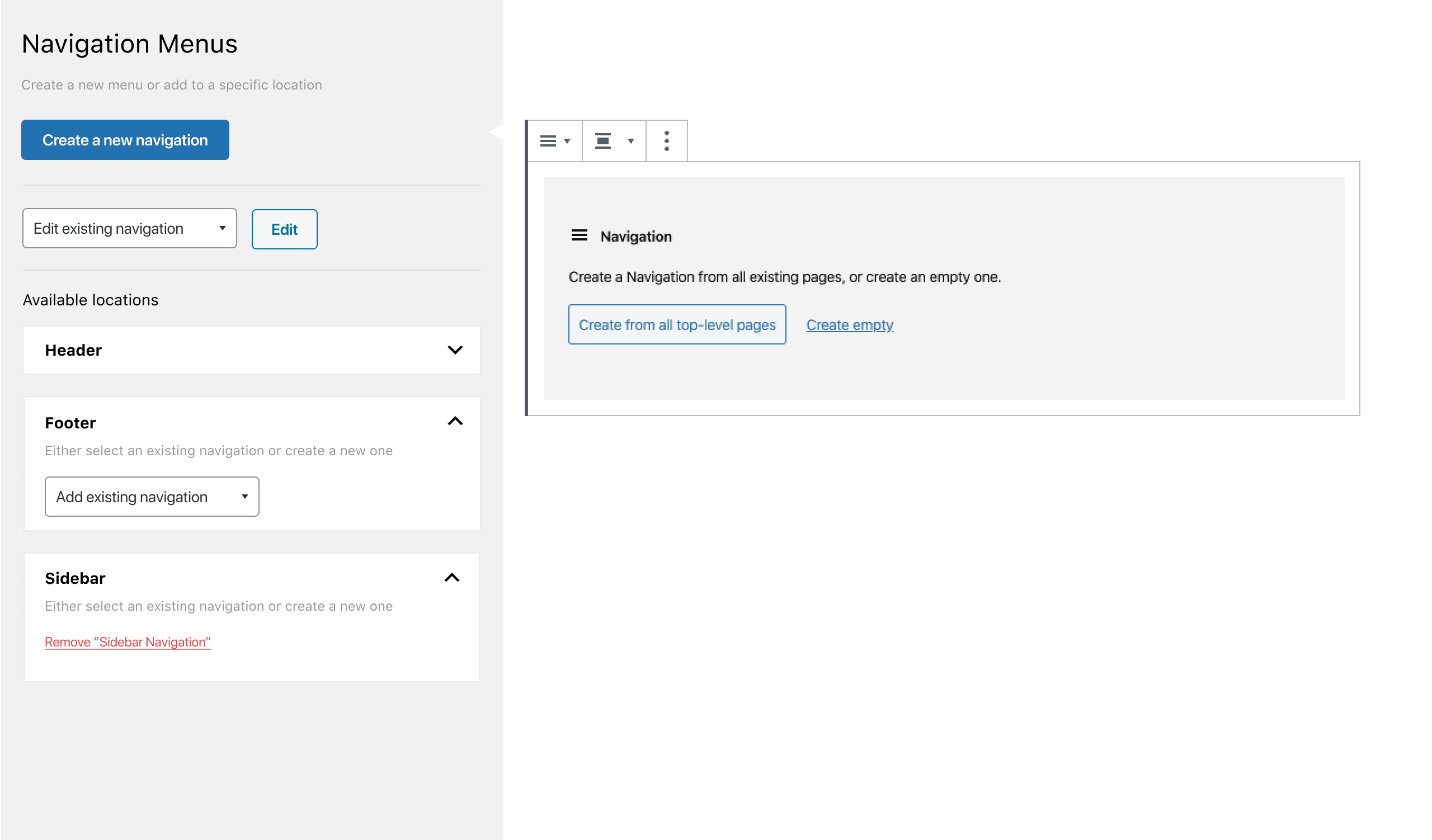
The only suggestion I have is that the "Creating new navigation" screen oddly shows the Navigation structure even though nothing is there. It makes sense, but maybe we can move it to the right side? I know this breaks the current screen's pattern, but it's not performing the same function as the older screen anyways. It also begins to align with the block editor as well.
So something like this?

Either way, let's get this built. 😄
mapk
on 18 Mar 2020
The only suggestion I have is that the "Creating new navigation" screen oddly shows the Navigation structure even though nothing is there.
Yes, this is a ponder of mine. I think keeping it to the left works as it will fill up. In the default menus.php today there is a 'greyed' out list of things to add to the menu. What we could just do, which might work is just have it empty to start and closed.
karmatosed
on 18 Mar 2020
I'd still like us to explore getting rid of the confusing _Locations_ / _Menus_ split, but this looks like a great first step in iterating on this screen.
My thoughts, looking at https://github.com/WordPress/gutenberg/issues/19170#issuecomment-600781129:
Without the block settings sidebar, we won't have a way to add nofollow and descriptions to links.
Semi-relatedly, there's some advanced menu properties in _Screen Options_ that we will need to add to the Navigation block:

Without the top toolbar, we won't have a visual way for users to undo or redo changes to the block.
We can remove the _Change alignment_, _Change items justification_ and _Open Colors Selector_ buttons from the block toolbar since, for menus, that's all decided by the theme.
_Screen Options_ can be removed.
Need to decide whether we want to update the copy in _Help_ or remove it as we've done in the block editor.
noisysocks
on 18 Mar 2020
I took some time to iterate the mocks, replacing the word menu.


Without the top toolbar, we won't have a visual way for users to undo or redo changes to the block.
@noisysocks I am suspecting it's complicated to bring in here? If that's the case I think it's ok to have to unset. You can delete out of a situation.
karmatosed
on 19 Mar 2020
@noisysocks I am suspecting it's complicated to bring in here? If that's the case I think it's ok to have to unset. You can delete out of a situation.
Yep, sounds good. Just checking to make sure we're conscious of these differences 🙂
noisysocks
on 19 Mar 2020
Addressing @ZebulanStanphill's comment over in https://github.com/WordPress/gutenberg/pull/21036#issuecomment-601799883 here:
I don't see the purpose in keeping the block interface at the bottom. There's no way for this interface to know how the theme is styling the navigation on the front-end, including whether or not it is vertical or horizontal. A block-based WYSIWYG interface only makes sense in the context of full site editing, in my opinion.
I don't think it's a problem that the block-based interface here won't have theme styling. It's not intended to be a WYSIWYG editor, just a more intuitive interface for creating and editing menus.
I know @mtias has some perspective on this which might be useful to share.
Trying to jam it into this screen is confusing (since it misleads users into thinking the block interface is an accurate front-end preview),
This is a good point. I think we could remove this confusion through design decisions. For example, we could use the system font that WP Admin uses so that there is a clear separation between admin and frontend.
and not useful at all in terms of accessibility.
What are the specific accessibility concerns you have?
I think the purely semantic/structure-based UI at the top is all we need. We could refine it to expose all controls needed to replicate the same functionality that the current wp-admin Menus interface provides. This non-WYSIWYG interface could then be backported to the block, allowing for a refined alternate editing experience for keyboard users.
100% agree with this last point. Any enhancements we make to the Block Navigator as part of a focus on the Navigation screen should also be made to the Block Navigator that exists within the block editor.
noisysocks
on 23 Mar 2020
What are the specific accessibility concerns you have?
How do you move a submenu item to the top level or vice-versa? This is impossible with the block interface unless you use drag-and-drop, which cannot be used by keyboard and screen reader users. Furthermore, the drag-and-drop is kind of funky right now, and doesn't work as well as the current wp-admin Menus screen. And worse, there's no way to move something from the top-level into a submenu (because the submenus are collapsed), no matter what controls you're using.
Additionally, it's somewhat awkward to have to shift-tab into the toolbar controls. Logically, the controls should come after the content. Of course, the DOM order should match the visual order, so the toolbar has to be at the top right now. This is a problem with the block UI in general, and it has been suggested that an option be added to toggle where the toolbar is, but no progress seems to have been made there lately. See #3976.
And to make this block interface make sense, you need to strip out a bunch of controls that are normally there, e.g. the block switcher, the style controls, and some of the options in the ellipsis menu. This is a lot of alterations to make to get the UI working in this context, and I'm not sure it's worth it.
At least some of these problems could be fixed, but until they are, I would not consider a block-ified navigation editing UI to be worth shipping.
I also question whether the block interface is really more intuitive than a standard vertical list of items. At it's core, a navigation is a list of links. I would think that that is the best way to present the interface. I'm sure the current Menus interface could be greatly improved, but so far I haven't seen any mockups of a UI that are better than it, since the Block Navigation half is still very limited in what it can do, and the standard block UI is full of gotchas like the ones I mentioned above.
ZebulanStanphill
on 23 Mar 2020
@ZebulanStanphill I would like to focus a little on what this issue is about, that is specifically the implementing of having the navigation block in the menu interface. Whilst, I understand you are suggesting iterations to the interface, that is specifically about iterating the block itself. There are quite a few issues for making the navigation block the best interface it can be, I would like to encourage commenting on those and for now, to focus this issue back on implementation.
At least some of these problems could be fixed, but until they are, I would not consider a block-ified navigation editing UI to be worth shipping.
An important part to do is shift thinking a bit to seeing it as linear. The block can be improved along with the work done here, they don't have to wait for each other.
karmatosed
on 23 Mar 2020
https://github.com/WordPress/gutenberg/pull/21036 is merged now so let's close this issue out and switch to using smaller follow-up issues.
noisysocks
on 1 Apr 2020
Related issues
 youknowriad
·
3Comments
youknowriad
·
3Comments
 BE-Webdesign
·
3Comments
BE-Webdesign
·
3Comments
 aaronjorbin
·
3Comments
aaronjorbin
·
3Comments
 franz-josef-kaiser
·
3Comments
franz-josef-kaiser
·
3Comments
 JohnPixle
·
3Comments
JohnPixle
·
3Comments
Most helpful comment
What I like about a lot of these mockups so far is that we're trying to de-emphasise the really unintuitive UI where one has to assign a menu to a location 🙂
I like this line of thinking but it will require some technical exploration to see what's possible. My concern is that existing themes have been built in a way that assumes that only menu markup will ever appear in navigation areas. We may need to restrict "navigation block areas" so that only the Navigation block can be added to them.
I don't think the second part of this is true. I anticipate these screens will stick around forever because it is how sites that run older themes that don't support Full Site Editing will access the benefits of using blocks.