Gutenberg: Consider revising the color swatch states.
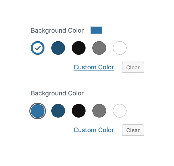
The current "Selected" color circle makes it really difficult to see the actual selected color. To combat this, Gutenberg adds a second, rectangular color swatch next to the panel title.

We should consider revising the circular swatch treatment in order to negate the need for that additional swatch.
One quick idea would be to adopt the select + focus states used for block styles. Here's how that might look:
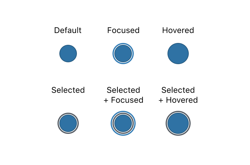
_Comparison to current approach:_
This isn't quite as clear, so I think some more iteration is needed. Also worth considering: either way, we'll need a place to include a swatch if the user selects a custom color.
 kjellr
All 5 comments
What about a white check icon in the circle without the additional white circle inside it?

 davewhitley
on 4 Sep 2019
davewhitley
on 4 Sep 2019
@drw158 That wouldn't work for the color white... unless the check had a black outline around it. Alternatively, a black check icon with a white outline could be used.
 ZebulanStanphill
on 4 Sep 2019
ZebulanStanphill
on 4 Sep 2019
Yes, that is what I had in mind. The check icon color would simply change to black to meet contrast requirements, depending on the color.
davewhitley
on 4 Sep 2019
I could see how the concentric circles might make it tricky for users to differentiate between the selected and hover/focus states. A check mark feels a bit more universally understood here, and it's a pattern we're already establishing elsewhere (see: image galleries) for selected states. (See also #17189, where an idea was floated for using the checkmark for a non-selected state.)
Here's a quick comparison of those options, including how it might look with the inverse (black check mark) treatment, riffing off @kjellr's original mockup. This should be easily accomplished using the tinycolor2 library already in use for contrast checks. (The mostReadable function is probably the easiest way to return the best result against the swatch colour.)
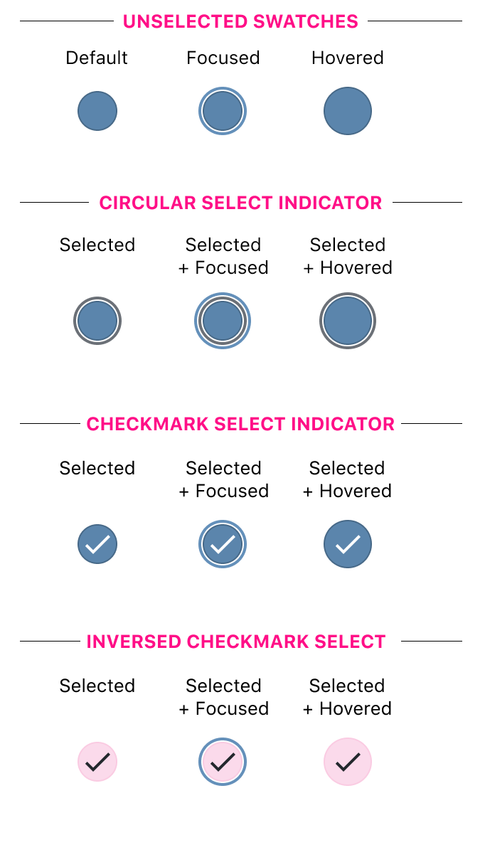
Note that this screenshot uses the blue focus ring used elsewhere in the UI for consistency, but we could also use the grey one currently in use for a less jarring contrast against certain colours:
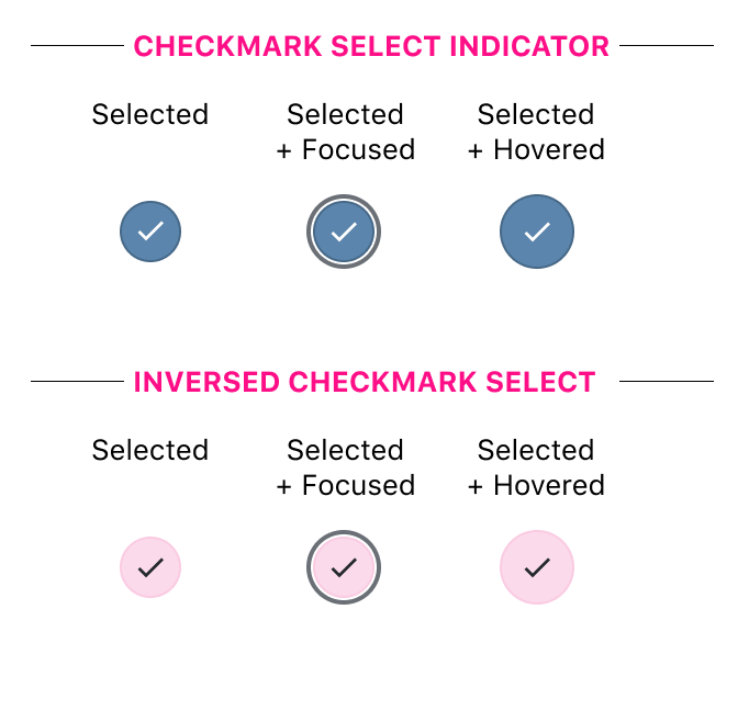
The above mockup also uses a slightly smaller checkmark, just so we can see more of the swatch itself. Providing it doesn't cause visibility issues, I'd be inclined to go with slightly more padding inside of the swatch.
 sarahmonster
on 11 Sep 2019
sarahmonster
on 11 Sep 2019
I love how y'all collaborately iterated and arrived to an awesome solution.
I like the last mockup that @sarahmonster shared. I think that the checkmark and the gray focus ring work really well.
 enriquesanchez
on 11 Oct 2019
enriquesanchez
on 11 Oct 2019
Related issues
 spocke
·
3Comments
spocke
·
3Comments
 aaronjorbin
·
3Comments
aaronjorbin
·
3Comments
 moorscode
·
3Comments
moorscode
·
3Comments
 jasmussen
·
3Comments
jasmussen
·
3Comments
 youknowriad
·
3Comments
youknowriad
·
3Comments
Most helpful comment
I could see how the concentric circles might make it tricky for users to differentiate between the selected and hover/focus states. A check mark feels a bit more universally understood here, and it's a pattern we're already establishing elsewhere (see: image galleries) for selected states. (See also #17189, where an idea was floated for using the checkmark for a non-selected state.)
Here's a quick comparison of those options, including how it might look with the inverse (black check mark) treatment, riffing off @kjellr's original mockup. This should be easily accomplished using the tinycolor2 library already in use for contrast checks. (The mostReadable function is probably the easiest way to return the best result against the swatch colour.)
Note that this screenshot uses the blue focus ring used elsewhere in the UI for consistency, but we could also use the grey one currently in use for a less jarring contrast against certain colours:
The above mockup also uses a slightly smaller checkmark, just so we can see more of the swatch itself. Providing it doesn't cause visibility issues, I'd be inclined to go with slightly more padding inside of the swatch.