Gutenberg: Consider adding a second-level help panel inside the Block Library
Alongside efforts like #16315, we should consider other areas where we can bring education and help to the user contextually. This is one of those ideas.
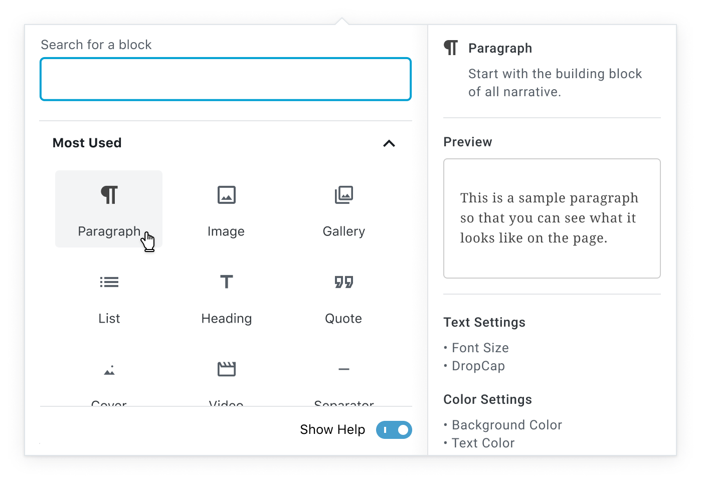
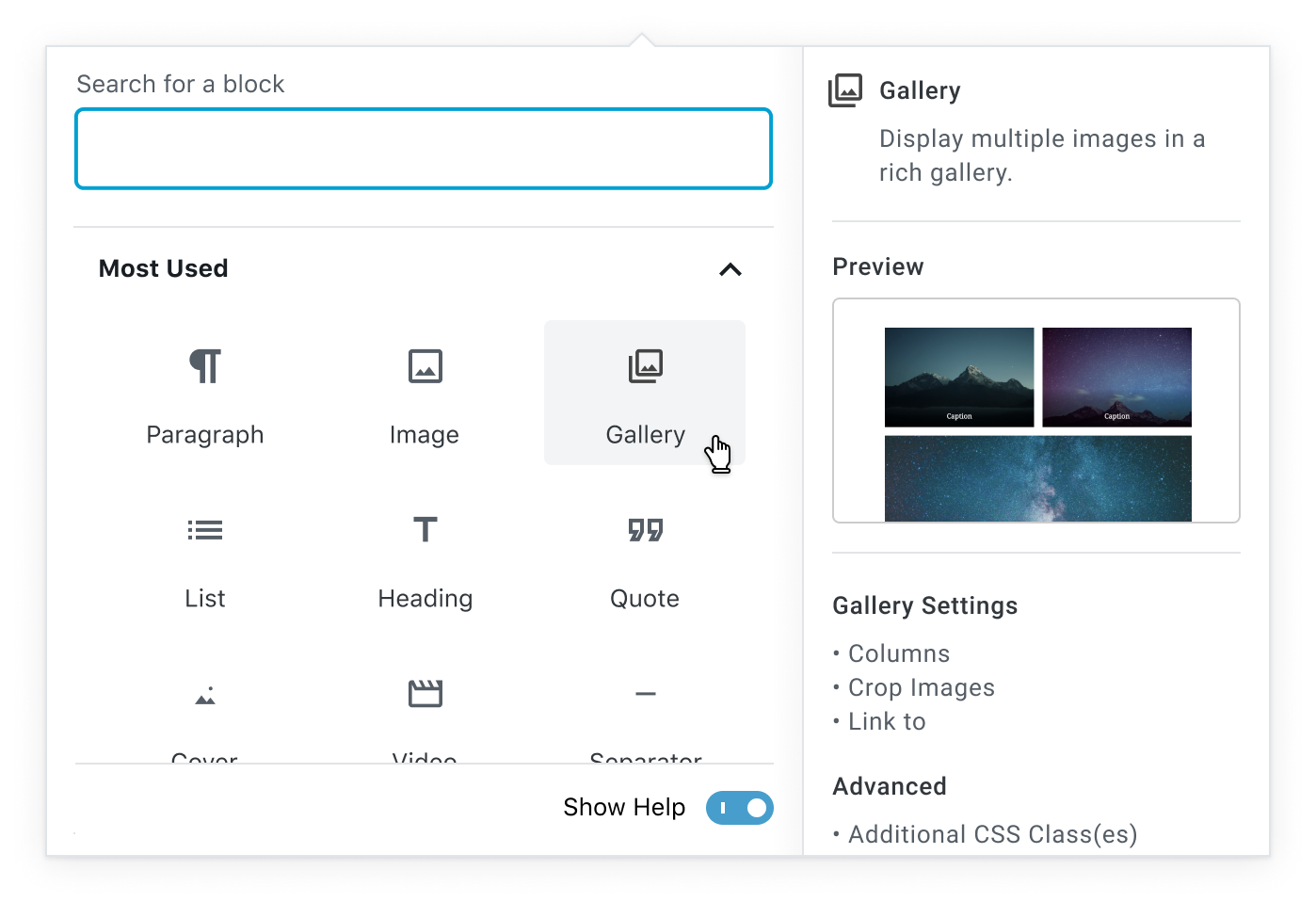
@dwolfe recently shared with me some explorations around adding a "Help" panel to the right of the Block Library overlay. Such a panel has a few potential benefits:
- It allows for the user to have an "at a glance" overview of the block. This content would be in a logical,
- It could house the preview, so they have a better idea of what to expect upon block insertion.
- It could also be a home for more evergreen block-specific "Tips." For instance, the Image block panel could have a line that points people towards the Gallery block for multiple images.
- It could also provide a place to link out to external block-specific documentation if it exists.
Some example mockups:
We'd still need to figure out how this behaves on mobile, but it seems like a promising direction for further exploration.
 kjellr
All 15 comments
I like a few things about this:
- Extends previews to every block, not just "reusable blocks".
- By having a persistent area dedicated for previews, it allows us to show general "what are blocks about" in the "no blocks hovered/focused state yet".
- Incorporating the block description into the preview panel would allow easier scanning and comparison of blocks.
 mtias
on 15 Jul 2019
mtias
on 15 Jul 2019
I like this if we do have previews on every block and we also maybe think how to make that section less dense with text and simpler to scan, otherwise, it's a lot to take in.
 karmatosed
on 16 Jul 2019
karmatosed
on 16 Jul 2019
I like this if we do have previews on every block and we also maybe think how to make that section less dense with text and simpler to scan, otherwise, it's a lot to take in.
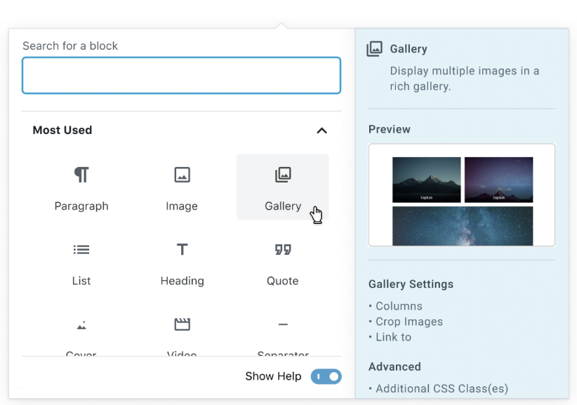
A "should have been obvious when I made these" note on the mockups above: Since these only appear on hover, we can't allow for scroll inside of them. 😂

This definitely limits the amount of text/content that can be placed inside of them. A more realistic mockup might be something like this:

- Block Description
- Preview
- Block-specific tip (Perhaps this is a different tip each time you load the view)
kjellr
on 16 Jul 2019
We can debate the copy but the 'realistic' mockup I think is great! It brings a clearer path scan and gets the insights you need, which is key here for me as this could be briefly seen.
karmatosed
on 16 Jul 2019
After discussing this in today's design triage in slack, we came to this possible conclusion:
This is related to: https://github.com/WordPress/gutenberg/issues/16594
Add tips to both locations.
- In the main Block Inspector, they can be turned off globally so they don’t interfere with the more advanced user’s experience.
- In this issue's option (help sidebar) on the Inserter/Library they can’t be turned off unless the user toggles off the entire help sidebar.
This flow makes sense and surfaces tip visibility while also allowing easy ways to turn them off completely.
 mapk
on 23 Jul 2019
mapk
on 23 Jul 2019
Just want to say this looks awesome and I think it's going to be really helpful to users! The latest mockup looks like a good compromise for detail. Any thoughts though on what happens when translations or text size preferences might cause that content to spill past the allotted area?
 rralian
on 25 Jul 2019
rralian
on 25 Jul 2019
Any thoughts though on what happens when translations or text size preferences might cause that content to spill past the allotted area?
That's a great question. In general, we'll need to build this to be fluid in order to properly support text-zoom options as well. My guess is that we'd (hopefully) try to get this to expand out to the left if necessary. 🤞
kjellr
on 26 Jul 2019
This introduces a _lot_ of text to a popover panel—my first reaction was one of visual overload. It might make sense to streamline and simplify here, taking into account user needs at this stage.
Here, users are looking to _choose a block_. Giving them tips about the functionality, settings, or details of the block is likely more appropriate after they've _already selected a block_ (ie, #16594), rather than when they're trying to choose a block to use.
Do we have any data about what users are thinking or struggling with at this stage?
How can we leverage this new area to give _contextual, relevant_ information that will help users with the current task at hand (selecting a block to use)?
 sarahmonster
on 1 Aug 2019
sarahmonster
on 1 Aug 2019
I actually really like seeing the text and can see a strong use case across the range of people, which is unusual for me as I am usually one to clear everything possible down. It feels like when I am browsing a plugin or something to buy. I want just enough description to say what it is and then I can do that or find out more.
I have seen time and time again people skim over or not use a block because names and an icon just aren't enough. The preview also whilst awesome, doesn't always say what it is.
How can we leverage this new area to give contextual, relevant information that will help users with the current task at hand (selecting a block to use)?
I personally would recommend putting it in and then reviewing if we need to scale back. I am in 2 minds if contextualising here doesn't add a ton of complications. Something to maybe explore but I feel like getting it in gives us that room for iteration exploring.
karmatosed
on 1 Aug 2019
This introduces a lot of text to a popover panel—my first reaction was one of visual overload.
I had this initial reaction as well. Maybe the whole information pane could be tinted in a light blue to visually seperate it from the main functions?
Also it would be nice if the Preview pane could accomodate GIFs or MP4s, similar to how Photoshop handles their tutorial tooltips.

 drawcard
on 13 Aug 2019
drawcard
on 13 Aug 2019
Maybe the whole information pane could be tinted in a light blue to visually seperate it from the main functions?
Interesting solution. I personally prefer the white background. The blue feels a bit strong. I wonder if a light gray would work better?
Also it would be nice if the Preview pane could accommodate GIFs or MP4s, similar to how Photoshop handles their tutorial tooltips.
Yea! I really liked this idea and brought it up before, but there's a concern for the level of maintenance involved with updating them when the UI changes. I think for a version 1, simple static previews might be best right now. But let's keep that other example in the back of our minds for future iterations.
mapk
on 13 Aug 2019
Yea! I really liked this idea and brought it up before, but there's a concern for the level of maintenance involved with updating them when the UI changes. I think for a version 1, simple static previews might be best right now. But let's keep that other example in the back of our minds for future iterations.
That's a fair point, my thinking was 3rd party blocks / plugins could take advantage of it.
drawcard
on 13 Aug 2019
Should we consider this fixed now that #16813 is merged? Is it better to try this for some time, and continue on dedicated issues like #16979
 youknowriad
on 19 Aug 2019
youknowriad
on 19 Aug 2019
Yep! I think we can close this for now. I've opened #17091 to track the next step of adding block-specific tips as well. 👍
kjellr
on 19 Aug 2019
Just noting a few other followup issues:
- Only show the inserter help panel when opened from the top toolbar #17110
- Add a "keyboard shortcut" treatment to the default tip in the inserter modal #17111
- Trim inserter help panel copy #17107
kjellr
on 20 Aug 2019
Related issues
 JohnPixle
·
3Comments
JohnPixle
·
3Comments
 BE-Webdesign
·
3Comments
BE-Webdesign
·
3Comments
 franz-josef-kaiser
·
3Comments
franz-josef-kaiser
·
3Comments
 spocke
·
3Comments
spocke
·
3Comments
 wpalchemist
·
3Comments
wpalchemist
·
3Comments
Most helpful comment
A "should have been obvious when I made these" note on the mockups above: Since these only appear on hover, we can't allow for scroll inside of them. 😂
This definitely limits the amount of text/content that can be placed inside of them. A more realistic mockup might be something like this: