Gutenberg: Publishing flow: Reconsider label for "Publish..." button
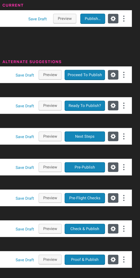
Right now, if you have pre-publish checks turned on, the Publish button looks like this:

This always makes me pause—even being familiar with the editor, I'm never exactly confident of what this will do. There's something about the ellipsis that engenders a feeling of uncertainty. What can we do to make this action more assertive and explicit?
Given that the core action here is to check your settings before publishing, I explored what a few different suggestions might look like:
(Thanks @mapk for feedback & a suggestion in #7602!)
I'd ❤️ some more feedback and ideas here, along with any data or insights that might validate or invalidate my hypothesis here! (Is this feeling of uncertainty unique to me?)
 sarahmonster
All 8 comments
It's helpful to see the different options as they'd actually appear in the button! I gravitated toward these three:
Ready to Publish?
Proceed to Publish
Check & Publish
However, there's something about the question mark in the first option I don't like -- it just doesn't look tidy and clean in the button (and along the lines of what you said earlier, it doesn't inspire confidence in the user). So, I lean toward the latter two, and like "Proceed to Publish" the most (though it's long).
All that said, there's something appealing, too, about "Next Steps," but ultimately I think it's important to have "Publish" in there.
 clucasrowlands
on 28 Jun 2019
clucasrowlands
on 28 Jun 2019
At least in German all these suggested alternatives would probably result in quite long translations. L10N needs to be considered here.
Personally I don‘t see any issues with the current string. If anything I would even remove the ellipsis.
 swissspidy
on 28 Jun 2019
swissspidy
on 28 Jun 2019
I'd second @swissspidy. Also, some of the proposed strings are difficult to translate in other languages.
I'd suggest to keep things very simple and just remove the ellipsis. "Publish" is what users are used to and it probably doesn't matter so much if it opens a modal instead of publishing right away. I'd tend to think the feeling of uncertainty is only related to the discover phase and will go away after the very first times users use this control.
 afercia
on 28 Jun 2019
afercia
on 28 Jun 2019
Whilst I want to be open to trying solutions here, I do think 'publish' is a strong enough mental model for the majority of people that changing it could cause issues. If you add in the potential hurdles translation will create for the UI, I really wonder if it's worth changing this. I sort of feel it's not right now and other things can be done to make it more understandable as an action.
 karmatosed
on 28 Jun 2019
karmatosed
on 28 Jun 2019
Very much agree with @karmatosed. Perhaps there's a way to integrate tips into this context, to emphasise that this is not an immediate action (you'll have a chance to correct)? And also, it would be great to make sure that there is a prominent "undo" option in the publish UI. Once you see that for the first time, it should reduce the potential anxiety around publishing since you'll know that you can easily revert.
 chrisvanpatten
on 29 Jun 2019
chrisvanpatten
on 29 Jun 2019
Thanks for the feedback, everyone!
I'm going to go ahead and close this in favour of leaving the button as it is—it sounds as though it may only be me who experiences a feeling of uncertainty around this interaction. 😄
If usability testing indicates that the ellipsis causes a level of uncertainty, we can re-open and discuss further, but it's probably not worth pursuing further if this isn't a problem in need of solving!
sarahmonster
on 2 Jul 2019
I don't mind closing this in favor of a consensus, but from what I gather the consensus is based on personal feelings. In some of the usability testing sessions, I've seen users click "Publish..." and think their journey was over. This is the reason for the change.
The button "Publish..." and then seeing "Publish" has proven to be confusing for _some_ users. We can revisit this at another time though.
 mapk
on 24 Jul 2019
mapk
on 24 Jul 2019
Can we hook into the usability testing that's being done to validate whether or not this is a problem for users? I find it confusing myself, but I'm well aware that I don't represent the typical WordPress user.
sarahmonster
on 2 Aug 2019
Related issues
 ellatrix
·
3Comments
ellatrix
·
3Comments
 pfefferle
·
3Comments
pfefferle
·
3Comments
 nylen
·
3Comments
nylen
·
3Comments
 BE-Webdesign
·
3Comments
BE-Webdesign
·
3Comments
 aduth
·
3Comments
aduth
·
3Comments
Most helpful comment
Whilst I want to be open to trying solutions here, I do think 'publish' is a strong enough mental model for the majority of people that changing it could cause issues. If you add in the potential hurdles translation will create for the UI, I really wonder if it's worth changing this. I sort of feel it's not right now and other things can be done to make it more understandable as an action.