Gutenberg: Establish guidelines for button placement
This has come up a few times in other issues (see https://github.com/WordPress/block-directory/issues/9 and #12048), so I figured it might be time to discuss and establish guidelines now.
- When we have two buttons side by side, which one goes on which side?
- Are buttons left-aligned, centre-aligned, or right-aligned?
Right now, the images used in the component documentation seem to indicate the following rules:
- Align buttons to the right.
- Buttons of higher emphasis (primary) sit to the right of lesser-importance-having buttons.
However, @afercia has pointed out that this conflicts with previous discussions on the issue, and the patterns that we _sometimes_ follow in core (but sometimes not):
https://core.trac.wordpress.org/ticket/40822
https://core.trac.wordpress.org/ticket/40822#comment:9
https://core.trac.wordpress.org/ticket/40822#comment:10
https://wordpress.slack.com/archives/C02S78ZAL/p1554138401066300
https://core.trac.wordpress.org/ticket/46758
https://core.trac.wordpress.org/ticket/45972
https://core.trac.wordpress.org/ticket/43412
https://core.trac.wordpress.org/changeset/40655
https://core.trac.wordpress.org/ticket/9777
Let's figure out a good approach for this moving forward, and update our documentation (and usage!) to reflect this, so we can be more confident and consistent with button placement into the future.
 sarahmonster
All 14 comments
@sarahmonster thanks for creating this issue! As mentioned in https://github.com/WordPress/block-directory/issues/9#issuecomment-501389715 and on the Trac ticket dedicated to proximity of controls, there should be a pattern for the buttons _group_ position. It is also OK if in a specific context the group position is different, for example within modals.
As usual, the most important part for accessibility (and I'd say general usability) is the _order_ of the buttons within the group.
In core there's some inconsistency. In an effort to establish a solid pattern, it was decided (see references above) to stick to the following order within the group:
- primary action on the left, as a primary button
- list secondary actions immediately to the right of the primary action, as secondary buttons
- list all negative action (cancel, delete) next, as links
Re: the group position:
In most cases, the actions should be left aligned, to line up with the forms. This would happen on Settings, bulk edit screens, edit term screens, etc.
In the case of things like the theme modal, actions should remain centered (since the content within the modal doesn't follow the same left-aligned linear path as forms do).
Whatever the decision will be, it should be coordinated with core. Ending up with a different buttons order in core and Gutenberg wouldn't be ideal. Users shouldn't be forced to learn new UI patterns depending on the page they're using and the controls order should always be predictable.
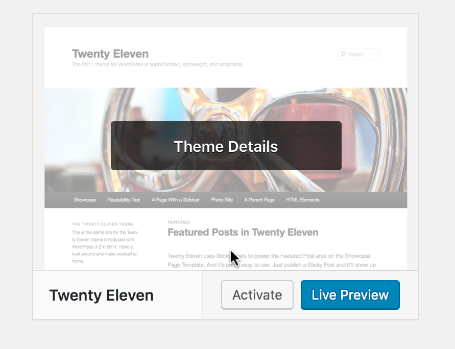
Some screenshots from core. In some cases, the different order is very evident:
Themes page > theme details:
Add Themes page > active theme and new theme preview: same design but different order and different primary action 😭

Other examples:


 afercia
on 13 Jun 2019
afercia
on 13 Jun 2019
We talked about this today in the slack triage. Looks like a decision is needed.
Seeing as it's the more frequent direction for our grouped buttons, and it works quite well, I support the right aligned buttons with the primary action to the right of all the other buttons.
As @kjellr noted in slack discussion, we should document this and create a Core issue as well. @afercia, thanks for gathering all those screenshots. Those are some great places to begins this work. @drw158, any thoughts around this approach from a design system point of view?
 mapk
on 16 Jul 2019
mapk
on 16 Jul 2019
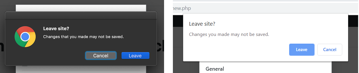
@afercia
As usual, the most important part for accessibility (and I'd say general usability) is the order of the buttons within the group.
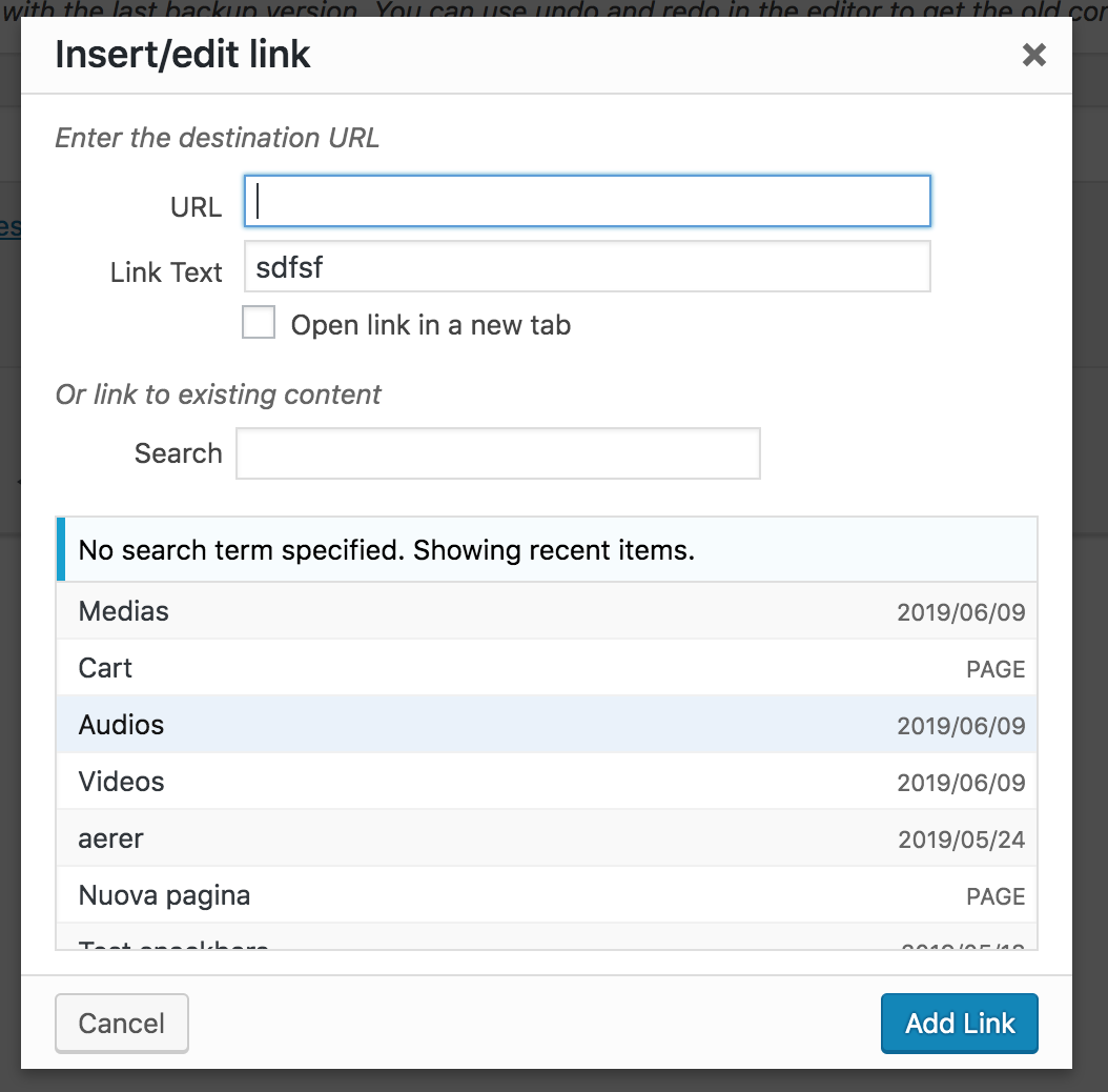
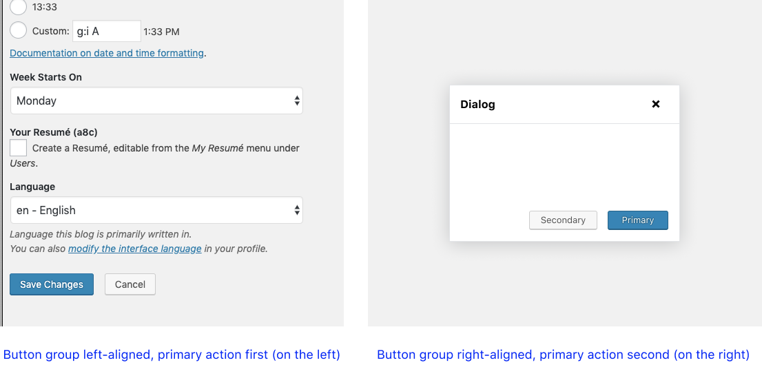
Just to make sure I understand — assuming an LTR language, you are saying that if the primary action is first (on the left) within a button group it should always be the first action (on the left). So, for example, in a dialog, the _group_ could be aligned to the right, but the primary action should still be first (on the left). So this image wouldn't be ideal and it would break usability guidelines?
 davewhitley
on 16 Jul 2019
davewhitley
on 16 Jul 2019
@drw158 correct 🙂Consistency is important. Also, as a user I would expect to find the primary action as first thing in the button group, whether the group is left or right aligned.
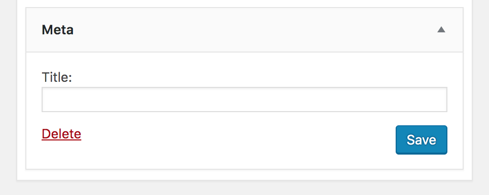
I'd like to point out that _visual_ consistency is important as well. The button group position should always be the same across the whole admin. Traditionally, for example in the settings pages, the "Save Changes" button is left aligned.
Also, if I remember correctly, the "F pattern" tells us the bottom right corner is the least scanned one.
Whatever the new pattern is, it's important to think at users with limited vision field / low vision and place the group in the spot that's easier to find. Thinking at today's desktop displays, a right-aligned group could end up very very far on the right.
afercia
on 17 Jul 2019
Button proximity
I think we can all agree that related buttons should be in close proximity to each other, and there are a lot of quick wins in WP Admin to improve this.
Button group alignment
To create a guideline that says _all_ button groups must align to one location (left or right) is lacking the context of the UI the buttons are in. Button group alignment is less important to keep consistent. Both right and left alignments each have their use cases (e.g. left aligned buttons for a settings form and right aligned butons for a dialog).
Button order
To put this issue into context, an nngroup article on button ordering says that both button order strategies (primary/secondary vs secondary/primary) have good arguments, and it doesn't matter which one we choose. It's not worth the the effort to do extensive research and figure out which one is "right". We could discuss the benefits of each strategy, which I've read good justifications for each. I think we should at least give it some thought and come to an agreement.
_Note: In both strategies, the "default" action (the one highlighted first) is the primary one, regardless of visual order, unless the action is destructive._
Although it's not explicitly stated in the article, I think consistency within the experience is the important part here, and following platform conventions. Unfortunately for web apps, there is no convention. Here are some options.
Option A
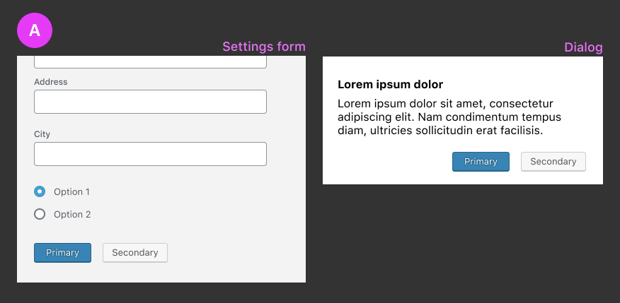
- Primary action is always first (to the left), regardless of button alignment
- Secondary action is to the right of the primary action
The disadvantage here is that it's in conflict with the idea that primary or confirming actions suggest _forward motion_ and secondary or dismissive actions suggest _backward motion_. Sometimes it can be subtle like Ok (forward) and Cancel (backward) or Agree (forward) and Disagree (backward). Sometimes it's more literal like Continue (forward) and Cancel or Next (forward) and Back (backward). If the primary action is the first action, it can look wrong and unnatural:
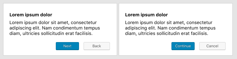
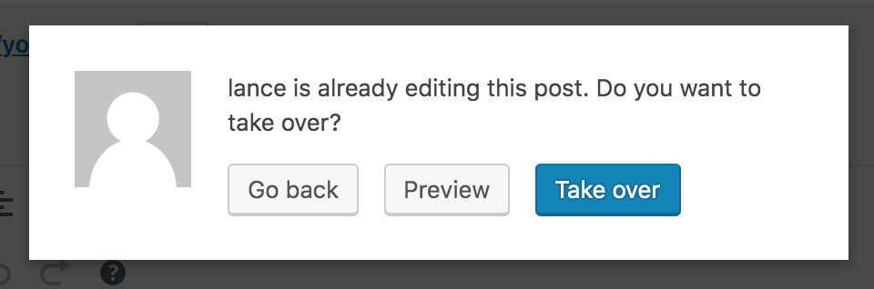
Here's a real example in WP Admin, of where I think Option A falls short:
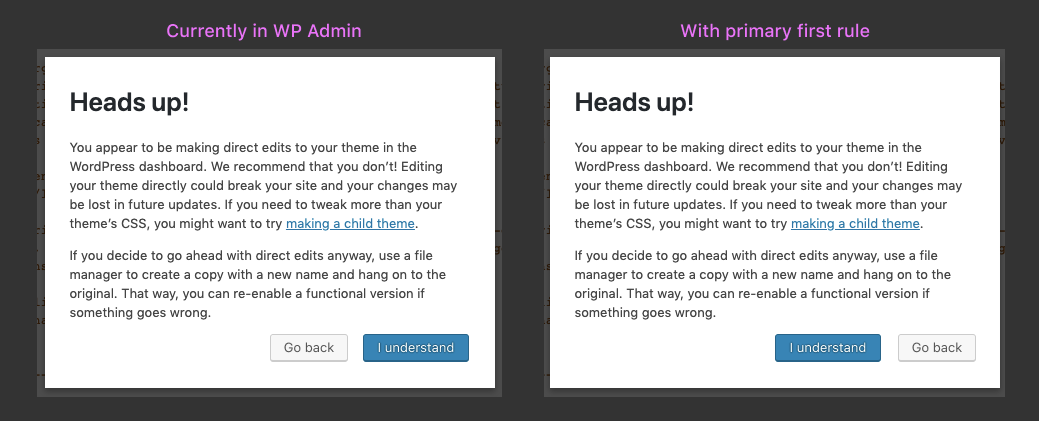
_Note: screenshot slightly edited_
Notice in the second dialog how the "Go Back" button is on the right, when it should be on the left to indicate backward motion.
Option B
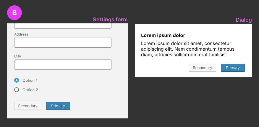
- Primary action is always second (to the right), regardless of button alignment
- Secondary action is to the left of the primary action
The disadvantage here is that it feels "unnatural" for the primary action to be second in a settings form context. It seems like the primary action should be the leftmost one because that's where the eye travels.
Option C
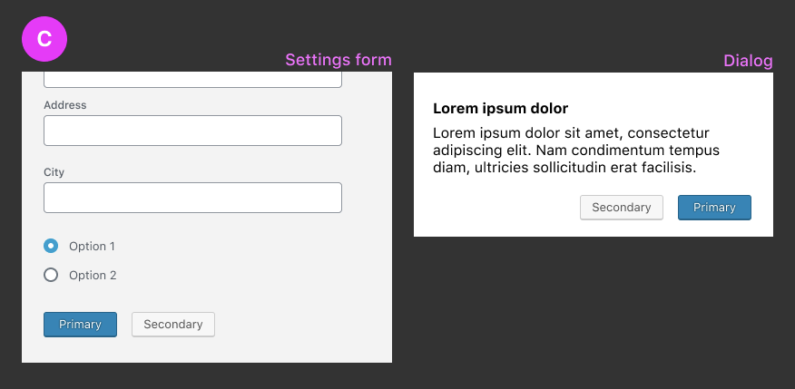
- The visual button order is different, depending on button group alignment.
- If aligned to the right, the primary action is second (to the right)
- If aligned to the left, the primary action is first (to the left)
_Note the _source order_ would be the same regardless of button alignment (primary first, secondary second)_
Although this solves the disadvantages of A and B, I think there might be an a11y issue with inconsistent ordering. Is there still an a11y issue if the source order is the same on both?
Looking forward to your thoughts.
davewhitley
on 17 Jul 2019
Visual order and DOM order must always match. A specific case was also reported in the WPCampus accessibility report, see https://github.com/WordPress/gutenberg/issues/15315 (now ported to a Trac ticket).
In that issue, the underlying problem is explained better than I could ever do:
Keyboard users benefit from a logical focus order which is consistent with the reading order. Users who have a cognitive disability and have difficulty reading may also be confused by an unexpected or illogical focus order.
References:
- WCAG Success Criterion 1.3.2 Meaningful Sequence (Level A) https://www.w3.org/TR/WCAG21/#meaningful-sequence
- WCAG Success Criterion 2.4.3 Focus Order (Level A) https://www.w3.org/TR/WCAG21/#focus-order
afercia
on 18 Jul 2019
In order to comply with that guideline, that means option C is out.
davewhitley
on 18 Jul 2019
It appears, and maybe I'm wrong, that Option C can work as long as the DOM order matches the visual order. This can happen in both examples. We'd need to identify and document when to use which order.
As indicated by the disadvantages of Option A, when comparing which item comes before the other, an order of progression should be evaluated. Just as our browser's "back" and "forward" buttons show arrows pointing to the left/right respectively, and the order of Gutenberg's "undo" and "redo" icons doing the same, we should be mindful of how buttons that indicate forward and backward movement through a flow can take advantage of that mental model and mimic those patterns.
"Go back" or "Previous" language seems to indicate movement to the left while "Next" and "Continue" indicate movement to the right. Now while a browser and our undo icons may not change based on RTL languages, our button order can! I only bring this up for additional consideration. The _Primary First_ disadvantages that @drw158 outlined do cause some awkwardness, at least for me.
mapk
on 24 Jul 2019
I'm not sure I'd agree with 2 different orders depending on the context 🙂
The main goal of this issue is to finally establish _one_, _predictable_, pattern to be used across the whole project. Yes, I'd agree that maybe doesn't matter so much _which_ of the two ones will be the one to use. Instead, it does matter to have just _one_ pattern to be used everywhere.
Found an interesting reference: Jakob Nielsen, 2008 🙂
OK-Cancel or Cancel-OK? The Trouble With Buttons
https://www.nngroup.com/articles/ok-cancel-or-cancel-ok/
afercia
on 29 Jul 2019
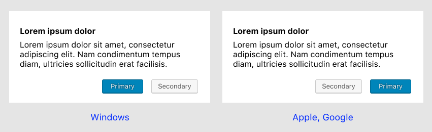
To illustrate that operating systems conventions vary, here's a quick screenshot. On the left: macOS. On the right: Windows 10.
At this point, a couple quick questions come into my mind 🙂
- are there any data about operating systems used by the WordPress admin users?
- as this issue relates to _all_ the buttons and button groups in the admin, should it be moved to Trac for greater visibility?
afercia
on 30 Jul 2019
as this issue relates to all the buttons and button groups in the admin, should it be moved to Trac for greater visibility?
Good point, @afercia.
mapk
on 6 Aug 2019
Can someone add a trac ticket? I can, but I haven't done it before.
davewhitley
on 22 Aug 2019
Moved to public Trac ticket https://core.trac.wordpress.org/ticket/48644
davewhitley
on 14 Nov 2019
Seems like this moved to a core ticket.
 youknowriad
on 5 Mar 2020
youknowriad
on 5 Mar 2020
Related issues
youknowriad
·
3Comments
 BE-Webdesign
·
3Comments
BE-Webdesign
·
3Comments
 wpalchemist
·
3Comments
wpalchemist
·
3Comments
 cr101
·
3Comments
cr101
·
3Comments
 hedgefield
·
3Comments
hedgefield
·
3Comments