Gutenberg: Feature request: create a block list view for easy block discovery
Is your feature request related to a problem? Please describe.
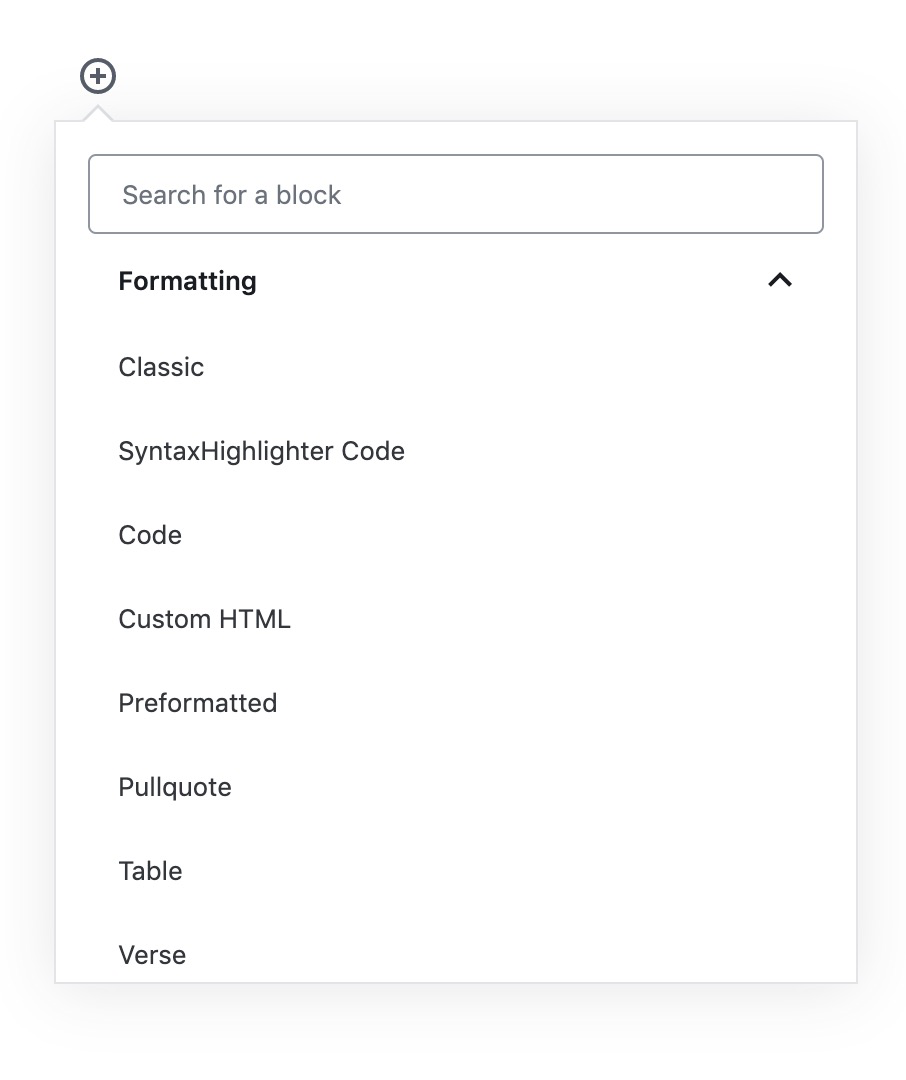
Currently the modal to select a block shows only 9-12 blocks at a time, and for a word-centric person like me it's hard to scan through and discover the block I want unless I know the specific keyword to search.
Describe the solution you'd like
Have a toggle to allow a full list of available blocks, one row per block, perhaps alphabetical. Icons are optional but should be small and to the side of the block name.
All 7 comments
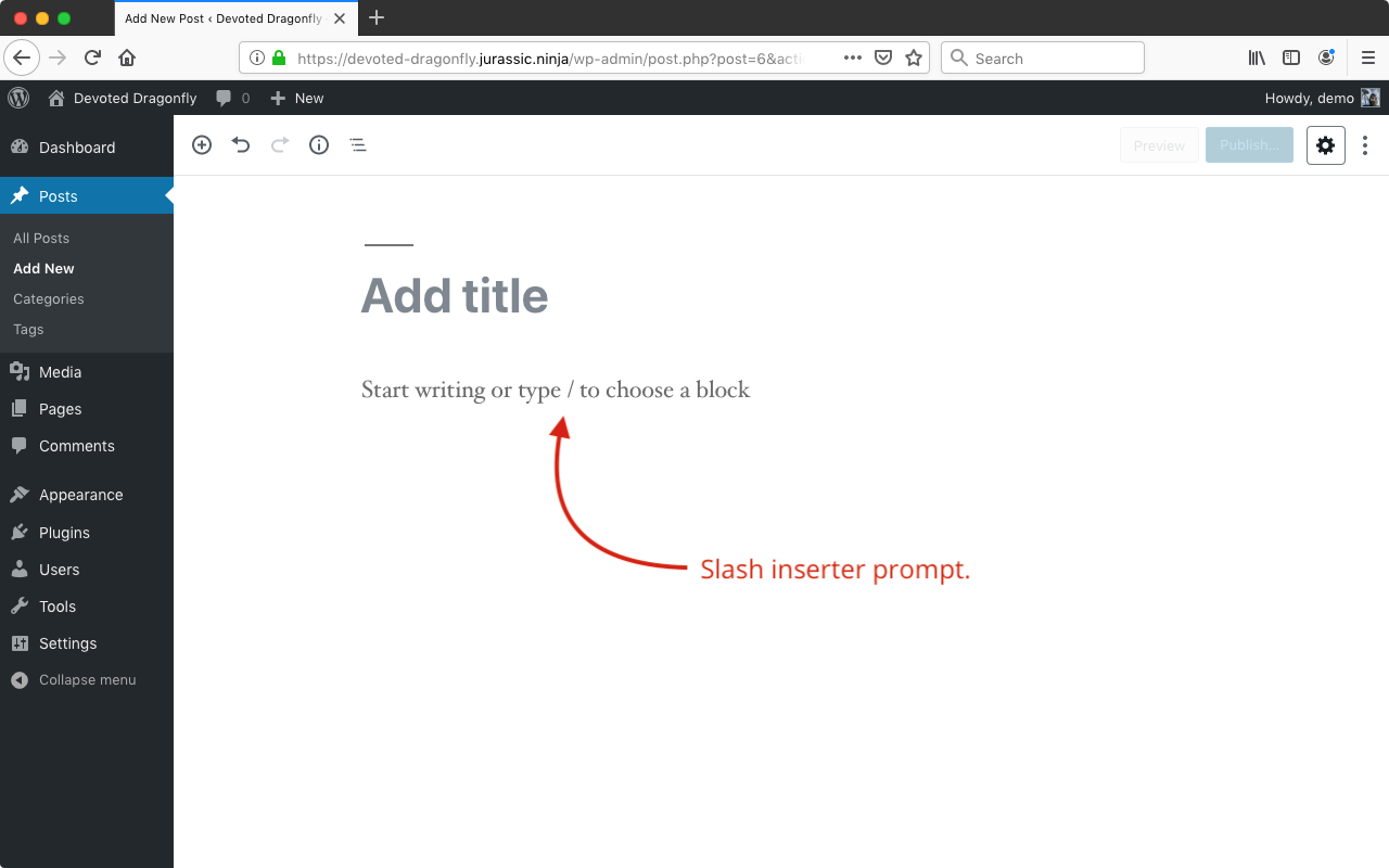
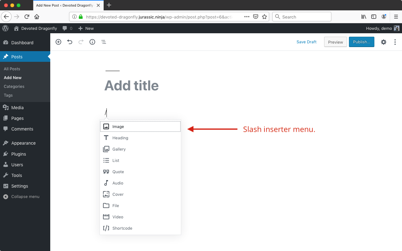
This option is available in the form of a menu that drops down when you place the cursor in a block and then adding a / character. There is a prompt in empty blocks that aren't already assigned a type when they are not active to try to help make it discoverable.

Tested with WordPress 5.2.1 and no active plugins using Chrome 74.0.3729.169 on macOS 10.14.5.

Tested with WordPress 5.2.1 and no active plugins using Chrome 74.0.3729.169 on macOS 10.14.5.
Yes, the slash insertion works fine if you know what keyword you want, but it only gives 10 items.
Currently to browse all existing blocks I have to cilck the +, expand each section, and skim through dozens (or hundreds) of blocks. This is hard to do when there are three columns of blocks. To me, this is mockup is much more usable:

I don't mind icons as they are in the slash inserter menu, but there's so much white space in the current selector that it's painfully distracting and hard to scroll. Try expanding each section and then quickly scrolling through them to see what I mean.
Bonus points for the following settings:
- show list alphabetically
- show full list without being segmented into categories
- remember section expansions
- allow a larger (expandable?) modal
👋 The design team discussed this during a triage session in Slack today (Note: You may need a Slack account to log in.)
A few notes from the chat:
- The block manager and the
/inserter both use a list-view, so there's some precedence there. - The grid puts a lot of emphasis on visual recognition and the icon. This might have been ideal back when there was only a handful of blocks, but is definitely something to reconsider today.
- This feels like something that could be explored in a plugin before bringing it in core. It could be especially beneficial for agencies or setups where folks have lots and lost of blocks. In general, reconfiguring the content in this panel seems like a good exercise, but we wonder how many people would use the options.
Thanks @kjellr! I'll remove the Needs Design Feedback label for now since the design team discussed the issue and responded with some notes.
Next, would you say that moving forward with this feature request should be on hold until we see a lot more feedback here in this thread?
Next, would you say that moving forward with this feature request should be on hold until we see a lot more feedback here in this thread?
Yeah, I think that's fair. Thanks, @designsimply!
I'm placing my vote here for us exploring this more. I would use this feature myself to add/reorganise the lists (even before adding more blocks) but it would be especially useful for people with large block libraries.
I think the new inserter design solves the original issue here since all categories are expanded.