Gutenberg: Move 'Block Navigation' into the Settings sidebar and make into magellan nav
Is your feature request related to a problem? Please describe.
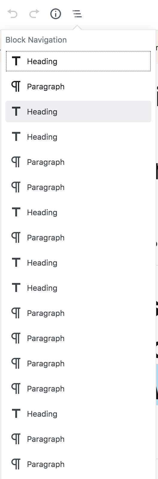
On large content pages, such as the default Privacy Policy page, The popover Block Navigation is unwieldy and doesn't provide a huge benefit when trying to find your place in the list.
Describe the solution you'd like
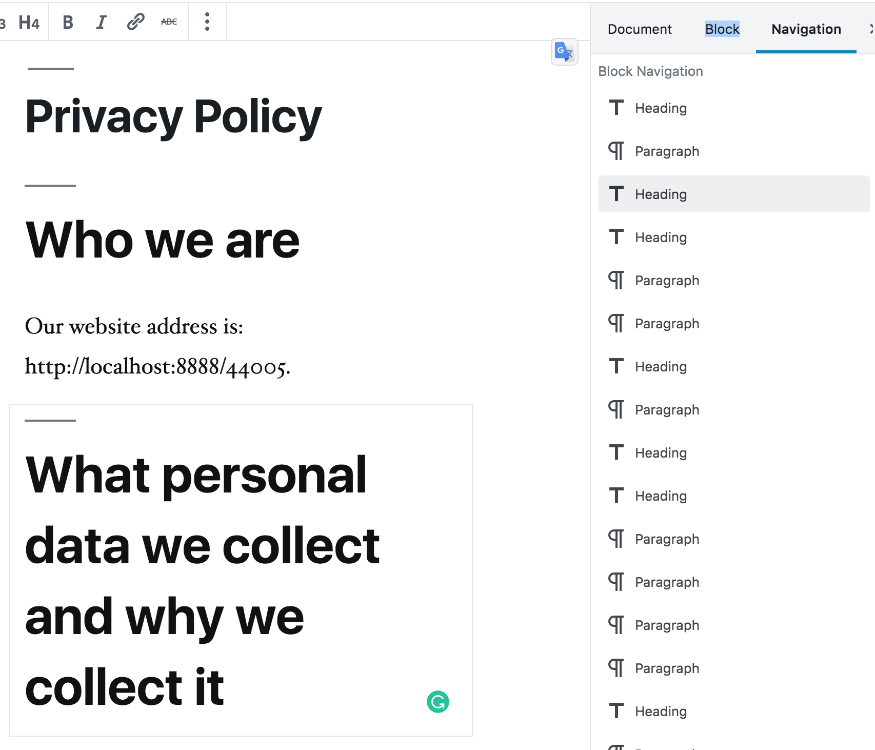
I think it would provide the user with a better grasp on their current place in the document if the Block Navigation was moved into the Settings sidebar along with 'Document' and 'Block' as an additional Navigation tab. This would allow the user to scroll in both views and if the menu is enabled with magellan navigation to highlight the current block within the navigation users will be able to easily find their current position within the blocks. Selecting a block in this sidebar would scroll that block into view providing focus and the ability to edit it quickly. Moving it out of the popover allows the two views to be tied together while both being present visually without interference.
Beyond this it would be another nice improvement to allow drag/drop of blocks in this sidebar navigation to easily reorganize blocks on long pages, currently moving the block itself through a long content page can be difficult.
Describe alternatives you've considered
If an additional tab on the Settings doesn't fit properly the navigation can be it's own side panel triggered by a toolbar button.
 garretthyder
All 7 comments
I see a benefit in moving this functions to the sidebar and highlighting the current block. I also notice a slight redundancy with the heading map under 'i' in the popover. I haven't used tis function, but I feel it could be of more use if it would be in the sidebar as described in the ticket.
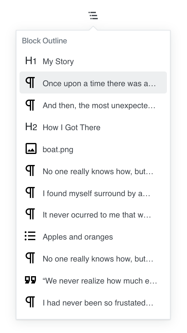
Not sure about the functionality when only showing the block names and not having a description of the content (or at least the first few words, or a preview as shown in the reusable blocks).
 boemedia
on 11 Mar 2019
boemedia
on 11 Mar 2019
Thanks @boemedia I appreciate the feedback.
I see a benefit in moving this functions to the sidebar and highlighting the current block. I also notice a slight redundancy with the heading map under 'i' in the popover. I haven't used tis function, but I feel it could be of more use if it would be in the sidebar as described in the ticket.
Not sure about the functionality when only showing the block names and not having a description of the content (or at least the first few words, or a preview as shown in the reusable blocks).
And I agree with you here, the current implementation only providing the block type in the list I found it hard to know which block you're looking at which is what prompted this ticket. I feel it would clear things up to the user if when the block is selected that the associated entry in the Navigation list is also highlighted, this could help avoid needing to provide description in the Nav list as when you select an item I'm hoping it scrolls the block into view so you have a direct correlation between what block you're working on and where it is in the navigation list.
*I hope that makes sense.
garretthyder
on 11 Mar 2019
I worry "navigation" as a label here might be confused for page/menu navigation — if we go in this direction, we should try out a different label.
 melchoyce
on 29 Mar 2019
melchoyce
on 29 Mar 2019
I worry "navigation" as a label here might be confused for page/menu navigation — if we go in this direction, we should try out a different label.
Agreed, maybe we can do with 'Hierarchy' or 'Block Hierarchy'
garretthyder
on 29 Mar 2019
Agreed that moving it to the document inspector (or its own pinnable sidebar) could help make this feature a bit more useful, especially if the currently-selected block could be highlighted.
However, there are some accessibility concerns with the sidebar at present, so I'd love to get some accessibility feedback on this idea.
I'm also not sure it warrants the prominence of being in the block inspector itself, rather than accessible elsewhere in the UI. It's worth trying a few different solutions here and seeing what feels right. Given that there are a number of proposed changes to this component now, it may warrant considering them holistically and doing some usability testing with proposed changes to see how they impact users.
 sarahmonster
on 15 Apr 2019
sarahmonster
on 15 Apr 2019
I also think that having the block hierarchy in a more visible/accessible place would be great. It reminds me of the outline you see when composing a document on some text editors.
I wonder how this will feel with the current implementation of the sidebar. Meaning that, if it's open, it dynamically shows the selected block's settings. I would want to have the block outline always visible or pinned instead.
I'll also add my support to the idea of making this panel more usable by providing more context for each block:
 enriquesanchez
on 25 Jul 2019
enriquesanchez
on 25 Jul 2019
Today's Design Meeting in slack suggested closing this for now. While the problem is real, we're not sure the sidebar is the right solution. Being that there are a number of issues underway improving the Block Navigator, let's see how that pans out.
 mapk
on 28 Jan 2020
mapk
on 28 Jan 2020
Related issues
 mhenrylucero
·
3Comments
mhenrylucero
·
3Comments
 spocke
·
3Comments
spocke
·
3Comments
 hedgefield
·
3Comments
hedgefield
·
3Comments
 youknowriad
·
3Comments
youknowriad
·
3Comments
 nylen
·
3Comments
nylen
·
3Comments
Most helpful comment
I also think that having the block hierarchy in a more visible/accessible place would be great. It reminds me of the outline you see when composing a document on some text editors.
I wonder how this will feel with the current implementation of the sidebar. Meaning that, if it's open, it dynamically shows the selected block's settings. I would want to have the block outline always visible or pinned instead.
I'll also add my support to the idea of making this panel more usable by providing more context for each block: