Gutenberg: Improve or rethink the Reusable Block Indicator
The Reusable Block Indicator is a small component meant to visually expose the name of a reusable block:
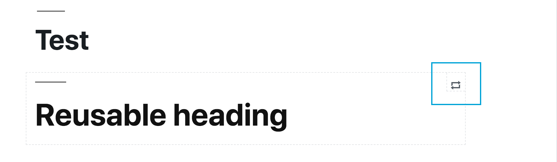
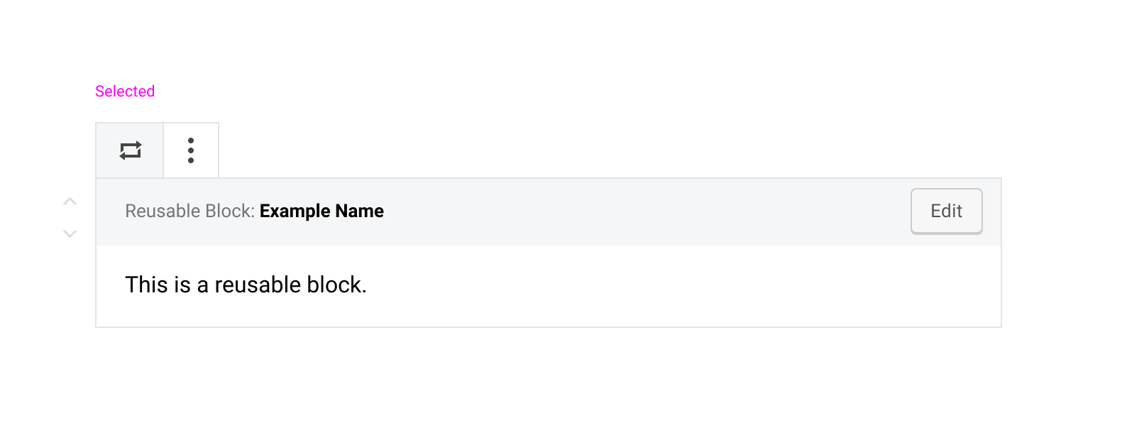
When hovered, it displays a tooltip with the block type ("Reusable block:") and the saved name of the block:
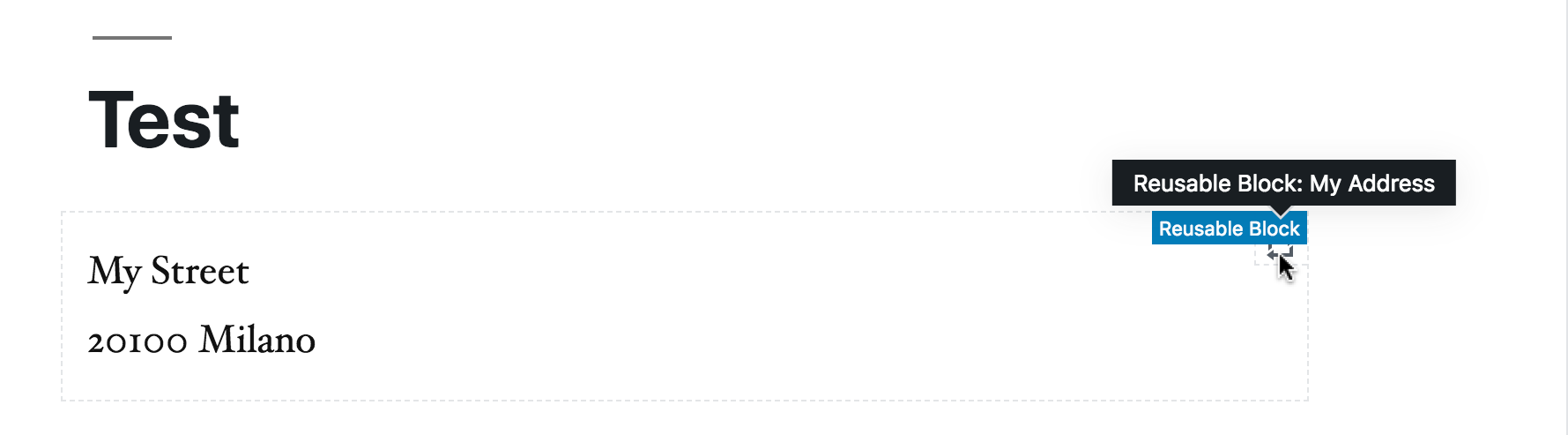
Although the Reusable Block Indicator appears only on hover, the saved name appears also when tabbing into the block, so let's say this is fine for keyboard users:
However, when hovering, the block "breadcrumb" appears too: the combined effect of two things appearing in the same spot doesn't look so nice and maybe could be improved:

Worth also considering making information available only on hover it's pointless on touch devices and mobile. Overall, I'd propose to consider to make this information available elsewhere in the block.
 afercia
All 4 comments
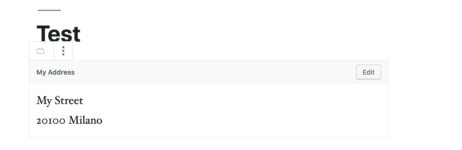
I wonder if we can just remove that indicator icon. These blocks already have a dotted border, which makes them distinct from standard blocks.

Either way, we should just rely on the standard block label on hover, and add the block's custom name into it:
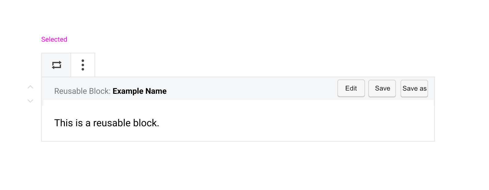
For greater clarity, we could also include a "Reusable Block" label before the name in the selected state:
 kjellr
on 19 Feb 2019
kjellr
on 19 Feb 2019
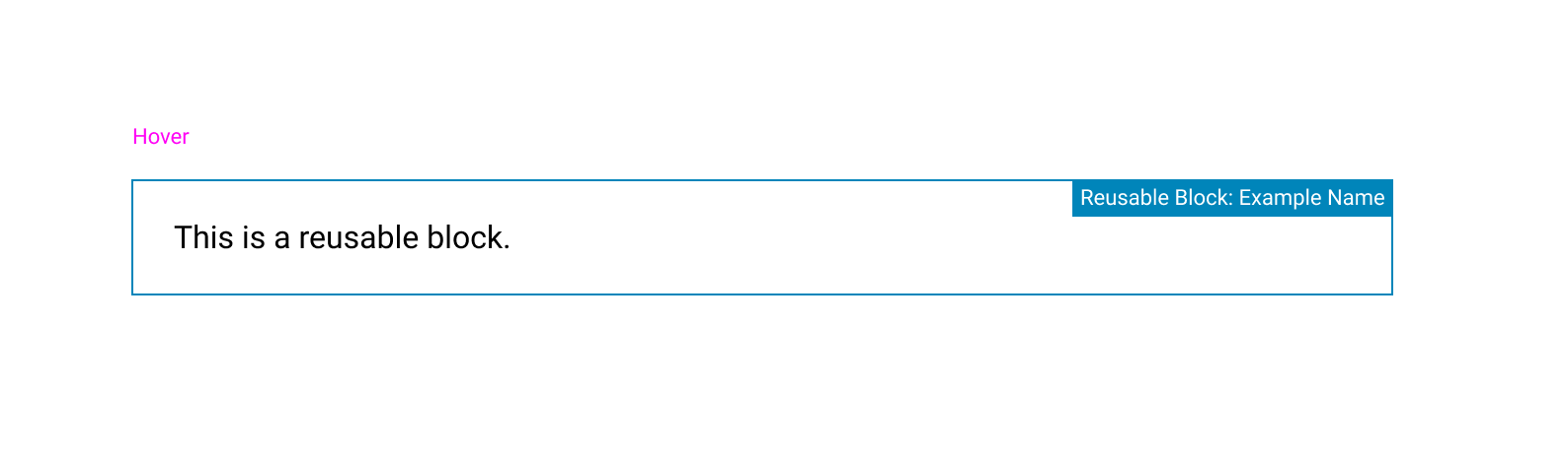
This was talked about in the Design weekly triage meeting today. Let's drop the tip and just show the more detailed label similarly to how columns does it right now.
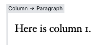
I do like how @kjellr shows a colon : instead of an arrow in the example above because this isn't a nested column, but rather a name given to the reusable block.
 mapk
on 16 Apr 2019
mapk
on 16 Apr 2019
I like the @kjellr idea of adding Resuable Block: Example Name.
EDIT:
Adding additional options.
 paaljoachim
on 27 Mar 2020
paaljoachim
on 27 Mar 2020
This was raised again in today's design triage.
I double checked and it looks like this isn't an issue anymore since the introduction of the new UI. There is no more indicator. For this reason, I'm going to close this issue.
mapk
on 31 Mar 2020
Related issues
 aduth
·
3Comments
aduth
·
3Comments
 JohnPixle
·
3Comments
JohnPixle
·
3Comments
 pfefferle
·
3Comments
pfefferle
·
3Comments
 jasmussen
·
3Comments
jasmussen
·
3Comments
 BE-Webdesign
·
3Comments
BE-Webdesign
·
3Comments