Gutenberg: Fix capitalization and refine design of "Move to Trash" button
Is your feature request related to a problem? Please describe.
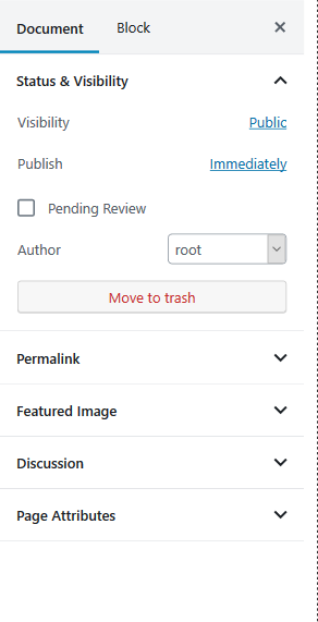
In fairly aggressive testing over the last month, I have frequently felt two seemingly contrary things about the "Move to Trash" button:
- It's too prominent/large
- It's much larger than the Publish button!
- I bet on touch devices, you would find people accidentally pressing it when trying to set the Author or expand/contract the "Permalink" panel.
- It's not "warning-y" enough
Relatedly, there button capitalization differs from 4.9.8 and should be updated accordingly to "Move to Trash" (capital T).
Describe the solution you'd like
I really wish we had data to know how frequently people delete posts, but I imagine that even if it's somewhat frequent, it should more obvious that it's a serious action to take. This is even more important because there is no warning message after a user presses Move to Trash and my experience suggests many people don't know how to go to the trash and restore a post.
Describe alternatives you've considered
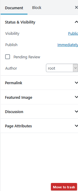
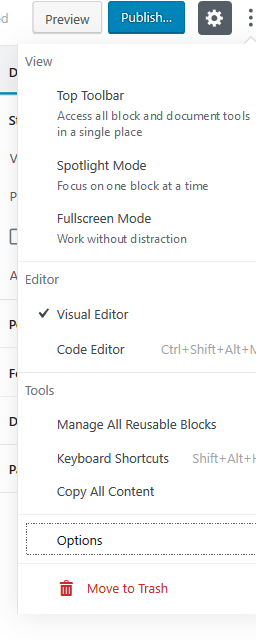
I think there are two potential places to move it, and when doing so, I'd be in favor of making it both less prominent and more serious looking:
 mrwweb
All 5 comments
Summarizing the requests for reference:
- Capitalize "T" in "Move to trash".
- Make the "Move to Trash" button smaller.
- Move the "Move to Trash" button to make it harder to tap accidentally.
Related:
- #1679 - suggests moving the trash button as well.
- #2209 - discusses an "Are you sure?" prompt for trashing content.
- #1212 - some updates were made to the alignment and color of the trash link.
Personal feedback: I really like the idea of moving it, but it will definitely be an adjustment and make it a bit hard for people to transition to finding the new location after becoming accustomed to the previous location. My own preference would be to keep it in the Document Settings sidebar and not in the More menu because all of the other publishing actions are in Document Settings and it logically makes sense to me that it would be there.
I bet on touch devices, you would find people accidentally pressing it when trying to set the Author or expand/contract the "Permalink" panel.
I haven't experienced this myself, however, in my own workflow I tend to close the panels I am not working with, and I think it would be worth exploring to get more feedback.
 designsimply
on 27 Nov 2018
designsimply
on 27 Nov 2018
it will definitely be an adjustment and make it a bit hard for people to transition to finding the new location after becoming accustomed to the previous location
Agreed. I get the sense that the 5.0-ship has sailed but if it's not too late, I'd be in favor of moving it immediately.
My own preference would be to keep it in the Document Settings sidebar
Mine too. Wanted to include options :)
I bet on touch devices, you would find people accidentally pressing it when trying to set the Author or expand/contract the "Permalink" panel.
To get a better sense of this, I set up some outlines showing a touch area of at least 40px in both dimenions:
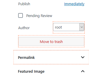
There's no overlap, but it's awfully tight. And just to reiterate, I think especially if there is no confirmation modal, it becomes drastically more important to guard against mistaken clicks with design.
mrwweb
on 27 Nov 2018
Correct, the current focus for 5.0 is fixing any major bugs we can find and looking for blockers. I like to say this is a time for convergent thinking, a design construct, which means as a group we should be aligning to work on getting the current release as bug-free as possible without getting too far into the details for enhancements or debating major changes. It's sooo tempting to keep doing enhancements and feature requests though!!
Adding the Needs Design Feedback label to ask if any of the three requests from above would be okay to add the Good First Issue label to? (My recommendation would be: 1/ yes, 2/ no, 3/ yes—bottom right of document settings panel.)
- Capitalize "T" in "Move to trash".
- Make the "Move to Trash" button smaller.
- Move the "Move to Trash" button to make it harder to tap accidentally.
designsimply
on 27 Nov 2018
I agree capitalizing the 'T' fits existing patterns, although I don't agree it's as usable as not having capitalisation for everyone. I don't agree without further investigation the button should be made smaller or moved. Let's flag this for a later version and not mark as a good first bug now. It would be great to get other design input on this after 5.0.
 karmatosed
on 28 Nov 2018
karmatosed
on 28 Nov 2018
I opened a PR (#14591 ) to fix the "T" on the button. Good catch, @mrwweb!
As for moving the button to the Option panel, I don't think it works there b/c the Options are more about the Gutenberg experience as a whole. It's better to keep the button in the Document Inspector as agreed above.
While it currently doesn't look scary right now, or important, I'm okay leaving it as is. Anything redder might be overwhelming on the page.
 mapk
on 23 Mar 2019
mapk
on 23 Mar 2019
Related issues
 ahmadawais
·
271Comments
ahmadawais
·
271Comments
 melchoyce
·
169Comments
melchoyce
·
169Comments
 jasmussen
·
173Comments
jasmussen
·
173Comments
 azaozz
·
91Comments
azaozz
·
91Comments
 DeveloperWil
·
102Comments
DeveloperWil
·
102Comments