Gutenberg: Searching checklists can be problematic
The current design pattern for searching a checklist is problematic because it's possible for checked items to be hidden from view. This can lead to posts being unintentionally published into undesired categories, among other quirks. See example;
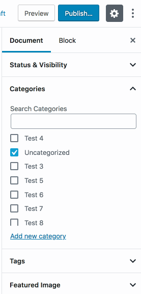
We're using this current search pattern in the WooCommerce blocks we're working on where the issue is arguably more prominent. This feels like something that should be addressed in core rather than in custom blocks.
Possible solutions
I haven't looked into solutions in any great depth just yet but the crux is that - ideally - checked items should always be visible, even when searching.
One option would be to employ a Chrome-inspired ⌘+F pattern which highlights results and allows you to cycle through them.
Another option would be to simply list the current checked items beneath the search results.
I'm posting this now to gather input before we dive further into the problem.
 jameskoster
All 6 comments
Here's a prototype of the solution we're running with for WooCommerce.
It's similar to the core FormTokenField component except that the list of suggestions is permanently visible and selected items are separate displayed outside the input.
Our reasoning for keeping selected items separate is twofold;
- We anticipate that folks could select many, long-named items (products) which could make the input unwieldy, especially in the sidebar settings panel where space is limited
- It provides an affordance to easily remove all selected items with a single click
For the category selector in core, I wonder if something between these solutions might work best. In that use case it seems less likely that _lots_ of selections would be made which decreases 1. the value of the "Clear all" button and 2. The concern about the input becoming visually saturated with tokens.
An instance of FormTokenField with the suggestions permanently visible might be the simplest solution for that use case.
jameskoster
on 29 Nov 2018
@jameskoster as phase two progresses, this is good to take another look at. I wonder did you in your work on this research any patterns from apps or sites that solve this differently?
 karmatosed
on 2 Apr 2019
karmatosed
on 2 Apr 2019
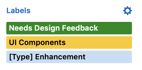
One thing that came to mind here is how GitHub itself does it, for instance, with labels. If you look at the sidebar here, it only shows the labels that are already checked:
Changing the labels happens in a popup, which contains the search:
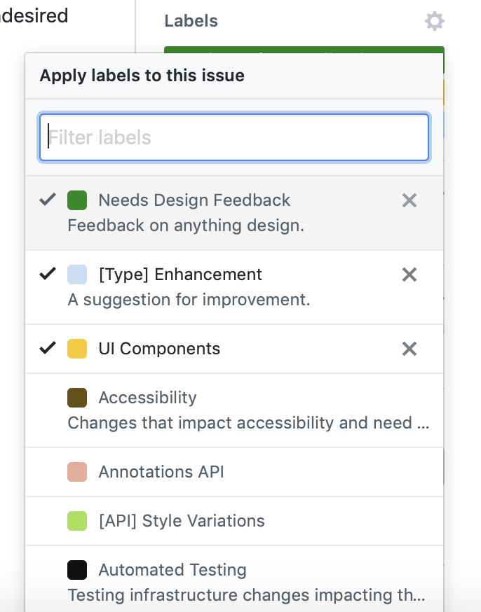
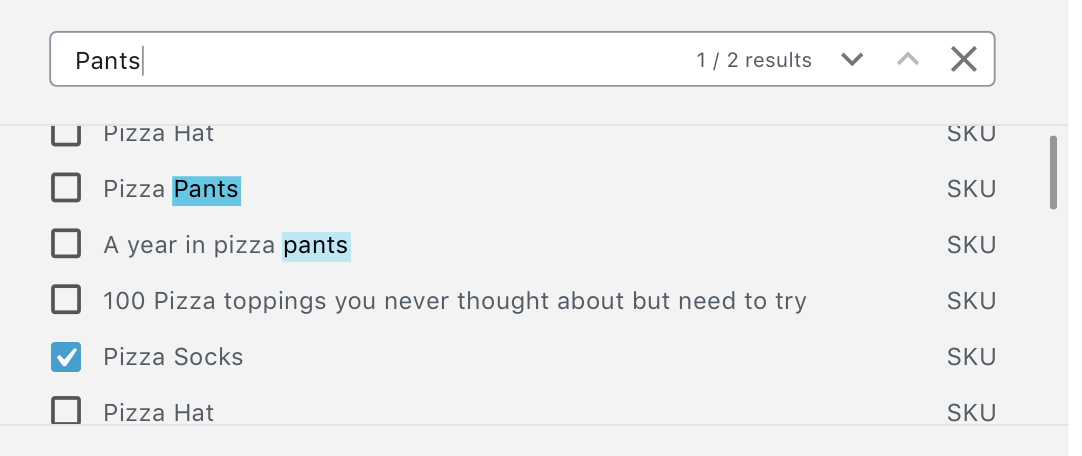
Searching there has the same behavior and it hides already checked labels that don't match the search:
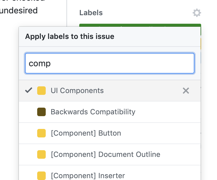
However, it's less problematic because the moment you are done picking labels, the popup is dismissed and you can see the final selection. This is kind of similar to the WooCommerce prototype, since the current selection there is displayed separately from the search/list.
 koke
on 3 Apr 2019
koke
on 3 Apr 2019
I really like the GitHub solution. Here's how it may look in Gutenberg.
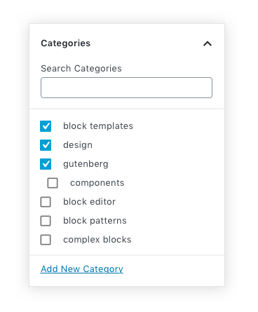
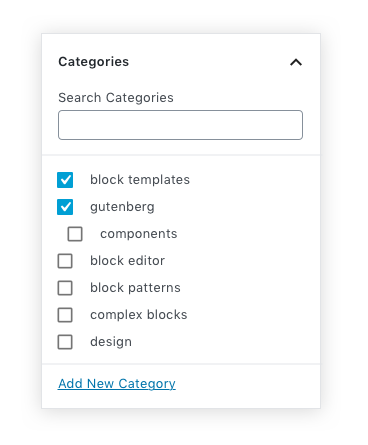
Categories
- Selected categories automatically appear at the top of the list.
- All other categories are displayed alphabetically below the selected ones.
Category deselect
- When a category is deselected, it drops down to its alphabetical position in list. (see "design")
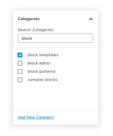
Category Search
- All selected categories that match the keyword are displayed at the top. (searched for keyword: "block")
- All unselected categories that match the keyword are displayed after alphabetically.
 mapk
on 19 Jul 2019
mapk
on 19 Jul 2019
Design team update: Looks like a solid solution, let’s go with it!
Micro-improvement suggestions:
a) Maybe reduce the distance between a checkbox and the word by a tiny bit.
b) Maybe explore more ways for the appearance of nested checkbox lists.
 thanasakleas
on 21 Jan 2020
thanasakleas
on 21 Jan 2020
Regarding nested checkbox lists (not sure if I got the meaning right). Here is an issue I made some time back: https://github.com/WordPress/gutenberg/issues/15103
 paaljoachim
on 2 Mar 2020
paaljoachim
on 2 Mar 2020
Related issues
 jasmussen
·
3Comments
jasmussen
·
3Comments
 JohnPixle
·
3Comments
JohnPixle
·
3Comments
 youknowriad
·
3Comments
youknowriad
·
3Comments
 spocke
·
3Comments
spocke
·
3Comments
 davidsword
·
3Comments
davidsword
·
3Comments
Most helpful comment
I really like the GitHub solution. Here's how it may look in Gutenberg.
Categories
Category deselect
Category Search