Gutenberg: ToggleControl visually broken when wrapped in `Disabled` component
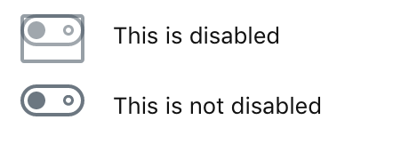
ToggleControl is visually broken by having a thick rectangular border around it when wrapped in Disabled component.
To Reproduce
Use Gutenberg 4.4.0 or current
master.Create a block:
import { registerBlockType } from '@wordpress/blocks';
import { Disabled, ToggleControl } from '@wordpress/components';
import { Fragment } from '@wordpress/element';
import { InspectorControls } from '@wordpress/editor';

const toggles = (
  <Fragment>
    <Disabled>
      <ToggleControl label="This is disabled" />
    </Disabled>
    <ToggleControl label="This is not disabled" />
  </Fragment>
);

registerBlockType( 'demo/toggle-control', {
  title: 'Toggle Control demo',
  category: 'layout',
  edit: () => (
    <Fragment>
      <InspectorControls>{ toggles }</InspectorControls>
      { toggles }
    </Fragment>
  ),
  save: () => null,
} );
Insert block in the editor
Observe how disabled toggle has funky borders around it in both sidebar inspector as well at the block content area.
Expected behavior
✔︎ No funkiness.
Desktop:
- OS: MacOS
- Browser Firefox
- Version 63
[Feature] UI Components
 simison
All 3 comments
This is not great, @jasmussen can you take a look when you have a minute? I'm hoping this will be some straight forward CSS <3
 catehstn
on 19 Nov 2018
catehstn
on 19 Nov 2018
Sure I'll take a look.
 jasmussen
on 19 Nov 2018
jasmussen
on 19 Nov 2018
❤2
Submitted #12091 to fix this.
jasmussen
on 20 Nov 2018
❤1
Was this page helpful?
0 / 5 - 0 ratings
Related issues
 davidAIS
·
129Comments
davidAIS
·
129Comments
 melchoyce
·
95Comments
melchoyce
·
95Comments
 mapk
·
80Comments
jasmussen
·
173Comments
mapk
·
80Comments
jasmussen
·
173Comments
 maddisondesigns
·
79Comments
maddisondesigns
·
79Comments
Most helpful comment
Sure I'll take a look.