Gutenberg: Make the "change an image" flow clearer
10up ran some great testing sessions where one particular hurdle was highlighted — users don't immediately pick up on the "pencil" icon as the way to edit or swap the image. More info at https://10up.com/blog/2018/testing-the-gutenberg-publishing-userflow/
This has come up anecdotally before as well.

One possibility is to use a text button instead:

Another could be to place the edit button within the image (on selection).
It'd also be nice to support "drag to swap" on the image block. This has also come up before.
 mtias
mtias
All 34 comments
Dunno if text is the best solution - "Edit" seems as ambiguous as the pencil.
Perhaps a custom icon is called for, like a picture with a pencil beside it?
 drawcard
on 16 Nov 2018
drawcard
on 16 Nov 2018
Another could be to place the edit button within the image (on selection).
I'd be a little worried about having icon overload at that point.
Writing out "edit" is a nice improvement, but feels more like a bandaid. I think this is something we'll likely have to iterate on a couple times before we find something that feels right.
One note — I actually find this pattern much more jarring on other blocks, where it removes the media/embed and brings you back to the placeholder. I always expect it to open the media uploader instead of the placeholder. Whatever we do here, let's figure out a consistent approach for all blocks.
It'd also be nice to support "drag to swap" on the image block. This has also come up before.
We might want to ask folks what they'd expect to happen if you dragged an image onto an image block. My gut reaction is "it would transform into a gallery," but that could just be me.
 melchoyce
on 27 Nov 2018
melchoyce
on 27 Nov 2018
Another interaction it could support is double-click to edit / replace on the image.
mtias
on 27 Nov 2018
@mtias I am not too sure about that idea as it would be hiding functionality to the point where it's completely invisible. But it could work in conjunction with the standard button that exists at the moment.
drawcard
on 28 Nov 2018
Yes, it wouldn't be the main interaction, just a possible addition to it.
mtias
on 28 Nov 2018
If that's the case I'm all for that :)
drawcard
on 29 Nov 2018
I'm working on a PR to test the double click as an option :)
 draganescu
on 26 Feb 2019
draganescu
on 26 Feb 2019
My PR made it to master, so now @mtias the image block has both a better icon to edit, a clearer flow and double click as a means to switch modes. I am continuing to add the same flow to all other similar blocks here: #14788
draganescu
on 3 Apr 2019
Closing this since it moved ahead with the #14142 merged PR and now the focus is on #14795
draganescu
on 10 Apr 2019
Reopening because I think this is still problematic and not as clear as it could be. (Icon is still confusing.)
mtias
on 24 Jul 2019
@mtias do you have anything else in mind other than the icon? I ask because I am working here #16200 to make a component that will port this to all the media components, and it would be great to make it better while it is not ready yet :)
draganescu
on 25 Jul 2019
Yes, I still think text based control for this would be much clearer. Interestingly, Google Docs is doing a similar thing:

With direct actions:

mtias
on 26 Jul 2019
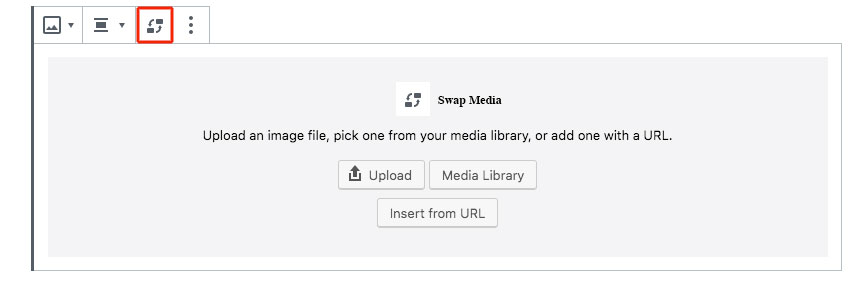
We can try something like this:

The "edit image" flow should probably be separate, specially once we surface some edit options directly (crop, flip, rotate, etc).
mtias
on 27 Jul 2019
This looks great @mtias. Thanks for your mockup. Let's roll with it, @draganescu. This will essentially remove the need to return to the block placeholder screen, correct?
 mapk
on 29 Jul 2019
mapk
on 29 Jul 2019
This will essentially remove the need to return to the block placeholder screen, correct?
Yes, exactly, which was a pain to make work well in smaller containers.
mtias
on 29 Jul 2019
Ok. then I'll focus this new component to use this menu and flow instead here: #16200
draganescu
on 30 Jul 2019
I am not sure why this issue is active as the image icon has changed. Clicking the icon brings up a dialog box.
The most resent image block in 6.2 RC looks like this:

It is a new icon that shows a kind of swap image with another. I know Kjell @kjellr worked on the icon in another issue some time ago.
Clicking the edit image icon brings up this dialog box:

To me the swap image icon seems pretty clear.
 paaljoachim
on 30 Jul 2019
paaljoachim
on 30 Jul 2019
To me the swap image icon seems pretty clear.
I've seen _many_ users miss this icon (in both the old and new iterations), so I'm definitely up for trying this new, clearer proposal. I also like how this would avoid the need for opening up the placeholder again. Once you have an image assigned, that interface is no longer technically a placeholder. Representing it that way has always seemed a little confusing.
If the new flow ends up working out, I wonder if we should consider eliminating that "Go back to the placeholder to edit" flow for embeds too:

 kjellr
on 30 Jul 2019
kjellr
on 30 Jul 2019
I'm trying to think through the URL portion of this new UI. If I select "Insert from URL", what happens? Does the user get taken to the Media Library Modal? Should the URL input appear similar to how it displays for an Image block?

Or could it work inline like this prototype below?
mapk
on 31 Jul 2019
Brain storming. Using the image block as an example.
The need to create an association between the existing swap image icon and the initial placeholder screen.
As seen today:

Adding the swap image icon. Just by adding the icon there to illustrate the association between the image placeholder screen and the swap icon.

Here is one where the swap image icon is also highlighted in the toolbar while the placeholder screen is open.

Third version. Replacing the placeholder image icon with the image swap icon. Creating an association that the swap icon has to do with the placeholder screen. It now becomes the swap media screen.
Double clicking the image or another interaction with the image the placeholder/swap media screen could show up.
paaljoachim
on 31 Jul 2019
Part of the confusion is related to the block icon in the toolbar, which also transitions to a "swap"-style icon when hovered. Lots of people think this means they can swap the image. The current swap icon to the right of that is barely recognized by anyone.
I think a text label is by far the best solution here. Worth noting that I've seen a handful of people expect to be able to double click as well, so I think that'd be a great enhancement here.
 shaunandrews
on 31 Jul 2019
shaunandrews
on 31 Jul 2019
Part of the confusion is related to the block icon in the toolbar, which also transitions to a "swap"-style icon when hovered. Lots of people think this means they can swap the image. The current swap icon to the right of that is barely recognized by anyone.
That's a great point. When I designed the swap image icon, I definitely didn't realize that. 😄

kjellr
on 31 Jul 2019
My biggest concern around this is adding another link interface. For example Google does:

@mapk what was the thinking in adding the link inline? Could we reuse the existing way links are added?
 karmatosed
on 7 Aug 2019
karmatosed
on 7 Aug 2019
@mapk what was the thinking in adding the link inline? Could we reuse the existing way links are added?
Good question, @karmatosed! So I thought about using the existing link interface, but then we'd have a popover on top of a popover which doesn't feel right. That's why I chose to put it inline. I'm not sold on my solution though.
Don't Do This

I'm totaly open to a separate Dialog to inject a URL, but this also seems like a new interface option. Are we using a link interface that isn't a popover anywhere?
mapk
on 7 Aug 2019
Are we using a link interface that isn't a popover anywhere?
Yeah, the Button block has one inline:

This isn't really standard though, and other options are being explored in https://github.com/WordPress/gutenberg/issues/16495.
kjellr
on 7 Aug 2019
Using the Button block as an example, and merging it with my prior mockup, I came up with this.
mapk
on 13 Aug 2019
The exploration fits for button block, however, some conversation was being had around unifying button block. Ultimately, I think looking holistically at link interactions is important. I am not sure it's important enough to hold up or block this issue. If that's case, then maybe we can open another ticket after to resolve this?
karmatosed
on 13 Aug 2019
@senadir, I'd like to get some accessibility feedback here before committing to one solution. Ultimately, a PR can get started to work through some of the other pieces. I think the last option here is the strongest right now.
cc @afercia @enriquesanchez @ryelle
mapk
on 15 Aug 2019
I'm in favor of a text label instead of an icon, it's more obvious and accessible overall. As for the dropdown, we just need to make sure it's accessible (see #16473). I'd be more than happy to test once we have a PR.
 enriquesanchez
on 15 Aug 2019
enriquesanchez
on 15 Aug 2019
We have this PR I am working on here #16200 which will make possible to add this to any media component, not only image.
Right now you can test using that or and inserting an audio block. It implemented the text button, the menu, media lib and file upload.
Coming soon is the URL input.
draganescu
on 16 Aug 2019
Re: "Insert from URL":
- say I have this image URL:
https://cldup.com/cXyG__fTLN.jpg - shouldn't it work as embeds work? Just paste that in the editor and I should get an image block with the image already inserted
- instead, I get an "Embed" block
- the block tells me that kind of content can't be embedded (then, I'd argue it shouldn't try to embed an image in the first place):

- of course, for accessibility there should be some kind of UI but it could be very simplified
- also, when _replacing_ an existing image with a new one from a URL there should be some kind of UI (maybe also allow paste a URL over an existing image?)
 afercia
on 23 Aug 2019
afercia
on 23 Aug 2019
Apart from the considerations above, the prototype from https://github.com/WordPress/gutenberg/issues/11952#issuecomment-520667525 looks promising to me from an a11y perspective. As long as it uses the dropdown menu, which already has good accessibility. The visible button text is an improvement for all users.
Question:
Will the following menu items open the media modal dialog?
- Media Library
- Upload Image
- Edit Image
Also: worth reminding there's an open issue from the WPCampus report about _visible_ labelling only done via the placeholder attribute. To address this point, the URL field needs a visible <label> element. See https://core.trac.wordpress.org/ticket/47138
See also https://core.trac.wordpress.org/ticket/40331
afercia
on 23 Aug 2019
What about just a media text button?


From the initial suggestion in this issue it seems like the placeholder screen will be replaced by the toolbar replace image drop down. I do find it interesting as it could also incorporate the image link icon with a open image in new tab or no follow etc. Creating a element that can be used for all blocks that deal in someway with images. For audio/video etc the element could be somewhat adjusted.
With a Media label.

Media label - in a video embed.

Media label - in a audio embed.

Including the V in the Enter URL area. To open up to linking to open a new tab.

paaljoachim
on 23 Aug 2019
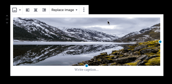
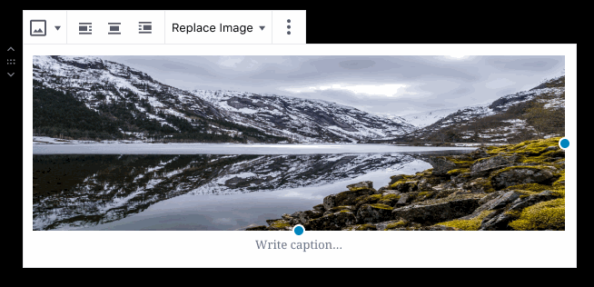
Coming here to +1 adding text labels. On WordPress.com we are regularly seeing users struggle to figure out how to replace images that already exist in a template. Looking through this thread, the clearest way to improve this IMO is to use labels like "Replace Image".
 apeatling
on 10 Oct 2019
apeatling
on 10 Oct 2019
Related issues
 franz-josef-kaiser
·
3Comments
franz-josef-kaiser
·
3Comments
 maddisondesigns
·
3Comments
maddisondesigns
·
3Comments
 aaronjorbin
·
3Comments
aaronjorbin
·
3Comments
 jasmussen
·
3Comments
jasmussen
·
3Comments
 aduth
·
3Comments
aduth
·
3Comments
Most helpful comment
We can try something like this:
The "edit image" flow should probably be separate, specially once we surface some edit options directly (crop, flip, rotate, etc).