Gutenberg: Add a headings hierarchy checker notice in the heading block sidebar
Previously, the headings hierarchy was placed also in the _Document_ sidebar, in the "Table of Contents" panel:
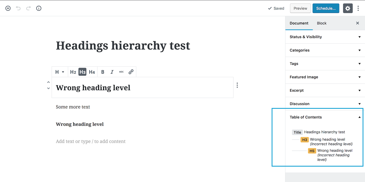
This panel has been removed so the only way to be aware of the incorrect headings level is to intentionally check the document outline tool in the top bar.
I'd like to propose to add a notice, even a small one, directly in the Heading block sidebar so users will be immediately informed the hierarchy is not correct _while_ they set the heading level. An option might be placing the notice under the buttons in the sidebar:

 afercia
All 10 comments
This is a great idea.
 mtias
on 23 Oct 2018
mtias
on 23 Oct 2018
Maybe something like this?

 melchoyce
on 16 Nov 2018
melchoyce
on 16 Nov 2018
👍 A simple notice would be great and also consistent with the core patterns. Re: the wording, not sure if the message should actually suggest a fix telling "Please use..." but I have no strong opinions. For reference, see below the wording used in the "Content structure" popover:

afercia
on 18 Nov 2018
Thinking about this, one thing I've found quite common is to have the ability to visually style one heading as though it were another heading level.
For example, say for some reason we need the 2nd level heading on the page to look like the h1. Currently, the only way to do this is by using the h1 heading level/tag. However, I should be able to select h2 and say "style this like a h1" and it should apply the h1 style but leave the tag as a h2.
I know this sounds a bit odd, but in my experience, it's common that designs have headings that don't always visually follow the ideal hierarchical structure. This might help us avoid incorrect heading hierarchies.
The issue I raised about this has been superseded.
 getdave
on 25 Feb 2019
getdave
on 25 Feb 2019
👍 A simple notice would be great and also consistent with the core patterns. Re: the wording, not sure if the message should actually suggest a fix telling "Please use..." but I have no strong opinions. For reference, see below the wording used in the "Content structure" popover:
We should align with the Color Settings panel and the notice that is shown when contrast verification fails:

When testing Color Settings I noticed that it is never announced for folks using VoiceOver so they might not be aware that there is an issue:

Should we change it as well?
 gziolo
on 20 Mar 2019
gziolo
on 20 Mar 2019
Yes! Ideally should work like all the other notices: when they appear, they should also be announced with speak().
afercia
on 20 Mar 2019
I really like @melchoyce's suggestion above. Let's get this developed @youknowriad.
 mapk
on 22 Mar 2019
mapk
on 22 Mar 2019
I like the suggestion from @melchoyce. The wording should probably be adjusted - in the example context, either an h2 or an h3 would be valid. I think that there are two paths we can take with the error message: either make it more generic, or more specific.
With any given heading, it can always be followed by a heading that's of the same or any higher level (excepting h1, as that should only be used once on any page) or by the heading immediate lower.
"higher" and "lower" levels of headings is ambiguous, however, which makes referencing these generically somewhat difficult.
Making it specific will on rare occasion mean listing a large number of heading levels - but only in relatively rare cases, where somebody is actually using h4. (There are no invalid heading levels that can follow an h5 or an h6)
 joedolson
on 22 Mar 2019
joedolson
on 22 Mar 2019
@AmartyaU started working on it, the first PR opened for the missing voice announcement: #14649.
gziolo
on 27 Mar 2019
I am removing the 'User Experience (UX)' label as part of a label cleanup. It's not being used anymore consistently so let's try and keep to 'needs design' and 'needs design feedback'. If we find a need for another label we can consider it but having those 2 should cover this.
 karmatosed
on 7 May 2019
karmatosed
on 7 May 2019
Related issues
 davidsword
·
3Comments
davidsword
·
3Comments
 nylen
·
3Comments
nylen
·
3Comments
 moorscode
·
3Comments
moorscode
·
3Comments
 aduth
·
3Comments
aduth
·
3Comments
 jasmussen
·
3Comments
jasmussen
·
3Comments
Most helpful comment
👍 A simple notice would be great and also consistent with the core patterns. Re: the wording, not sure if the message should actually suggest a fix telling "Please use..." but I have no strong opinions. For reference, see below the wording used in the "Content structure" popover: