Gutenberg: Color contrast issues with TinyMCE Inline Boundaries and light grey text
Describe the bug
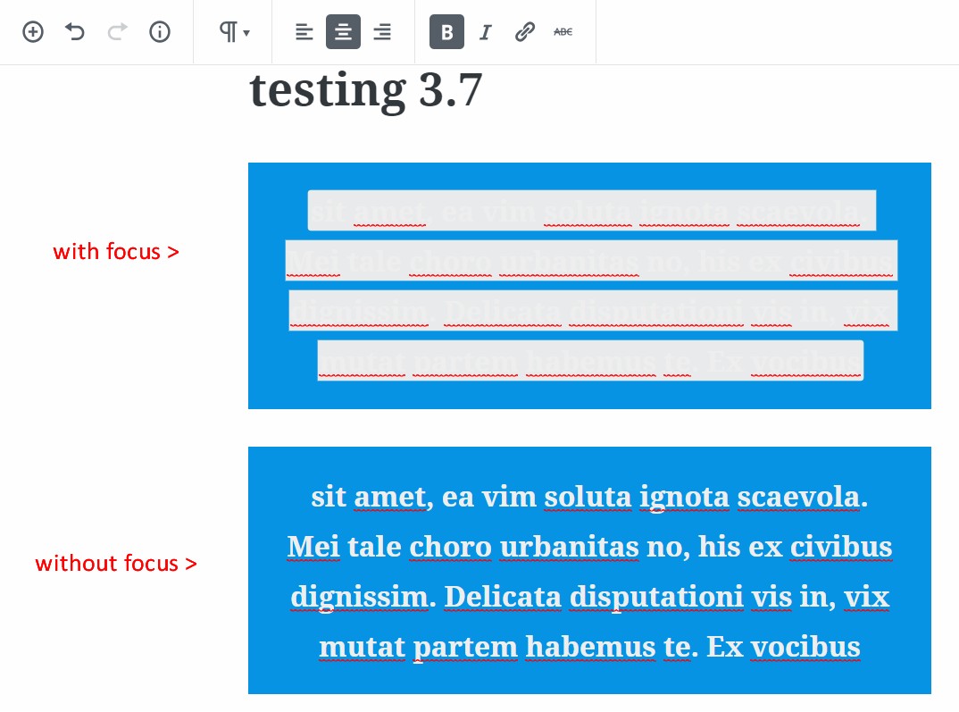
On the back-end, rich text has a special background color on focus. If the text color is "very light gray", that special background color makes the text unreadable on focus.
To Reproduce
- Create a paragraph block with text
- Choose "very light gray" text and boldface or _italics_
- Choose any colored background (or no background)
- Click the text to give focus. (it's unreadable)
- Click off the text. (it's readable)
 GlennMartin1
All 12 comments
Tested with WordPress 4.9.8 and Gutenberg 3.7 using Firefox 61.0.2 on macOS 10.13.6 and in my case the highlight background color is light blue.
Of course it may always be the case that if you select a specific combination of foreground and background colors that one of the combinations will be hard to read. In that case, wouldn't any color used for the text highlight color potentially be a problem? Is there an accepted solution in the Accessibility community that is preferred for a case like this?
I have added the Accessibility and Needs Design Feedback labels here to hopefully get more opinions added to the mix!
 designsimply
on 1 Sep 2018
designsimply
on 1 Sep 2018
No, I'm afraid the point was entirely missed. This is not about getting a bad combination of colors.
As mentioned, this is the case with ANY background color, as long as three conditions are met:
- very light gray text
- boldface
- the text has focus (not selected/highlighted)
Try it again. You'll see what I mean.
GlennMartin1
on 1 Sep 2018
@designsimply
What you're illustrating is not what I was describing.
Play with boldface / italics on very light gray text. That's where the issue arises.
GlennMartin1
on 1 Sep 2018
Aha, I think I see what you mean. My mistake was that, for the focus step, I had highlighted instead of just clicking on the inline boundary as your instructions mentioned. Sorry about that!
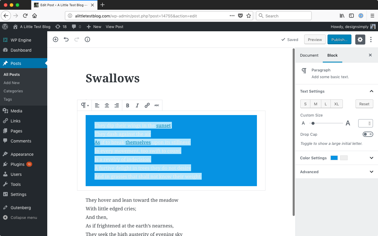
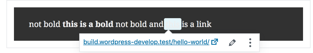
Click the text to give focus. (it's unreadable)
Tested and confirmed with WordPress 4.9.8 and Gutenberg 3.8.0-rc.1 that clicking on any text with an inline boundary (such as bold text) while the text color is set to very light gray results in text that is hard to read. (35s)
Screenshot showing very light gray text with a selected inline boundary:
Seen at http://alittletestblog.com/wp-admin/post.php?post=14870&action=edit running WordPress 4.9.8 and Gutenberg 3.8.0-rc.1 using Firefox 62.0 on macOS 10.13.6.
I am not sure if this is something easy to solve and am keeping the Needs Design Feedback label in order to get a designer's opinion on it.
designsimply
on 11 Sep 2018
@GlennMartin1 I hope you don't mind but I edited the title to be a bit more descriptive of the problem! For reference, the original title was "[3.7] on backend, very light gray rich text with focus not readable..."
That background color you see on the text is a TinyMCE inline boundary, which is there to indicate the full chunk of text that has a certain formatting. The style for the inline boundaries needs to be more aware of context so there is no contrast issue.
 chrisvanpatten
on 11 Sep 2018
chrisvanpatten
on 11 Sep 2018
One quick thought would be to use the automated contrast checker to invert the background-color if necessary, although I'm not sure if the inconsistency between light and dark text would be confusing.
Another option would be to tweak the inline boundary design—maybe just have a light border…?—to avoid using a background-color.
chrisvanpatten
on 11 Sep 2018
Ouch, this is a bit of a tough one. Changing the boundary design to a border over a background won't work (or at least will look incredibly strange and possibly buggy) for multi-line text.
I think the best option here is what @chrisvanpatten suggests:
use the automated contrast checker to invert the background-color if necessary
It might be confusing, but it's better than illegible.
 tofumatt
on 10 Oct 2018
tofumatt
on 10 Oct 2018
Not sure how the inline-boundary background can be changed via the automated contrast checker, as inline boundaries are a TinyMCE thing.
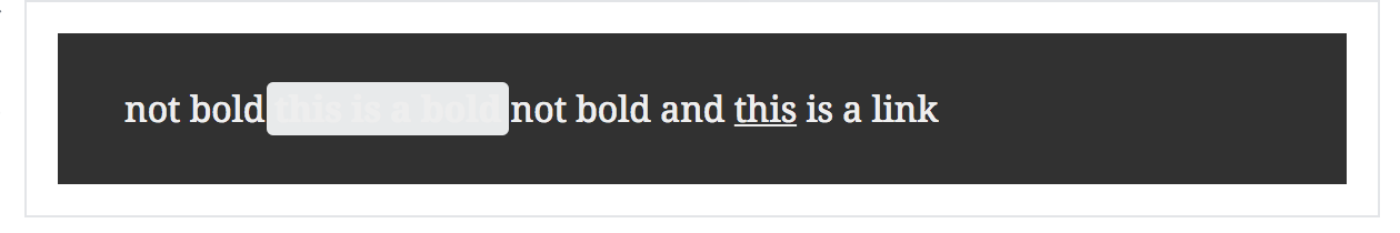
Some elements, when the caret is placed within them, get an "inline boundary". For example:
<strong data-mce-selected="inline-boundary">this is bold</strong>
The applied background color is background: #e8eaeb;. Same happens for other elements: b, i, strong, em, del, ins, sup, sub. A slightly different gray is used for code. Links get a light blue background instead.
Regardless of the _block_ background color, if the _text_ color is very light then the content of the inline boundaries is barely visible when clicked.
 afercia
on 13 Oct 2018
afercia
on 13 Oct 2018
@afercia I'm not 100% sure of the technical side but my thought is that the automated contrast checker could apply a class to the container which would be like "mce-boundary-invert" and we would conditionally update based on that.
Another option, which might be easier, would be to force the text color to change to black _when the inline boundary is active_. I don't think that would be too confusing… what do y'all think? Worth exploring?
chrisvanpatten
on 13 Oct 2018
@chrisvanpatten interesting, yes the second option would definitely be easier. If it's acceptable, from a design / UX perspective, to force a text color overriding the one set by users, I wouldn't have objections from an a11y perspective. I'd ask for design feedback first. Quickly tried it:
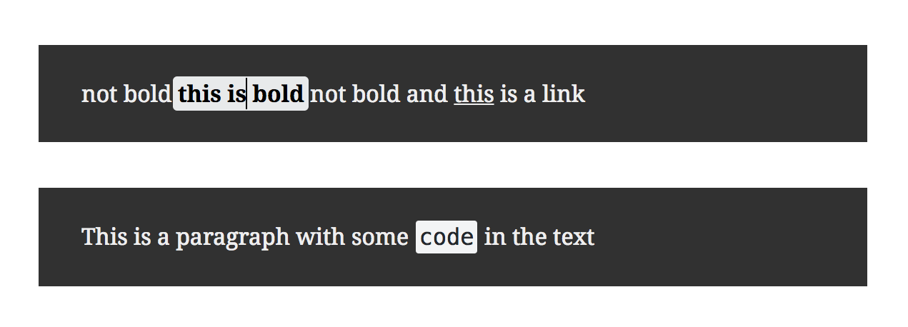
Interestingly, inline <code> elements always force the text color to a dark one.
afercia
on 13 Oct 2018
I like the second approach too. It's way more usable than what we have now.
There could be the argument it's a bit unexpected, but Gutenberg is not 100% WYSIWYG, and this is a case where unexpected faces off against unusable 😄
tofumatt
on 15 Oct 2018
Removing design feedback as just approved in PR.
 karmatosed
on 15 Oct 2018
karmatosed
on 15 Oct 2018
Related issues
 jasmussen
·
3Comments
jasmussen
·
3Comments
 ellatrix
·
3Comments
ellatrix
·
3Comments
 aaronjorbin
·
3Comments
aaronjorbin
·
3Comments
 nylen
·
3Comments
nylen
·
3Comments
 aduth
·
3Comments
aduth
·
3Comments