Gutenberg: Cloud Icons as saving status in Gutenberg
I would hesitate on the use of the cloud icon in as a prompt for saving a draft in Gutenberg.

The Cloud symbol has come to represent the uploading or editing of content to a cloud computing software on the internet. Dropbox, Google Drive and iCloud. So when we think about saving a draft are we using these types of services? Will, the user get confused with these types of services,
"Oh I thought I was uploading to my google drive with that cloud button"
Questions?
Since the draft is already on the site what are we actually uploading? If that is what icon is to suggest we are doing here?
Also once it has completed saving the cloud icon loses its arrow and becomes a full cloud. Does this mean that the content wasn't on the site previously?
I am asking these questions because I have never actually seen the cloud icon used before in a post saving way.
What is common place is what all WordPress installs are already using is spinners to show something is in action.
https://wordpress.org/wp-admin/images/spinner-2x.gif
We could also use a refresh spinning icon of two arrows circling each other which works better as the page is being refreshed or we are refreshing the autosave, it also is something different than the spinner from the classic WordPress.
The other suggested icon would be what Font Awesome likes to call circle-o-notch Which is a rotating circle with a notch missing showing the circle is actually rotating around.
If we wanted to break away from the icons of the past, sure, ok. There are plenty of animated icons to show the site is thinking or doing something. But the cloud icon is not the proper icon for what we are trying to show or accomplish here.
Articles I read on my research for this ticket:
Wikipedia on Cloud Storage
A brief history of the cloud
There is only one Cloud Icon in the Entire Universe
 robertdall
All 22 comments
Thanks for the ticket. This came up shortly after we added the icons in the first place.
One half of the answer I posted on the other ticket about the save draft button overall, and the gist is that we mean for there to _be_ no save button at all. Saving is something that should happen all the time, in the background, ensuring you never lose your work. But due to the legacy of WordPress, we can't yet reach that goal, so we have to have one.
So why not just have the text label and no icon? Well, because we need to support mobile, and on mobile this button collapses unto itself:
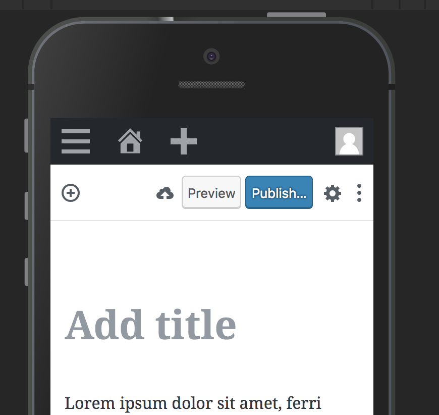
As you can see above, mobile is one of the extra important reasons for why we long term should try and get rid of the save button entirely. On that platform, users assume things are saved automatically because that's what happens everywhere else.
Okay, so why use the cloud icon? The primary reason is because you _are_ saving to the cloud. You are saving the document to your own private WordPress cloud. Once you get the checkmark, that means your document is saved online, and you can close the tab. Google Keep does this too:

A secondary reason is that we want to avoid using the floppy disk. Although still (I think?) used by Word to indicate saving to disk, not only are you _not_ saving to disk, but people born after 2000 are less likely to intrinsically _understand_ that icon. Fun anecdote: a kid of an acquaintance found a floppy disk in a drawer and exclaimed LOL dad someone 3D printed the save icon!
Is there a better icon? Possibly. We need an icon for mobile users to press to indicate "you are saving your post so you can close the browser afterwards and not lose your work". If we can find a good icon for that, I'd be happy to add that in.
Hope that explains some of the context. Good ticket 🌟
 jasmussen
on 30 Aug 2018
jasmussen
on 30 Aug 2018
I did some research on replacing the disk icon as you say it's quite antiquated and I would be suggesting we replace it with that. But what about a Checkmark in a circle and non-circle check mark? This would resolve the issue of the disk and be an improvement over the cloud.

robertdall
on 1 Sep 2018
Interesting. I like the train of thought of having an icon to indicate _saved_ and _not saved_, there could be meat on that bone. Though I'm not personally sold on the grayed checkmark with asterisk — we need to consider both contrast and color blindness, ideally it should work as a simple shape.
Adding design feedback label in case others can add in some thoughts! Cool!
jasmussen
on 3 Sep 2018
I do like the green checkmark. That seems clear and solid. 👍
For the not saved version, I wonder if we can use an ellipsis somehow? It may have some conflict with the ellipsis we use for our settings menu, but in some contexts, an ellipsis can read a little bit like a "loading", "in progress", or "wait" indicator, which might be appropriate here.
 kjellr
on 3 Sep 2018
kjellr
on 3 Sep 2018
Just want to note @bph's issue, #9767, which noted that the auto-save effect is distracting in spotlight/full screen. Might be good to loop into this.
 chrisvanpatten
on 10 Sep 2018
chrisvanpatten
on 10 Sep 2018
Completely fair point. Before watching the video I assumed it was the animated cloud saving that was distracting, to which we could simply fade it out a bit. It is supposed to be _automatic_ anyway, so perhaps it an be less opaque.
However the issue Birgit seems to experience is that the autosave indicator briefly flashes in for an already published post, that has the big "Switch to Draft" button. Which suggests this is sort of a bug to me. With a couple of optional solutions:
- Don't show the autosave indicator at all for already published posts. It happens in the background if it needs to. The "Switch to Draft" button doesn't flicker.
- Show both. This feels confusing to me, because you're not really saving a draft at that point.
- Show an icon-only version of the save draft button next to the switch to draft (but show it always), like on mobile, and rename the tooltip to "Save" when the post is published.
Thoughts?
jasmussen
on 11 Sep 2018
Don't show the autosave indicator at all for already published posts. It happens in the background if it needs to. The "Switch to Draft" button doesn't flicker.
Show an icon-only version of the save draft button next to the switch to draft (but show it always), like on mobile, and rename the tooltip to "Save" when the post is published.
Either one of these seem like fine solutions to me. My gut says that it's fine to hide the autosave indicator entirely in this case, but that's largely because I can't think of a reason you _need_ to know that the file has been auto-saved before you switch it to a draft or update the post. (Saved versions of already-published posts have always seemed confusing to me in general).
kjellr
on 11 Sep 2018
Seems like that's the next thing to try then 👍 👍
jasmussen
on 11 Sep 2018
Dumb question but as a point of clarification (I honestly don't know)… once your post is published, is auto-save creating new revisions, or just saving a backup copy in case your browser crashes or whatever?
If it's actually saving revisions, I think it's important that it's visible. But if it's more of a backup thing, I think hiding it seems reasonable.
Another small thing that might need to be factored in is that autosave seems to block using the update button. If that doesn't need to be the case, that'd be great… it drives me slightly crazy when an auto-save starts when I want to hit the update button. However if there's a technical reason for it, we'd need to account for that.
chrisvanpatten
on 11 Sep 2018
Something that also strikes me (as a related thought above), is that there are a lot of pieces happening in terms of saving.
We have…
- Some kind of auto-save storing a local copy to your browser in case of a crash
- Saving post revisions
- Publishing content
- Updating published content
I know there's a lot of history in WordPress around "save draft", "update", and "publish" that may be tough to break away from… I'm not sure if there is any prior art in Gutenberg around changing this, but I would _love_ to see some more clarity (and simplicity) around the difference between "save" and "publish".
If I may jump straight to a solution (something I try to avoid, but let's play), in my perfect world there would be a clear "Save" option, that is always available, and "Publish"/"Publish Changes"/"Unpublish" options. They would exist totally separately and independently. After all "Publish" is primarily about a _status_ change, which has gotten sort of implicitly bundled into saving over the years, but is really a separate action.
I know this is all slightly complicated by the lack of revisions for post meta, metabox behavior, etc. But I do think there might be an opportunity to improve here if we take a step back.
…or I might just be rambling and making no sense. Either/or :)
chrisvanpatten
on 11 Sep 2018
Good morning,
Someone seems to think the "Switch to Draft" is important to actually give it a button, but I have had any use case for it. In the classic editor I would change the status of a post if I needed it to be in draft again. All the buttons feel crowded to me. Update / Publish / Save draft are perfectly acceptable
Show an icon-only version of the save draft button next to the switch to draft (but show it always), like on mobile, and rename the tooltip to "Save" when the post is published
... is a perfectly acceptable solution @jasmussen with the caveat that I would remove the 'switch to draft' button.
As for the Auto-Save, I don't need an indicator that it's auto-save to make it silent is perfectly fine for me. If I need to look at revisions, I have that spot in the sidebar, if I needed it.
Now that you mention it @chrisvanpatten I also noticed that the auto-save sometimes gets in the way of deliberate saving, disabling the update button for a split second.
 bph
on 11 Sep 2018
bph
on 11 Sep 2018
@bph it's even more noticeable if you're on a slow web host. The update button can be disabled for a few seconds or more while the auto-save is processed. Very frustrating :)
chrisvanpatten
on 11 Sep 2018
Someone seems to think the "Switch to Draft" is important to actually give it a button, but I have had any use case for it. In the classic editor I would change the status of a post if I needed it to be in draft again. All the buttons feel crowded to me. Update / Publish / Save draft are perfectly acceptable
I'm one of those people :) — it is also based on feedback from WordPress.com, where it's appreciated that the button is so big and easy to find in case you accidentally publish oh on OH NO OH NO UNPUBLISH _oh phew that was easy_.
The larger argument is that the whole meta changes once your post is published. At that point the actions you you are likely to take are either to _update the post_ or to _unpublish it_. Save, notably, becomes much less important as it's both automatic and implied.
Chris you're also right, there are several layers of things to save in WordPress — metaboxes, revisions, the document. If WordPress were written today there would just be one thing to save, and it would all be part of revisions. But such it is with working with 10 year old software, and the explicit Save button exists as a compromise with the hope that one day it can be retired.
There's also the design principle that in Gutenberg you have to be able to do any action you need to get your basic blogging done, without ever having to visit the sidebar. Yes, you can change the status in the sidebar, but only if you have the sidebar open, or know to look for the action there. This is made worse on mobile where the sidebar is a modal.
I'm suggesting this for _context_, not as a way to put the boot down and say this is how it needs to be.
jasmussen
on 12 Sep 2018
@jasmussen - haha! Yes, I have been known to hit the publish button way to early at while working around werwolf time:-) And propagate to facebook and twitter half-baked content. That's why I appreciate the two-step publishing in Gutenberg very much! I have the feeling that is also would reduce the need to actually 'switch back to draft' for a lot of people. Time will tell...
bph
on 12 Sep 2018
@jasmussen Yeah totally, I appreciate there are 15 years of history to contend with. Also I actually like the explicit save; it makes it easier to say "this is a version of my content I want to store as a timestamped revision". I only wish it were possible to separate that saving process from publishing, but I recognise that's not necessarily possible given the limitations of the platform :)
chrisvanpatten
on 12 Sep 2018
@bph the extra publish button step is largely appreciated by the majority, but a minority of people will be happy when #9760 gets merged, allowing users to untoggle that step and publish directly. In that situation, the Switch to Draft prominence is likely to be extra appreciated :)
jasmussen
on 13 Sep 2018
Ha @jasmussen I can see that. And I think you can see my follow-up question from 4000 miles away: "Can the display of the "Switch to Draft" button be dependent on the Publish immediately toggle switch?"
bph
on 14 Sep 2018
I appreciate that 😅
But I'm not sure what we're trying to accomplish here. The Switch to Draft button is only present on published posts, where we've presented an argument that it's a primary action. Similarly, the behavior of "save draft" changes on a published post, so there's no obvious reason that button needs prime real estate.
I can appreciate a desire to simplify and reduce complexity, but in this case I'm not sure I see the problem we're trying to solve by removing the "Switch to Draft" button.
On the other hand, the principle that Gutenberg is to be mobile friendly has suggested that important actions should not be buried in the sidebar, because the sidebar is a modal on mobile.
jasmussen
on 14 Sep 2018
Focused simplicity is one of my goals, and it's probably bleeding into this discussion from the rest of my life's context. I was not aware that "Switch to draft" is a "primary action" - it's quite the foreign concept to me, that's why I feel it's crowding my space
bph
on 15 Sep 2018
Hi all, I have read all of the comments and the additional ticket @bph mention and starting to feel that my original question is somewhat being lost in this discussion. While I think this discussion is super important, lets also not forget the original reason this ticket was created.
Also, I feel my other ticket Save Draft should have the same style as all other publishing action is somewhat relevant to this conversation as well.
robertdall
on 15 Sep 2018
Noting we have feedback and some iterations in #10552, removing feedback label for now on this.
 karmatosed
on 14 Oct 2018
karmatosed
on 14 Oct 2018
The word 'saving' now appears and personally I feel we can probably close this for now. If that's wrong we absolutely can re-open.
karmatosed
on 18 Nov 2019
Related issues
 cr101
·
3Comments
cr101
·
3Comments
 BE-Webdesign
·
3Comments
BE-Webdesign
·
3Comments
 moorscode
·
3Comments
moorscode
·
3Comments
 hedgefield
·
3Comments
hedgefield
·
3Comments
 aduth
·
3Comments
aduth
·
3Comments