Gutenberg: Transform "Fix Toolbar to Top" into "Focus Mode"
Inspired by the "Focus" mode that @mtias introduced in #8920, I'd like to propose we try a different kind of Focus Mode.
Problem
A key feedback point we hear is that Gutenberg’s interface can be a little overwhelming. This often comes from users who more commonly focus on "writing" versus "building" their posts. They find the contextual block controls and block hover states to be distracting: When they're focused on writing, they don't necessarily want to think about blocks — they just want to write.
Oftentimes, this subset of users also miss the common "formatting toolbar at the top of the page" paradigm that's present in Google Docs, Microsoft Word, and the Classic Editor.
I think we can introduce an alternate editing mode that addresses both these concerns for them.
Suggested Solution
We already have a "Fix Toolbar to Top" option that moves the contextual block toolbar to the top of the page. For the user I described above, this is already a step towards the interface they're used to. It's also a good first step to decluttering the writing interface — relocating heavy UI to a less-disctracting area of the screen.
I suggest we take that option further, and adapt it into a more complete "Focus Mode":
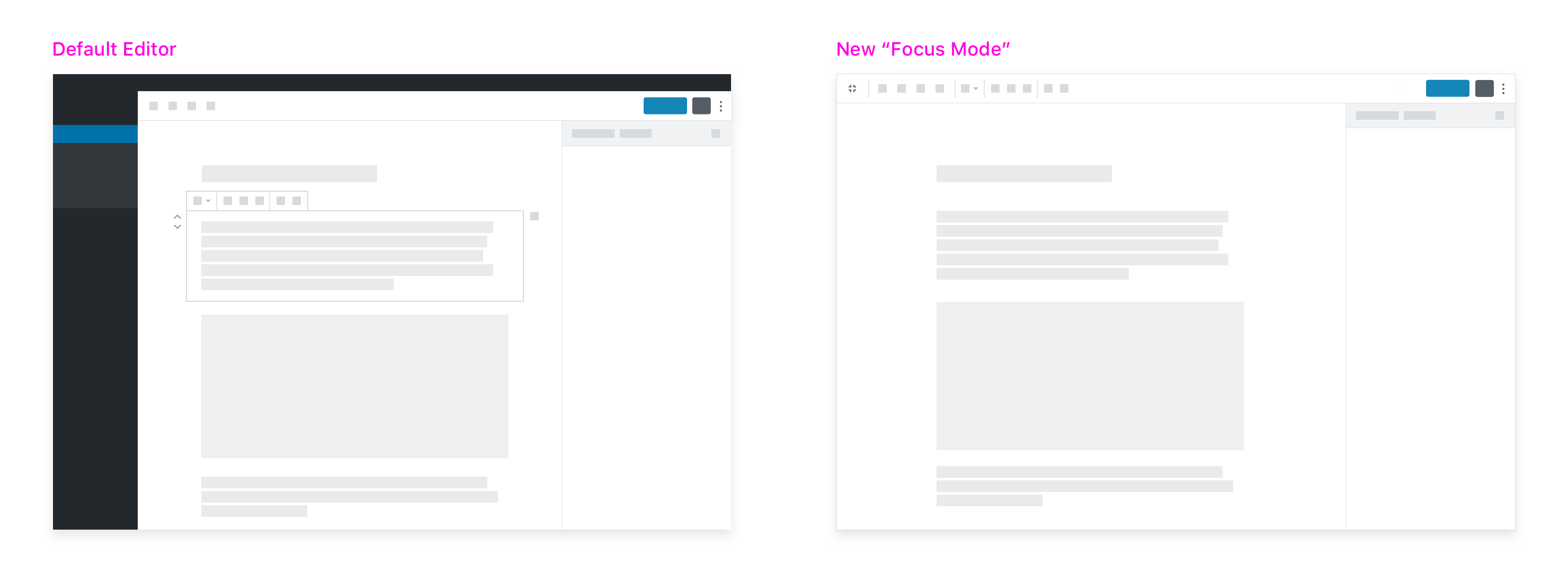
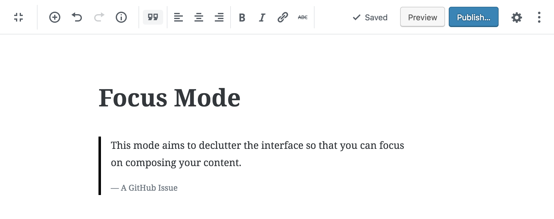
This new editing mode would consist of a collection of UI updates aimed at decluttering the interface so that the user can focus on writing their content.
▶️ Video demo: https://cloudup.com/cMr22auRtXC
Details
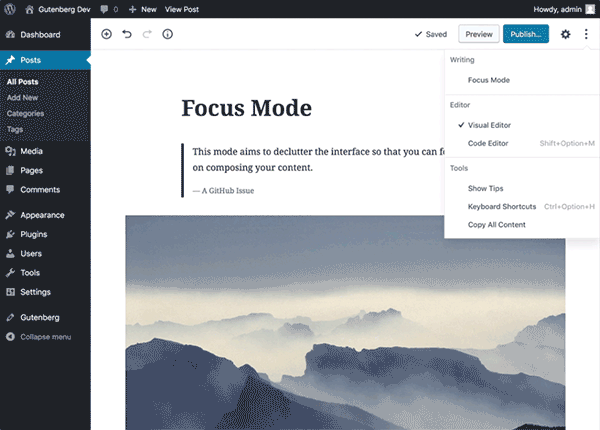
Focus Mode would be activated via the "More" menu. To accomodate this new mode, I propose renaming the "Fix Toolbar to Top" option to "Focus Mode" and including this as a new "Writing" option:
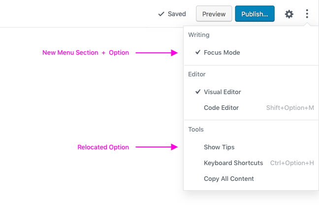
_(Since this would leave "Show Tips" all alone under "Settings", I suggest moving it into the "Tools" section at the bottom)_
When users have this new mode active, the editor would include the following UI updates:
1. The block toolbar would be pinned to the top of the screen.
(This is an existing feature.)
2. The editor would be full screen.
This is one of the highest impact changes, and would be the default for this mode. Users could exit out of full screen mode — and retain all other features of Focus Mode — via a new toggle in the upper left of the toolbar.
3. Block outlines would be removed for both hover and selected states.
I initially thought this change would be confusing, but (as a power user myself) I find it quite usable. Since this is an optional mode, and this is a high-impact change in terms of eliminating distractions, I'm all for it.
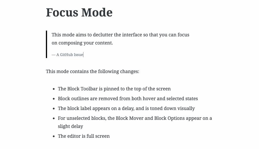
4. The block label would appear on a delay, and be toned down visually.
This label is less essential in this mode, but including it will help with wayfinding. (The delay aspect of this change is already in progress in #9197)

5. Block mover + block options would also appear on a delay.
(For non-selected blocks). When a block is selected, they'll appear just as quickly as they usually do.
_Non-selected Blocks_

_Selected Blocks (This is the same as our current behavior)_

In case you missed it above, here's a short video demo to convey how these changes work in practice:
▶️ https://cloudup.com/cMr22auRtXC
FAQ
I foresee a few likely questions to this approach, so I'll try to address them in advance:
- How does this relate to the "Focus Mode" in #8920? These can work together. The pattern of focusing in on a single block is compatible with both writing modes, so we could either allow it to be available in both modes, or we could make it an add-on feature for this Focus mode.
- There are acessibility issues with not showing block borders. That's very likely true. I'd reinforce the fact that this is a non-default, opt-in mode. If block borders and contextual controls are important to your use of Gutenberg, the default option will still be available. This direction would _not_ take that away.
- Nested blocks will still require borders in this mode. Yes, maybe they will! We'll need to address this, and I think it's reasonable to include some sort of minimal border in this case.
- What about mobile? We currently don't offer the "Fix Toolbar to Top" option on small screens, due to a Safari issue noted here. That will still be a problem for us. The other enhancements in this mode (full screen, hover state changes, etc.) would have little to no effect on mobile. For those reasons I suggest we limit this to larger screens only at this point.
Looking forward to thoughts and reactions. 🙂
 kjellr
All 14 comments
I'm a big fan :)
I have just one concern. If I want to make this my default mode, I'd select it from the menu in that case I don't want it to always stay full screen but I still want to navigate to other pages of WP-Admin, I'd suggest adding a "close" or "previous" icon at the position where you put the icon to close the fullscreen mode (like the customizer). This have some impact on the "exit fullscreen mode button", I wonder if we can have two buttons next to each other or have something separate for the "exit full screen" button.
 youknowriad
on 24 Aug 2018
youknowriad
on 24 Aug 2018
I love the look of it, with two thoughts:
- I wonder if this could somehow relate to #9292, with the idea of different editor modes? Rather than making this a separate menu section, this would be just another mode. This would give us three official modes: Blocks, Writing (or "Focus"), and Code. Worth a thought, anyway :)
- This behaviour more closely resembles the Classic Editor's behaviour and visuals. Could that lead to confusion with people expecting behaviour similar to Classic? Blocks behave fundamentally differently, even if we're de-emphasising them here.
- I think "Fix Toolbar to Top" should still exist as its own thing, independent of this. But if you think of this as another "mode" it could be set up so it's only an option when in "Blocks" mode, but is not an option (and forced on) in this Writing/Focus mode.
Overall it looks nice though and is definitely worth iterating on!
 chrisvanpatten
on 25 Aug 2018
chrisvanpatten
on 25 Aug 2018
@chrisvanpatten I'm a big fan of your idea in item 1 of making this Focus Mode (which I'd love to include strong ideas from @mtias #8920) and continuing to make things filterable with #9292 :thumbsup:.
I'm less attached to keeping Fix Toolbar to Top as an option independent (it's my personal preferred default, see #9063) of making Focus Mode a third official Editor Type.
 0aveRyan
on 25 Aug 2018
0aveRyan
on 25 Aug 2018
I like this idea! I agree with @chrisvanpatten that making Focus Mode use the kind of system proposed in #9292 is a good idea.
I also think that Fix Toolbar to Top should remain a separate option at least in the normal Visual Mode. Perhaps it can be enabled permanently in Focus Mode as suggested by @0aveRyan.
I think the Fullscreen option should be separate for the reasons pointed out by @youknowriad.
Note also that the ellipsis being moved to the toolbar would have a slight effect on this idea. See #9074 and #9282. I think having the ellipsis in the toolbar would work really well with a Focus Mode like this, since you would not need to see the block borders to find the ellipsis for the selected block.
 ZebulanStanphill
on 25 Aug 2018
ZebulanStanphill
on 25 Aug 2018
I really like this and thanks for everyone's thoughts. Regarding fixing to the top, I am in favour of not having this as a separate option. My reasons fall into a few points:
- Right now it's lost to people where the option is or what it means.
- We have not got conclusive insight people want the option yet but when people do they are also often asking for focus.
I would like at least us to try in prototype this suggestion as I think it's something feeling would be beneficial. This isn't dismissing as much as wanting us all to actually feel this flow, I want that myself. Then we can get feedback on it before merging.
One thing to think of here is stepping outside our own flows and preferences. Right now we have a few issues. People are either feeling things are 'too blocky' or feeling the experience is 'too much'. I say the two things separate but they really come down to the same feelings. If we think about flows that people may use splitting out like this makes a lot of sense to explore. Creating easy to understand flows that make sense is what we can see this as setting us on the path for. We're not saying it's done but it's a start.
I also think in this case it would be good to prototype what full screen not being an option feels like, yes we could be going too far but let's see.
Thanks everyone, I think we're all coming from the same point just circling around the finer details.
 karmatosed
on 26 Aug 2018
karmatosed
on 26 Aug 2018
Same a11y considerations made on #8920:
No objections from an a11y perspective, as long as this is _not_ the default mode. However, I'd consider to not pair this feature with the option to have the toolbar at the top. Moving the toolbar at the top should be possible also for users who don't want this "lighter" UI.
I'd only suggest to not use Focus Mode as name for this feature, as that's already used for screen readers specific feature and could be potentially confusing.
 afercia
on 26 Aug 2018
afercia
on 26 Aug 2018
I really like this idea, especially integrated with #9292 .
As for the mode name, "writing" mode I think works well?
 rogerlos
on 27 Aug 2018
rogerlos
on 27 Aug 2018
Thanks for the feedback, everyone!
Rather than making this a separate menu section, this would be just another mode. This would give us three official modes: Blocks, Writing (or "Focus"), and Code. Worth a thought, anyway :)
@chrisvanpatten — it's funny you mention that: my initial thinking was along those same exact lines. I even mocked up the menu that way at first. 😄
I ended up pulling back from that in an effort to be less prescriptive with flows. If someone prefers to "write" using the "blocks/building" mode, or to build out layouts using the "writing/focus" mode, I wouldn't want them to feel like they're using Gutenberg wrong. The core of this direction is really about eliminating distractions, so I think a name like Focus (though not exactly "Focus Mode" for @afercia's reason above) makes sense.
I think "Fix Toolbar to Top" should still exist as its own thing, independent of this.
I prefer limiting the top toolbar (and full screen) to this mode for two reasons.
- Currently, the top toolbar option serves as a way to simplify the UI a little bit, and these changes just take that further.
- If we're going to have different modes, they need to each feel distinct from each other — keeping the toolbar on the top in this mode will help define it as different from default mode.
Regarding everyone's other notes about full screen — I think we'll likely need/want to iterate on it once we have this prototyped. It'll help us to see it in action. However we handle it though, I'd love for us to "remember" the users full-screen preference: If they prefer to always edit in full screen mode, that should be possible.
kjellr
on 27 Aug 2018
Really liking the direction of this proposal. Over the past few weeks I've started using Gutenberg heavily for writing on my own blog. I really like it better as a writing experience (much better than the existing editor, which I only pasted pre-written articles into). The work suggested here would really help with a problem I've faced in being distracted by some parts of the interface. Looking forward to seeing how this progresses! +1 on hiding the sidebar.
 jwold
on 29 Aug 2018
jwold
on 29 Aug 2018
Fixed toolbar centered is :fire: it's been super awkward to reach on the left end of the screen all the time.
 lkraav
on 29 Aug 2018
lkraav
on 29 Aug 2018
After some follow up chats related to #9394, we've decided to break this out into a few features:
- Unified Toolbar
- Spotlight Mode
- Full Screen
Each will be toggled separately. More details over here.
I have a few additional notes on the Full Screen mode. Posting here until we break that out into its own PR:
- Full screen mode should be available in both Visual and Code editing modes
- When full screen is activated, the setting will remain in place until it's unchecked in the ellipsis menu. So for instance: if a user activated full screen, then left the editor, the editor should be in full screen mode next time they return.
- Since all of the WP Admin chrome is hidden in full screen mode, the user will need a way to exit the editor. To solve for this, we can add a new "Close" button in the upper left of the screen. Clicking this would close the entire editor and direct the user back to whatever their previous WP-Admin page was. If there is no previous page, we can drop them off on the dashboard screen for the associated post type (All Posts, All Pages, etc).
For the close button, I suggest we either use an x icon, or spell it out to match the other text buttons in the menu:


_Updated animation (for example only... we'll tweak this in a PR):_

kjellr
on 29 Aug 2018
Interesting... I made a comment long ago on WPTavern about a fixed toolbar that could possible make people happier about Gutenberg from a user's perspective.
 Mocha365
on 29 Aug 2018
Mocha365
on 29 Aug 2018
Can I add, as someone who’s been quite vocal about finding Gutenberg difficult for “just writing”, that I MUCH prefer this to #8920. Apart from making it full-screen. I’d still like the document options on the right.
I’m going to re-state that I would prefer this to be the DEFAULT editing experience with advanced block mode as a toggle. This ticket opens with:
This often comes from users who more commonly focus on "writing" versus "building" their posts.
I’d have thought that most people would want to “write” most of the time rather than “build”. Is there evidence that people want to “build” as default?
Great work though. I’d very much like to support this concept.
 rosswintle
on 29 Aug 2018
rosswintle
on 29 Aug 2018
The name "Focus mode" has a lot of history in software already so I would actually argue that is another reason it _should_ be named that. Both _spotlight mode_ and _writing mode_ don't evoke the same immediate acknowledgment and are confusing. It could be argued that it would make it less accessible to be named something else so maybe there is a way to address that in the code which the screen reader will read?
Decisions over options makes sense but there is a precedent for allowing users to decide their preferred editor writing option so it makes sense to me to have a user setting rather than a site setting to choose their default editor mode. The fact is that some people writing in other software and simply paste it into Gutenberg, others use WordPress and Gutenberg for their writing experience and both of these experiences will differ to editing previously published content.
Overall I think this approach on focus mode is brilliant and it addresses a lot of feedback.
 martingoldie
on 30 Aug 2018
martingoldie
on 30 Aug 2018
Related issues
 davidsword
·
3Comments
davidsword
·
3Comments
 maddisondesigns
·
3Comments
maddisondesigns
·
3Comments
 aduth
·
3Comments
aduth
·
3Comments
 ellatrix
·
3Comments
ellatrix
·
3Comments
 jasmussen
·
3Comments
jasmussen
·
3Comments
Most helpful comment
The name "Focus mode" has a lot of history in software already so I would actually argue that is another reason it _should_ be named that. Both _spotlight mode_ and _writing mode_ don't evoke the same immediate acknowledgment and are confusing. It could be argued that it would make it less accessible to be named something else so maybe there is a way to address that in the code which the screen reader will read?
Decisions over options makes sense but there is a precedent for allowing users to decide their preferred editor writing option so it makes sense to me to have a user setting rather than a site setting to choose their default editor mode. The fact is that some people writing in other software and simply paste it into Gutenberg, others use WordPress and Gutenberg for their writing experience and both of these experiences will differ to editing previously published content.
Overall I think this approach on focus mode is brilliant and it addresses a lot of feedback.