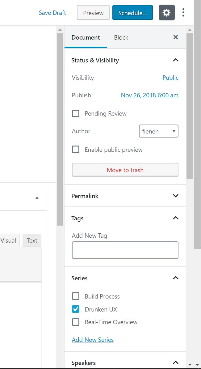
Gutenberg: Multiple scrollbars appear if the left black menu is too long
Multiple scrollbars appear if the left black menu is too long, is also not good to have 2 scroll bars, you need to customize one and make it a custom sidebar smaller and tinier.
All 12 comments
See also: #8068, which ~is caused by this issue~. EDIT: Apparently not, since that issue appears to have been fixed at some point while this issue still exists.
Adding a screenshot for reference:
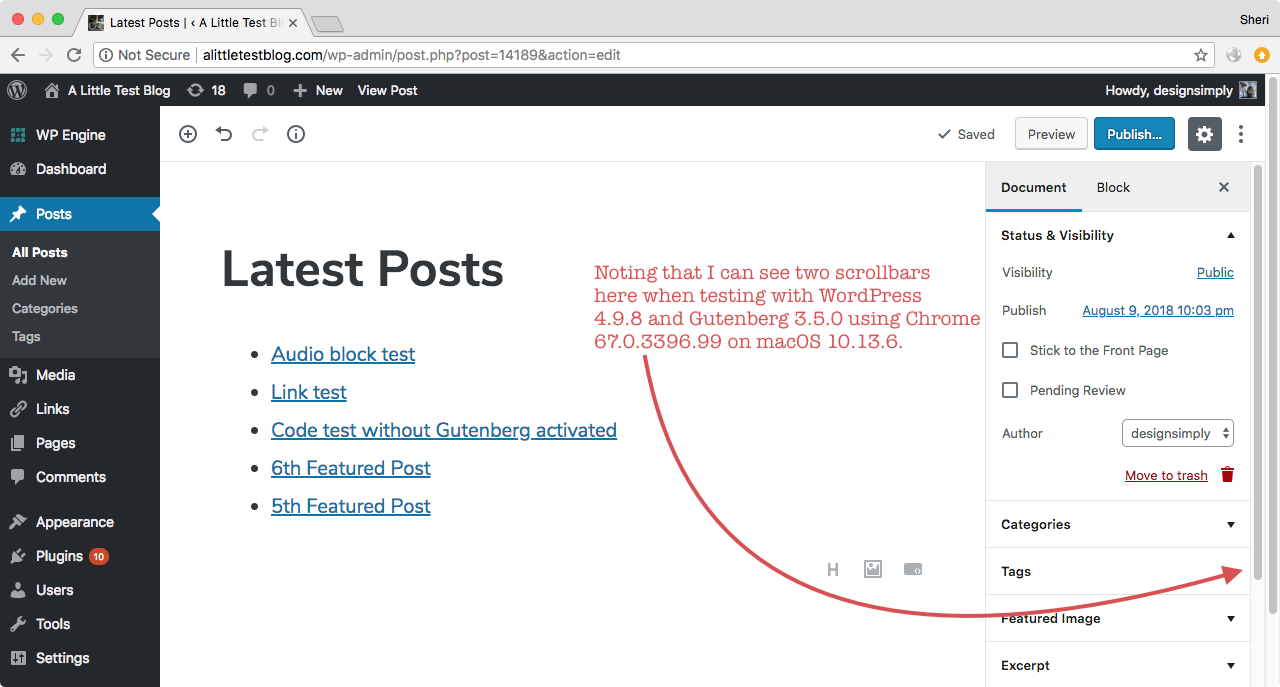
Seen at http://alittletestblog.com/wp-admin/post.php?post=14189&action=edit running WordPress 4.9.8 and Gutenberg 3.5.0 using Chrome 67.0.3396.99 on macOS 10.13.6.
I've noticed the same thing. Here's a situation in the Gutenberg demo where there are 3 scrollbars in the UI. I have a lot of plugins installed so the menu is long.
- Left of Settings panel. Scrolls up and down the Gutenberg content.
- Right of Settings panel. Scrolls up and down the Paragraph block settings.
- Right of the screen. Scrolls up and down the page to see all the menu items.

It's not that great from a UX point of view to have multiple scrollbars.
The document is gaining the scrollbar on the right (at least in firefox) from edit-post-toggle-panel. On my machine, its height is 71 pixels, which is exactly the amount of scroll the document exhibits.
The likely cause of this is that though this panel is floated right, it is after edit-post-layout__content, and therefore I believe its height is taken into account _somewhere_ in the rendering engine, though firefox's inspector is very unhelpful in pinpointing the offending item.
As a quick check, changing position:relative to position:absolute on edit-toggle-publish-panel eliminates the document scroll bar.
(I should note there are at least two self-clearing divs below this panel in the DOM, though they are a few layers up in the stack, as it were.)
Instead of float:right and top: -9999em to hide it, how about position:absolute, top: -9999em and right: 0? I haven't looked at the code, but I assume if it needs to be shown the value of top is changed? This should not affect that behavior...eh? Hopefully?
This issue was brought up 2700 tickets ago in #6094. That issue was closed without resolution, and the opinion left was basically "oh well." At least this one still has some gas in it, even if it's getting old. I think we need someone taking a serious look at it though.
This is both a failed user experience, and an accessibility pot hole for anyone with mobility or muscle control issues. I have full use of my noodly appendages, and it _constantly_ captures my mouse and screws up my scrolling. Imagine how frustrating it's going to be for anyone with less control. It's a bad approach, and when people really start using Gutenberg after it drops in a couple days, packed with all their plugins and whatnot, you're gonna see a lot more people raising noise about how ugly and confusing this is. UX matters.
The solution to this should be simple, right? Can we not just let the longest container control the document height like would be standard practice? I'm not sure I can think of a single produce I use where this pattern is employed or accepted.

Just thought I'd also mention that Fullscreen Mode does help get right of the main scrollbar and reduces things down to two scrollbars. I know it's not the answer to a lot of the criticism, but it could help some.
Can we not just let the longest container control the document height like would be standard practice?
@fienen This seems like it'd make it difficult to change the block settings in the sidebar for a block that's at the bottom of a long post.
I understand the need for modernization with Gutenberg, but this is some serious regression in regard to usability. I introduced Gutenberg to a client, just telling it was a normal evolution and would be helpful and then encountered the 3 scrollbars.
I'm a bit sad and surprised this is barely acknowledged, and the issue is basically left as "not possible to fix right now". It is a major UX issue.
Some updates to fix scrolling issues have been ongoing in other pull requests (notably #13327 shipped in the latest Gutenberg release 4.9) so scrolling issues are not being completely ignored! If there is not a clear path to a solution or if there is a case not happening in all environments or (and this is something I worry about missing) if I am missing a local environment setting that make scrollbars behave differently for me compared to you when I help test, any of those things can work against helping to make an issue clear and actionable. The best thing we can do from this point is to work together to figure out the the source of the trouble and document the relevant details and find reliable steps to reproduce the problem.
For this case, I re-tested using WordPress 5.0.3 (current latest stable) and no active plugins with Firefox 64.0.2 and Chrome 71.0.3578.98 on macOS 10.13.6. I did not see the same scrollbar problem that I noted in my earlier comment on Aug 9, 2018 (https://github.com/WordPress/gutenberg/issues/8790#issuecomment-411921499) when using the same OS and browser (upgraded browser version though), the same post, and this time without Gutenberg installed as a plugin since it is no longer needed unless you are testing something that hasn't yet been added to the main WordPress project.
Then I tried with Windows 10, both with and without the Gutenberg plugin, and I can see the multiple scrollbars problem using the same site in two different browsers that I tested: Chrome 71 and Edge 17.
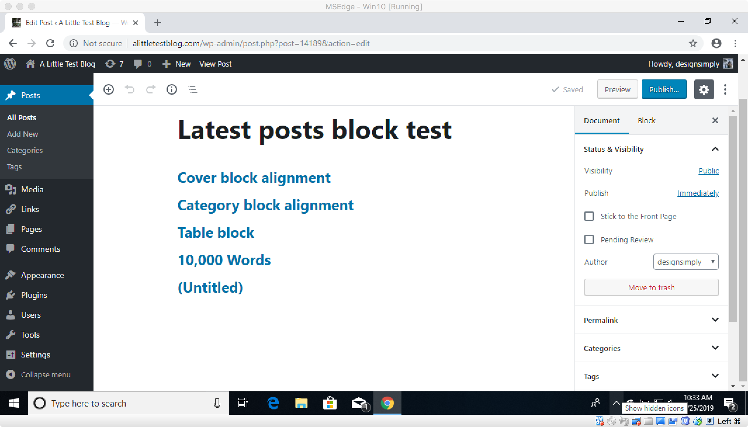
Seen at http://alittletestblog.com/wp-admin/post.php?post=14189&action=edit running WordPress 5.0.3 and Gutenberg 4.9.0 using Chrome 71 on Windows 10.
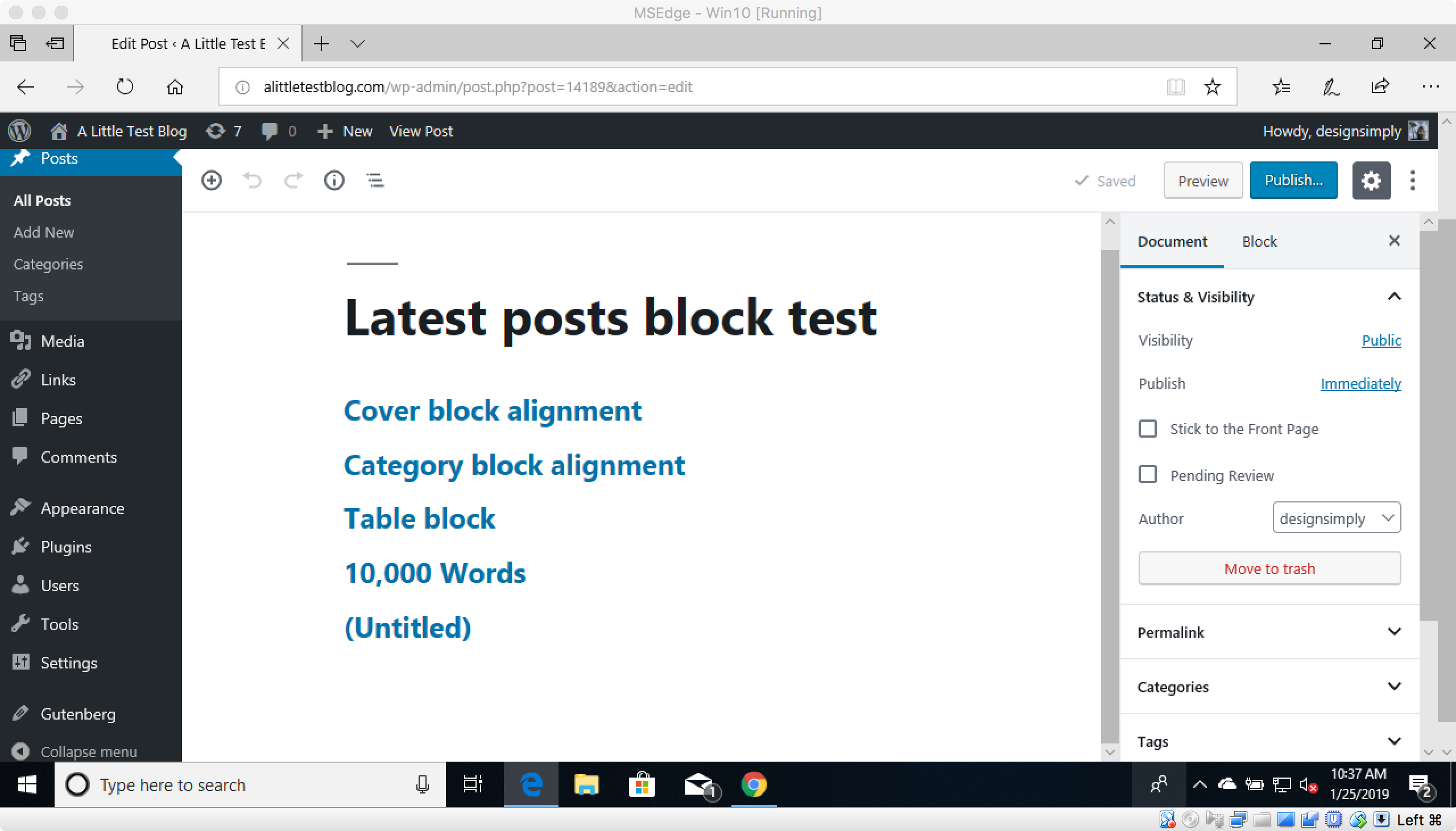
Seen at http://alittletestblog.com/wp-admin/post.php?post=14189&action=edit running WordPress 5.0.3 and Gutenberg 4.9.0 using Edge 17 on Windows 10.
@jasmussen since you did some recent work on scrolling in #13327, may I ask if you have time to have a look at this case as well?
Thanks for the ticket.
The frustration is completely understandable, we'd like to fix the issue soon. I ask for your patience, as there are a lot of different elements at play here.
One of the key goals of Gutenberg is to make it easy for anyone to create rich layouts without having to know how to code. Blocks that are easy to insert and configure in the right hand sidebar play a key part in that. The block library and that same sidebar scroll individually. This is done so that if you are working on a very long post, you can scroll way to the bottom of it, but still see all the content in the sidebar. This is different from how the classic editor worked, where if you needed to access the sidebar on a very long post, you had to scroll all the way back up to the top again. That's why the main editing canvas and the sidebar both have scrollbars.
That extra scrollbar, way on the right, is for the navigation menu on the left, which as noted in this ticket, is present on screens that are not very tall, i.e. tablets, 11-13'' laptops. That scrollbar is way to the right due to how the navigation menu is built, which is to say it has flyout menus (hover a menu item to reveal submenu items). Because of that, we can't put the scrollbar in context of the left side navigation menu, or the scrollbar would "crop out" the flyout menu.
We are currently exploring ways to improve how the left hand navigation menu works, to:
- make it more accessible
- make it more userfriendly
- make it scale better across mobile and desktop
- make it work better on small viewports
You can see in-progress work here in the WordPress core Slack. The improvements we are exploring there will allow us to fix this issue.
In the mean time, you can use a few workarounds:
- You can use fullscreen mode, click the · · · menu in the top right corner and choose "Top Toolbar".
- If you hover the mouse over the left navigation bar and use the scroll wheel, it scrolls the navigation bar, and you don't have to drag the scrollbar on the right.
Thank you for your patience as we fix this.
I just wanted to note my comments above, where, at least on my Windows machine, it was a single component of the right menu which invoked the third scrollbar. I honestly don't know what "best practices" are these days in CSS, but hiding an element with a large negative "top" value only really works if that element is also absolutely positioned, doesn't it? Otherwise, its height will be taken into account during the document render.
It's been a while since this ticket was opened, and it's also been a while since I last responded. So just in case it can help move the issue forward, a few things have changed since then.
The original issue remains: there's an extra scrollbar on the right, when the left-most navigation menu is too tall for the screen and requires scrolling.
This is not an issue when the block editor is "fullscreen", which as of WordPress 5.4 is default.
But the issue does appear again if:
- The user unchecks fullscreen
- The user has a tall left-hand navigation menu in a small viewport
So absent a redesign of the wp-admin to not have flyout menus, the issue will remain when you're not in fullscreen.
Most helpful comment
This issue was brought up 2700 tickets ago in #6094. That issue was closed without resolution, and the opinion left was basically "oh well." At least this one still has some gas in it, even if it's getting old. I think we need someone taking a serious look at it though.
This is both a failed user experience, and an accessibility pot hole for anyone with mobility or muscle control issues. I have full use of my noodly appendages, and it _constantly_ captures my mouse and screws up my scrolling. Imagine how frustrating it's going to be for anyone with less control. It's a bad approach, and when people really start using Gutenberg after it drops in a couple days, packed with all their plugins and whatnot, you're gonna see a lot more people raising noise about how ugly and confusing this is. UX matters.
The solution to this should be simple, right? Can we not just let the longest container control the document height like would be standard practice? I'm not sure I can think of a single produce I use where this pattern is employed or accepted.
