Gutenberg: URLInput: Include date as context for link search results
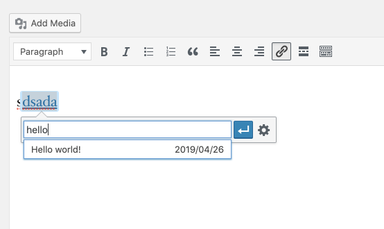
When we insert a link on a word(s), in the list of related links we don't have anymore the date of the article published or if it's a page or event.
That kind of information is important because we may want to make interlinking to older pages or understand if we're not linking to a past event for mistake.
thanks
Joao
 JoaocsMagalhaes
All 16 comments
Testing this today. If I'm understanding correctly, the request is to include additional contextual information in the list of posts / pages presented as options when adding a link to text?

It seems to me a reasonable request, but may need some design consideration for how to accommodate the additional information relative the title, especially if occupying the same space.
 aduth
on 31 May 2019
aduth
on 31 May 2019
I think we can go for a simple option using what classic editor has for now:
The option I am suggesting then would be:

 karmatosed
on 27 Jun 2019
karmatosed
on 27 Jun 2019
+1 to this approach. How would it work for longer post titles? How would we indicate other CPTs, like pages?
This does add a bit of extra cognitive load to the UI. Would there be a way of only showing this information if it's relevant? For instance, if I just have one piece of content with the title I've searched for, I probably don't need any additional context, but if I have multiple pieces of content in a search result, I might need more information in order to make an informed decision. Is there a way of supporting both of these use cases without creating an inconsistent interaction pattern?
 sarahmonster
on 2 Jul 2019
sarahmonster
on 2 Jul 2019
A thought...a quick/rough mockup.
I think of this similar to making a search in the future backend.
It will show posts, then pages and then CPTs. Giving an overview.

 paaljoachim
on 9 Jul 2019
paaljoachim
on 9 Jul 2019
@paaljoachim interesting, thanks for taking the time to mock this. I do think perhaps just showing date works as a starting point. Perhaps this is a solid exploration into the next iteration?
karmatosed
on 9 Jul 2019
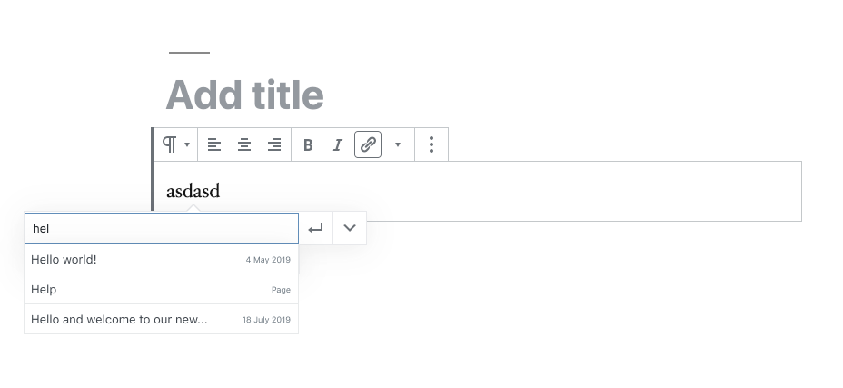
Post type may be confusing for some users—many people aren't super aware of the distinction between posts and pages, and if I only have one piece of content named "Hello world", then displaying the post type doesn't really give me any additional information I didn't already have. It might make sense to show post types only as a way of clarifying the decision between two pieces of content with the same title.
In the same vein, it's probably only useful showing dates for posts—since pages and other types of content aren't tied to a date in the same way, this information just becomes visual clutter that doesn't help with the task at hand (selecting the right piece of content to link to.)
A better solution to the problem could be to show dates for posts, and post types for all other types of content:
Note that I've tweaked the colours here so they pass colour contrast checks, but we'll also want to consider how to make this interface as usable as possible for keyboard and screen reader users. There's some prior art in the original designs for the navigation menu block:

It would probably be good to double-check to see if this is the best approach, or if we're alright with just having the current focus styling, rather than adding an explicit button.
sarahmonster
on 1 Aug 2019
Discussed during today's Gutenberg design triage (registration required).
We agreed that the classic editor approach (https://github.com/WordPress/gutenberg/issues/8573#issuecomment-506452198) seems to be the simplest and clearest solution.
 enriquesanchez
on 3 Dec 2019
enriquesanchez
on 3 Dec 2019
+1 for me on this...does anyone know if it is possible to hook into this functionality and add something like this as a plugin?
 xnau
on 7 Dec 2019
xnau
on 7 Dec 2019
I'm adding 'Needs Design Feedback' again because the link component has changed quite a bit since the creation of this issue and it needs to be reevaluated.

enriquesanchez
on 13 Mar 2020
This issues was discussed today during the Accessibility Team's weekly meeting: you can find the complete discussion here: https://wordpress.slack.com/archives/C02RP4X03/p1584117146464800.
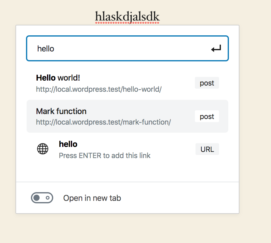
As already pointed out by @enriquesanchez, the current version of Gutenberg already adds more information to each option (such as the URL and the post type), so new mockups to understand where to add the post/page date are needed.
During the discussion, more accessibility issues about the listing of available links where pointed out:
- Below is an example of list of possible links to post/pages (the dark gray rectangle allows to visualize what is announced by a screen reader).

Here is the code of the corresponging element.
<button type="button" role="option" tabindex="-1" id="block-editor-url-input-suggestion-5-1" aria-selected="false" class=" ... ">
    <span class="block-editor-link-control__search-item-header">
        <span class=" ... ">Mark function</span>
        <span aria-hidden="true" class="block-editor-link-control__search-item-info">http://local.wordpress.test/mark-function/</span>
    </span>
    <span class=" ... ">post</span>
</button>
From a technical point of view, here is what is announced:
- anything inside a
role="option"gets “flattened” to a string and announced as such; - the URLs are not announced because they use
aria-hidden="true"; - the “type” e.g.
postis announced; - the rest is added by the screen reader e.g.
text (2 of 3) completion selected.
The information provided is probably not very clear to understand for a screen reader user: adding some screen-reader-only text would probably be useful to add context (especially if also the date of the post/page is added to the information already provided).
The toggle to choose if the link should open in a new tab is located under the suggestion list: this would be unexpected for a screen reader user.
When typing the name of the post/page to be linked, the user can also create a link: the URL of such link would be what has been typed. In the screenshot below, the user typed "hello" and would be able to create a link to
http://hello.

Best solution would be to first check that the entered string is a valid URL and then offer the ability to insert it as a link. Also, the option to add the URL is the only one with an icon to the left, so there's no visual uniformity.
- The background color of the highlighted option is a light gray, very similar to the white background of non-highlighted options.
The points above can be discussed in the context of the current issue, or they can be separated into new issues for better discussion.
 Ryokuhi
on 13 Mar 2020
Ryokuhi
on 13 Mar 2020
Just wanted to note that the permalink only provides useful information if permalinks are set to be pretty.
For example, this is not helpful to the user
http://mysite.com/?p=9346897345
But if set to be pretty it is helpful:
http://mysite.com/my-posts-title
Whereas a date would be helpful regardless of the site's permalink settings.
 johnstonphilip
on 24 Mar 2020
johnstonphilip
on 24 Mar 2020
Comparison.
Using the Classic Editor plugin:
Link module has focus on title, page and for posts date.
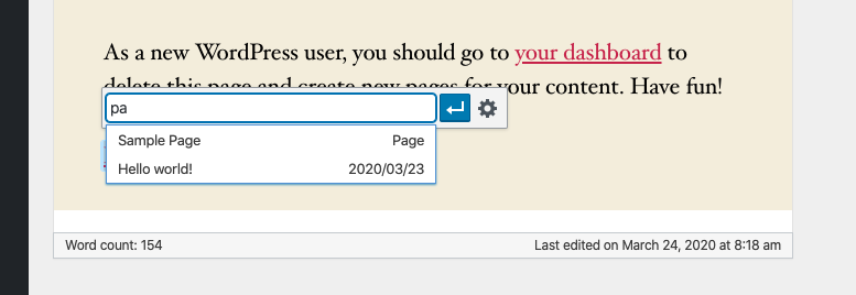
Using Gutenberg plugin version 7.7.1.
Link module has focus on title, url and post/page/url.
+Open in new tab.

What about removing the word post and instead inserting the date? Similar to the Classic Editor.
It is very useful to have easy visual access to the date when a post has been created.
paaljoachim
on 24 Mar 2020
I actually, in this case, think the type is more useful potentially than the date. This was worked on within the new interface a bit and I would love to have that reviewed over the older one that's linked previously for accessibility. @enriquesanchez do you think you could see about that happening the weekly triages for a11y?
karmatosed
on 27 Mar 2020
@karmatosed the new link creation UI was reviewed and discussed a couple of weeks ago (see https://github.com/WordPress/gutenberg/issues/8573#issuecomment-598903828 above).
Is there anything else that you'd like us to check?
enriquesanchez
on 30 Mar 2020
I have associated this include date as context issue with the link control issue being updated here: https://github.com/WordPress/gutenberg/issues/23375
paaljoachim
on 21 Jul 2020
In today's triage meeting in Slack, the Design Team thought it would be good to include this work in the new LinkControl UI being explored here: https://github.com/WordPress/gutenberg/pull/24021 and in the issue here: https://github.com/WordPress/gutenberg/issues/23375
Basically trying out a date in the results dropdown.
 mapk
on 4 Aug 2020
mapk
on 4 Aug 2020
Related issues
 maddisondesigns
·
3Comments
maddisondesigns
·
3Comments
maddisondesigns
·
3Comments
maddisondesigns
·
3Comments
 JohnPixle
·
3Comments
JohnPixle
·
3Comments
 jasmussen
·
3Comments
jasmussen
·
3Comments
 BE-Webdesign
·
3Comments
BE-Webdesign
·
3Comments
Most helpful comment
Post type may be confusing for some users—many people aren't super aware of the distinction between posts and pages, and if I only have one piece of content named "Hello world", then displaying the post type doesn't really give me any additional information I didn't already have. It might make sense to show post types only as a way of clarifying the decision between two pieces of content with the same title.
In the same vein, it's probably only useful showing dates for posts—since pages and other types of content aren't tied to a date in the same way, this information just becomes visual clutter that doesn't help with the task at hand (selecting the right piece of content to link to.)
A better solution to the problem could be to show dates for posts, and post types for all other types of content:
Note that I've tweaked the colours here so they pass colour contrast checks, but we'll also want to consider how to make this interface as usable as possible for keyboard and screen reader users. There's some prior art in the original designs for the navigation menu block:
It would probably be good to double-check to see if this is the best approach, or if we're alright with just having the current focus styling, rather than adding an explicit button.