Gutenberg: Improve Custom Color Button
From a recent meetup there was feedback that the color picker wasn't that obvious for everyone. Right now we just show the rainbow circle:

A suggestion was to add the 'droplet picker' icon, props to @rickybanister, but we could also add a droplet itself. I have done 2 versions and I think the droplet works well as a suggestion but visually easy to work out.
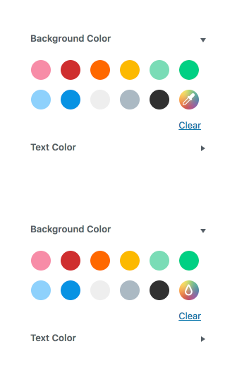
What do people think? Does this make it more obvious? Is this enough or should we do more? What else could we do?
 karmatosed
All 22 comments
The picker does make it a lot more obvious and seeing it I know right away what it does.
 aristath
on 26 Feb 2018
aristath
on 26 Feb 2018
I also prefer the picker!
This looks so much better than it did in my head, nice work @karmatosed
 rickybanister
on 26 Feb 2018
rickybanister
on 26 Feb 2018
Agreed on picker. Thanks @rickybanister and @karmatosed!
 joanrho
on 26 Feb 2018
joanrho
on 26 Feb 2018
I prefer the picker too.
 Rahmon
on 26 Feb 2018
Rahmon
on 26 Feb 2018
I prefer the droplet picker icon in the first example and agree it would make the UI better.
What would be even more ideal is when using the color picker the rainbow background then changed to the color that they picked. Although this makes things complicated as you would then need to know based on the custom color if the droplet picker icon should then be displayed using a dark or light color.
But the UI already warns you if the color combination may be hard for people to read so the detection to know if the droplet picker icon should be light or dark based on the custom color selected appears to already be available.
 carlhancock
on 26 Feb 2018
carlhancock
on 26 Feb 2018
+1 for picker icon over droplet
 maddisondesigns
on 27 Feb 2018
maddisondesigns
on 27 Feb 2018
Picker over droplet for me
 rileybrook
on 27 Feb 2018
rileybrook
on 27 Feb 2018
Picker seems the winner, let's mark this to be developed! Thanks everyone.

karmatosed
on 5 Mar 2018
I started working on it.
@karmatosed From where can I get picker dashicon? Should I request it in https://github.com/WordPress/dashicons ?
 faishal
on 6 Mar 2018
faishal
on 6 Mar 2018
Forgive me for jumping in way after the fact, you have permission to ignore me.
Could we remove the rainbow swatch entirely, perhaps add another theme swatch in that spot, and simply show a blue link below that says "Custom Color" next to the "Clear" link? Seems like it would be easier to implement, and users wouldn't have to interpret the icon.
 jasmussen
on 6 Mar 2018
jasmussen
on 6 Mar 2018
I wouldn't be against that @jasmussen, although my concern is with 2 actions beside each other again of the 'custom color' and 'clear'. With our link styling that could get a little hard to work out which is which.
@faishal it would be requesting this as a dashicon, however right now let's make sure we are going that path. Thank you for stepping up and once we have a route agreed we can help you get your PR committed.
karmatosed
on 6 Mar 2018
I wouldn't be against that @jasmussen, although my concern is with 2 actions beside each other again of the 'custom color' and 'clear'. With our link styling that could get a little hard to work out which is which.
We could use gray buttons perhaps. Also I know how super annoying it is I'm coming in from the sidelines here, I do apologize, though I figure it's easier to test a quick link before drawing a new dashicon.
jasmussen
on 7 Mar 2018
We could use gray buttons perhaps. Also I know how super annoying it is I'm coming in from the sidelines here, I do apologize, though I figure it's easier to test a quick link before drawing a new dashicon.
I'd be up for testing, although I kind of feel link here would be confusing. Up for seeing.
karmatosed
on 7 Mar 2018
Is it possible to set gradient in my theme support for Gutenberg ?
For example like that:
add_theme_support( 'gutenberg', array(
    'colors' => array(
        'linear-gradient(to right, #33ccff 0%, #0000cc 100%)',
    )
) ).
I want to add a few gradients to color picker list.
When I wanted use this code at front-end block hasn't background but when u go to edit saw this:

Front-end:

Is it possible to change at front-page "background-color" to "background" ?
Or get user to choose how it have to display ?
 IgorWpserved
on 6 Apr 2018
IgorWpserved
on 6 Apr 2018
Is it possible to set gradient in my theme support for Gutenberg ?
No, not as part of the core offering. But incidentally I just saw a plugin in development allowing this: https://wordpress.slack.com/archives/C02QB2JS7/p1522937131000291
jasmussen
on 6 Apr 2018
@karmatosed @jasmussen
Want to confirm we are going with adding picker icon for custom color.
If yes can we get the icon added to dashicons? https://github.com/WordPress/dashicons/tree/master/sources/svg/gutenberg
 ajitbohra
on 10 Jul 2018
ajitbohra
on 10 Jul 2018
Let's go with the picker and yes we'd need to have it added to dashicons.
karmatosed
on 12 Jul 2018
Could we remove the rainbow swatch entirely, perhaps add another theme swatch in that spot, and simply show a blue link below that says "Custom Color" next to the "Clear" link?
Here's how that might look.

I still prefer the icon on the color swatch, myself.
Now because Gutenberg uses Material icons, can we just go with something like this?

which is linked here: https://material.io/tools/icons/?icon=colorize&style=outline
Or does this necessitate a Dashicon to be created?
 mapk
on 24 Jan 2019
mapk
on 24 Jan 2019
The eye-dropper tool feels like the wrong tool here, as that's not actually what the custom color swatch does. And the fact that it is a swatch feels like we should show a swatch.
How about this?

SVG:
<svg xmlns="http://www.w3.org/2000/svg" viewBox="0 0 24 24"><path d="M14.4 9.6l4-4c-1.2-1.2-2.6-1.9-4-2.3l-1.5 5.4c.6.2 1.1.5 1.5.9z" fill="#8ac441"/><path d="M12 8.6c.3 0 .6.1.9.1l1.5-5.4c-1.6-.4-3.2-.4-4.7 0l1.5 5.4c.2 0 .5-.1.8-.1z" fill="#fbed1d"/><path d="M11.1 8.8L9.7 3.3c-1.6.4-3 1.2-4 2.3l4 4c.3-.4.8-.7 1.4-.8z" fill="#f59120"/><path d="M9.6 9.6l-4-4c-1.2 1.2-1.9 2.6-2.3 4l5.4 1.5c.2-.6.5-1.1.9-1.5z" fill="#ea2127"/><path d="M8.6 12c0-.3.1-.6.1-.9L3.3 9.7c-.4 1.6-.4 3.2 0 4.7l5.4-1.5c0-.3-.1-.6-.1-.9z" fill="#ea185a"/><path d="M9.6 14.4l-4 4c1.2 1.2 2.6 1.9 4 2.3l1.5-5.4c-.6-.2-1.1-.5-1.5-.9z" fill="#8f288c"/><path d="M3.3 14.3c.4 1.6 1.2 3 2.3 4l4-4c-.4-.4-.7-.9-.9-1.5l-5.4 1.5z" fill="#e80a89"/><path d="M14.4 14.4c-.4.4-.9.7-1.5.9l1.5 5.4c1.6-.4 3-1.2 4-2.3l-4-4z" fill="#0872b9"/><path d="M12 15.4c-.3 0-.6-.1-.9-.1l-1.5 5.4c1.6.4 3.2.4 4.7 0l-1.5-5.4c-.2 0-.5.1-.8.1z" fill="#2d368e"/><path d="M15.2 12.9c-.2.6-.4 1.1-.9 1.5l4 4c1.2-1.2 1.9-2.6 2.3-4l-5.4-1.5z" fill="#28aae1"/><path d="M15.2 11.1l5.4-1.5c-.4-1.6-1.2-3-2.3-4l-4 4c.5.4.8.9.9 1.5z" fill="#00a44f"/><path d="M20.7 9.7l-5.4 1.5c.1.3.1.6.1.9s-.1.6-.1.9l5.4 1.5c.4-1.8.4-3.4 0-4.8z" fill="#01a79b"/></svg>
I actually really like the text link option. It's very clear and puts a bit more weight on the theme's supplied palette, which guides people to more consistent choices.
 kjellr
on 4 Feb 2019
kjellr
on 4 Feb 2019
Let's go with that then, it's super simple and if it is insufficient it can be revisited after. Also way simpler than anything we've proposed so far.
jasmussen
on 4 Feb 2019
I'm good with that decision. Let's get a PR up and ship it!
mapk
on 5 Feb 2019
Related issues
 moorscode
·
3Comments
moorscode
·
3Comments
 hedgefield
·
3Comments
hedgefield
·
3Comments
 mhenrylucero
·
3Comments
mhenrylucero
·
3Comments
 aduth
·
3Comments
aduth
·
3Comments
 davidsword
·
3Comments
davidsword
·
3Comments
Most helpful comment
Forgive me for jumping in way after the fact, you have permission to ignore me.
Could we remove the rainbow swatch entirely, perhaps add another theme swatch in that spot, and simply show a blue link below that says "Custom Color" next to the "Clear" link? Seems like it would be easier to implement, and users wouldn't have to interpret the icon.