Gutenberg: Handling overflow in the quick toolbar
This topic has come up a number of time, but hasn't been opened in a separate ticket. All discussions will be referenced from this ticket.
The question for the day: how do we handle overflow in the quick toolbar?
Overflow refers to when there isn't enough available space to fit the buttons inside the quick toolbar. This might happen on mobile, or it might happen if you float a block.
As the quick toolbar decreases in width, there are a number of ways to handle the overflow, including:
- "pop off" buttons and move them to an overflow menu
- let the quick toolbar scroll horizontally
- allow multiple stacked toolbars
Solution 1 is good for the desktop, as scrolling horizontaly is not a good experience.
Solution 2 is good on mobile, as swiping horizontally feels natural. But it makes the code complex when it comes to dropdowns in the quick toolbar.
Solution 3 is what the Classic Text block does, and should ideally be avoided.
Note: there _is_ an overflow menu on mobile, there to handle the mover, cog, trash buttons. As we look for a solution to the quick toolbar overflow, we should keep this in mind, for example by moving these buttons to the quick toolbar on the mobile breakpoint.
Mockups
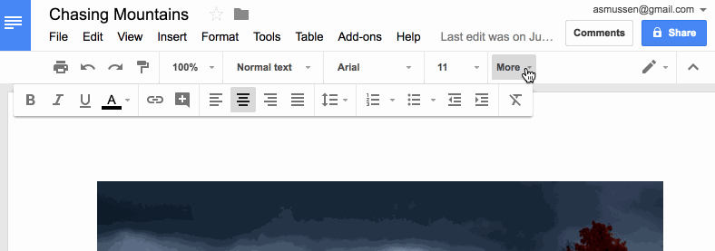
Here's how Google Docs handles it on the desktop:
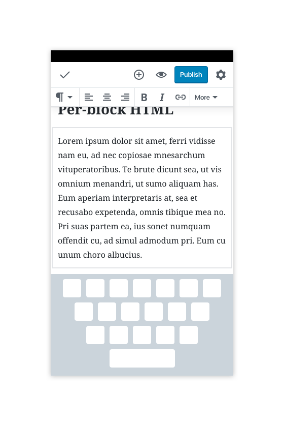
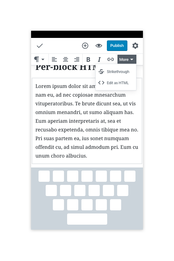
Here are various mockups that illustrate potential solutions:
Desktop breakpoint:

Mobile breakpoint version 1, toolbar scrolls:


Mobile breakpoint version 2, "More" button appears (like Docs):
Tickets where this has come up:
 jasmussen
All 8 comments
FWIW we found Version 1 (a horizontally scrollable toolbar) worked better on mobile than a "more drawer." (Version 2) in Textbox.io. The "more drawer" covered up too much screen real estate.
 androb
on 9 Oct 2017
androb
on 9 Oct 2017
@androb Nice, thanks for the info. How did you handle dropdown menus inside a scrolling toolbar?
jasmussen
on 9 Oct 2017
I'd go for a horizontal scroll too, it's a pattern that Google also uses in Material when a tab/toolbar is wider than the screen 👍
As a side note, I'd hide the scrollbar (seen in the second mobile mockup), you wouldn't be able to grab that with your finger on a mobile device anyway, and as a visual cue there's probably something better(-looking), like a fade or an arrow on the end of the bar (or nothing, like in Material, but I don't know if enough people are familiar with that pattern yet).
 hedgefield
on 9 Oct 2017
hedgefield
on 9 Oct 2017
I'd go for a horizontal scroll too, it's a pattern that Google also uses in Material when a tab/toolbar is wider than the screen 👍
I like the horizontal scroll, but the two problems with it remain — it's very difficult to get a dropdown button to work when it can also scroll horizontally. And it also doesn't work on the desktop, whereas an ellipsis or a "more" button would work on both.
As a side note, I'd hide the scrollbar (seen in the second mobile mockup), you wouldn't be able to grab that with your finger on a mobile device anyway
Totally — that was just an artifact of the mockup, to indicate the auto hiding scrollbar that shows up on mobile when you drag.
jasmussen
on 9 Oct 2017
Ah hm, I wasn't paying attention to the fact that overflow could also be an issue on desktop... Then I would prefer the more button too yeah. My only concern with that on mobile is to make sure there won't be any of the standard, commonly-used features hidden behind that button due to lack of space. From the mockups it looks like that won't be an issue, but if it ever does become one, maybe we could also offer a way to customize which elements go on the main toolbar and which are inside the more dropdown, like Apple sometimes offers for apps with a bottom drawer?
hedgefield
on 9 Oct 2017
@jasmussen we had a different interaction on mobile vs. desktop. Horizontal scroll worked better on mobile and a "more" button worked better on the desktop.
As for scrolling horizontally with a drop down, I am not sure what the issue is? Is that the drop-down doesn't move in sync with when the toolbar gets scrolled?
androb
on 9 Oct 2017
As for scrolling horizontally with a drop down, I am not sure what the issue is? Is that the drop-down doesn't move in sync with when the toolbar gets scrolled?
No, just wondering whether you solved the technical challenges (sounds like you did), like syncing up the x position of where to show the dropdown, etc.
jasmussen
on 9 Oct 2017
I'm going to close this ticket in favor of #4084, which offers a different approach to some of the issues this ticket tried to address.
That doesn't mean the inherent issue here is fixed, but it is mitigated both by the horizontal scrolling of the quick toolbar, and when 4084 happens, by a more obvious and discoverable place to find the trash button and movers.
jasmussen
on 19 Dec 2017
Related issues
 maddisondesigns
·
3Comments
maddisondesigns
·
3Comments
 davidsword
·
3Comments
davidsword
·
3Comments
 aduth
·
3Comments
aduth
·
3Comments
 moorscode
·
3Comments
jasmussen
·
3Comments
moorscode
·
3Comments
jasmussen
·
3Comments