Gutenberg: Can we get to just two block toolbars?
Some criticism received is the amount of 'busy-ness' in the main editor experience. The constant showing and hiding of icons in three separate toolbar locations for blocks create anxiety.
Perhaps we should reconsider the need for the right toolbar with the Inspector and Delete buttons?
The Inspector button seems like they could be moved somewhere else (top toolbar or another in-context toolbar.)
The Delete button feels like it could be achieved just using the keyboard. Why do we even need a button? This would be particularly the case if clicking a block selector comes to fruition (as suggested by @nylen at https://wordpress.slack.com/files/jnylen/F6P1GU8FP/2017-08-15t12.01.33-0500.png). You'd just click the block selector icon or use the keyboard to select the box and the press the delete key. Regardless, it feels like it could be moved.
IMHO, constantly showing and hiding three toolbars is at least one too many. Thoughts?
 androb
All 6 comments
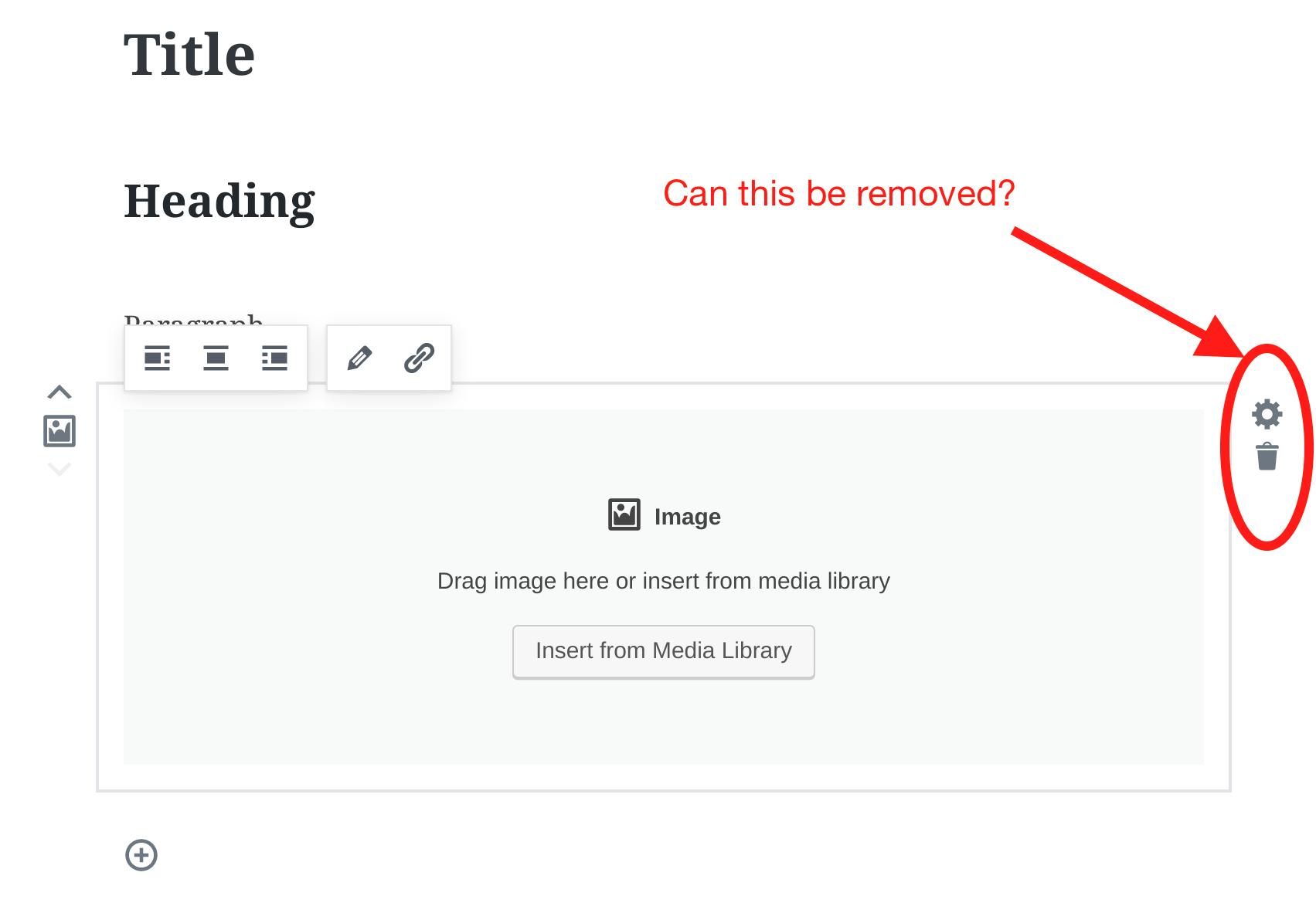
I was in the process of formulating a similar request, but more towards the UI in its entirety. Images really expose how less UI would be, in my opinion, much better and more intuitive.
Here, the entire boundary of this block has interface elements to manipulate an object that doesn't even exist yet. The UI should be more intentional when adding an image to do just that - _add an image._ Once the image is added and selected, I think there's a better opportunity to expose more options such as linking, positioning, deleting, replacing, and so on. There just needs to be some consideration for context.
With that in place, I think we could explore the placement of actions within the editing context that are logical and not noisy for those who are simply looking to add a block.
 nic-bertino
on 15 Aug 2017
nic-bertino
on 15 Aug 2017
Do not go "keyboard" way. Very few people edit with keyboard in WordPress.
You decided for blocks. You fix place for delete icon.
 StaggerLeee
on 16 Aug 2017
StaggerLeee
on 16 Aug 2017
You're not alone in thinking these thoughts, I've had similar thoughts that I posted in https://github.com/WordPress/gutenberg/issues/2156, which suggested moving the trash and cog button into the quick toolbar. Combined with https://github.com/WordPress/gutenberg/pull/2443 it would even work on mobile.
Having it be keyboard only — select, then press backspace — was our initial approach. We were very bullish on it, and only added the delete button after it had been requested a number of times. Now that it's here, it feels nice to use in practice, especially for the big blocks. I only ever find it frustrating when it comes to the plain text blocks, which I agree, feel much heavier with the extra chrome. As Matías suggested in the other thread, it feels like it might be worth improving the writing interactions first, before we start optimizing the UI. But once that happens, I personally still think the quick toolbar is the right place for it. The only downside to that is, those buttons disappear from hover, so you have to select the block first. Okay tradeoff, I think, but worth noting.
 jasmussen
on 17 Aug 2017
jasmussen
on 17 Aug 2017
You can put much inside last right "3 dots" button, in block top toolbar.
I know we would need to send one screenshot to beginners with this button dropdown open, and short explanation. But not so big deal, once they learn there is something there they will never forget it.
At the same time you solved problem of iritation of showing buttons everywhere.
StaggerLeee
on 17 Aug 2017
@StaggerLeee agreed. Coping with a large number of buttons is somewhat inevitable in an editor.... particular on smaller width devices. We should strive to avoid it, but most likely won't be able to.
I know WordPress has gone with the "three dot" approach. I personally prefer a "more" label as it is more obvious... but that would be a bigger change.
androb
on 17 Aug 2017
@jasmussen sounds like everyone is thinking along the same lines... I will go ahead and close this ticket for now :)
Also, I can see the necessity for a delete button for large blocks. Makes sense. At least until selection of blocks is more natural/obvious (handles etc).
androb
on 17 Aug 2017
Related issues
 BE-Webdesign
·
3Comments
BE-Webdesign
·
3Comments
 ellatrix
·
3Comments
ellatrix
·
3Comments
 davidsword
·
3Comments
davidsword
·
3Comments
 franz-josef-kaiser
·
3Comments
franz-josef-kaiser
·
3Comments
 hedgefield
·
3Comments
hedgefield
·
3Comments