Gutenberg: Consider moving cog and trash to quick toolbar
Right now the cog and trash button float to the right of the block for two reasons:
- to free up space in the quick toolbar
- to be available on hover
1 is spurious as we've had to move the cog and trash buttons (as well as the mover) into an ellipsis on mobile regardless.
- is what we should discuss. There's been discussion recently about the weight of the block UI. And completely granted, it's a complex silhuette for just writing text.
Recent PRs all take stabs at improving this:
- Fixed toolbar: https://github.com/WordPress/gutenberg/pull/2148
- Combined Quick Toolbar: https://github.com/WordPress/gutenberg/pull/2151
- Lightweight block hover design: https://github.com/WordPress/gutenberg/pull/2155
While these all improve things, it seems like it's still a heavy silhuette with floating buttons left and right of a button. By moving the cog and trash buttons to the quick toolbar, we can both get closer to the mobile UI, and we can reducie the silhuette, all at the cost of having to click a block before you can delete it. Since multi select makes it easy to delete blocks, and since backspacing in an empty block deletes them, this feels like a fair tradeoff to me. Compare:


(Those screenshots assume the ligthweight block hover design gets merged)
CC: @mtias @melchoyce
 jasmussen
All 11 comments
+1 for trying this, as it would also improve the current focus order. That always puzzles me: move up, move down, cog, trash, and _then_ the toolbar.
 afercia
on 2 Aug 2017
afercia
on 2 Aug 2017
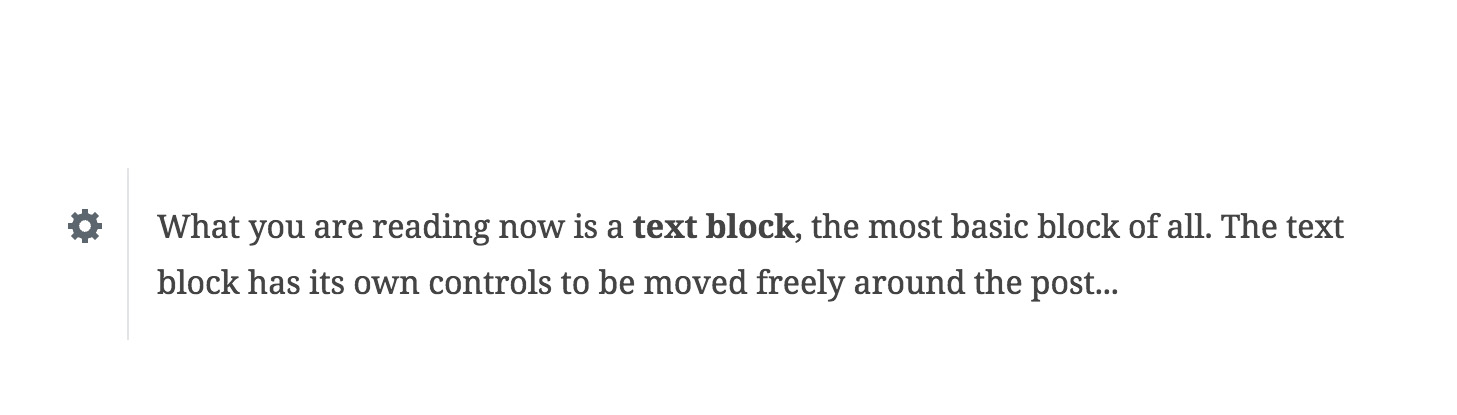
Here's a mockup that collapses the toolbar, and adds the trash and cog to it also:

Here's a before and after for text:


jasmussen
on 2 Aug 2017
Move sorting arrows to the block toolbar too ? You can have them as separate toolbar group with few pixels margin.
I wrote once here, padding at left for all blocks, and no padding at the right is bad visual solution.
Those 2 buttons at the right just made good visual balance.
I know you can solve it for all devices. because just this padding will give You about much enough place in toolbar.
Problem is sorting arrows needed hover over, toolbar needs click on block. (Arrows toolbar group showed on hover, other toolbar buttons on click ?) Do not know how it could be solved. Know only I dont like this ugly spacing at the left of all blocks.
Maybe to follow this logic:
- When blocks are hovered show only toolbar with sorting arrows, centered.
- When block is clicked you can assume User IS NOT interested for sorting, but editing. Hide sorting toolbar arrow, show normal toolbar.
 StaggerLeee
on 2 Aug 2017
StaggerLeee
on 2 Aug 2017
+1 to having this. I would caution though putting everything there. I am not convinced adding the sorting makes as much sense. My thinking is that isn't to do with the block itself as much as the placement within the document.
 karmatosed
on 2 Aug 2017
karmatosed
on 2 Aug 2017
Thanks for exploring. I don't like bundling things in the toolbar very much (I wish we could find another place for the block switcher) as it makes the toolbar feel heavier to me, and it's not clear the level of abstractions that the various item groups reside on. As mentioned in another issue, I'd like us to focus on improving the writing interactions first before trying to make larger changes to the UI of blocks, because I think a lot of the issues at the moment come from seeing _any_ UI when you would rather see none (because you are writing).
 mtias
on 2 Aug 2017
mtias
on 2 Aug 2017
See also discussion here: https://github.com/WordPress/gutenberg/pull/2155#issuecomment-320184196
Another option is to move the _cog_ to the quick toolbar, and leave the trash button where it is. I agree this is lower priority than the text interactions and milestones. But it feels like it would help solve a hierarchy issue: block position and state actions on the side (and available on hover), block _content_ options grouped in the quick toolbar.
jasmussen
on 4 Aug 2017
Great ideas @jasmussen. I did some similar explorations recently - I repurposed the cog icon to open the toolbar (and the block settings in the sidebar), that will keep a lot of the toolbar clutter behind a user decision. Then I attached the toolbar to the block itself and lifted both up a bit more as a whole.

The absence of the sorting arrows is part of a different UX thing I was trying, so ignore that.
 hedgefield
on 4 Oct 2017
hedgefield
on 4 Oct 2017
Thanks for the mockup, @hedgefield. This reminds me a lot of a UI that @iseulde tried also. In the end we didn't go with that, because so long as we treat the basic elements as individual blocks (p, ul, ol, h, etc) it seems like we should be careful in making the formatting controls harder to get to.
I agree that there are some issues in timing when these appear, how they appear, and where they appear. But it seems like at the very least you should be able to shift-select something and have them appear, without having to tab to a button to invoke it.
jasmussen
on 9 Oct 2017
That makes sense. I do agree the things you mention would make more of an impact than making it a user action. I've seen it mentioned a few times before, is there a dedicated place or person exploring the timing stuff somewhere?
It might go too far to make something like this an editor toggle, you know, offering people a choice of how they want it to behave, but it might be something we could investigate down the line, if we come across a feature that is problematic more for personal preferences than because we couldn't make sense of the UX for some reason.
For this, I like your last suggestion a lot. Like you say, it makes sense to separate state from content. So just the arrows and the trashcan outside the toolbar.
hedgefield
on 9 Oct 2017
There are a couple of PRs here with some discussion ongoing:
https://github.com/WordPress/gutenberg/pull/2884
https://github.com/WordPress/gutenberg/pull/2148
jasmussen
on 9 Oct 2017
This is done 🎉
jasmussen
on 19 Oct 2017
Related issues
 aaronjorbin
·
3Comments
aaronjorbin
·
3Comments
 spocke
·
3Comments
spocke
·
3Comments
 JohnPixle
·
3Comments
JohnPixle
·
3Comments
 maddisondesigns
·
3Comments
maddisondesigns
·
3Comments
 franz-josef-kaiser
·
3Comments
franz-josef-kaiser
·
3Comments
Most helpful comment
Here's a mockup that collapses the toolbar, and adds the trash and cog to it also:
Here's a before and after for text: