Gutenberg: Improve widescreen experience
On my 2K monitor the editing space occupies only 31% of the available screen width. tinyMCE uses 100%
See areas highlighted in pink on screenshot
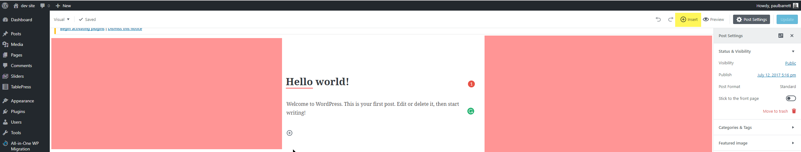
The 'Insert' link is out of focal point and out of peripheral vision way over on the right
Chrome Browser
 pb52
pb52
All 18 comments
While the existing post editor's UI extends the full width of the screen, the edited content does not (may depend on theme's $content_width).
May also relate to ideal line length research.
 aduth
on 13 Jul 2017
aduth
on 13 Jul 2017
The theme's content width is:
pb52
on 13 Jul 2017
And I think ideal line length is my choice.
pb52
on 13 Jul 2017
The theme's content width is: […]
$content_width is something else. It's a value in pixels set by the theme in the code. It's usually around 600-800px as anything higher is really hard to read (again, ideal line length).
 swissspidy
on 13 Jul 2017
swissspidy
on 13 Jul 2017
"It's usually around 600-800px as anything higher is really hard to read (again, ideal line length)."
But when you have 2 sidebars, that considerably reduces the body content width. And, as I said before, if I choose to use a widescreen monitor then that is my choice. I am perfectly happy with a display such as:
And I also consume my content on a tablet and a smartphone. My chosen theme is responsive to all those devices. Why should I be limited on the editor? I have been editing in full width on the wide screen ever since I started using WordPress and the width of the text has never been an issue for me.
I can see the benefit in having the editor reflect the same width as the body content of the theme but to squeeze me into a highly constrained box in the middle doesn't work for me. Does the Theme's author have to change the theme to suit Gutenberg? I hope not or there will be a lot of unhappy theme owners and users.
But as long as Gutenberg isn't imposed as core functionality and tinyMCE remains available as a plugin I won't have an issue. I haven't found anything in Gutenberg that's of interest to me. The new UI is a hindrance, not a help because it increases the clicks required to achieve tasks and forces the user to stop and think where things have been hidden.
pb52
on 13 Jul 2017
It's true that the current editor takes its max-width from the theme (mostly by lack of tinymce setting a width, which means it uses the width from the theme's body property), but in gutenberg this has not been added yet, as far as I can see. The editor is set to a static pixel width by the developers, probably indeed based on ideal line length research.
max-width: $visual-editor-max-width + ( 2 * $block-mover-padding-visible );
It would be nice to make this optional at least (or indeed make it depend on the theme's setting again).
 hedgefield
on 20 Jul 2017
hedgefield
on 20 Jul 2017
Yes that would help. But unless there's an option to unhide everything that's useful, Gutenberg will never be for me. It is a dreadful UI / UX. I just hop it is not imposed as core product and that tincyMCE Advanced remains an option. It has a few issues and it would have been better to fix those rather than reinventing the wheel and making it square.
pb52
on 20 Jul 2017
In https://github.com/WordPress/gutenberg/issues/2045 there is more discussion about this. Closing that to merge to this older ticket.
 karmatosed
on 27 Jul 2017
karmatosed
on 27 Jul 2017
@melchoyce reported this from the forums:
From: https://wordpress.org/support/topic/dreadful-awful-unusable/
Responsiveness has been totally ignored. I use a wide screen monitor. The current editor used the full-screen width. The new one uses a very narrow editing column in the centre of the screen and presents me with blank areas to both sides. Of the available screen width that the editing space could fill, Gutenberg uses 30.8% That’s less than a third of what’s available. tinyMCE uses 100%
Meanwhile the “Insert” link (pretty important when you’re editing) is placed miles away in the top right corner, out of my focal point, beyond my peripheral vision.
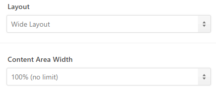
Maybe we could consider a max-width on the content area on wide screens. Worth playing around with a couple different ideas to improve this experience.
karmatosed
on 27 Jul 2017
Quote above comes from the OP of this issue ;)
I think targeting something adjacent to ideal line length is good as the default. Many people will probably not think so deeply about this, so we should make the decision for them based on what the research shows is the most comfortable. But there should be a way to extend this for people who want to. Personally I prefer something around 960px - which I believe is also the breakpoint at which Wordpress switches to tablet view.
A few ideas to start:
Youtube has a dedicated button that extends the video to cover the entire body width (separate from the fullscreen button). It makes sense more for video than for text, but it could be a nice toggle. Something like this exists in the current editor, but not in gutenberg.
Ommwriter shows a fullscreen writing environment, and within that floats the text field. This area can be resized at will with the anchors on the sides of the text field. We could perhaps do something similar, by placing a grabbable control next to the text area, by which you can stretch it to your desired width. This should only appear on the desktop when enough empty space appears around the text column.
hedgefield
on 27 Jul 2017
It would be easy to add a setting at the document level for changing the main content length. Also it is expected themes can inform the default, probably through the work being done in https://github.com/WordPress/gutenberg/pull/2021
 mtias
on 27 Jul 2017
mtias
on 27 Jul 2017
As long as it's a set once and forget option, that's fine. But I don't
want to have to reset this every time I go in. The problem, it seems to
me, that 'responsive' seems to be applied at the bottom end of the scale
range but not the top. Yet something like 35% of the monitors being bought
today are > 25 inches.
Paul (The OP)
On 27 July 2017 at 12:44, Matias Ventura notifications@github.com wrote:
It would be easy to add a setting at the document level for changing the
main content length. Also it is expected themes can inform the default,
probably through the work being done in #2021
https://github.com/WordPress/gutenberg/pull/2021—
You are receiving this because you authored the thread.
Reply to this email directly, view it on GitHub
https://github.com/WordPress/gutenberg/issues/1887#issuecomment-318338642,
or mute the thread
https://github.com/notifications/unsubscribe-auth/Acwk15NztfWdEK6FSITeiL-ybMXsoUpbks5sSHgJgaJpZM4OXTLT
.
pb52
on 27 Jul 2017
As long as it's a set once and forget option, that's fine.
Of course.
The problem, it seems to me, that 'responsive' seems to be applied at the bottom end of the scale range but not the top.
That's not true. Many of us are working on large monitors. It's just that—design wise—the preference has been set for what is generally considered to be a readable line length. Some people, like yourself, may have different preferences, and that's ok. The above are a few ways to offer that, but it's not a general disregard for large viewports.
mtias
on 27 Jul 2017
OK, I get that now.
What about my other issues? Is there going to be an option to have all the
edit options visible at all times instead of disappearing when you are not
doing a mouse-over? I don't mind menus being context sensitive but I do
want to see them please
Paul
On 27 July 2017 at 14:20, Matias Ventura notifications@github.com wrote:
As long as it's a set once and forget option, that's fine.
Of course.
The problem, it seems to me, that 'responsive' seems to be applied at the
bottom end of the scale range but not the top.That's not true. Many of us are working on large monitors. It's just
that—design wise—the preference has been set for what is generally
considered to be a readable line length. Some people, like yourself, may
have different preferences, and that's ok. The above are a few ways to
offer that, but it's not a general disregard for large viewports.—
You are receiving this because you authored the thread.
Reply to this email directly, view it on GitHub
https://github.com/WordPress/gutenberg/issues/1887#issuecomment-318359605,
or mute the thread
https://github.com/notifications/unsubscribe-auth/Acwk19SKwyY3BDonkIGbIIjecQ3RFSZYks5sSI6GgaJpZM4OXTLT
.
pb52
on 27 Jul 2017
Sorry, I must have missed that. Which ones are you referring to that appear / disappear on mouse moves?
mtias
on 27 Jul 2017
Would it help if the top menu (From the visual/text switcher to publish) had a max-width, maybe between 1400–1600px?
 melchoyce
on 27 Jul 2017
melchoyce
on 27 Jul 2017
Around the top of the edit box there are hidden editing functions that only
appear on mouse over
On 27 July 2017 at 14:56, Matias Ventura notifications@github.com wrote:
Sorry, I must have missed that. Which ones are you referring to that
appear / disappear on mouse moves?—
You are receiving this because you authored the thread.
Reply to this email directly, view it on GitHub
https://github.com/WordPress/gutenberg/issues/1887#issuecomment-318369503,
or mute the thread
https://github.com/notifications/unsubscribe-auth/Acwk12ZgDJVPnpRtzbYyq1MWK42LJJCZks5sSJbzgaJpZM4OXTLT
.
pb52
on 27 Jul 2017
Given changes to the top-bar since July, as well as the option to fix the toolbar to the top of the screen, I feel like this issue is largely addressed, and going to close it as such.
If there are still sub-optimal issues on wide screens, it's perfectly fine to open separate specific tickets for those.
 jasmussen
on 5 Dec 2017
jasmussen
on 5 Dec 2017
Related issues
 wpalchemist
·
3Comments
wpalchemist
·
3Comments
 moorscode
·
3Comments
moorscode
·
3Comments
 cr101
·
3Comments
jasmussen
·
3Comments
cr101
·
3Comments
jasmussen
·
3Comments
 JohnPixle
·
3Comments
JohnPixle
·
3Comments
Most helpful comment
It would be easy to add a setting at the document level for changing the main content length. Also it is expected themes can inform the default, probably through the work being done in https://github.com/WordPress/gutenberg/pull/2021