Gutenberg: Improve range slider design
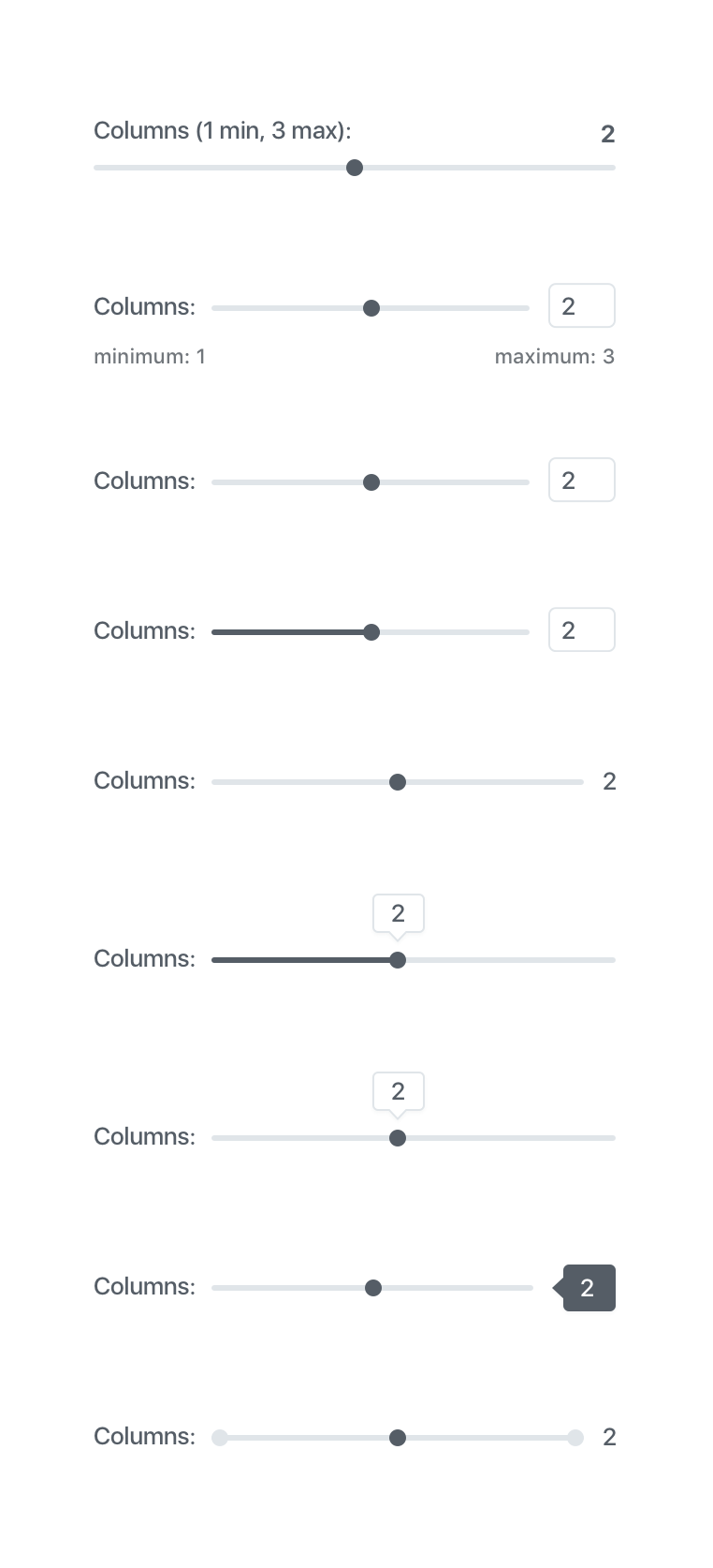
Chatted a little bit with @jasmussen earlier today about the range slider currently in the Gallery block. It's currently using browser defaults. We discussed introducing a custom design to help improve the overall clarity of the column feature. Here's a bunch of ideas:
cc @afercia to make sure whatever we design and build is accessible :)
 melchoyce
All 15 comments
Nice work! Definitely some great improvements here!
Here is my completely scientific feedback on each ;)

 jwold
on 28 Jun 2017
jwold
on 28 Jun 2017
Beautiful sliders! Another thought might be to not display the slider until the user focuses into the value field. This could be helpful when the value needs more description text or a unit value displayed beside it.
 brentjett
on 28 Jun 2017
brentjett
on 28 Jun 2017
Thanks @melchoyce !
Keeping it native (with some CSS improvements) would be the best option for a11y. To maximize interoperability it could be interesting to explore making the blocks-range-control__hint a styled input field, so users can also directly type the number there.
Modern screen readers work pretty well with native range inputs, not sure about speech recognition software /cc @grahamarmfield
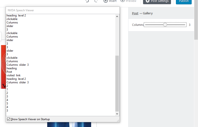
About styling, please don't forget it needs a focus style 🙂 it could be the platform native one (meaning: don't use outline: 0) or a custom one. Screenshot taken on windows Firefox + NVDA
 afercia
on 28 Jun 2017
afercia
on 28 Jun 2017
Really love the work ongoing here. From everyone. Thanks Mel, Joshua, Brent and Andrea. 🌟🌟🌟🌟🌟 work.
 jasmussen
on 28 Jun 2017
jasmussen
on 28 Jun 2017
Hi there,
I'd like to add two points:
Firstly, the last time I tried (a few months ago) the native slider control
didn't work with mobile screen readers - Voiceover and/or Talkback I can't
remember which. The situation may be better now but that needs to be tested
- assuming that Gutenberg is intended for use on smartphones and tablets.
A project I worked on for a client recently wanted to use a native slider.
After our findings, they also provided a text box as an alternative for
mobile screen readers.
Secondly, Dragon NaturallySpeaking does have support for drag and drop, so
in theory it should work. But once again it would need to be tested.
I'm a bit maxxed on client work at the moment but I will try to get some
time to have a look.
In what situations is the slider used?
Regards
Graham Armfield
On 28 Jun 2017 08:29, "Andrea Fercia" notifications@github.com wrote:
Thanks @melchoyce https://github.com/melchoyce !
Keeping it native (with some CSS improvements) would be the best option
for a11y. To maximize interoperability it could be interesting to explore
making the blocks-range-control__hint a styled input field, so users can
also directly type the number there.
Modern screen readers work pretty well with native range inputs
https://make.wordpress.org/accessibility/2017/02/13/testing-html5-type-attributes-in-forms-with-different-browsers-and-at/,
not sure about speech recognition software /cc @grahamarmfield
https://github.com/grahamarmfieldAbout styling, please don't forget it needs a focus style 🙂 it could be
the platform native one (meaning: don't use outline: 0) or a custom one.
Screenshot taken on windows Firefox + NVDA[image: screenshot 115]
https://user-images.githubusercontent.com/1682452/27625229-2db56b9c-5be4-11e7-835b-81dd2dd31182.png—
You are receiving this because you were mentioned.
Reply to this email directly, view it on GitHub
https://github.com/WordPress/gutenberg/issues/1523#issuecomment-311580057,
or mute the thread
https://github.com/notifications/unsubscribe-auth/ACclgSWiXilJVc-eTQsvOMClj9mWLhAjks5sIgDRgaJpZM4OHQqL
.
 grahamarmfield
on 28 Jun 2017
grahamarmfield
on 28 Jun 2017
In what situations is the slider used?
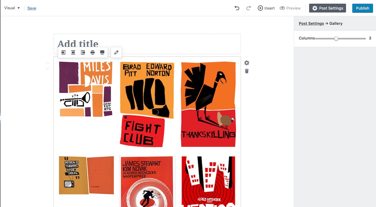
Just add an image gallery in the post and the right sidebar will show the range input to set the number of columns:
afercia
on 28 Jun 2017
Though Mel's slider looks great, would Brent's suggestion help address things in case the slider itself still isn't accessible? https://github.com/WordPress/gutenberg/issues/1523#issuecomment-311509532
jasmussen
on 28 Jun 2017
I'd display both at the same time: range and input field: no surprises and maybe also easier?
afercia
on 28 Jun 2017
Questions about focus: should there be a focus on the whole element, as well as on the toggle? Or could we just add a focus to the toggle itself, if that's possible?
melchoyce
on 28 Jun 2017
@melchoyce I think users just need to clearly see that something has focus and so that it's actionable. Whether it's the whole "track" or the "thumb" (or whatever it's called :) ) could work.
afercia
on 28 Jun 2017
Edit Media Modal does not reflect number of columns, It is allways on default 3.
 StaggerLeee
on 28 Jun 2017
StaggerLeee
on 28 Jun 2017
Do we feel okay moving forward with this for now, and enhancing as necessary?

melchoyce
on 29 Jun 2017
Yes, that sounds good.
 mtias
on 29 Jun 2017
mtias
on 29 Jun 2017
Do we feel okay moving forward with this for now, and enhancing as necessary?
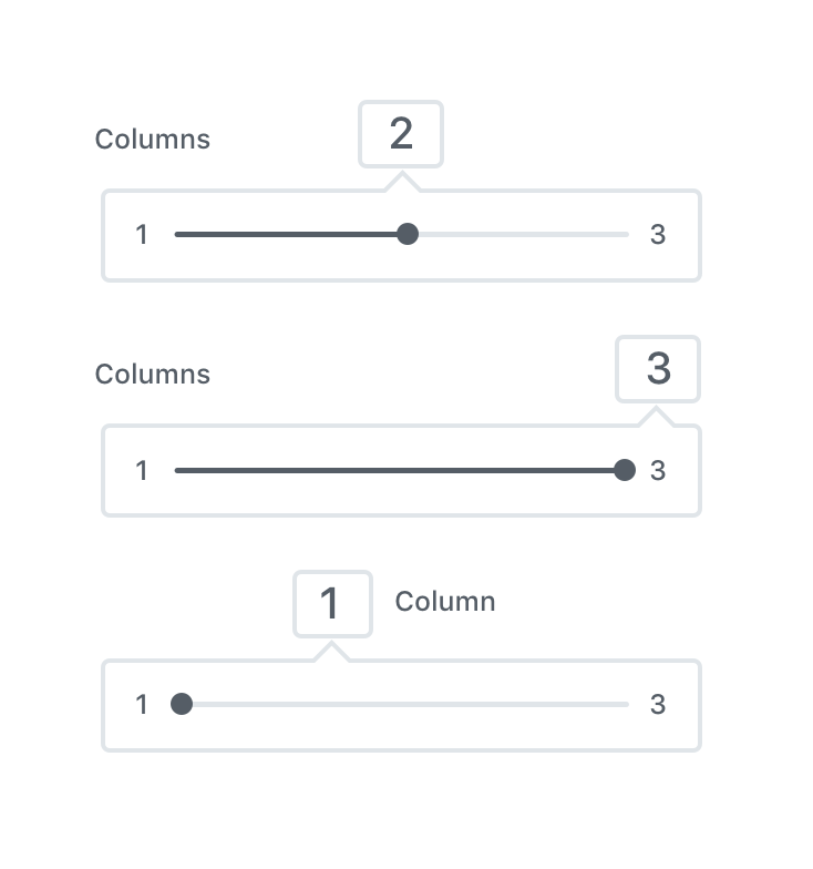
That is exactly the one I would have preferred from the various mocks for clarity and ability to type. 👍
 folletto
on 3 Jul 2017
folletto
on 3 Jul 2017
Do we feel okay moving forward with this for now, and enhancing as necessary?
Yes! Great choice I feel.
jwold
on 3 Jul 2017
Related issues
 aaronjorbin
·
3Comments
jasmussen
·
3Comments
aaronjorbin
·
3Comments
jasmussen
·
3Comments
 spocke
·
3Comments
spocke
·
3Comments
 aduth
·
3Comments
jasmussen
·
3Comments
aduth
·
3Comments
jasmussen
·
3Comments
Most helpful comment
Do we feel okay moving forward with this for now, and enhancing as necessary?