Similar to: #1799, #1800, #1801
PRs where similar blocks are developed: #7966, #7875, #4501
Attributes
- None, Left, Right, Center, Full Width?
- Display full-width
States
Selected:


Neutral (Full-Width):

Questions:
- Should we include alignment?
- If yes, should alignment be a default setting in the Block Level Formatting bar?
- Are there any other settings that should be included?
Related to #1011.
 melchoyce
All 21 comments
This seems like it would be more useful with a way to specify a list of events. A few possible ways that data could be specified:
- Filter by post type, tag, category, etc.
- Manual entry
- Google calendar import
- ICS file import
 nylen
on 27 Jun 2017
nylen
on 27 Jun 2017
@nylen To clarify, this is a conversion of the Calendar widget, which is a calendar of your posts.
melchoyce
on 27 Jun 2017
@nylen most use cases I can think about requires support for at least CPT.
 marsjaninzmarsa
on 30 Jun 2017
marsjaninzmarsa
on 30 Jun 2017
Should we include alignment?
If we support it not being full width, I think supporting alignment makes sense. The two go hand in hand for me.
I'd also ask if we should make "full width" the default.
If yes, should alignment be a default setting in the Block Level Formatting bar?
Only if "full width" does.
Are there any other settings that should be included?
Some come to my mind, but I don't think they make sense for the first version. Mentioning still as might be useful for the discussion:
- Show a specific Month / Year
- Show only a specific Category
- Show only a specific Tag
- Show only a specific Post / Custom Post Type (as suggested by @marsjaninzmarsa)
- _{{ Show only future posts (this is unsupported in WordPress, as future posts are automatically Scheduled instead of posted, but seems something that could build up to a nice way to feature future events for event sites) }}_
Also given the discussion right above, I might suggest to change "Calendar" to "Posts Calendar" or something more specific?
Which leads me to another consideration: is the "Calendar" just an alternative view of the Posts List Archive (#1464)?
 folletto
on 3 Jul 2017
folletto
on 3 Jul 2017
I believe this depends on having an endpoint for server-side rendering: #780
 westonruter
on 12 Jul 2017
westonruter
on 12 Jul 2017
I think changing to 'Posts Calendar' makes sense. I've marked this as needing to get dev as I think it's ready for someone to dip in.
 karmatosed
on 4 Sep 2017
karmatosed
on 4 Sep 2017
As the project moves towards merge proposal, we are moving issues that aren't needed for that to projects. This doesn't mean they won't get done, they totally can and that's why we're moving to projects. This allows us to focus on the issues that have to happen to Gutenberg. I am closing this but it will live in projects.
karmatosed
on 7 Nov 2017
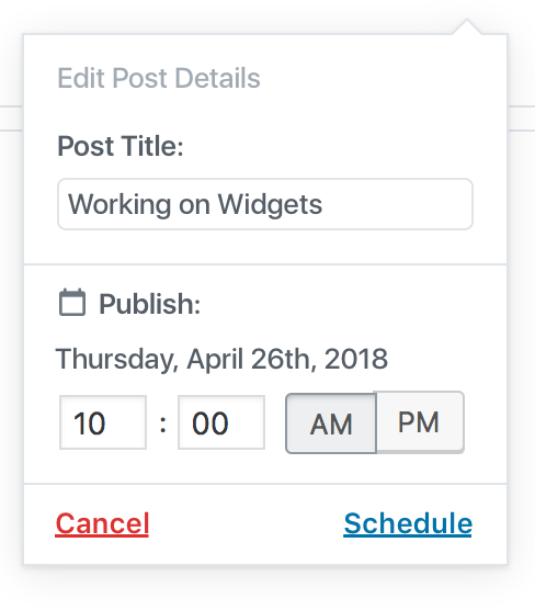
Took a step back and rethought what a calendar block could look like if we started from scratch.
I focused on exploring the “what if’s” — what if you could schedule drafts from the Calendar block? What if you could reschedule posts?
You can view what I have here: https://cloudup.com/c3HqgFiImw5
Or walk through it in this prototype: https://wp.invisionapp.com/share/VHHNY6CQZGS#/screens
cc @mtias @karmatosed
melchoyce
on 27 Apr 2018
Worth reminding the date picker (see the "Calendar Popover Scheduled Edit DateTime" on cloudup) is not accessible and needs to be replaced by a more accessible solution. See #1311.
The multi-step "fly-out" are tricky to be made accessible but they can probably be treated as modals, correctly handling focus when moving from one step to the following step.
As per the content structure, it's important to take into consideration how the content will be perceived when linearized (that's the typical experience for keyboard users and assistive technology users):
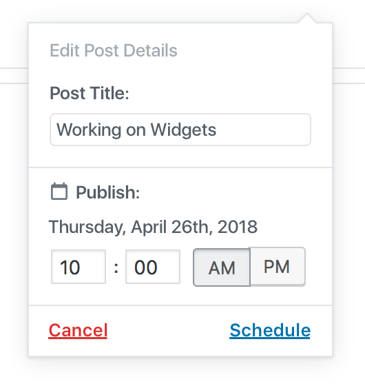
Ideally the available actions, in this case "Cancel" and "Select" should be placed _after_ the content, otherwise users would be forced to navigate backwards to operate on them.
 afercia
on 27 Apr 2018
afercia
on 27 Apr 2018
Thanks for your feedback, @afercia! We should definitely use whatever accessible calendar solution comes from #1311.
Ideally the available actions, in this case "Cancel" and "Select" should be placed after the content, otherwise users would be forced to navigate backwards to operate on them.
In this instance, do you think it's okay for the actions to visually appear at the top of the modal, as long as they're located correctly within the source order of the page?
melchoyce
on 27 Apr 2018
Thanks for your reply @melchoyce. FWIW I think your design is very elegant.
Re: ordering, another important a11y rule is that visual order should match the DOM order. Some references:
See also a couple related recommended techniques:
- C27: Making the DOM order match the visual order
- G59: Placing the interactive elements in an order that follows sequences and relationships within the content
For clarity, the mismatch between visual and DOM order is considered non-conformant "when it affects meaning and operability" so the WCAG implicitly admit there may be cases where the mismatch is acceptable. However, in this case I'd say it does affect meaning.
Couple examples. As a screen reader user, I'd like to know where I am in the first place and what a specific "fly-out" is about as soon as I land on it. As a screen magnifier user, I see only a small portion of the page at a time, especially at a high level of magnification; when I'm operating in a "fly-out", especially if it's tall, I'd like to find the available actions where I'd expect them to be: _after_ I've set my options or filled out a form.
So, from an accessibility perspective, ideally the "fly-out" should tell users "what" it's about as first thing.
In some cases it does, for example:
- "Published" (a state)
- "Add a Post" (name of the task)
In other cases, it doesn't: - "Cancel" | "Schedule"
In other cases it's a mix of the twos: - "Scheduled" | "Edit"

So I'd suggest to consider to always put a "title" at the top. This would be even more important when the "fly-outs" are part of a multi-step wizard.
afercia
on 28 Apr 2018
Looking at standardizing these popups:

melchoyce
on 30 Apr 2018
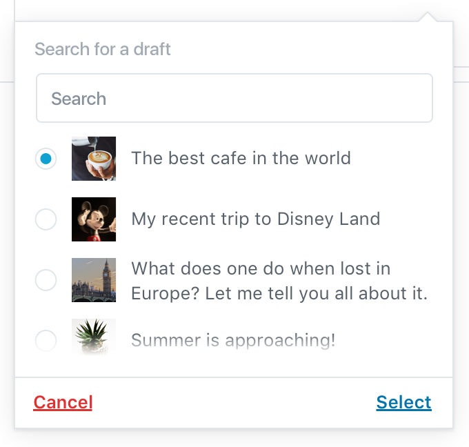
Prototype updated: https://wp.invisionapp.com/share/VSHRRSCX47E#/293882456_Calendar-_Neutral
melchoyce
on 30 Apr 2018
Could this blocks be called "Post Calendar", to avoid confusion?
 ellatrix
on 14 Jan 2019
ellatrix
on 14 Jan 2019
@melchoyce, I have just checked the prototype you shared a long time ago. It looks quite complex for the first iteration. What would be the minimal version of Calendar of Posts? Should it be possible to switch between months or should we only render the current month?
 gziolo
on 28 Jan 2019
gziolo
on 28 Jan 2019
I have quickly enabled Calendar on my own website. This is what I see on the frontend:

Some observations:
- it renders the current months by default with a link to the previous month with a post published
- if I browser the post it sets the month for the calendar to align with the post, the same applies to archives
- it links months to archive pages for months
- it links days to archive pages for days
gziolo
on 28 Jan 2019
The v1 should more closely match the initial mockup, which is a 1:1 port of the existing calendar widget. Visually, I figured we could reuse the styles for the datepicker component.
melchoyce
on 28 Jan 2019
Adding the Accessibility label in addition to the "needs..." one so the team can search for all the widget-blocks related issue in an easier way.
afercia
on 30 Jan 2019
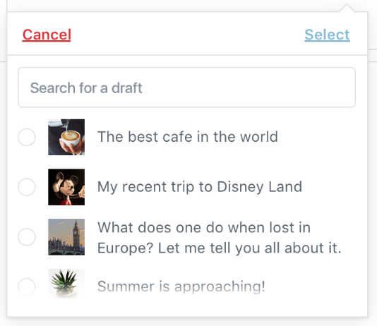
For clarity, here's what v1 should look like:

melchoyce
on 4 Feb 2019
@melchoyce I'm guessing you will want to open a new issue with some refinements planned for the future, right? :)
gziolo
on 14 Feb 2019
Yes, will do 👍
melchoyce
on 14 Feb 2019
Related issues
 aduth
·
3Comments
aduth
·
3Comments
 aaronjorbin
·
3Comments
aaronjorbin
·
3Comments
 maddisondesigns
·
3Comments
maddisondesigns
·
3Comments
 youknowriad
·
3Comments
youknowriad
·
3Comments
 JohnPixle
·
3Comments
JohnPixle
·
3Comments
Most helpful comment
For clarity, here's what v1 should look like: