Gutenberg: Space between sections in toolbar
Hey
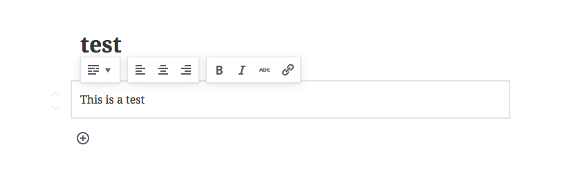
I just want to bring this up.... It is nid picking, but I feel that there is too much space between the sections in the toolbar.
Default right now:
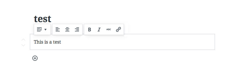
Here is an adjustment:
 paaljoachim
All 4 comments
Nice consideration to the details but I don't think that could be a valid reasoning. To keep the visual hierarchy, the space between toolbar sections should be bigger than the items inside each one.
 georgeolaru
on 16 Jun 2017
georgeolaru
on 16 Jun 2017
I've been thinking about this for a while, because it feels very sensible. But it also felt slightly wrong for me, and @georgeolaru helped clarify for me why that is.
Already now, when you move to the mobile breakpoint, the space between is minimized. But I lean towards using the available space to relax the toolbars when we can. That is, the larger space between them, I think, can help separate things visually.
 jasmussen
on 16 Jun 2017
jasmussen
on 16 Jun 2017
Some good valid points!
The main reason for me was space can connect and also create disconnection if there is too much space. The point of having a bigger space between the sections then between individual items is a valid point, and so the responsive design issue.
paaljoachim
on 16 Jun 2017
One of the key reasons for actually separating the buttons with spacing was to convey the difference each group had on the block itself, where in the past it's all been kind of mixed together.
The switcher on the left provides content transformations. The alignment controls apply to the _whole block_, and picking one button here unsets the others. The inline controls are more oldschool in nature.
Closing for now, but it's a good ticket to have in the archive so we can surface and / or reference this discussion in the future if need be.
jasmussen
on 17 Jun 2017
Related issues
 maddisondesigns
·
3Comments
maddisondesigns
·
3Comments
 aaronjorbin
·
3Comments
jasmussen
·
3Comments
aaronjorbin
·
3Comments
jasmussen
·
3Comments
 nylen
·
3Comments
jasmussen
·
3Comments
nylen
·
3Comments
jasmussen
·
3Comments
Most helpful comment
Some good valid points!
The main reason for me was space can connect and also create disconnection if there is too much space. The point of having a bigger space between the sections then between individual items is a valid point, and so the responsive design issue.