Gutenberg: Links: Search your old posts and pages in the input field
The old editor lets you search the link input field for old posts and pages you wrote. We should try and port this:

 jasmussen
All 16 comments
When the ability to add links is fixed, can you also ensure that the link boundaries work, as per the changes that were added with WP4.8. Those recent updates to the link boundaries make editing links (and the surrounding text) so much easier. Thanks.
 maddisondesigns
on 20 Jun 2017
maddisondesigns
on 20 Jun 2017
When the ability to add links is fixed, can you also ensure that the link boundaries work, as per the changes that were added with WP4.8. Those recent updates to the link boundaries make editing links (and the surrounding text) so much easier. Thanks.
This is already working. There's an issue where if the link is empty (i.e. <a></a>), the boundaries do not show up.
jasmussen
on 20 Jun 2017
@jasmussen Do you think we should put the link UI in the main toolbar, or leave it inline? Other than that, should we keep the exact some layout as core has now?
 ellatrix
on 26 Jun 2017
ellatrix
on 26 Jun 2017
I'm not super sold on adding even more UI inline. On mobile I'm not even sure where to add it because there's only half a screen of space. Maybe the inspector makes more sense in the form of "Post Settings → Text → Link" and in that same space we can have more advanced link settings.
ellatrix
on 26 Jun 2017
I'm cool with trying the inspector for this—agreed the inline UI can get unwieldy at time. The problem is discoverability for this one.
 mtias
on 26 Jun 2017
mtias
on 26 Jun 2017
I honestly think Google Docs is the gold standard for how this is handled:
But that should not be the enemy of shipping this feature in a way that is less complicated.
To put it differently, we should probably do what is easiest first, and then we can iterate if need be.
jasmussen
on 27 Jun 2017
I would suggest doing the link UI the same, or similar, to how it's done currently done in TinyMCE since people are familiar with it. It's also very similar to that Google example just above
maddisondesigns
on 27 Jun 2017
Well, I know I'm kind of arguing against my past self. :) In the current context, it does seem like a lot, and the searching does seem to be a more advanced feature (the basic feature being add and remove the URL). Additionally the inspector provides a lot more space to list many other things next to local posts, like linking heading anchors, results from google...
To be honest, even in Google Docs that starts being a bit much, having panels and toggles inside panels inline:
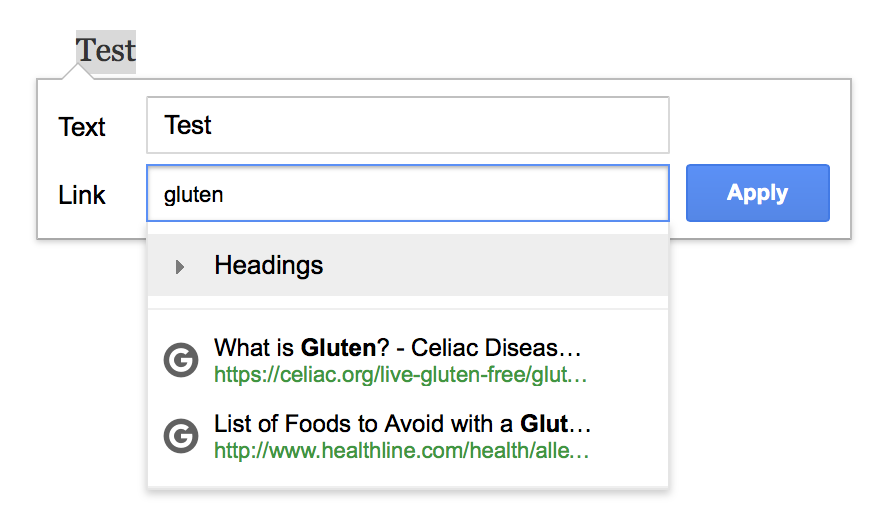
They also have something like this:
ellatrix
on 27 Jun 2017
I'm a big fan of the inspector, don't get me wrong. It scales to mobile, and it's a great way to have a big canvas for advanced features without weighing down the basic features.
However this makes it all the more important that we think very carefully about what we put there. Because anything we put there won't be _immediately visible_ to mobile users, or users who dismiss post settings.
In this case, I think the UI, although it looks heavy, should be thought of in the same category as the slack / command, or text auto complete — it really exists best when inline with the text.
jasmussen
on 27 Jun 2017
Could a compromise be that when you are interacting with a link input field, the other elements (format toolbar, alignment) fade away as if you were in editing mode?
mtias
on 27 Jun 2017
That was the idea behind
Do you think we should put the link UI in the main toolbar, or leave it inline?
We when you click the link button, the input field could expand over the whole toolbar area, because you don't really need all that while adding a link.
ellatrix
on 27 Jun 2017
Or at least the other formatting button, it should also work for captions etc.
ellatrix
on 27 Jun 2017
Could a compromise be that when you are interacting with a link input field, the other elements (format toolbar, alignment) fade away as if you were in editing mode?
I think it's worth exploring.
Edit: and I apologize if in the past I was a blocker on this. I make many mistakes ;)
jasmussen
on 28 Jun 2017
Added the Accessibility label because if this is going to be implemented "inline" it should be done as a combobox, like in the current editor and in the Gutenberg tags suggestions.
 afercia
on 12 Jul 2017
afercia
on 12 Jul 2017
Please add one new filter to disable this when wanted.
With TinyMce it had to be done with javascript, or CSS, dont remember. And it was not easy at all.
It is needed often when you want to make life easy for comments and bbPress Users, but do not want them to see this list of all Posts. Or by searched keyword, but it is the same.
 StaggerLeee
on 14 Jul 2017
StaggerLeee
on 14 Jul 2017
I see now this was merged (#1985) even if it has the accessibility label and no accessibility was addressed at all. See previous comment.
In its current implementation, this is an a11y regression compared to how the links suggestion currently works in WordPress. Will open a new issue...
afercia
on 29 Jul 2017
Related issues
 youknowriad
·
3Comments
youknowriad
·
3Comments
 nylen
·
3Comments
nylen
·
3Comments
 cr101
·
3Comments
cr101
·
3Comments
 davidsword
·
3Comments
jasmussen
·
3Comments
davidsword
·
3Comments
jasmussen
·
3Comments