Gutenberg-mobile: Tapping on an empty editor area
When you have little content and tap on an empty area below it, some people might expect something to happen, like adding more text. Let's discuss here what should happen.
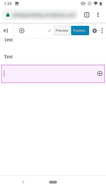
@iamthomasbishop suggested adding a limited area below the last block where you can tap:

@hypest suggested adding some UI to it to make it discoverable, like the web has on hover:
I think it'd be also interesting to explore how the perception changes when we implement view/edit modes in #204
 koke
koke
All 12 comments
@hypest suggested adding some UI to it to make it discoverable, like the web has on hover:
A note: that UI isn't shown on small screens Guten-web. I'm not sure if they're completely removing the ghost block completely or if that's a bug.
It seems to be expected behavior to be able to tap the empty space below content to add a new line in most editors, so I wouldn't stress too much about discoverability – at least until we know for sure if it's going to be an issue.
My mocks above show the ghost block up a little on the canvas, but I think if we do add this empty block (which I'm calling a "ghost block" 👻), we can make that the end of the canvas so that the ghost block is flush to the bottom edge of the visible canvas. So for all intents and purposes, tapping any of the visible whitespace below the last _visible_ block will achieve the original goal.
 iamthomasbishop
on 12 Dec 2018
iamthomasbishop
on 12 Dec 2018
Side note on @hypest's comment: There _is_ a minimal version of that example @hypest gave on mobile web, but only on "hover" (which means it didn't show until second tap) on a newly-created empty block, which kinda defeats the purpose here. Here's what it looks like:
iamthomasbishop
on 12 Dec 2018
Just to add clarity, on the native mobile editor the "on hover" action doesn't make much sense so, the idea was to have the "ghost block" always shown at the end of the post, always available to tap into.
 hypest
on 29 Mar 2019
hypest
on 29 Mar 2019
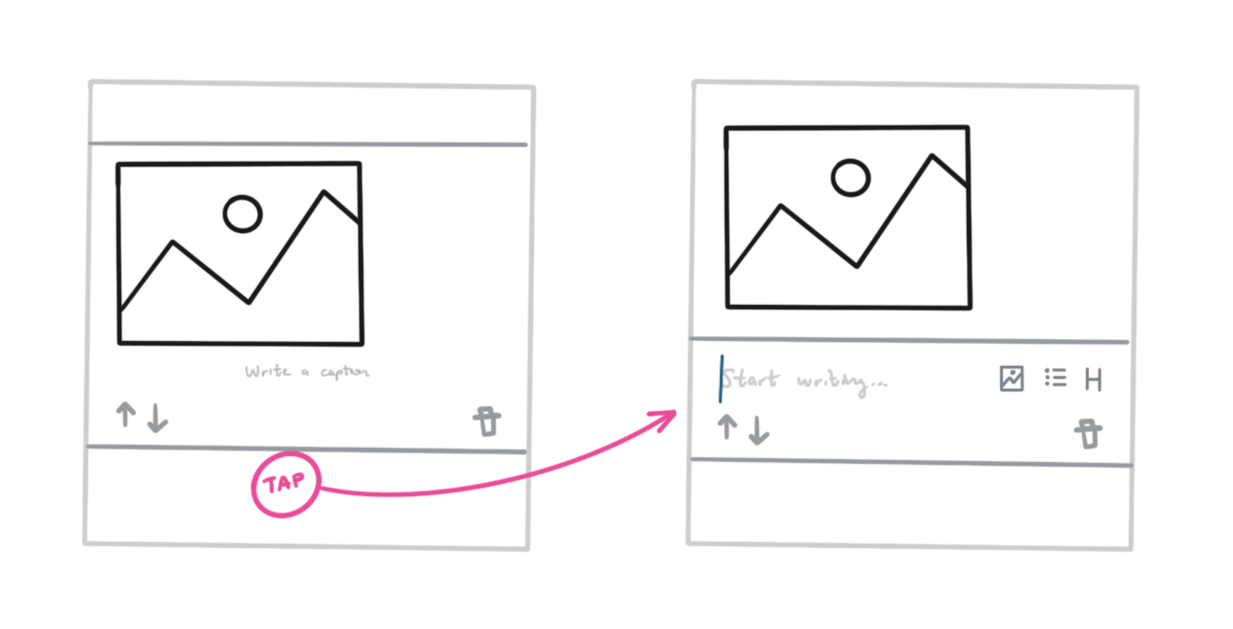
I keep coming back to this issue, mostly after I've added an Image block. Usually after I've added an Image block the writing flow is essentially blocked unless I tap the inserter. This same issue concept applies to other media blocks, page break, more, separator, etc etc. Another sketch from the other day:
iamthomasbishop
on 21 May 2019
I wish we would bump up the priority of this ticket or similar.
As a example of how I stumbled on this again, I recently noticed that even though sharing a photo from the photo app into the editor is quite streamlined, trying to add a simple text below the image has friction since I need to tap on the Inserter first, locate the Paragraph block and tap it to insert it. I'd gladly tap on a "placeholder" at the end of the post and quickly start writing in it instead.
hypest
on 24 May 2019
I agree, I've encountered this a few times while testing, and it's quite frustrating. It's back on the project.
koke
on 24 May 2019
What about just having a (+) kind of inserter block always on the end of the content?
 SergioEstevao
on 30 May 2019
SergioEstevao
on 30 May 2019
That’s been explored a bit, but the rationale is that we want to have one consistent and clear entry point (the blue (+) button in the toolbar) for the inserter to limit confusion. If we decide to add anything at the end of the canvas, I’d want to explore some alternatives.
Tbh, I’m not sure if it’ll even be a problem if/when we implement this ghost block behavior, since it seems that a bunch of folks have stumbled onto the same expectation of tapping at the end of the canvas. It’s a very subtle thing but it seems to be an expected behavior.
iamthomasbishop
on 30 May 2019
Can we do something super minimal here, like reusing the placeholder we have when starting a new post but have it say "Tap to write here"?
That said, I think we should at least implement the "tap in the empty/invisible area" shown in Thomas' comment above and iterate on it.
hypest
on 27 Jun 2019
IMO, it would be really weird to have a stray "tap to write here" or similar – at that point we might as well put a (+) icon there, but I want to avoid doing that for the reasons mentioned earlier.
The more I use the editor, the more strongly I feel about an "invisible tap area" at the end of the canvas being the intuitive solution because I find myself (and have seen others using the editor do the same) intuitively tapping on that area to add more content – like most content editing applications.
This also solves the other issue that I have in that there isn't any whitespace at the end of the canvas.
iamthomasbishop
on 27 Jun 2019
I'll add that I find myself often tapping on that empty space expecting to add more text, I think it'd just feel natural to append add a touchable section at the bottom of the list, even if it's blank
koke
on 1 Jul 2019
Implemented (tapping on empty area) with #1200.
hypest
on 22 Jul 2019
Related issues
 maxme
·
3Comments
maxme
·
3Comments
 designsimply
·
3Comments
designsimply
·
3Comments
 etoledom
·
4Comments
etoledom
·
4Comments
 mzorz
·
3Comments
mzorz
·
3Comments
 wptester9845
·
4Comments
wptester9845
·
4Comments
Most helpful comment
I agree, I've encountered this a few times while testing, and it's quite frustrating. It's back on the project.