Gutenberg-mobile: Make heading styling distinguishable from paragraph
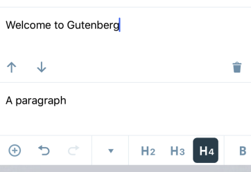
Currently, the h4 setting for a heading makes it look too close to the styling of the normal paragraph block
Let's update it to be more distinguishable.
 hypest
All 7 comments
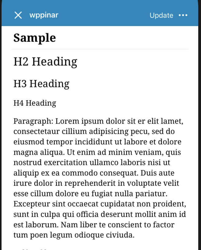
@iamthomasbishop What's your opinion on this? I am also attaching some screenshots to demonstrate heading heights.
Here's the corresponding font sizes on iOS side:
.h1: 36,//not available on Gutenberg
.h2: 24,
.h3: 21,
.h4: 16,
.h5: 14,//not available on Gutenberg
.h6: 11,//not available on Gutenberg
Aztec editor:
Gutenberg editor:
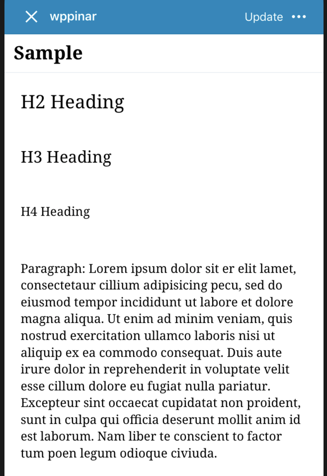
Both Aztec and Gutenberg use the same font size values in the background so the change will affect Aztec editor also.
I am not very clear about what kind of change can be made to make it more distinguishable from Paragraph block so any help will be appreciated.
 pinarol
on 22 Jan 2019
pinarol
on 22 Jan 2019
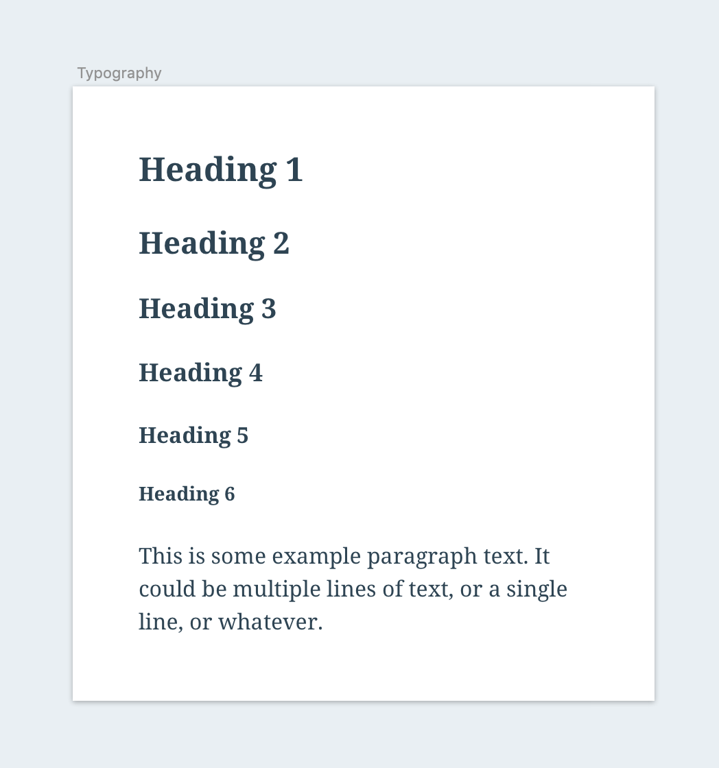
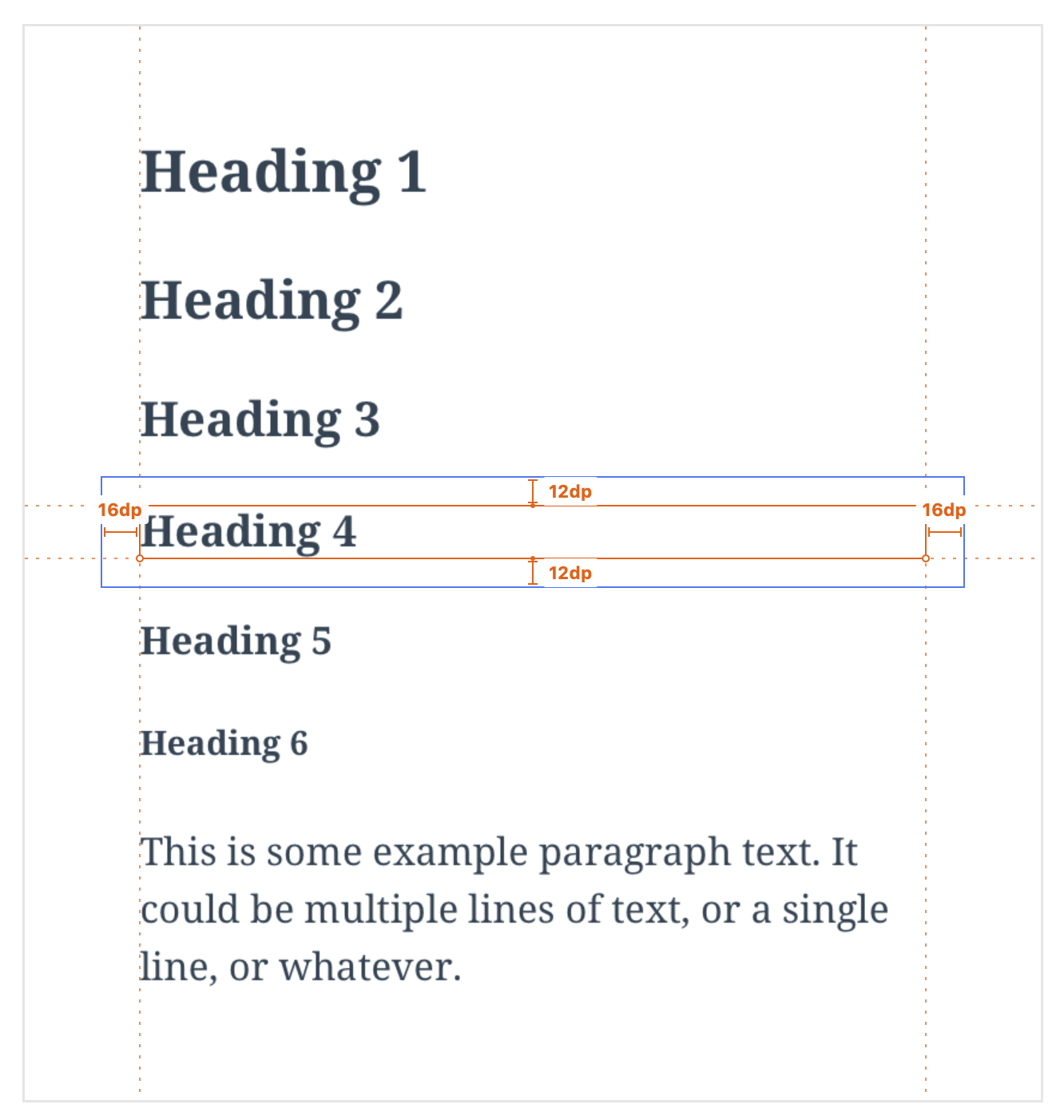
Hey @pinarol, here are the current proposed values for mobile GB, in terms of font-size/line-height:
- H1: 24/32
- H2: 22/28
- H3: 20/26
- H4: 18/22
- H5: 16/20
- H6: 14/18
Note, all blocks share the following:
- Color:
$gray-dark(#2E4453) - Font:
Noto-Serif,Bold - Internal padding within blocks (
top/bottom = 12pt,left/right = 16pt– Because of this, the optical vertical margin between text elements is 24pt)
Here's what that looks like in practice:
 iamthomasbishop
on 22 Jan 2019
iamthomasbishop
on 22 Jan 2019
Another note: we should make sure this is responsive to OS-level accessibility preferences like text-size, zoom, etc. // cc @etoledom
iamthomasbishop
on 22 Jan 2019
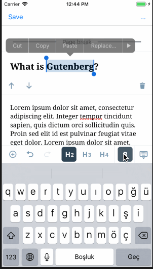
as discussed with @iamthomasbishop it looks like we are going to mimic web's behavior about this.
On the web side, they don't visually bold anything in the editor, it just applies to the front end result.

so I am planning to do this in 2 steps:
- Bold by default, but customization to non-bold will also be available
- Web's behavior as seemed in the gif. <- Planning to open a separate PR for this
Although I'd like to ask @iamthomasbishop once again, how strong are you feeling about item 2? Because after digging in a bit it looks like a bit problematic to implement that on iOS side. It will require us to detach RN side "bold" attribute from the main app side and adding exceptions on the current format attribute propagating logic. At least I can say that it is not as straight forward as just setting the font. So I wanted to take your opinion once more before introducing this complexity.
pinarol
on 25 Jan 2019
Web's behavior as seemed in the gif. <- Planning to open a separate PR for this
For the record I'm not a fan of the web behavior – it's confusing because there is no visual feedback when you tap "bold". The trick here is that we don't know what the theme's styles are, so telling the editor how a heading should display sets the expectation that it's going to appear as on the theme/front-end. A few paths we could go down, ordered by preference from my perspective:
Default headings to bold (display in
boldfont-weight and highlight the toolbar button) and when the "bold" button is tapped, intentionally set thefont-weighttonormal. This seems like the most natural path to me.Remove the "bold" option in the toolbar altogether. Not a preferred solution, but at least it won't be there to cause confusion, and tbh I'm not sure how often folks will use this – we'd need to dig up data before going down this path.
Use web behavior: tapping
bolddoes nothing inside the editor – this is confusing and feels like something is broken because nothing visually changes (as it does with italic), because we don't have a heavier weight than bold.
What do you think would be the most preferred path, considering the complexity and user expectation challenges of each?
iamthomasbishop
on 25 Jan 2019
Hey @iamthomasbishop, thanks for the options there! I was close to going with option 1 too but then I found another idea and I think it might solve both user experience issues and the code complexity issues.
Here is a preview:
So what I am doing is I am using a shadow effect to mimic the bold effect here. The shadow here doesn't have any blur so it looks like we are using a bolder font. We can also play with the thickness of it (vertical and horizontal thicknesses can be customized separately) (the above screenshot has shadow offset of horizontal: 0.6, vertical: 0.1). I can provide more samples to choose if we decide to move fwd with this. Also note that animated gifs are making everything look more blurry and the shadow is looking thicker than it really is, so I'll send you a quicktime capture from slack.
This is also not adding complexity to the current architecture because it will only require overriding some formatting behaviors for heading blocks, the decision mechanisms about how things are working will remain same.
So what do you think @iamthomasbishop ?
pinarol
on 28 Jan 2019
After discussing with @hypest and @iamthomasbishop we decided to make this change on standalone Aztec level so classic editor will also be affected, gutenberg will automatically inherit those changes.
pinarol
on 29 Jan 2019
Related issues
 mkevins
·
3Comments
mkevins
·
3Comments
 chipsnyder
·
3Comments
chipsnyder
·
3Comments
 etoledom
·
4Comments
etoledom
·
4Comments
 designsimply
·
4Comments
designsimply
·
4Comments
 maxme
·
3Comments
maxme
·
3Comments