Gutenberg-mobile: Toolbar
Implement a toolbar component to put the block formatting controls.

API:
- Blocks/components should be able to use the same API/code to define their toolbar
UI:
- The toolbar should stay attached to the bottom of the screen, or the top of the keyboard when visible.
- If the toolbar contains more buttons than fit in the screen width, the user should be able to scroll
- When the keyboard is visible, the toolbar should show a button that allows to toggle/hide the keyboard
What we're not doing as part of this issue (but good to keep in mind):
- Inserter button: that will be part of the Inserter task #58
- Undo/redo buttons: that will be part of the undo/redo task #171
Tasks
Slot/Fill pattern with Toolbar (1 week)
- [x] Fix : is block focused logic on Android platform
- [x] Implement Slot/Fill "portal" pattern in gutenberg mobile
- [x] Test Slot/Fill pattern with existing InlineToolbar
- [x] Create Toolbar container with Format Toolbar Slot and Heading Toolbar Slot on top of the screen
- [x] Test Slot/Fill pattern with Format Toolbar Slot and existing Format Toolbar
Context (Consumer, Provider) pattern with Toolbar (3 days)
- [x] Provide isSelected logic to Toolbar level
Toolbar Style (2 days)
- [x] Implement toolbar button style by specs
- [x] Implement toolbar style by specs
Keyboard with Toolbar (4 days)
- [x] Move Toolbar to the bottom of the screen and make it keyboard sticky
- [ ] Create Keyboard control with the corresponding Slot
- [ ] Implement keyboard toggle functionality
Tests (3 days)
- [ ] Make proper tests
 koke
koke
All 25 comments
I started to look at this task and at the moment I'm planning to break this on the following tasks:
- [x] Make the format bar code (format-toolbar) compatible with React Native
- [x] Implement Buttons with text only
- [x] Implement Buttons using an image and or SVG
- [x] Link Button/Toolbar actions to Aztec RN
- [x] Pin the toolbar to the bottom of the screen, on top of the virtual keyboard
 SergioEstevao
on 14 Aug 2018
SergioEstevao
on 14 Aug 2018
Heads up, I went ahead and updated your list https://github.com/wordpress-mobile/gutenberg-mobile/issues/55#issuecomment-412913744 @SergioEstevao to reflect current status
 hypest
on 18 Sep 2018
hypest
on 18 Sep 2018
Hey, @hypest @koke is this one https://github.com/WordPress/gutenberg/issues/8989 redundant?
 marecar3
on 11 Oct 2018
marecar3
on 11 Oct 2018
👋 @marecar3 , good point. Let's update and close the one in the Gutenberg repo and update and work off this one here only. WDYT?
hypest
on 12 Oct 2018
@hypest should I take on me updating and closing that one?
marecar3
on 12 Oct 2018
Feel free to @marecar3 , sure! Thanks!
hypest
on 12 Oct 2018
@iamthomasbishop can you update this issue with a better mockup of the toolbar? The one I could find had a black background that I had to remove but it looks odd. Also, can you confirm that the requirements I added for the UI in the description are accurate?
koke
on 17 Oct 2018
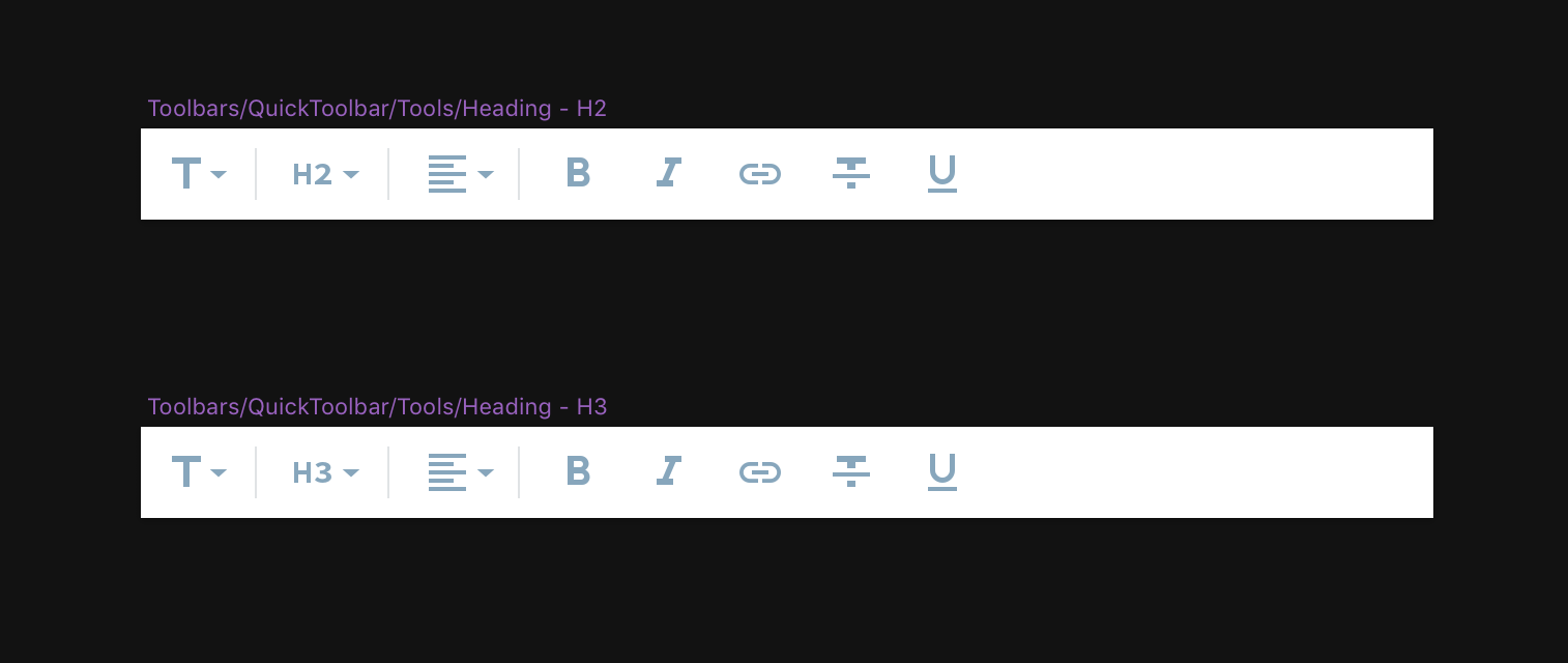
Here's the current iteration for the toolbar:
Documentation sounds right, other than this part:
When the keyboard is visible, the toolbar has a button at the end to
Should that be "When the keyboard is visible, the toolbar should show a button that allows to toggle/hide the keyboard."?
 iamthomasbishop
on 17 Oct 2018
iamthomasbishop
on 17 Oct 2018
Thanks, updated the description with those 😄
koke
on 18 Oct 2018
Hey @koke, @iamthomasbishop,
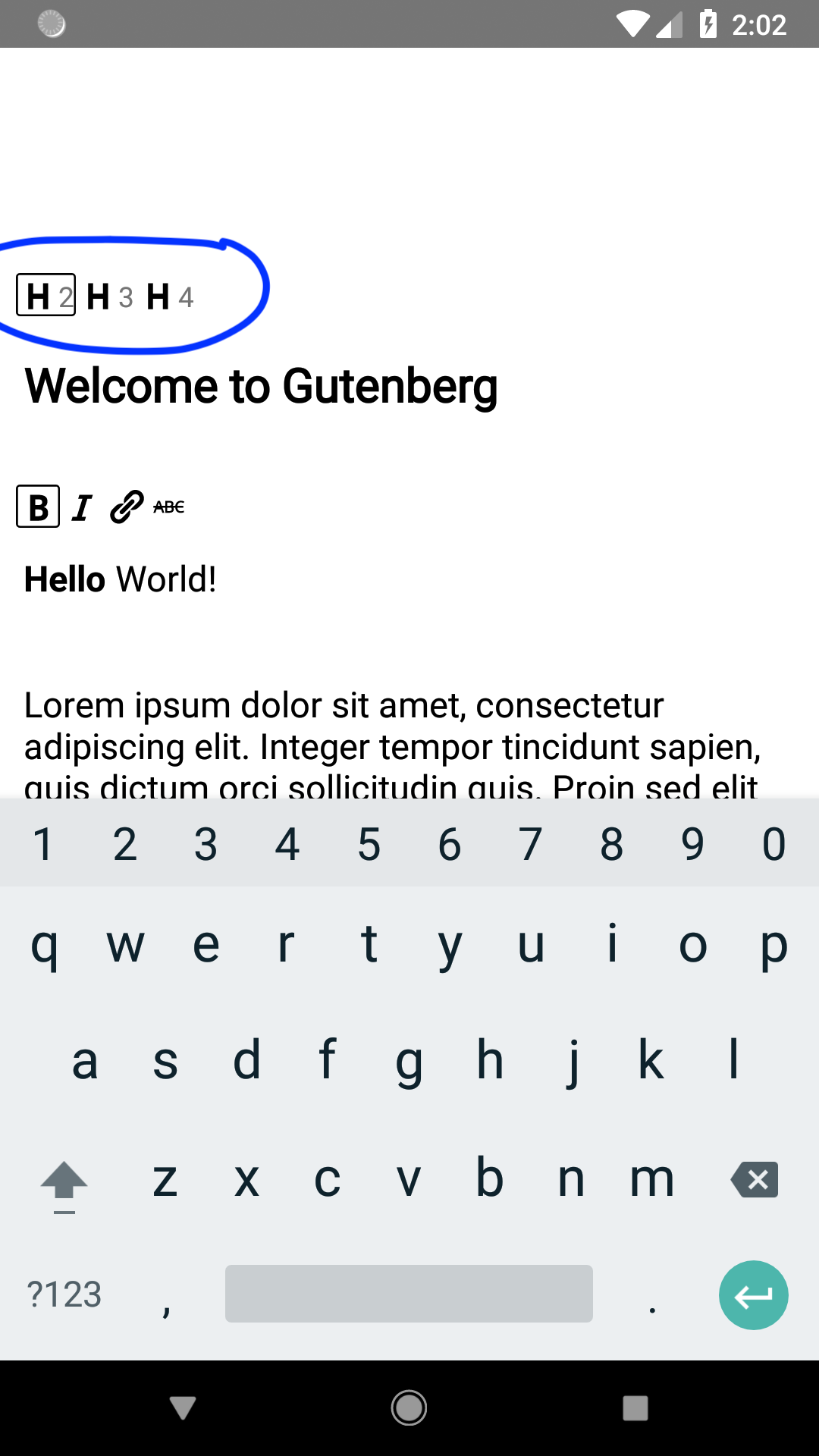
Currently, we are presenting header toolbar (marked with blue color on the attached screenshot) in the Gutenberg app. Should we remove it from the UI and do we have some future plans for it? Thans.
marecar3
on 23 Oct 2018
Slot/Fill pattern with Toolbar
Estimation : 1 week
- [x] Fix : is block focused logic on Android platform
- [x] Implement Slot/Fill "portal" pattern in gutenberg mobile
- [x] Test Slot/Fill pattern with existing InlineToolbar
- [x] Create Toolbar container with Format Toolbar Slot and Heading Toolbar Slot on top of the screen
- [x] Test Slot/Fill pattern with Format Toolbar Slot and existing Format Toolbar
Context (Consumer, Provider) pattern with Toolbar
Estimation : 3 days
- [x] Provide isSelected logic to Toolbar level
Toolbar Style
Estimation : 2 days
- [ ] Implement toolbar button style by specs
- [ ] Implement toolbar style by specs
Keyboard with Toolbar
Estimation : 4 days
- [x] Move Toolbar to the bottom of the screen and make it keyboard sticky
- [ ] Create Keyboard control with the corresponding Slot
- [ ] Implement keyboard toggle functionality
Tests
Estimation : 3 days
- [ ] Make proper tests
Subtasks
- [ ] [Create Inserter control with corresponding Slot](https://github.com/wordpress-mobile/gutenberg-mobile/issues/58)
- [ ] [Create Undo/Redo Toolbar controls with corresponding Slot](https://github.com/wordpress-mobile/gutenberg-mobile/issues/171)
- [ ] Create Block type control with corresponding Slot
- [ ] [Create Alignment control with corresonding Slot](https://github.com/wordpress-mobile/gutenberg-mobile/issues/170)
marecar3
on 23 Oct 2018
Hey @koke,
I have made a list above. However, I didn't find a task for Create Block type control with the corresponding Slot and Create Keyboard control with the corresponding Slot. I can make those if you want?
marecar3
on 23 Oct 2018
Regarding your earlier question:
Currently, we are presenting header toolbar (marked with blue color on the attached screenshot) in the Gutenberg app. Should we remove it from the UI and do we have some future plans for it?
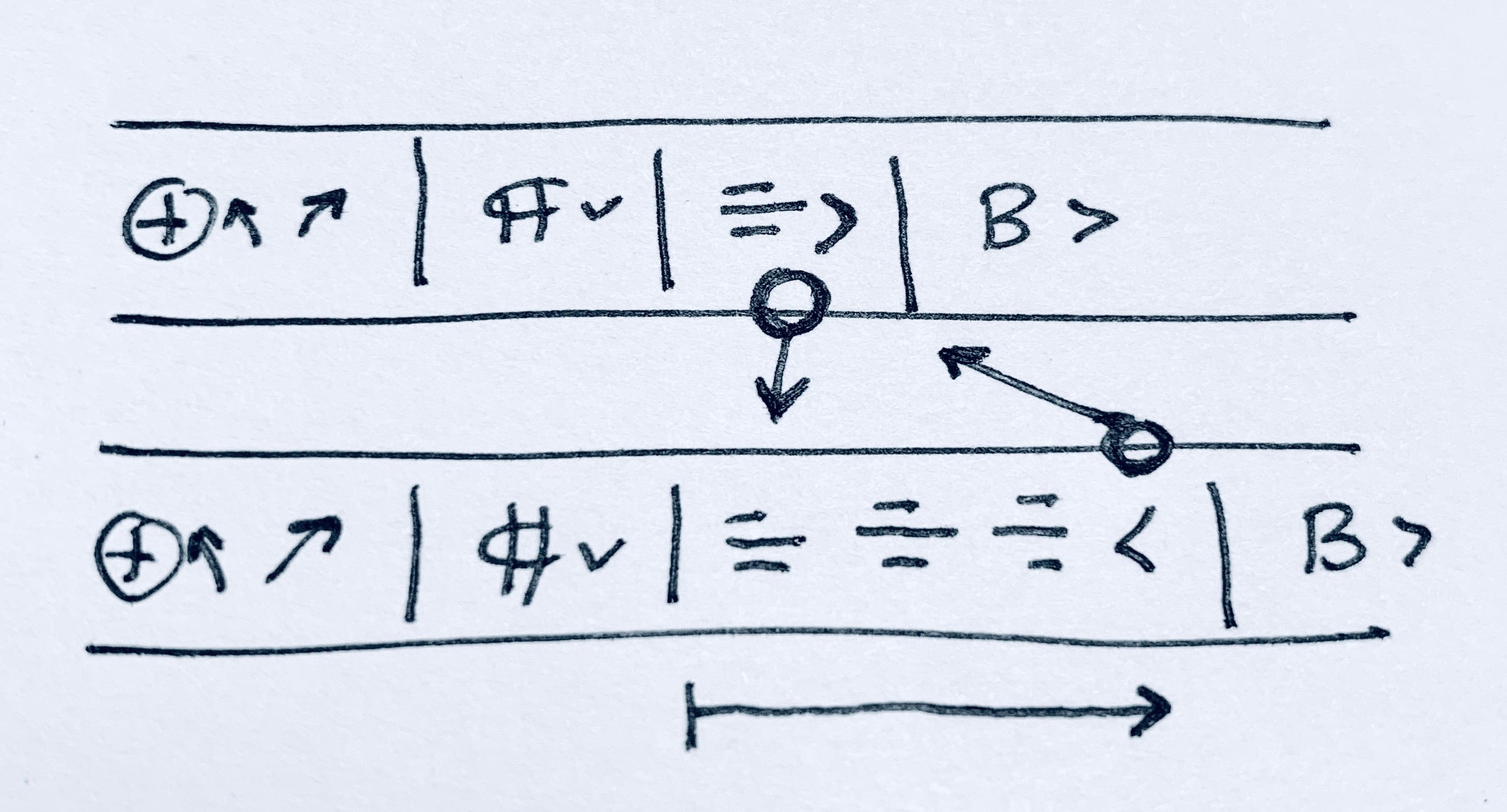
The intention is to show these controls in the Quick Toolbar, which would be attached to the bottom edge or above the keyboard. Using the Heading block as an example, it would look something like this:
Inserterundo/redoblock type(block type icon w/ dropdown for transform)block variation(h1, h2, etc)primary block controls(alignment, bold/italic, etc)- keyboard toggle
The only controls that will be attached – visually – to the block itself are the inline tools (up/down, settings aka inspector, and •••. That looks like this:
iamthomasbishop
on 23 Oct 2018
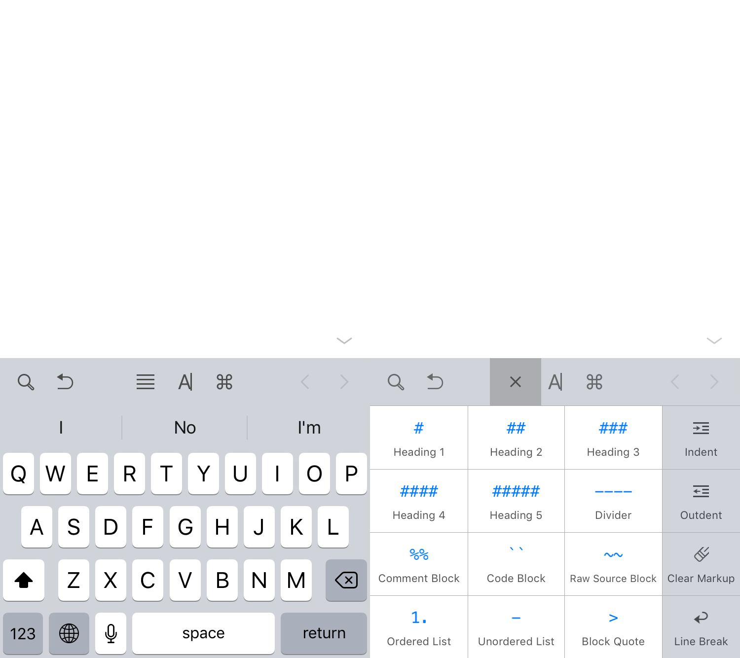
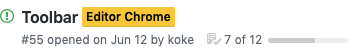
@iamthomasbishop for the dropdown buttons (heading, text alignment) I didn't see how they would look in the designs. I'm assuming something like this (from Ulysses), showing options in the keyboard area?
koke
on 24 Oct 2018
@marecar3 thanks! There's no need to create issues for those yet, we can account for them as part of this issue.
- Create Block type control: we're not doing this as part of the alpha, and maybe not even the beta, so no need to account for this one yet
- Keyboard toggle: is this one included in the existing estimations?
koke
on 24 Oct 2018
The design calls for a condensed button for the headings, for example. Like, just use a single toolbar button with a dropdown to change the heading size. I'd say that is should be fine to do that in more than one steps: in step one, just put the 3 heading buttons in the toolbar. Step two: condense them to one. I expect the second step to be non-trivial. cc @marecar3
hypest
on 24 Oct 2018
@koke Updated. Keyboard toggle is now included in the existing estimation.
Please, let me know if there should be more adjustments to the estimation list.
marecar3
on 24 Oct 2018
@marecar3 thanks, I think that's all I need for now.
@hypest let's wait to hear from Thomas, but I think the collapsable buttons could wait for the beta?
koke
on 24 Oct 2018
Hey @koke, I have added one more section in the estimation. It's Toolbar Style as toolbar buttons and toolbar itself doesn't implement the latest style provided by @iamthomasbishop.
marecar3
on 25 Oct 2018
Thanks, good catch
koke
on 25 Oct 2018
@koke to answer your question above – I haven't provided a dropdown component design yet because I assumed (maybe wrongly) that we wouldn't implement this for a while. It sounds like that is the case, but I will start preparing some mockups for this.
Fwiw, my first thought was that for a quick i1, we could use something along the lines of either bottom sheets, action sheets, or popovers (aka menus). I will explore this further.
iamthomasbishop
on 25 Oct 2018
I imagined something like that, although another approach to considering is expanding the options in place inside the toolbar, a sort of horizontal accordion
koke
on 25 Oct 2018
That too was on the list of considerations, but I'd like to see if we can find an existing pattern or component to utilize. I thought about doing something like this, but I'm not sure I like this approach over the others mentioned previously.
iamthomasbishop
on 25 Oct 2018
@marecar3 I moved the task list to the issue description, please make sure to do any new updates there so it shows on the issue summary:
koke
on 7 Nov 2018
Thanks, @koke, I will do that.
marecar3
on 7 Nov 2018
Related issues
 etoledom
·
4Comments
etoledom
·
4Comments
 wptester9845
·
4Comments
wptester9845
·
4Comments
 pinarol
·
4Comments
pinarol
·
4Comments
 designsimply
·
4Comments
designsimply
·
4Comments
designsimply
·
4Comments
designsimply
·
4Comments
Most helpful comment
@marecar3 thanks, I think that's all I need for now.
@hypest let's wait to hear from Thomas, but I think the collapsable buttons could wait for the beta?