Gridcoin-research: GUI Improvements
Overview
I'm looking to make some changes to the UI of the Gridcoin wallet. The goal, in a nutshell, is make it easier to understand for someone who would class themselves as a "novice". As a parallel goal, I'll aim to ensure that the new design passes elements of WCAG 2.0 standards - making content accessible to a wider range of people with disabilities.
The existing wallet

UI Framework _(Open for feedback)_
Here we can see the general framework for the app; title bars, headers / logos, navigation, status bar, and all the various states involved within this.
Proposed design

_Changelog_
- Introduced the new branding / fonts / colour scheme
- Replaced the full logo in the header with the typemark
- Moved the BOINC logo to the content area of the Overview tab
- Removed any icons in the navigation, allowing for a neat type-based nav
- Introduced a "New" notification badge on the Vote option
- Moved the status bar to the bottom of the app
_Remaining tasks_
- [ ] Mock up all hover / active states
- [ ] Complete the icon states in the status bar
_Accessibility_
All colour-combos have been checked so far and pass the recommended guidelines for an accessible contrast ratio. Colour-blindness tests are successful, I believe. Please correct me if you spot anything wrong.

_Translations_
Translations seem to be okay. Generally, I'll mock in English (native language) and then do a Greek, Russian, and/or Korean version to see the length of text strings. Apologies for any bad translations - blame Google Translate. Might have to make the navigation column a little wider to accommodate some lengthier languages.


 mattcoxonline
All 103 comments
No logo vs Gridcoin logo
As you may have seen from the mocks above, there is one with the Gridcoin logo in and one without. Either way - whether it's in or out - I don't mind.
Should the Gridcoin logo be visible in the navigation rail as default?
You decide! Answer by adding emoji reactions to this comment.
👍 _to keep the logo_
👎 _is no logo_
mattcoxonline
on 19 Jan 2018
This will be a step toward greater visibility and adoption.
I think we should set up a UI bounty to be fund matched up to X GRC (5k? 10k?) by foundation funds. This would require a proposal to be organized and requirements for the release of funds to be defined.
Additionally, we could begin to allocate foundation funds to specific endeavors and use the foundation's interested earned to pay continuous development and maintenance. This would be far more in depth than a simple bounty/fund-match campaign. At this point in time, the bounty might be more practical.
Does anyone else have thoughts on how we can support @mattcoxonline and his work moving forward?
 jring-o
on 19 Jan 2018
jring-o
on 19 Jan 2018
Regarding the Gridcoin logo, I might just not like where the logo is placed? Idk. What if it is placed in the same bar as the word "Gridcoin" to counter-balance the BOINC logo?
jring-o
on 19 Jan 2018
im in between liking and not liking where the logo is. I agree making this more user friendly and to those with disabilities as well. I think you will benefit the most if you working with the people who have the designed the current look in development branch to reach a common goal on this. also you could make this simply another display theme or design in Settings -> options -> display -> style. I honestly really like the development wallet as is with design and re-branding.
 iFoggz
on 19 Jan 2018
iFoggz
on 19 Jan 2018
@mattcoxonline cool, I like the logo next to the word "gridcoin" as it is in the current development branch.
Are you aware that we have different color schemes? (at least in the development branch) You can choose them in the options menu. I would like to keep at least a light and a dark color scheme. But that also means we could create special color schemes for people with disabilities.
I noticed that you don't use any icons. Is everyone fine with that? I think the removal of most icons will reduce the complexity of the qt code in certain areas.
I will look into the following changes next:
- create an alternative overview page
- introduce an option to switch back to the classic overview page
- move the little vertical toolbar to the bottom
- apply the new color schemes (@mattcoxonline can you provide me with the colors in RGB or HEX format?)
 skcin
on 19 Jan 2018
skcin
on 19 Jan 2018
I love where this look is going. Super clean and the color scheme ties in with branding. I think the background color should stay on the lighter side, the purples could get lost as you darken the background.
👎 I am in agreement with the other folks on the logo. I think it should go next to Gridcoin or just be removed. It looks lost in the bottom left corner.
 wisecracka
on 19 Jan 2018
wisecracka
on 19 Jan 2018
I'm in agreement with Foggyx420 .. You should do this in conjunction with the Dev branch .. my son has a particular type of colour blindness so I'll be checking to see if he has any problems .. I really think that the gridcoin logo should not be left out .. needs to be in a better place than a small one at the bottom ..
 Mercosity
on 19 Jan 2018
Mercosity
on 19 Jan 2018
i agree i think his ideas are good and i'm happy about that consider a style addition
iFoggz
on 19 Jan 2018
@skcin i think the removal of icons is great. makes the wallet look smooth. many other wallets don't use icons either. if it simplifies the qt as well... all the better
jring-o
on 19 Jan 2018
@skcin
Are you aware that we have different color schemes? (at least in the development branch) You can choose them in the options menu. I would like to keep at least a light and a dark color scheme. But that also means we could create special color schemes for people with disabilities.
Yes! Someone on Slack sent me a build and screenshot of the dev branch and I could see the newest theme. Generally, a _Light_ and _Dark_ theme are good options and I've found that a lot of developers really prefer a dark theme. 😮
Right now I just want to get the one theme out of the way, and correct. From there it will mostly be a case of changing colours. In addition to _Light_ and _Dark_, it's common and useful to have a _High Contrast_ mode.
@skcin
I will look into the following changes next:
- create an alternative overview page
- introduce an option to switch back to the classic overview page
I want to take a pass at the content of each page - coming up with a layout for the Overview content, as well as each subsequent page. Right now, I just presented the framework because I didn't want to overload anyone with a lot of work. ☺️
@skcin
can you provide me with the colors in RGB or HEX format?
Yes! Better still, you can view the spec in it's entirety here:
https://xd.adobe.com/spec/d941d56b-f06d-497b-9c39-8f5eef925b6e/
☝️


@Mercosity
my son has a particular type of colour blindness so I'll be checking to see if he has any problems
That would be great. I check the artwork by simulating deuteranopia, protanopia and tritanopia. These are extreme forms of color blindness – therefore, it should also be easily readable by those with minor color blindness and relatively normal vision. 👌
mattcoxonline
on 19 Jan 2018
Logo vs No Logo
I don't want this discussion to drag out, but as commented on this Gridcoin Marketing discussion, it's not common at all for an app to place the logo within the UI.
To open the app, you click the logo. When the splash screen loads, the logo is there. You see the logo a lot before you get into the app - and then it's ever-present in the taskbar (Windows) / dock (MacOS) / switch app dialog.


Right now, I'd like to keep it where it is (in the lower part of the navigation) or get rid of it in the interface altogether - considering it'll still be at the OS level and on the Splash Screen. 🙂
mattcoxonline
on 19 Jan 2018
Is this UI designed in a scalable way? The current wallet doesn't scale nicely with High or Low DPI displays. would this fix that?
 RoboticMind
on 19 Jan 2018
RoboticMind
on 19 Jan 2018
Regarding the logo:
In cryptoland, logos seem to generally appear in wallets. Some quick examples are:
-PINK
-SLR
-NXT
-XLM
Sometimes they occupy most of the real-estate. It is a marketing and identification tool for an ecosystem that is flooded with wallets. If you see it, you remember it. If you see it, you know which wallet you have open. Seems odd, but it's a thing.
Major organizations don't need to have their logo present on the main screen because they are major organizations. = )
jring-o
on 19 Jan 2018
302
 tomasbrod
on 26 Jan 2018
tomasbrod
on 26 Jan 2018
A breakdown of current polls on the main page would be nice
 ragnaroklow
on 3 Feb 2018
ragnaroklow
on 3 Feb 2018
Mockups can be accessed in Invision: http://invis.io/APJIDTNFV47
Overview Tab [Dark]


Overview Tab [Light]


Status Bar States

 madmaxpayne
on 25 May 2018
madmaxpayne
on 25 May 2018
@madmaxpayne could you add in somewhere a sync progress bar? That would help with https://github.com/gridcoin/Gridcoin-Research/issues/841
RoboticMind
on 25 May 2018
Have some thoughts. Am I right thinking that it should show current block number and some kind of a progress bar or graph? I'm not great at blockchain technology so some explanation would be helpful.
madmaxpayne
on 25 May 2018
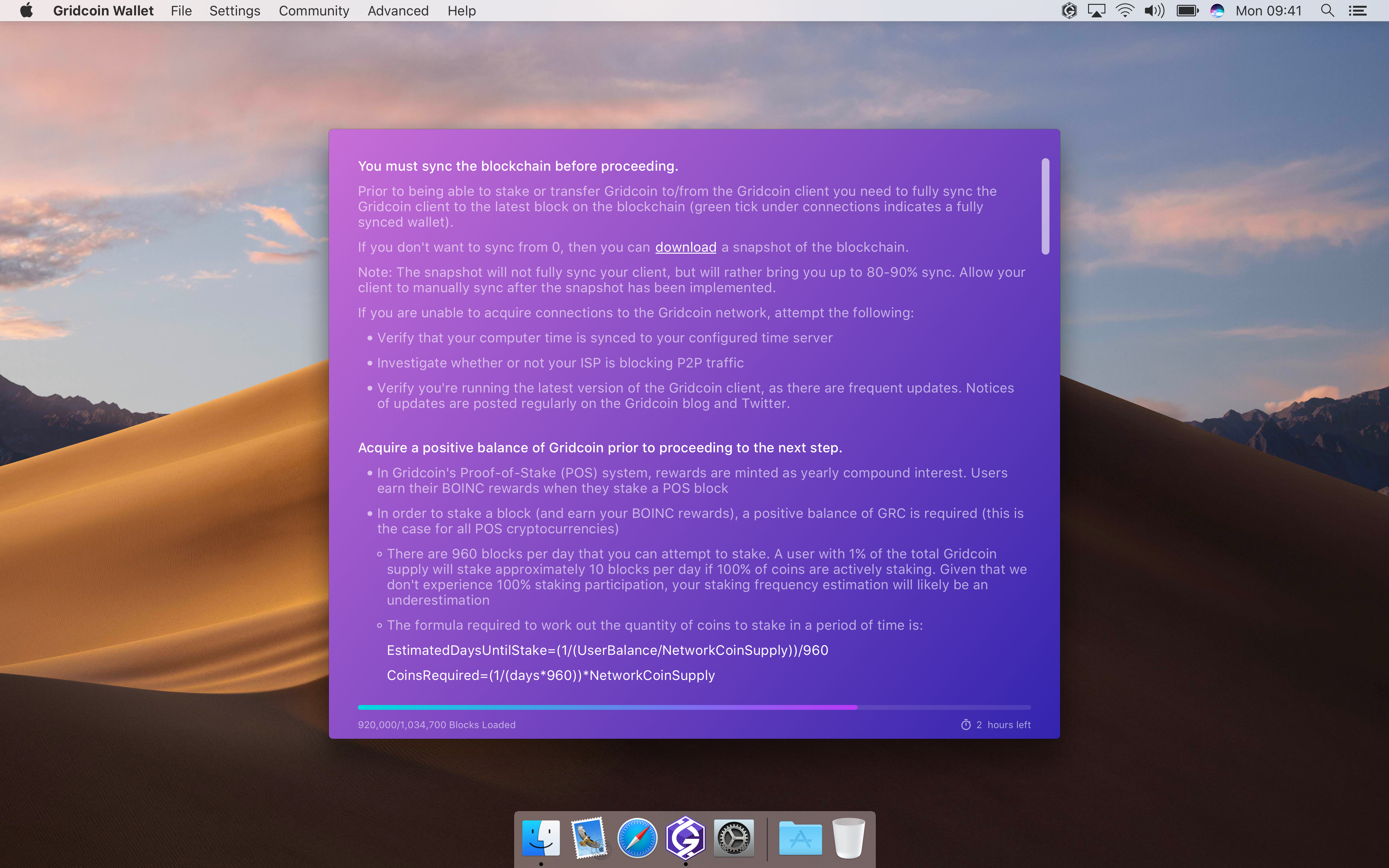
When you are not on the latest block, you have to download all of the blocks that you are missing. So when the wallet is downloading all of the blocks that it doesn't have you could show a progress bar on the progression of the download. Here's a link that explains how it works on Bitcoin, which is similar on Gridcoin: https://en.bitcoin.it/wiki/Bitcoin_Core_0.11_(ch_5):_Initial_Block_Download
RoboticMind
on 26 May 2018
@madmaxpayne I love the layout in your mockup. Very professional feel. I'd vote for this to be our next UI
 an0n7mous3
on 26 May 2018
an0n7mous3
on 26 May 2018
- Added Est. RR/day and Est. TTS fields
- Drew details of the status bar (correct me if I have missed something)
@RoboticMind I decided to go with a pie progress bar. Amount of processed blocks can be displayed inside a tooltip, don't want to overburden UI with unimportant information. Let me know your thoughts.
madmaxpayne
on 28 May 2018
@madmaxpayne how would the bar at the top change when going to Send/Receive/Transactions/Address Book/Voting. Should it be static like currently, or change its content as well, displaying the most important information for each pane?
 TheCharlatan
on 29 May 2018
TheCharlatan
on 29 May 2018
Yes, it will change dynamically.
madmaxpayne
on 29 May 2018
Naive Sync progress bar would sit at >90% when syncing, but not from zero. Ok this issue is about graphics, but lemme add functional thoughts. When syncing not from zero, make the 0% position of progress bar the block number on startup and 100% the highest reported by peers. There is a small possibility of this bare going backwards (reorganize), maybe even negative.
tomasbrod
on 29 May 2018
@madmaxpayne Just for clarification are these just mockups or are you working on the code? I created a new sidebar (after @mattcoxonline mockup) and I am currently creating a new overview page which can be selected from the options menu. The new overview page is meant to be very clean and without all the network info. If you or @mattcoxonline have suggestions please let me know.
skcin
on 4 Jun 2018
@skcin These are mockups. Currently I'm working on Polls tab. Hope to show it this week. Have pretty tight schedule.
madmaxpayne
on 4 Jun 2018
with syncing status:
could we include the block number during syncing? it might be useful to know what block you're on for troubleshooting if/when a lot of people get stuck syncing.
this is why a lot of other wallets have a % completed bar with the X / total blocks displayed inside the bar.
jring-o
on 4 Jun 2018
@jring-o Why not to display amount of processed/total blocks inside a tooltip? As I mentioned previously I don't want to overburden UI. I didn't know that syncing may get stuck. What's your thougth about if we make that the app will change a color of the pie chart to red in this case? Then a user can hover over the pie and see details.
It is just my vision. If it's so vital for users to see this info in the status bar then I'll invent something.
madmaxpayne
on 4 Jun 2018

So, this is the current state of the gui changes I am working on. The user can switch between this overview page and the old one in the options menu.
By the way, we already have the processed block count in the tooltip, just not the total blocks. We might want to add that.
skcin
on 6 Jun 2018
- Added 'Syncing Stuck' state to the status bar (see original post).
- Drew tooltip
- Drew Polls tab and related windows (first version)
Mockups can be accessed in Invision: http://invis.io/APJIDTNFV47
Polls Tab [Light]
Active

Details

Vote

Create Poll

Loading Completed

Completed

Participated

Archived

Polls Tab [Dark]
Active

Details

Vote

Create Poll

madmaxpayne
on 7 Jun 2018
Hey @madmaxpayne,
what do you think about including @mattcoxonline sidebar (or a redesigned version of it) in your designs?
The upside would be:
- I already created it. (more of a selfish reason, but still)
- No Icons on the sidebar. That is particularly handy if a new page needs to be created. We had the situation in the past that we had a new page but no icon for it. That looked terrible.
- The little indicator label. There were several requests for something like that in the past. It is not yet functional because I am not sure on how to track if a poll has been seen. But I think it is a good idea.
skcin
on 9 Jun 2018
Users might want to work on multiple outgoing transactions at one. Currently it is possible to work on transaction AND go to eg address book or voting, because the pane content persists, but not multiple transactions.
Idea: allow opening send coins form in new window.
e: or just fix the message field so this wont be needed.
tomasbrod
on 11 Jun 2018
@skcin
- It is just my vision. I want to make the wallet look modern and slick.
- Most of guidelines recommend to use icons in navigation and toolbars. Icons can contribute greatly, speeding comprehension and understanding, when their form is recognizable and builds on a user’s past experience. I use icons from Material Design library (https://material.io/tools/icons/?style=baseline) so there should be no problems in the future.
- It's a great idea. I had some thoughts about it recently. I'll add some kind of a marker for Polls and likely for income transactions.
madmaxpayne
on 12 Jun 2018
@tomasbrod
I'll ponder over the problem and see what can be done.
madmaxpayne
on 12 Jun 2018
I am for icons in tab-bar. For development we can have some generic placeholder icon ready, like a lightbulb :bulb:.
tomasbrod
on 12 Jun 2018
Added following:
- Notification markers for new polls and transactions
- Unlock Wallet, Splash and About Screens
- Settings and Console windows


In the next 2 weeks planning to complete Send, Receive, Transactions and Favorites tabs; Sign/Verify Message; create Dark Theme style for all screens and detailed style guide.
Mockups can be accessed in Invision: http://invis.io/APJIDTNFV47
madmaxpayne
on 14 Jun 2018
Taking into consideration brod's suggestion I designed a second version of About screen where it is a part of Settings tab.

madmaxpayne
on 15 Jun 2018
Quick update:
- Favorites tab
- Sign/Verify windows
- Send tab
- Receive tab
Mockups can be also accessed in Invision: http://invis.io/APJIDTNFV47


madmaxpayne
on 20 Jun 2018
You guys are beautiful. Keep up the good work, it is appreciated. :D
 caraka
on 21 Jun 2018
caraka
on 21 Jun 2018
This was all re-design of mostly existing gui. But I have in mind gui module that does not exist. A News feed. Your current polls list looks close to that, maybe you can combine pols with news? Idk.
tomasbrod
on 23 Jun 2018
Hm, polls and news are essentially different by meaning. I think we need another tab.
madmaxpayne
on 24 Jun 2018
I think he meant to reuse most/all of the layout
RoboticMind
on 24 Jun 2018
@tomasbrod i like the idea of a news feed but i think that the main issue is that we do not currently have a structure for this sort of decision making;
how do we decide what news gets onto the feed?
a centralized option where a group of devs/admins decide would be quick and easy, but i'm not sure if it would have a majority of the community supporting it.
a decentralized option based on some sort of upvote (or something) structure would probably be supported, but seems like a lot of work to implement when we have other priorities to focus on.
if we went with a centralized option, i'd say add it, but if the community does not want that, i'd say leave the news feed for a future development.
jring-o
on 26 Jun 2018
I'll design News tab anyway. Should be able to upload more mockups by the end of this week.
madmaxpayne
on 26 Jun 2018
I'd like to suggest hover-over tooltips or links back to a wiki, especially for errors or techno-speak.
Try and help newbies to help themselves.
 Scalextrix
on 26 Jun 2018
Scalextrix
on 26 Jun 2018
@madmaxpayne Sorry to add more to your to-do list, but could you improve the popup explaining all the Gridcoin information, and asking for the required information, when you first open the wallet.
RoboticMind
on 27 Jun 2018
It's ok. I have some drafts of help tips. Could you send me a screenshot of the first open screen?
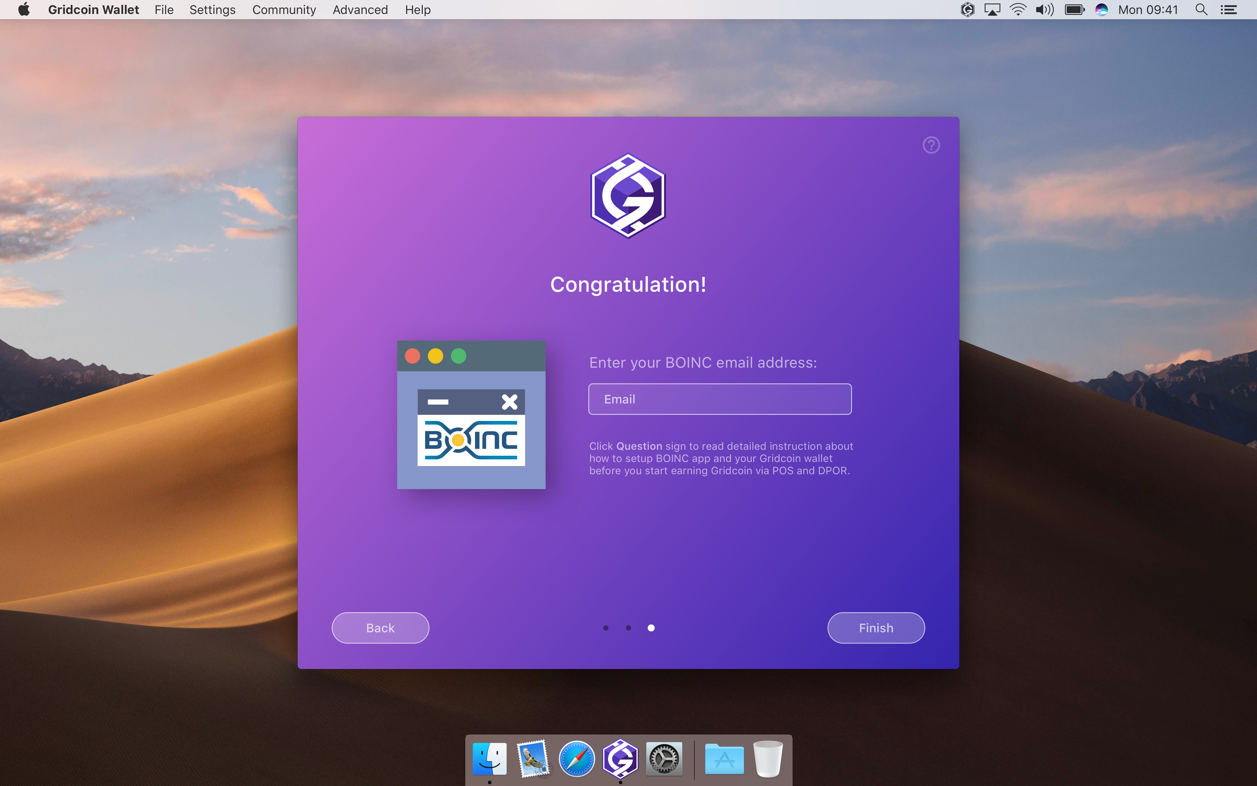
madmaxpayne
on 27 Jun 2018
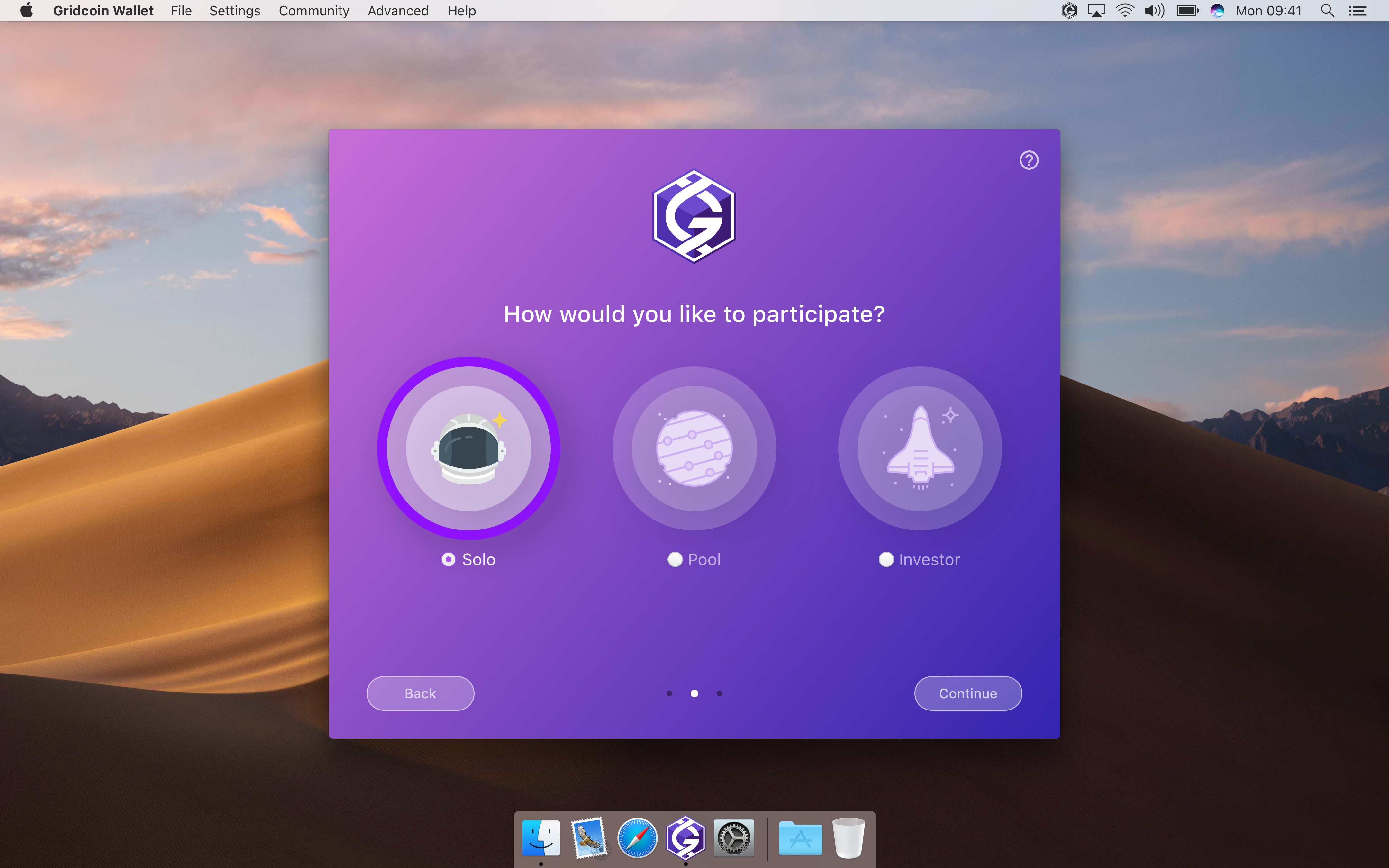
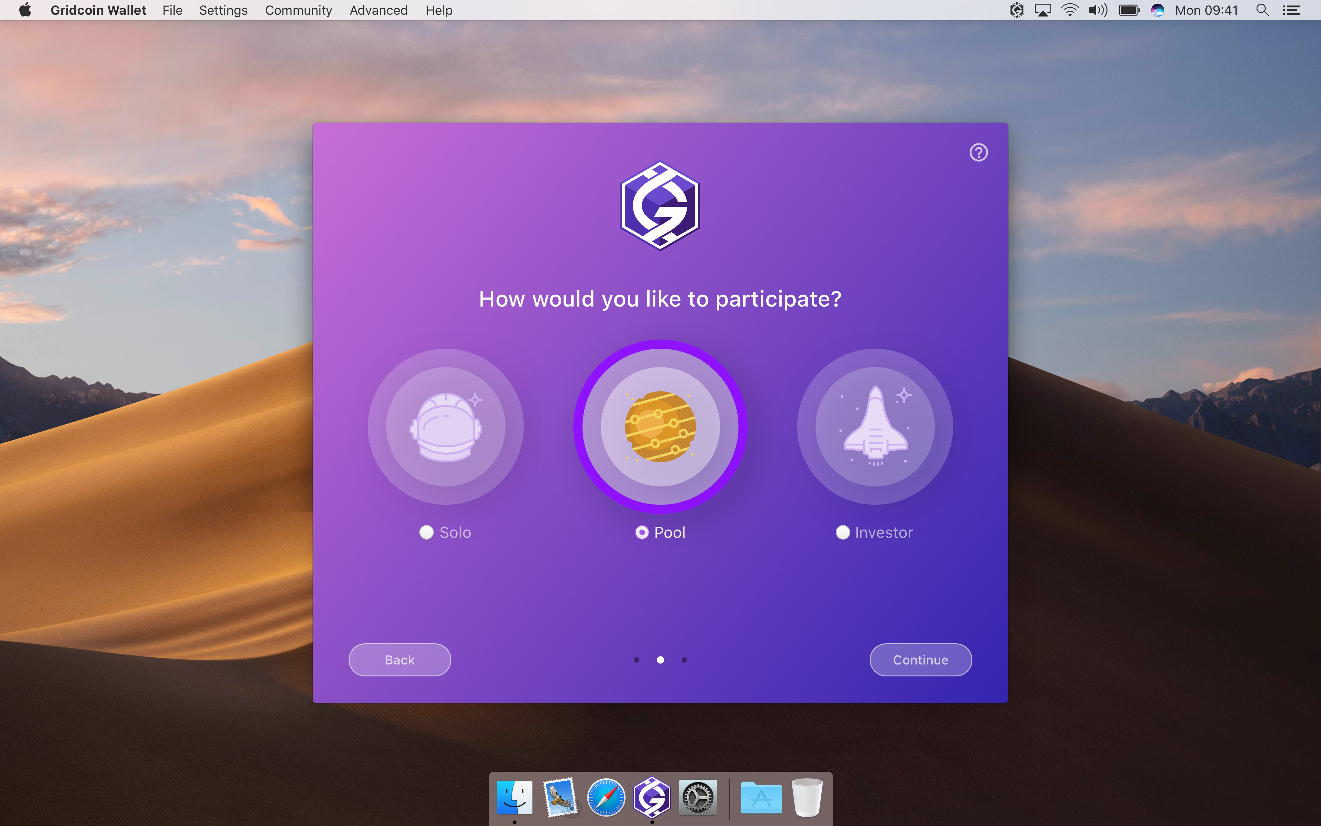
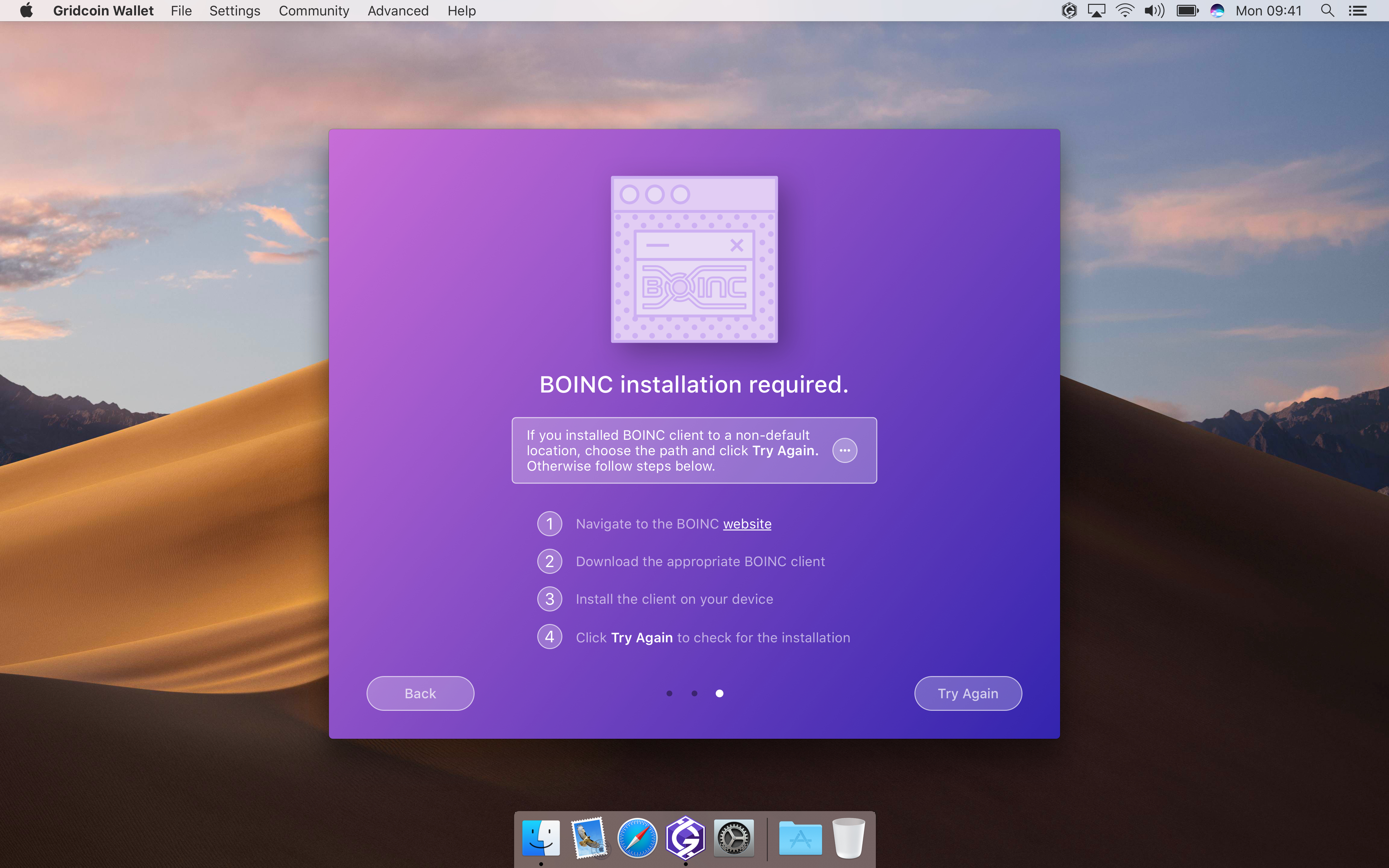
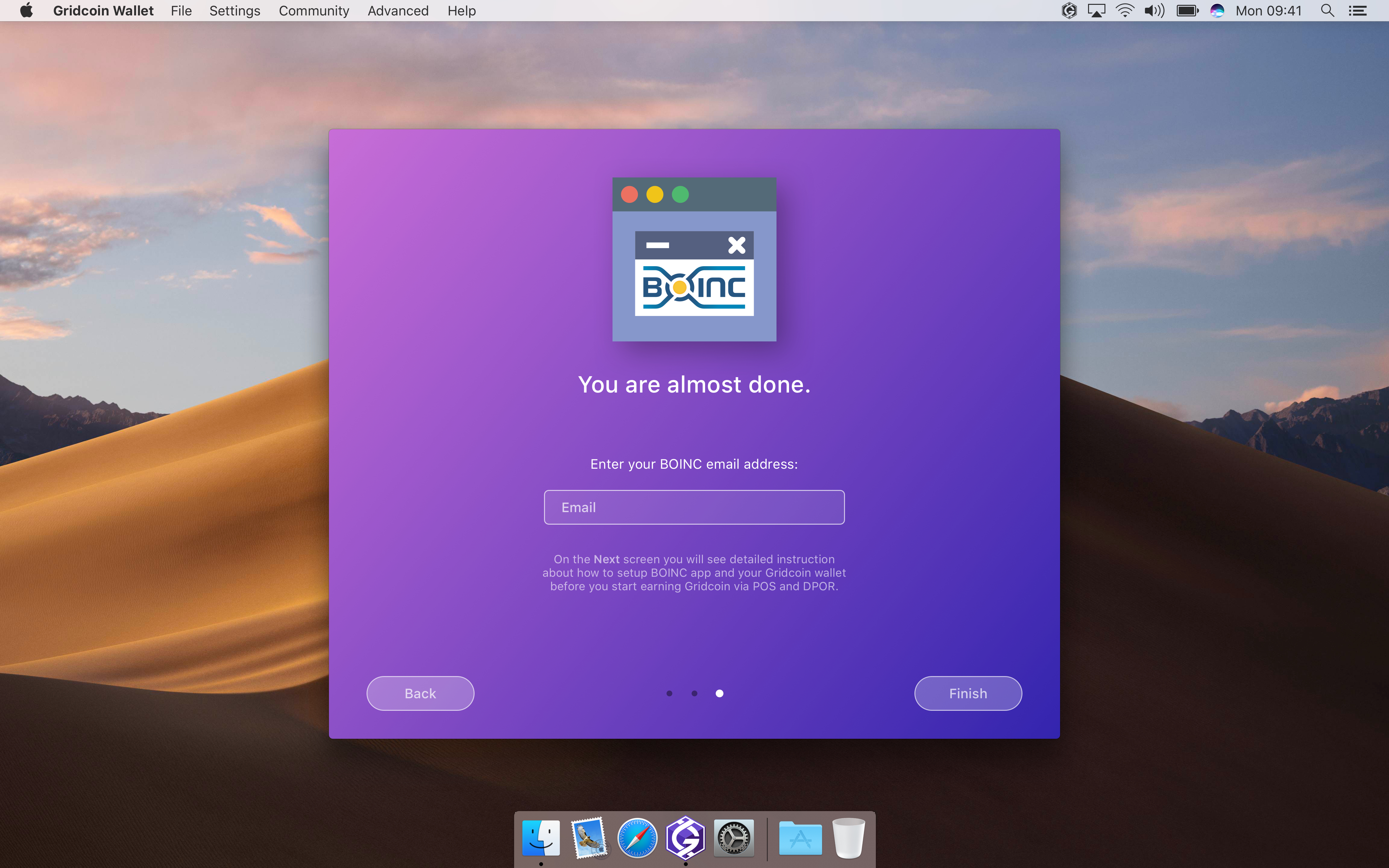
The Current UI for the new user screen is not a useful guide to look at as it gives very little information to users and immediately asks for the BOINC user email (it shouldn't do that as you only need to give that if you are solo mining). It then proceeds to tell you (if you don't have BOINC install) that it can't find BOINC. BOINC only needs to be installed if you want to mine solo.
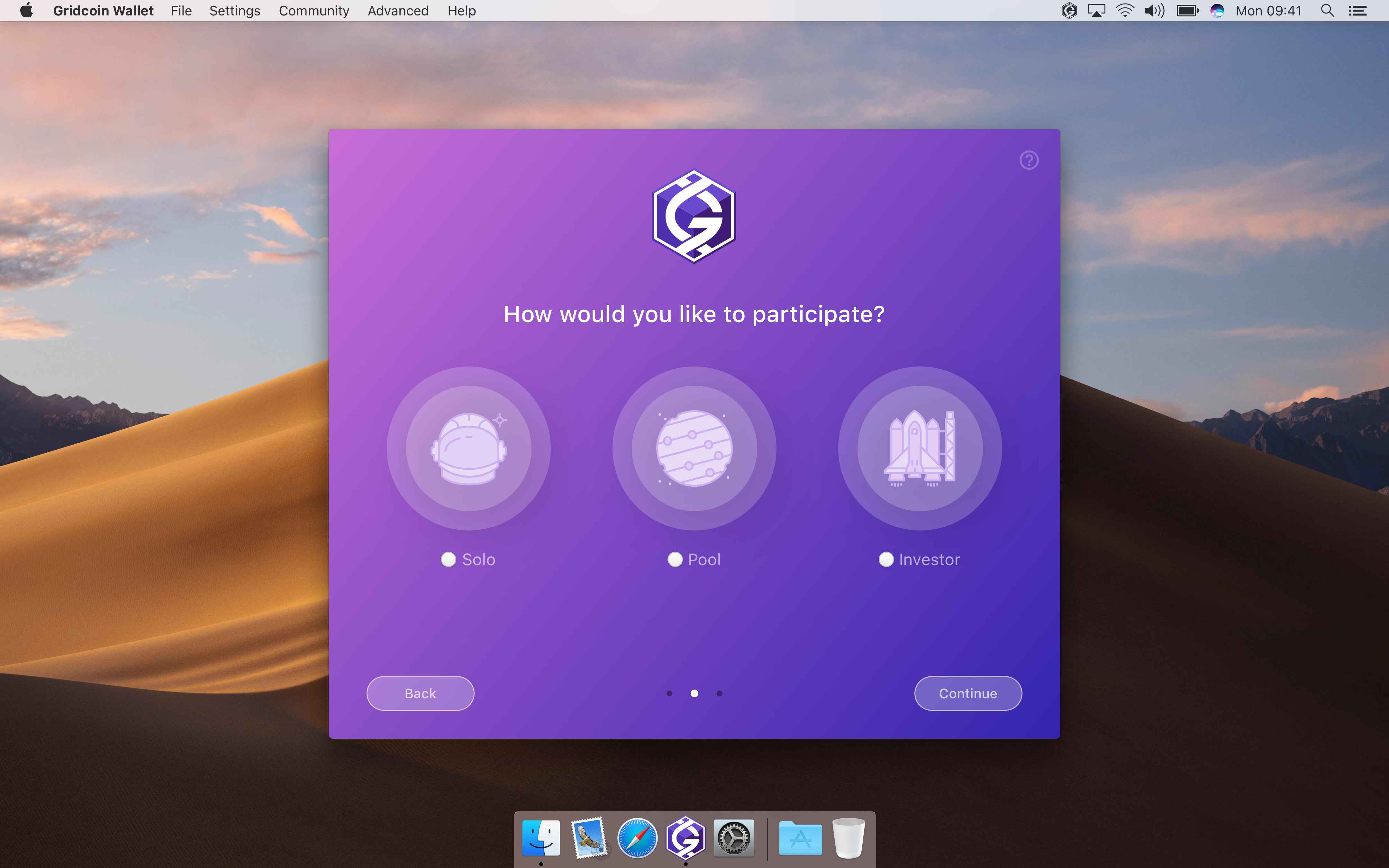
Maybe ask the user first whether they are an investor, solo miner, or pool mining and explain what those are? Then proceed to explain how to setup BOINC for mining and how you need it to install on the machine running the wallet to verify information if they are solo mining. Then finally ask for the email (if solo) after all that. (with all other important Gridcoin information somewhere in there)
RoboticMind
on 27 Jun 2018
Got it. Thanks!
madmaxpayne
on 27 Jun 2018
Here's another update on the new UI:
- Enhanced Overview tab with help tooltips (Miner & Investor modes)
- History tab
- News section (not sure if news can contain graphics so I created two versions: one with images and one without)
- Change passphrase view
Mockups can be also viewed in Invision app: http://invis.io/APJIDTNFV47
Overview


History


News


Change Passphrase

madmaxpayne
on 28 Jun 2018
this is looking very good, i like it.
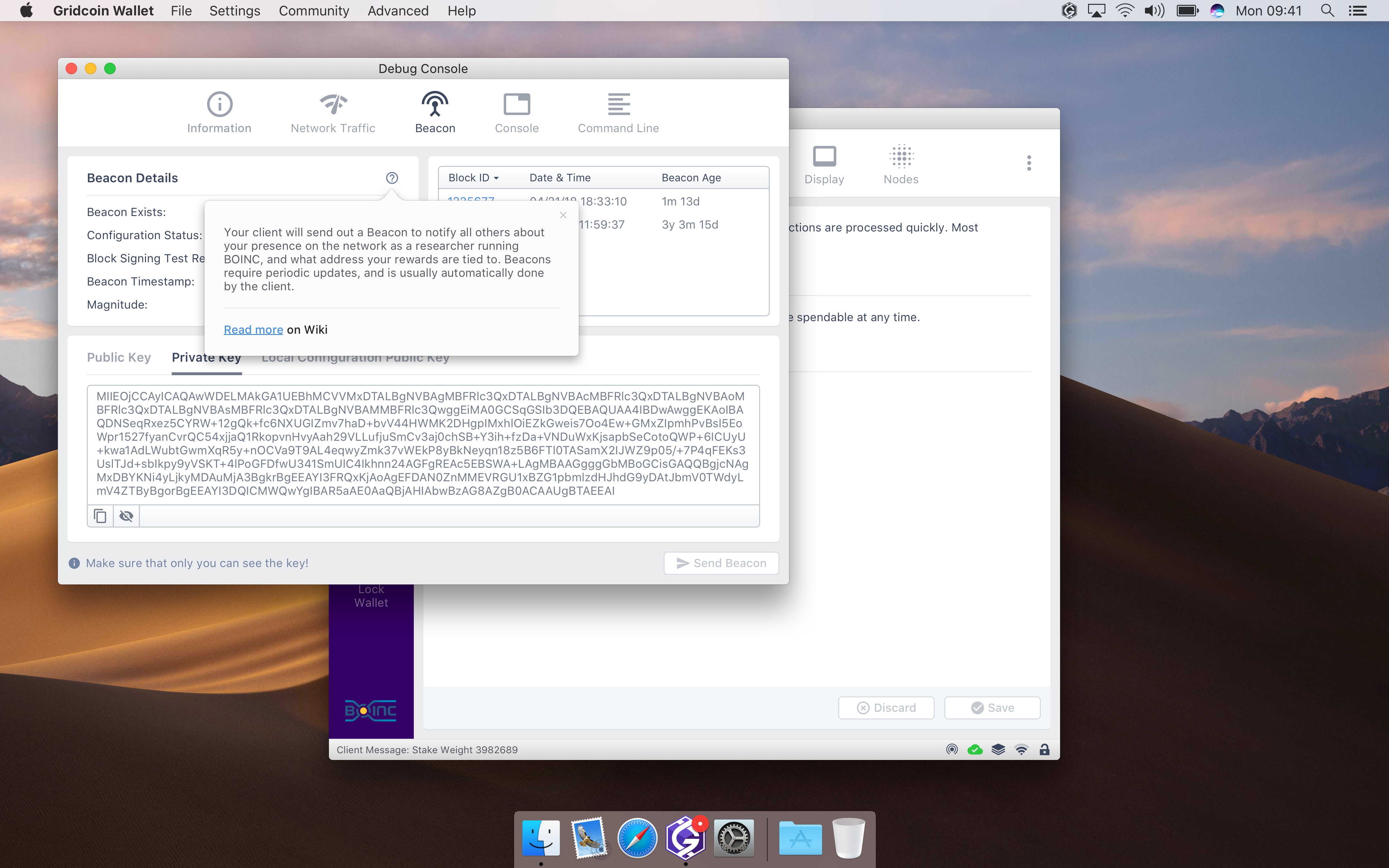
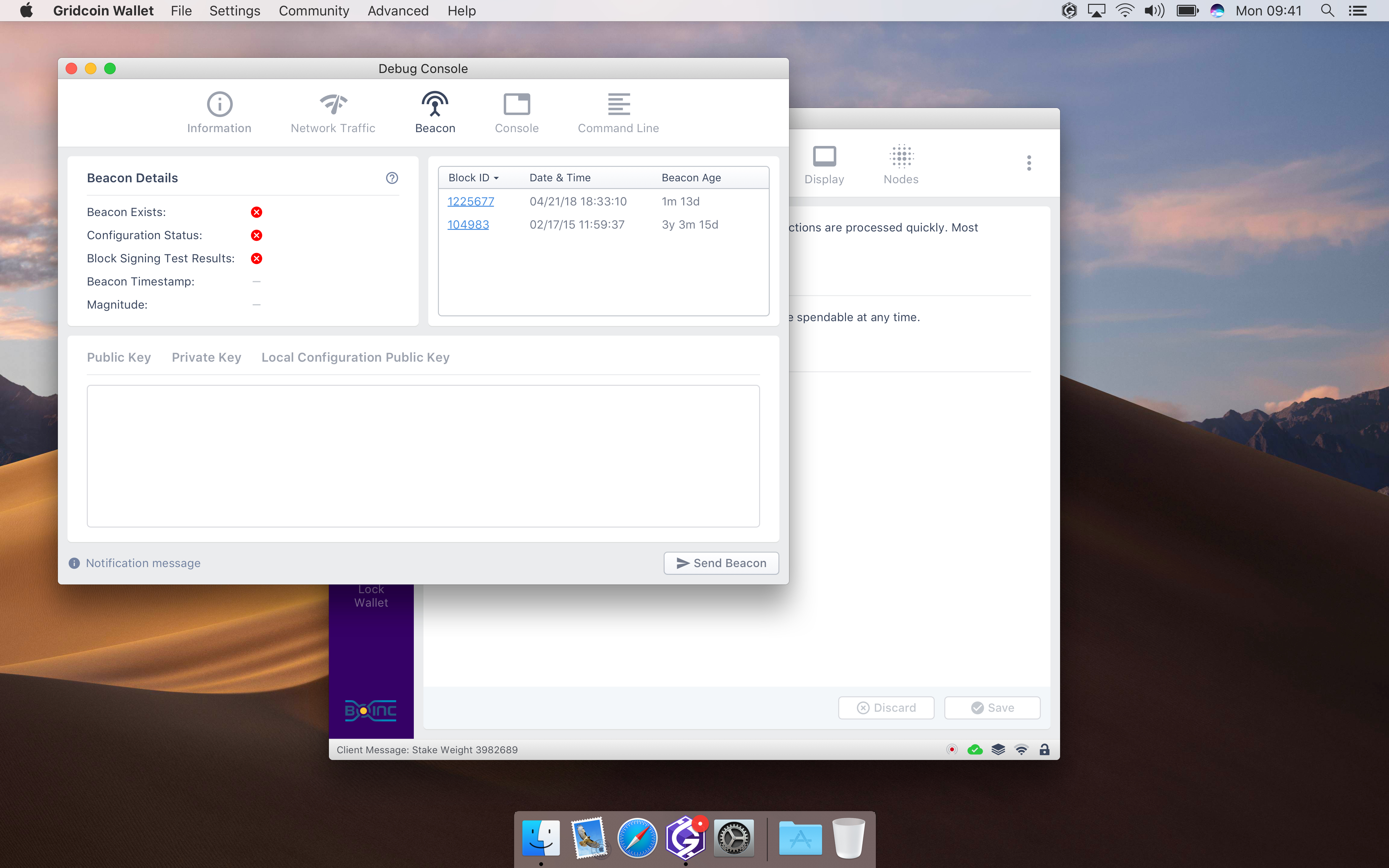
in the interest of making this more newbie friendly, how about adding a button to send the beacon so new users dont have to go into the console?
 Nethlek
on 28 Jun 2018
Nethlek
on 28 Jun 2018
Great idea! Here is my thought:
We can display Beacon status in the status bar and create a new tab in Console or Settings with some Beacon info/statistics and the action button.
madmaxpayne
on 28 Jun 2018
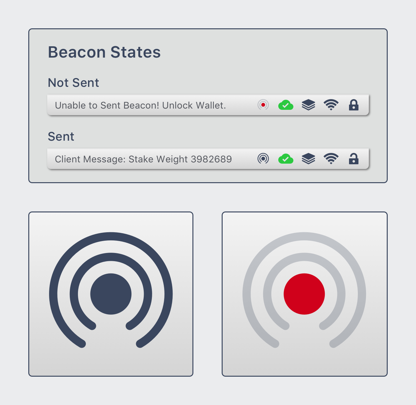
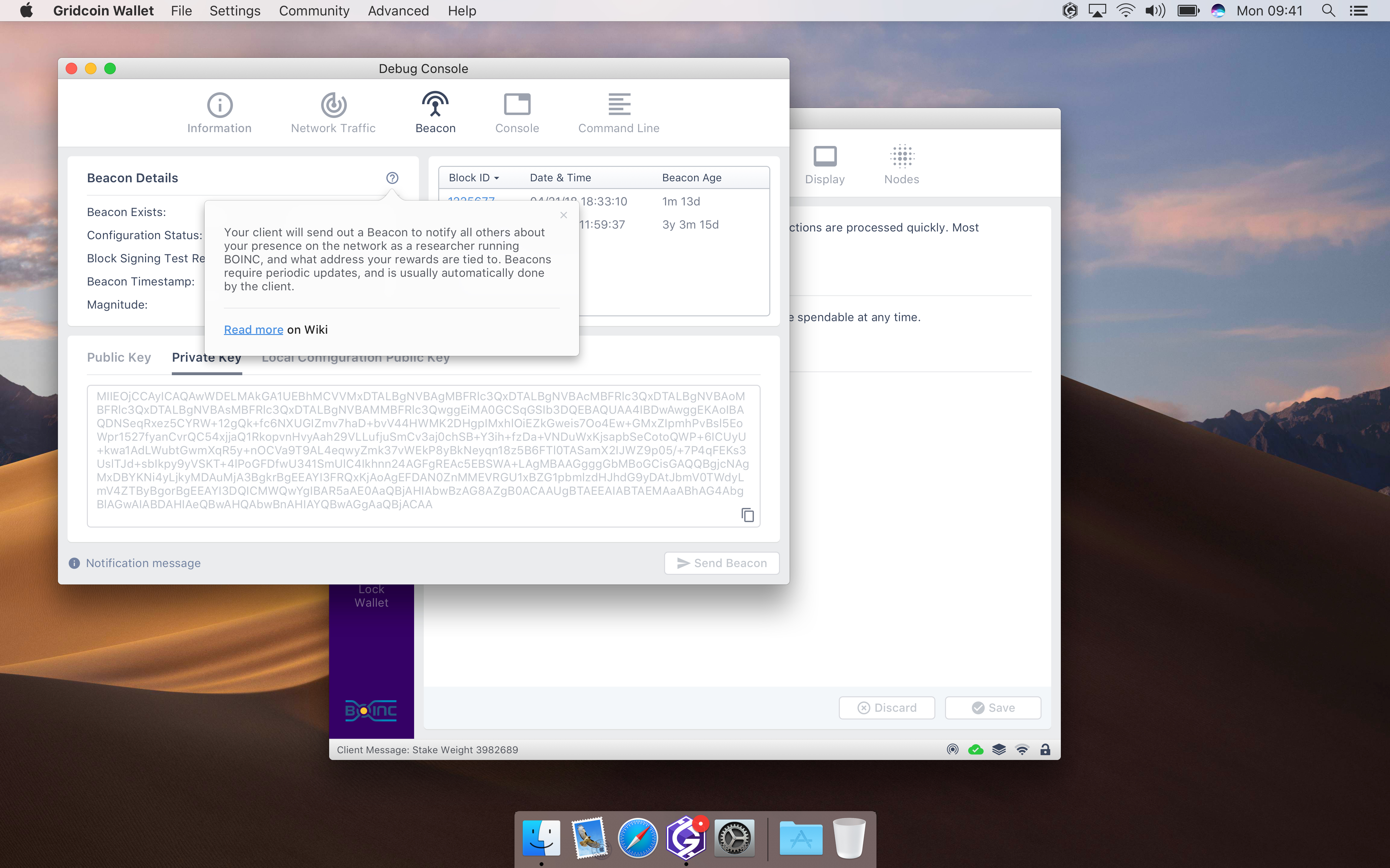
Here we go again!
I added Beacon state icon into the status bar and created Beacon tab in Console. Now users will be able to view details and send beacons in a dummy way.
I've started working on Onboarding screens. Unfortunately I'm lack of time to create help and manuals content. Also I'm not really fluent in English to generate properly composed text. Could somebody help with this part? Even simple text documents will be good enough.
All mockups can be viewed in Invision: http://invis.io/APJIDTNFV47


madmaxpayne
on 10 Jul 2018
@madmaxpayne I don't currently have time to write content from scratch, but I'm more than happy to take content that others have written and proofread it. It wouldn't take me long since I'm experienced in technical writing. Let me know!
 grc-H202
on 24 Jul 2018
grc-H202
on 24 Jul 2018
@grc-H202 It will really help as I have extremely tight schedule this month.
madmaxpayne
on 24 Jul 2018
@madmaxpayne Great -- just let me know exactly what needs to be done and what your deadlines are.
grc-H202
on 25 Jul 2018
There have been some slight improvements on Settings view and Beacon Tab:
Ability to open Debug Console from Settings
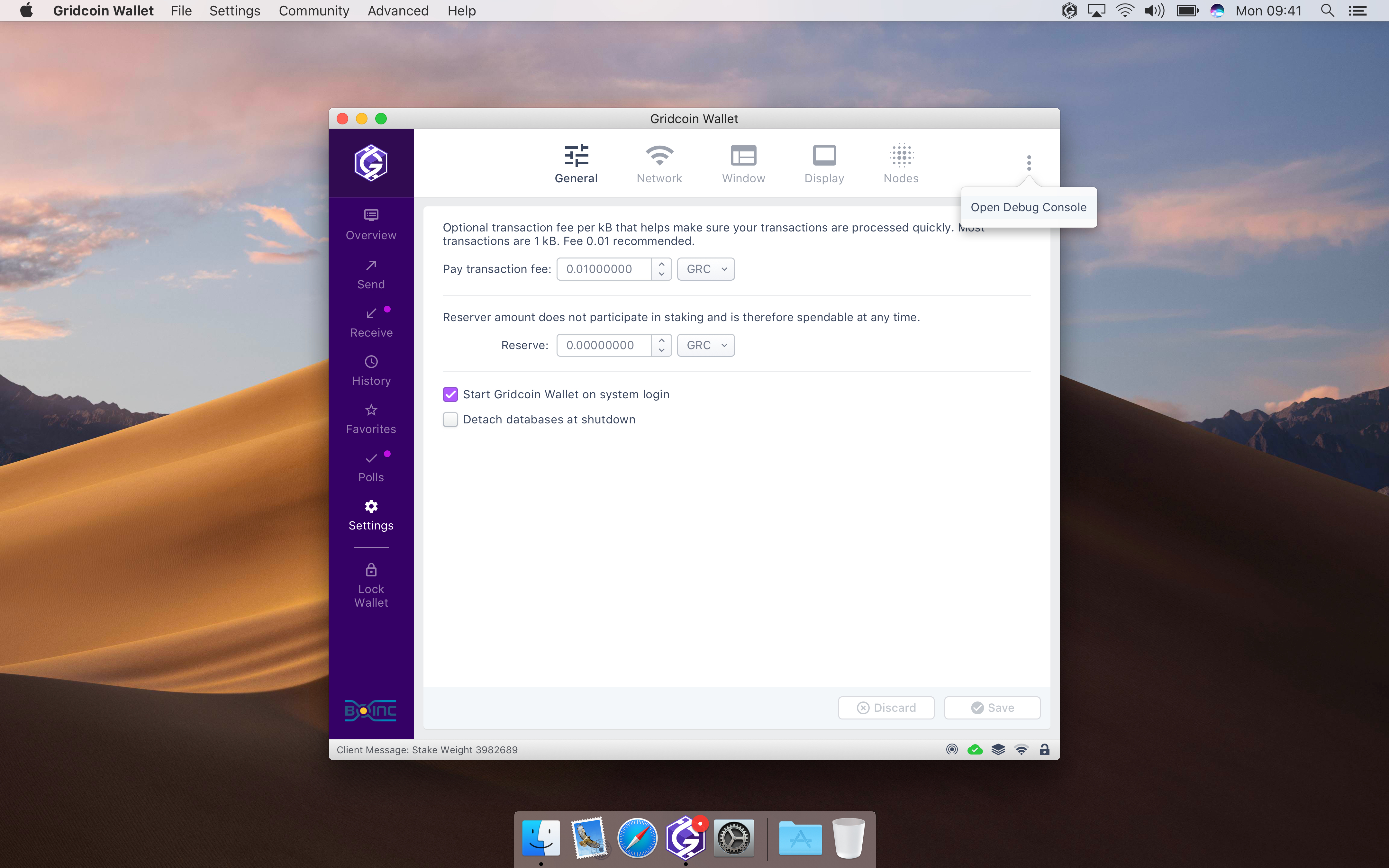
Private Key is hidden until "Crossed Eye" button is clicked

madmaxpayne
on 25 Jul 2018
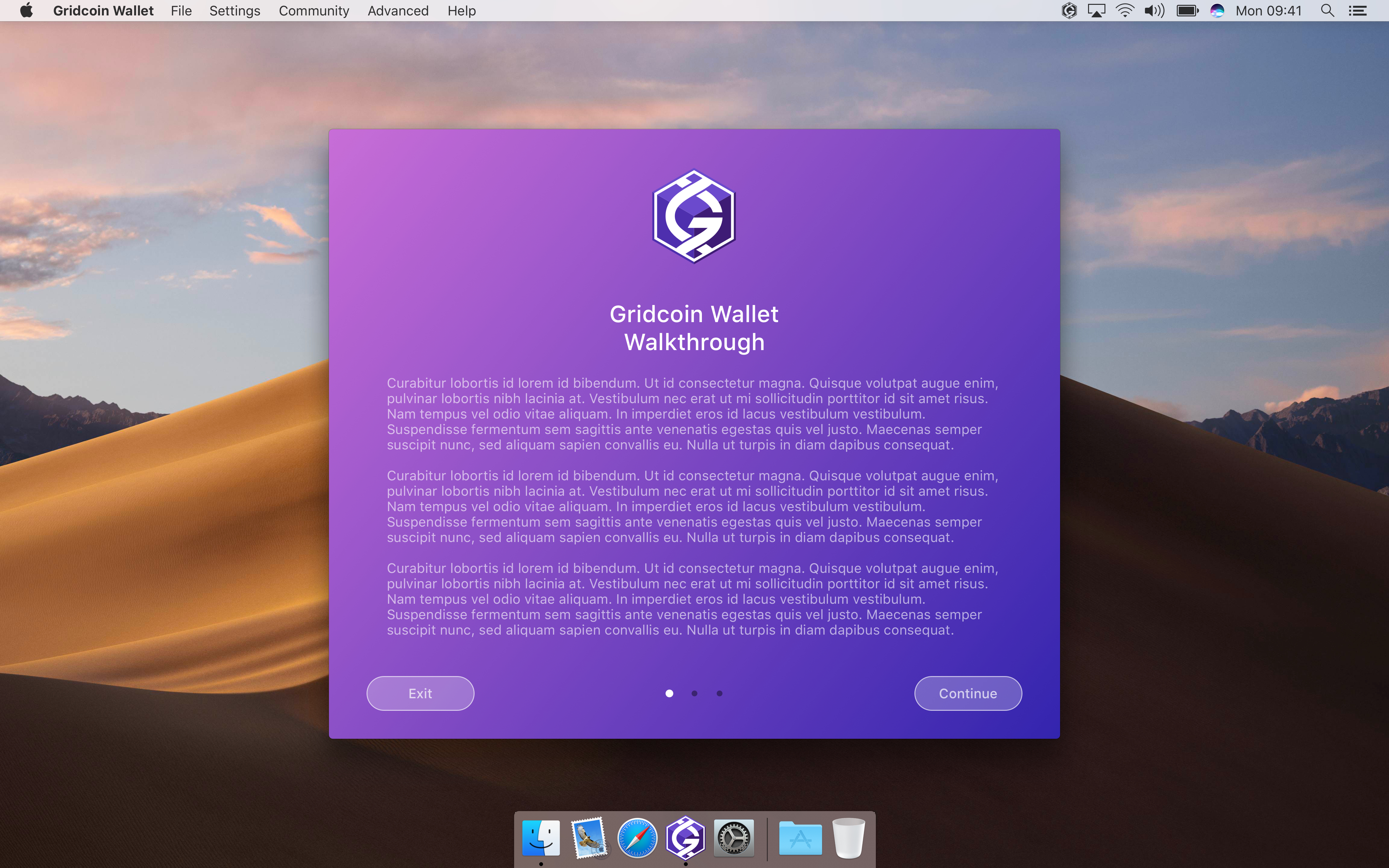
@grc-H202 You can see Onboarding flow (windows with purple background) above. Some of them contain Lorem Ipsum text that must be replaced with a welcome message etc, some needs proper instructions. I'm still working on them however common layout will stay the same.
madmaxpayne
on 25 Jul 2018
@madmaxpayne You're doing great work on this! 🥇
mattcoxonline
on 25 Jul 2018
Did some proofreading today --see attached text files. I tried organizing by screen / post on this thread. My next task will be to draft text for the onboarding flow. I think it will be reasonable to adapt some content from the official Gridcoin site.
grc-H202
on 26 Jul 2018
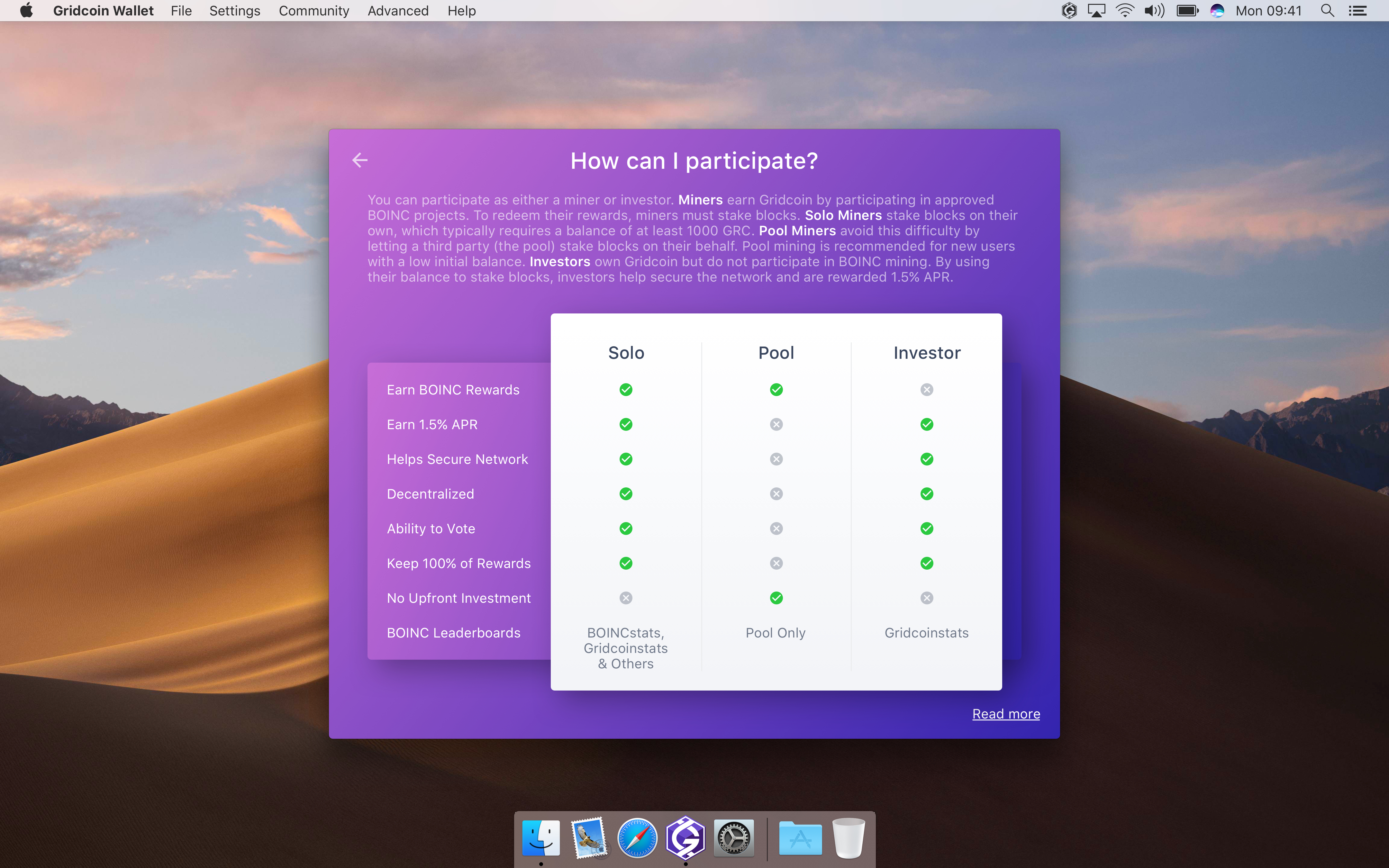
@madmaxpayne See previous post. Also, attached below is text for the "how can I participate" info screen. CAPS is supposed to indicate bold or italics.
onboard-participation-info.txt
Also, what do you have in mind for text on the "Gridcoin wallet walkthrough" screen? Just summarizing what the walkthrough does? It seems that would only need a couple of sentences.
grc-H202
on 28 Jul 2018
@grc-H202 Great job! Hopefully I'll be able to finish everything this week.
I think the first screen should contain greetings, some words about Gridcoin and short description of the onboarding process.
madmaxpayne
on 29 Jul 2018
@madmaxpayne Makes sense! I'll try to put something together along those lines.
grc-H202
on 30 Jul 2018
Quick update on Beacon tab and Onboarding views:
Added red style for warning messages

Replaced text content provided by @grc-H202
- Replaced Investor icon
- Enhanced Installation Check view
- Created Sync view with a copy of an instruction from Gridcoin website
- Created Completion view


madmaxpayne
on 30 Jul 2018
Leave your comments, guys. A couple of screens for other 2 modes left and I'll start putting the Dark skin on all views.
madmaxpayne
on 30 Jul 2018
With CBR comming soon, the 1.5% APR will be changed into a fixed amount earned every stake. What would be the best way to phrase that in the pool vs solo vs inventer chart.
RoboticMind
on 30 Jul 2018
Also, with all the explanations from this GUI change, when this gets implemented can we close our longest standing issue https://github.com/gridcoin-community/Gridcoin-Research/issues/52?
RoboticMind
on 30 Jul 2018
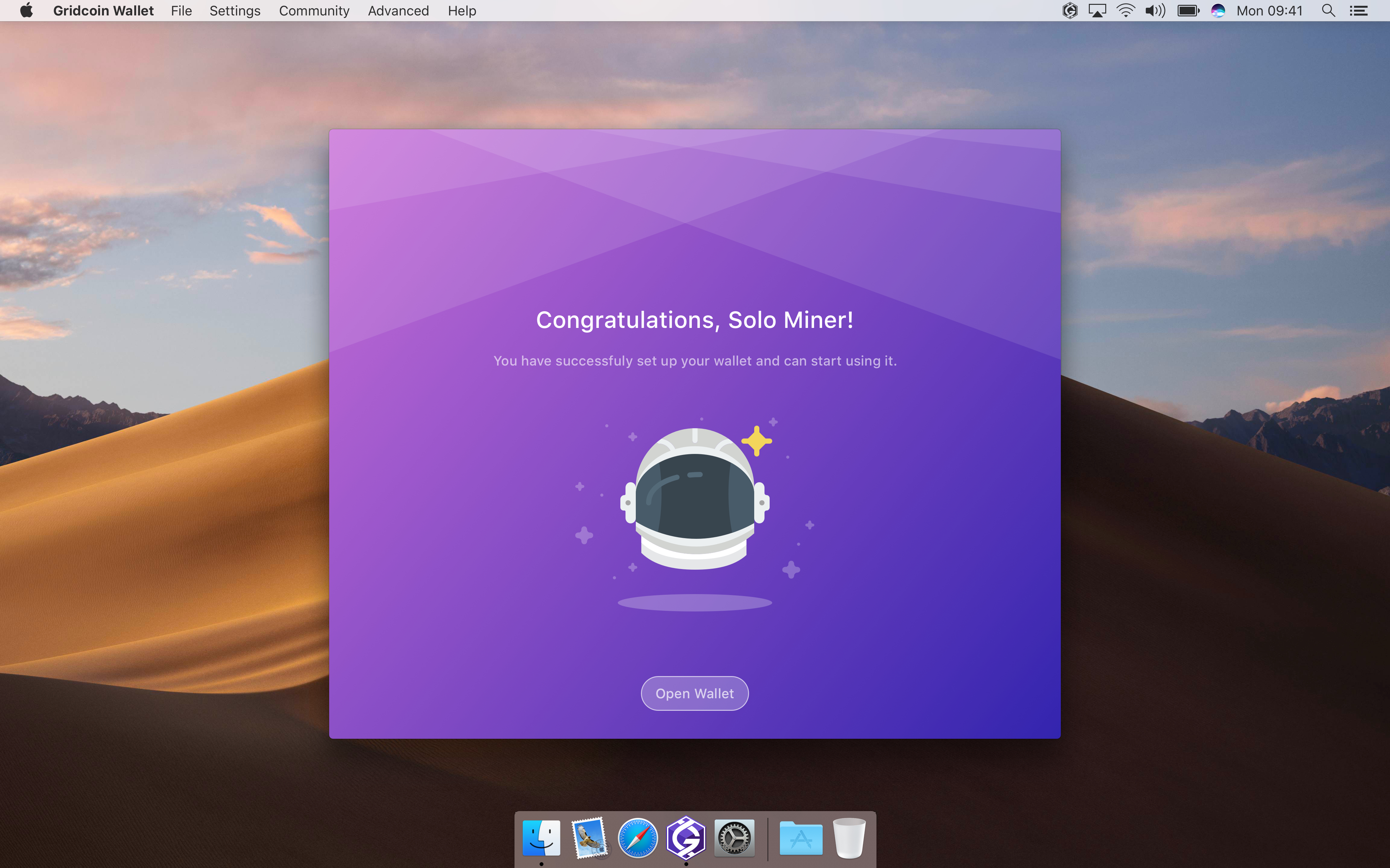
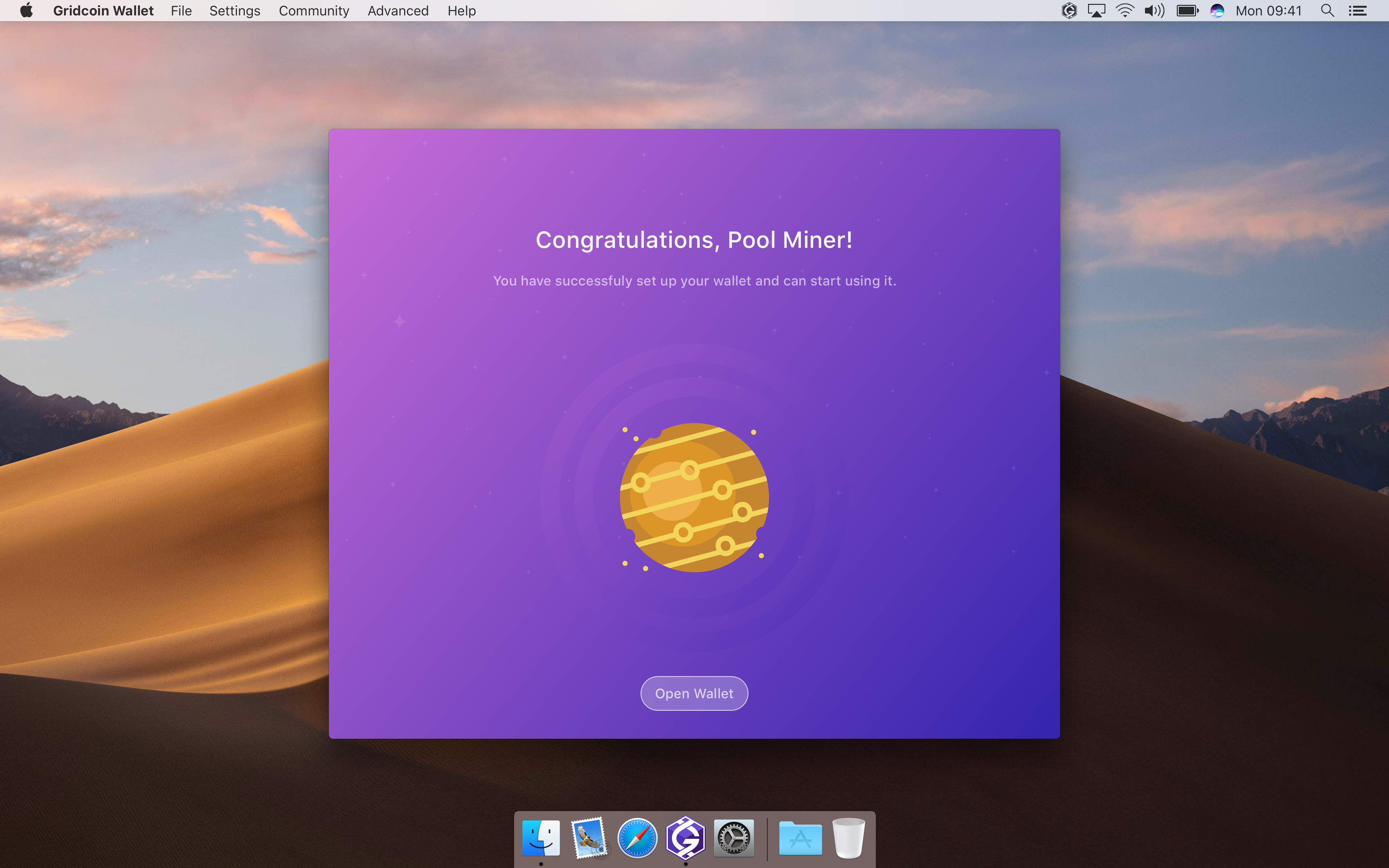
Pool and Investor Completion screens:
madmaxpayne
on 31 Jul 2018
Congratulations! The wallet poll has ended, and the overwhelming majority of voters approved the funding of this UI overhaul. It looks amazing, keep up the good work!
an0n7mous3
on 3 Aug 2018
Congrats! We are on the homestretch of the 1st phase. I'll do my best to finish within a week.
madmaxpayne
on 3 Aug 2018
A few comments:
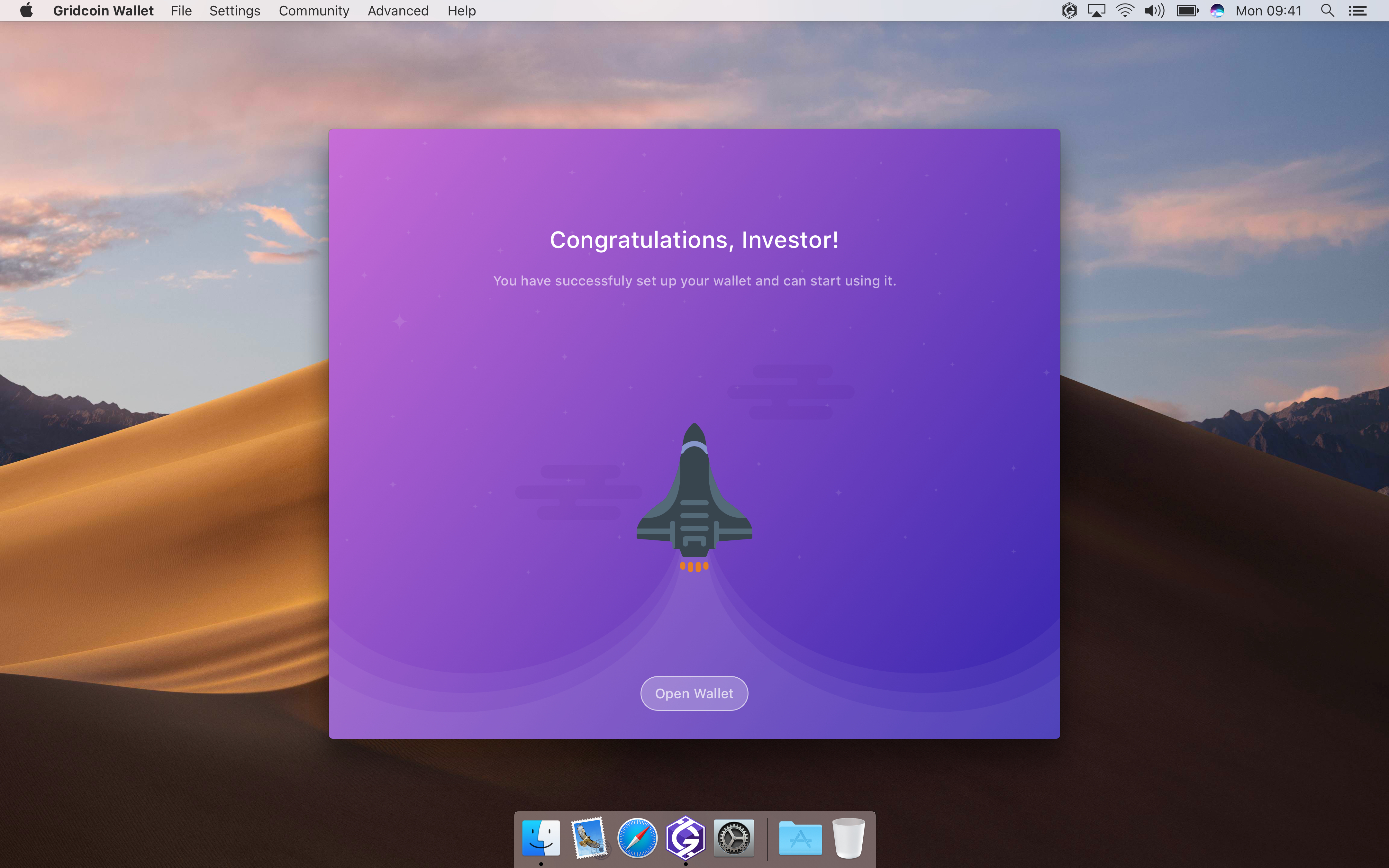
- It seems the first screen doesn't need much text. Given that the user is already installing the wallet software, we can assume that they have read at least one or two sentences about Gridcoin. So, I think all we need is something like this: "Welcome to Gridcoin! The next few screens will guide you through the setup of your Gridcoin wallet."
- The "How can I participate" help screen looks good. One thing that bothers me though is the presence of such a large, unbroken block of text (this is partly self-criticism, since I wrote the text). I think it would look better to break up the text into separate lines or bullet points. To generate the extra space for this, I recommend dropping the "BOINC leaderboards" row of the table, which I think is unnecessary and confusing anyways for a new user.
- Onboarding completion screen. I recommend this wording: "Congratulations! You have successfully set up your wallet in pool mining mode."
grc-H202
on 7 Aug 2018
Leaderboards are important point in the comparison.
tomasbrod
on 7 Aug 2018
@tomasbrod Maybe, but I don't think the screen in question is the right place for it. Even if leaderboards should go somewhere else, there needs to be more explanation. Not sure a new user will know what's being talked about in terms of BOINC leaderboards in general, and boincstats in particular.
grc-H202
on 8 Aug 2018
@grc-H202 Thanks. I'll make recommended adjustments.
madmaxpayne
on 8 Aug 2018
Finally I've finished Dark theme and made multiple enhancements considering latest feedback from this topic. Starting to create style guide for developers.
madmaxpayne
on 14 Aug 2018
Is the logo in the mockups different than the one on Github? For reference https://github.com/gridcoin-community/Gridcoin-Marketing/tree/master/Gridcoin%20Logos. If so, I'd suggesting switching it to prevent confusion and keep with branding.
Not trying to be prick by playing logo police. You're doing some seriously kick ass work!
wisecracka
on 15 Aug 2018
Isn't the logo used this one on the marketing repo
https://github.com/gridcoin-community/Gridcoin-Marketing/blob/master/Gridcoin%20Logos/PNG%20Format/Standalone%20Logos/GRCLogoOnly_Purple%26White_Solid.png
RoboticMind
on 15 Aug 2018
Nope. The logo in the mockups has three solid shades of purple, it almost looks like a cube. The logo from https://github.com/gridcoin-community/Gridcoin-Marketing/blob/master/Gridcoin%20Logos/PNG%20Format/Standalone%20Logos/GRCLogoOnly_Purple%26White_Solid.png has a vertical gradient and no additional "shapes."
wisecracka
on 15 Aug 2018
Noticed in the overview that where we now have the word "Stake" you have put the word "Stack".... I myself would prefer to keep the word "Stake". Makes a person think are we staking GRC or stacking GRC ? but like wisecracka said.... Not trying to be a prick by playing word placement police. You're doing some seriously kick ass work!
 HopSling
on 15 Aug 2018
HopSling
on 15 Aug 2018
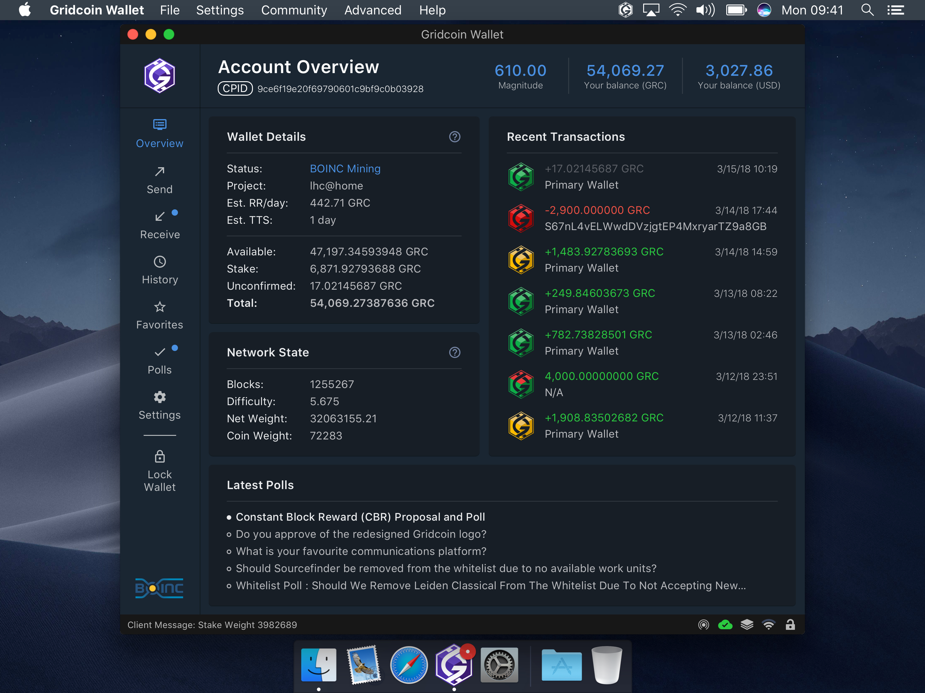
That field was showing amount that was locked by CoinStake and therefore unspendable. I do not think that the reason for locking is important in the overview and would prefer single field that shows sum of all unspendable, currently locked, funds. Then the Unconfirmed fund, which are already on overview.
By looking at the mockaps, it seems to me that there is Too much stuff in the window. Does it fit on 1024x768 screen? Plus Balance is two times there.
tomasbrod
on 15 Aug 2018
Corrected Stack to Stake (it was a typo)
The window will fit into 1024 x 768. Yes, we have lots of stuff here, News tab was added. Slimming it down will involve reducing of margins, icons and the text size which will make the content hardly readable.
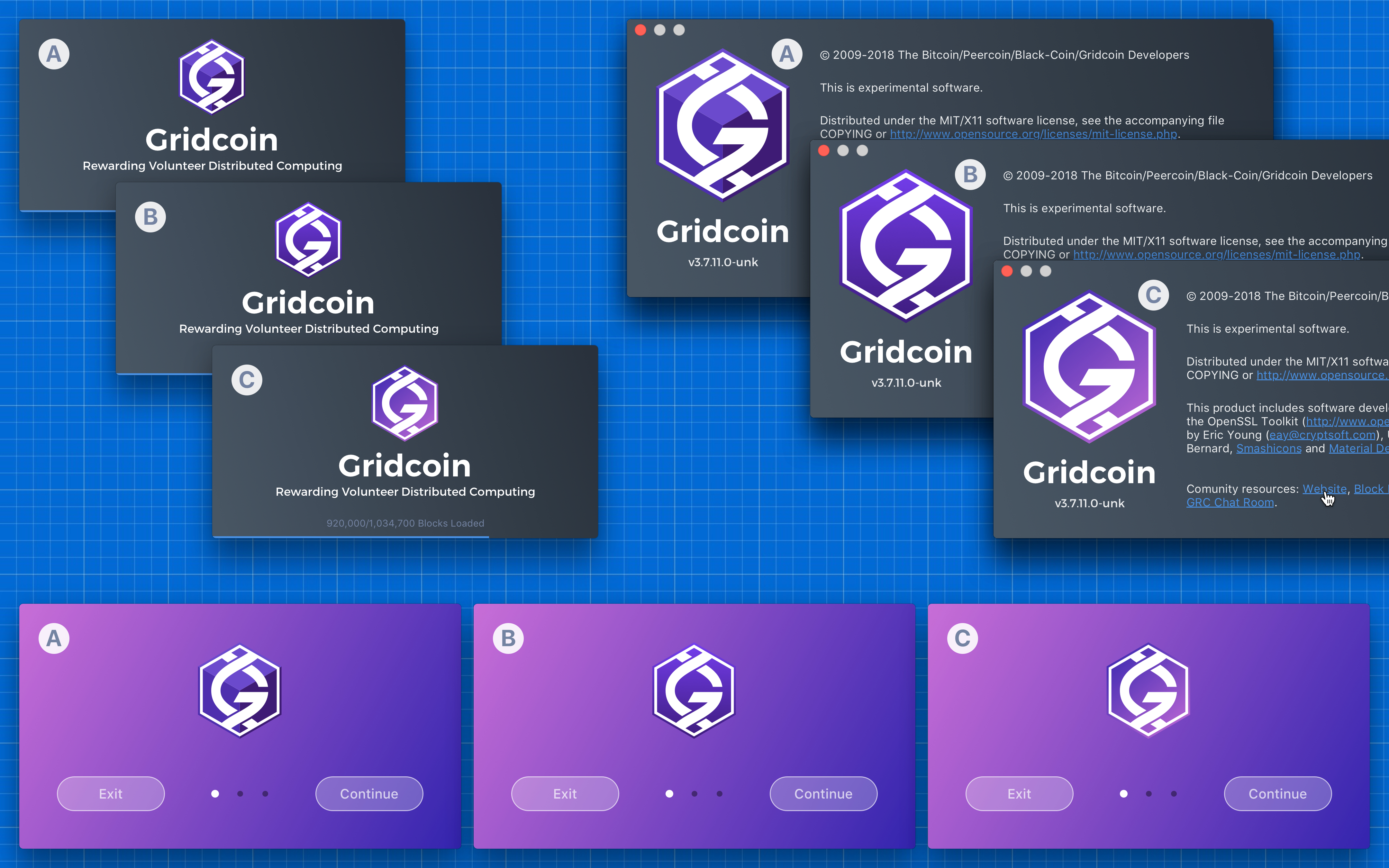
I modified the logo to add some freshness. From my point of view the existing one looks quite faded. Below are 3 variants for comparison purposes: a) Modified logo b) Existing logo c) Existing with an altered gradient. What are your thoughts guys? I'm planing to submit redesigned website for voting in the nearest future. We can include the new logo into the poll also.
madmaxpayne
on 15 Aug 2018
I dig the alternate logos but I strongly think any logo alterations should be a separate project. The community voted for the current logo, I believe any edits would have to pass a poll to be implemented in any work. Changing the logo would mean changes to other products such as the white paper. We'd have to make sure the new logo works in or is adjusted for CMYK. Hell, I don't think the current logo is in the CMYK gamut.
wisecracka
on 15 Aug 2018
We can stick to the current logo. I'll raise the issue of website, logo and white paper redesign later.
madmaxpayne
on 15 Aug 2018
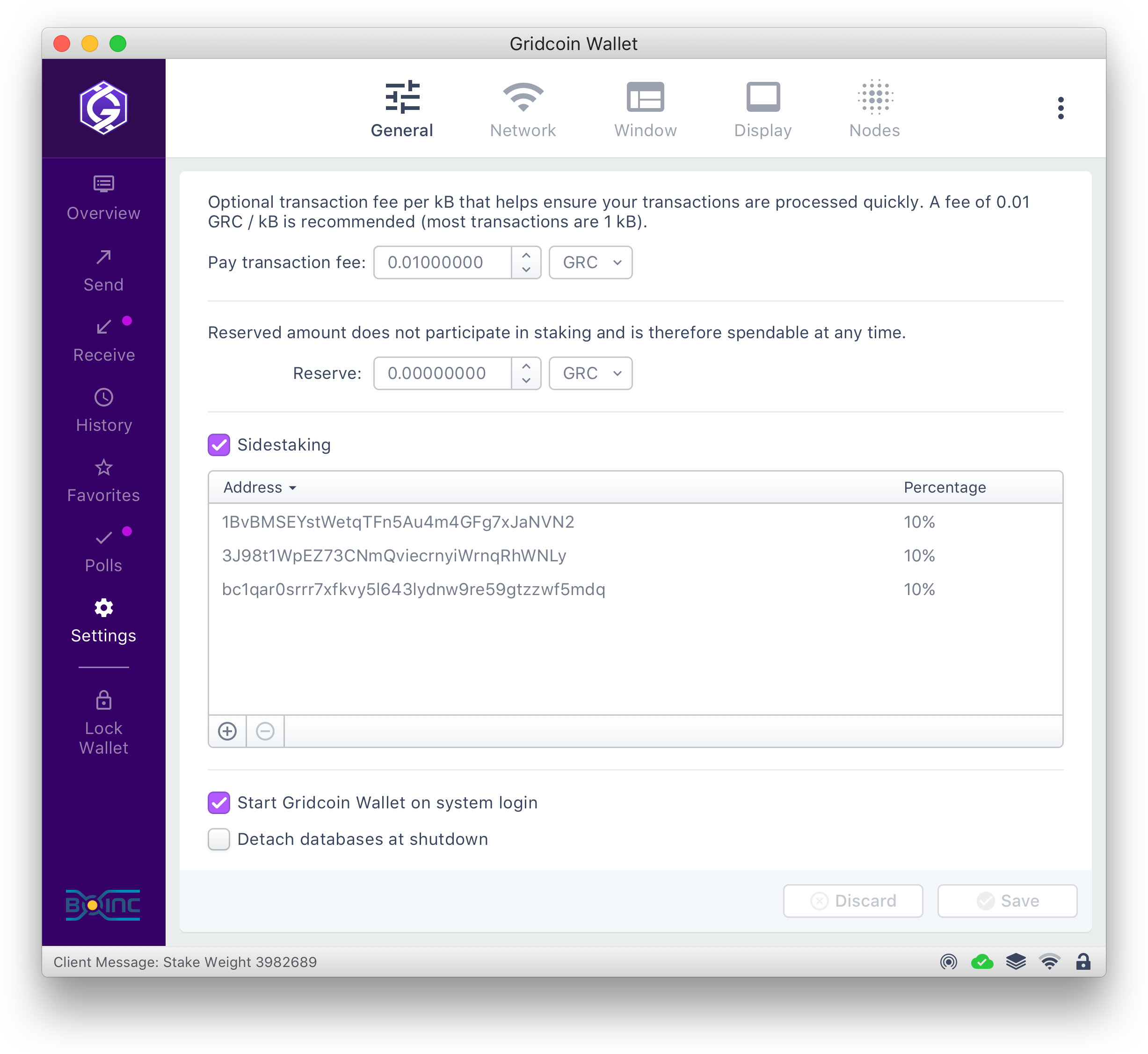
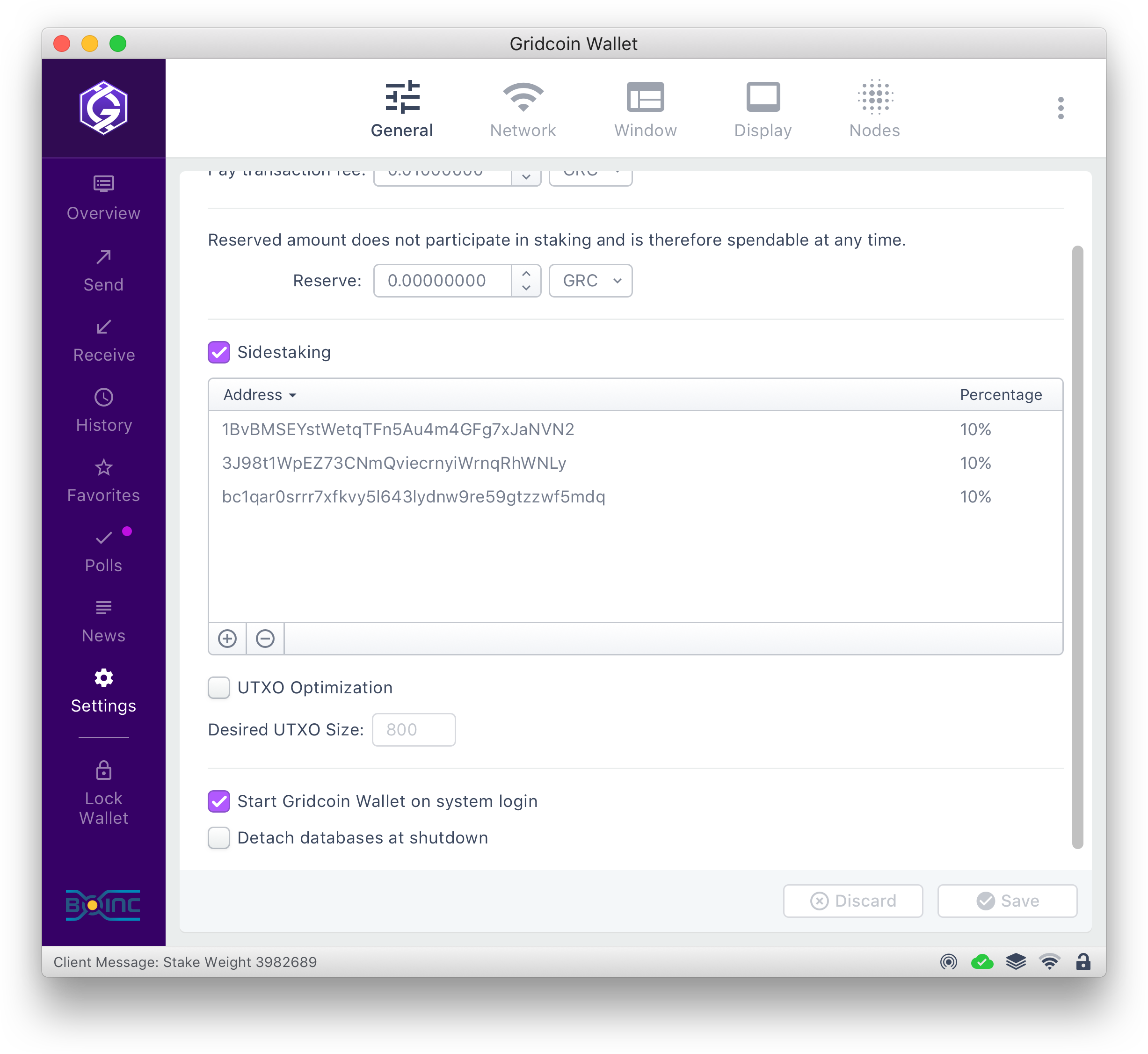
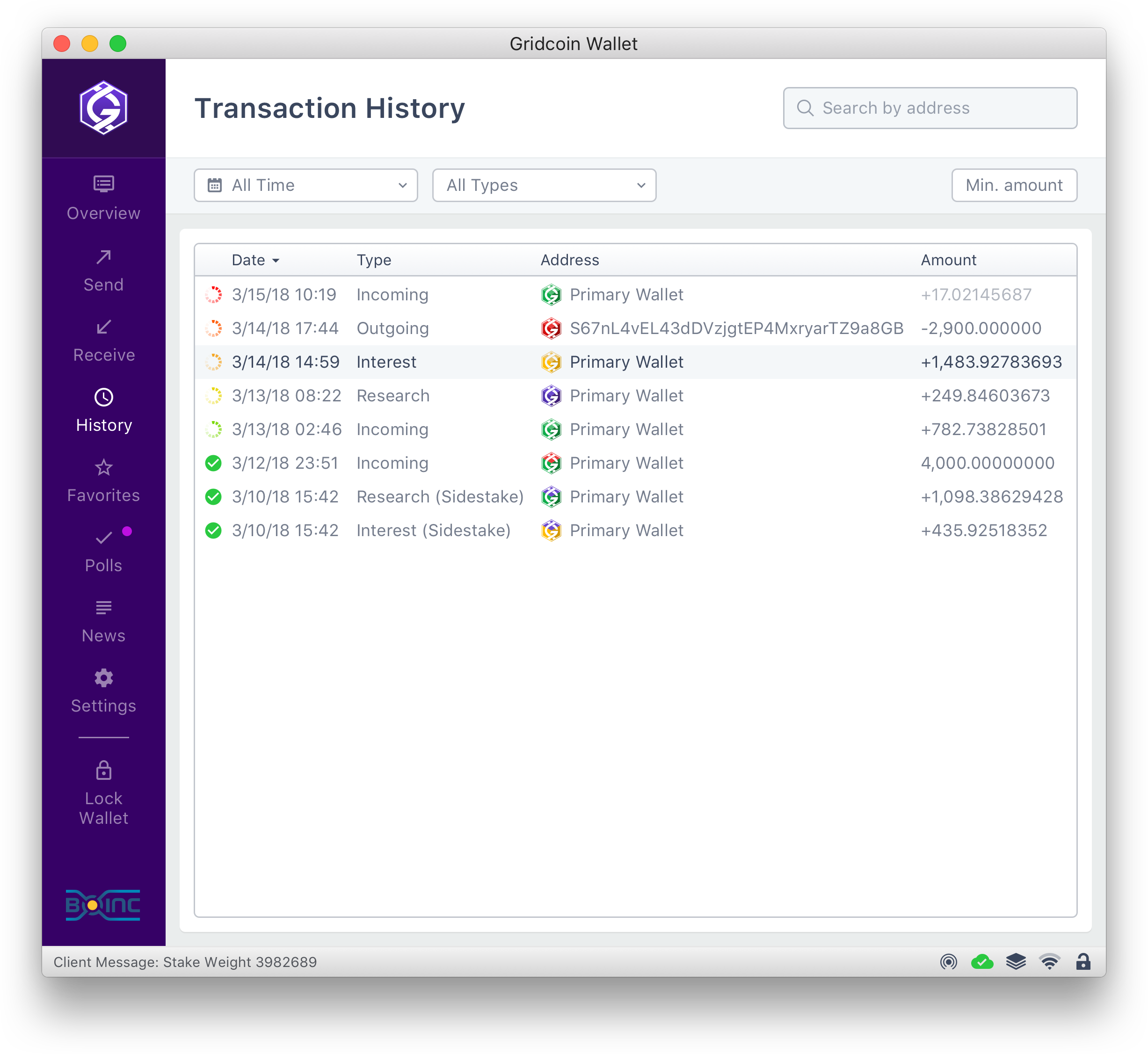
We should think about the upcoming sidestaking PR #1265. New icons may be warranted that indicate rewards received from another wallet staking. There may be other things we want to do.
We also need controls to be able to specify in the UI whether splitting or sidestaking is active,
And provide up to 6 entries for sidestaking each having an address and allocation percentage. See 1265 and related PR's for more details.
 jamescowens
on 4 Sep 2018
jamescowens
on 4 Sep 2018
I do not think that sidestaking requires elaborate gui support. Icon with little marker and few extra lines in Transaction detail view.
tomasbrod
on 4 Sep 2018
The support does not have to be elaborate.
I agree on the icons.... use the same as the normal PoS and PoR icons, maybe with a curved arrow on top, like a desktop shortcut, to indicate it came from another staking wallet...
The transaction view table simply needs to have a different description in the "Type" column.
This can all be accomplished as part of the initial sidestake rollout.
The second partis allowing UI control of the sidestaking instead of having to edit the config file by hand. That can be done later, but we should probably model the screen for it now.
Forgive my hand sketch for the second part. :)
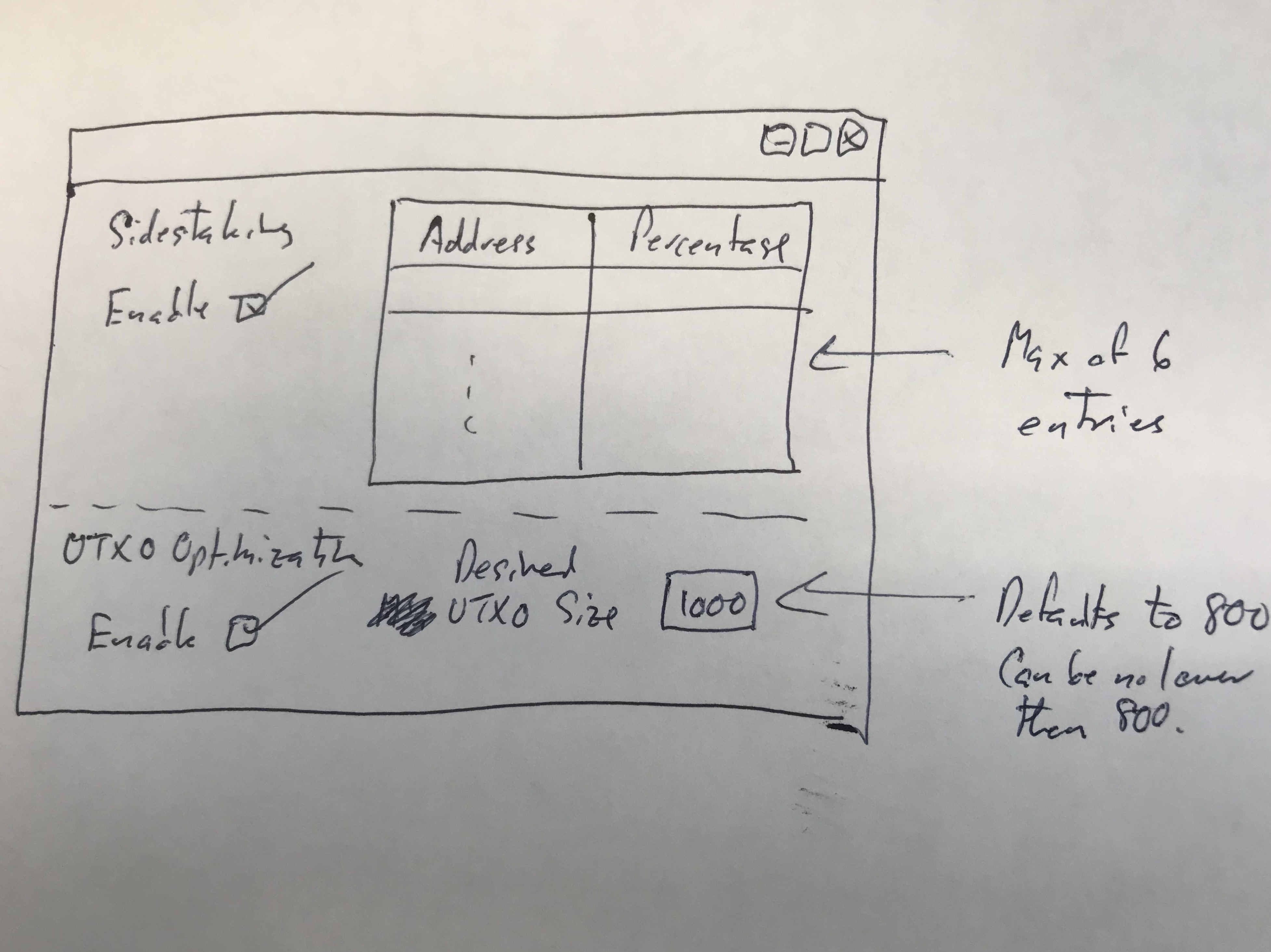
Note we may want to use efficiency instead for the UTXO splitting part. Efficiency defaults to 90%, and has to be in the range of 75% to 98%. The config file also allows the specification of a min UTXO size, which prevents UTXOs from being split smaller than a certain amount (defaults to 800 and can be no lower than 800), in case difficulty drops significantly.
jamescowens
on 4 Sep 2018
Where we gonna place it? Into General tab?
I'll add UTXO Opt and create new icons later this week.
madmaxpayne
on 4 Sep 2018
You were talking about the receiver side of sidestake. I thought that could be plain receive transaction. The stake split, efficiency and sidestaking settings form? Well it is settings, so it should go where other settings are.
tomasbrod
on 4 Sep 2018
You are right - Receiver side for the transaction grid and sender side for the settings.
Sent from my iPhone
On Sep 4, 2018, at 2:08 PM, Tomáš notifications@github.com wrote:
You were talking about the receiver side of sidestake. I thought that could be plain receive transaction. The stake split, efficiency and sidestaking settings form? Well it is settings, so it should go where other settings are.
—
You are receiving this because you commented.
Reply to this email directly, view it on GitHub, or mute the thread.
jamescowens
on 4 Sep 2018
All right, Gents! Only button icons left. I'm planning to finish slicing assets tomorrow and will make a commit.
madmaxpayne
on 5 Sep 2018
@denravonska @Foggyx420 @skcin @TheCharlatan @quezacoatl1
Max has uploaded the assets. Once all 5 of you sign off on their completion and your own satisfaction then we can get $1,500 to Max. This works out to 52,024.33629086 GRC.
Once we have an implemented GUI with the new assets we can get the final $500, or 17,341.44543029 GRC, to him.
View the assets at:
https://github.com/madmaxpayne/Gridcoin-wallet-redesign
Average price for 30 days before close of poll: 0.02883266 USD
Total GRC owed now: 52,024.33629086 GRC
Owed upon implementation: 17,341.44543029 GRC
Data from: https://coinmarketcap.com/currencies/gridcoin/historical-data/?start=20180701&end=20180801
Proposal with financial details: https://steemit.com/gridcoin/@jringo/proposal-and-poll-funding-a-proposed-gridcoin-core-client-ui-redesign
jring-o
on 3 Oct 2018
@denravonska @Foggyx420 @skcin @TheCharlatan @Quezacoatl1
Max has uploaded the assets. Once all 5 of you sign off on their completion and your own satisfaction then we can get $1,500 to Max. This works out to 52,024.33629086 GRC.
Once we have an implemented GUI with the new assets we can get the final $500, or 17,341.44543029 GRC, to him.
View the assets at:
https://github.com/madmaxpayne/Gridcoin-wallet-redesignAverage price for 30 days before close of poll: 0.02883266 USD
Total GRC owed now: 52,024.33629086 GRC
Owed upon implementation: 17,341.44543029 GRCData from: https://coinmarketcap.com/currencies/gridcoin/historical-data/?start=20180701&end=20180801
Proposal with financial details: https://steemit.com/gridcoin/@jringo/proposal-and-poll-funding-a-proposed-gridcoin-core-client-ui-redesign
Looks fine by me. @madmaxpayne has agreed to answer any questions we might have.
 denravonska
on 11 Oct 2018
denravonska
on 11 Oct 2018
Just a question to the developers out of curiosity: How is this going to be implemented? To me it looks almost impossible to do it with traditional Qt widgets, like it is done currently. Will you use Qt Quick / QML instead, or even switch to a whole new library for the frontend?
Btw, these mockups are looking phenomenal! I especially like the initial set-up procedure, this would make it so much easier for new people to get started!
 a123b
on 16 Oct 2018
a123b
on 16 Oct 2018
I would still like @madmaxpayne to at least try to mock it in Qt designer. was not part of contract, i know
tomasbrod
on 18 Oct 2018
@tomasbrod I have never worked with QT so I can only collaborate with somebody who knows how to deal with it.
madmaxpayne
on 18 Oct 2018
Hey, at first glance everything is there. I don't think it is an easy task to implement this, but it looks great. But as I understand it @madmaxpayne will be around for consultation. @a123b I am currently looking into Qt QML, I think it is the way to go for a modern UI. I have never used it so I am not sure how much of the code can be reused. And there might be performance issues with large data sets. (in table or list views) But it is also possible to mix QML and widgets. I guess we will see how this works out.
skcin
on 18 Oct 2018
For large data grids/lists we can use paging.
madmaxpayne
on 18 Oct 2018
@denravonska @Foggyx420 @skcin @TheCharlatan @Quezacoatl1
Max has uploaded the assets. Once all 5 of you sign off on their completion and your own satisfaction then we can get $1,500 to Max. This works out to 52,024.33629086 GRC.
Once we have an implemented GUI with the new assets we can get the final $500, or 17,341.44543029 GRC, to him.
View the assets at:
https://github.com/madmaxpayne/Gridcoin-wallet-redesignAverage price for 30 days before close of poll: 0.02883266 USD
Total GRC owed now: 52,024.33629086 GRC
Owed upon implementation: 17,341.44543029 GRCData from: https://coinmarketcap.com/currencies/gridcoin/historical-data/?start=20180701&end=20180801
Proposal with financial details: https://steemit.com/gridcoin/@jringo/proposal-and-poll-funding-a-proposed-gridcoin-core-client-ui-redesign
I like it. :)
 Quezacoatl1
on 18 Oct 2018
Quezacoatl1
on 18 Oct 2018
I forgot to mention that I agree that @madmaxpayne satisfied the contract.
I was hoping we could keep QtWidgets, but ok, QML offers more styling. I am glad that QtQuick can compile both the QML and JS into native form, otherwise this would be a huge regression.
My experience with QML was that it completely trashed out the operating system user interface theme, and replaced everything with app specific designs. Consequently, conservative users may not be able to recognize basic widgets, like button, checkbox, radio and text fields, because in the app they look completely different than in system.
tomasbrod
on 19 Oct 2018
I Approve. This will bring the wallet into the future it is nice to see gridcoin headed in a forward direction. Thank you @madmaxpayne for taking on this.
iFoggz
on 21 Oct 2018
I suggest adding an ability to select several UTXOs in coin control by holding down shift like Windows does with files.
Nethlek
on 30 May 2019
I suggest adding an ability to select several UTXOs in coin control by holding down shift like Windows does with files.
Normally all grids should support this feature.
Ctrl + Select – allows you to click and select multiple records that are anywhere on a list, not necessarily next to each other.
Shift – allows you to select a group of records that are contiguous (i.e. next to each other) by clicking one record, and then holding Shift and clicking the last record. All the records in between are then selected.
Ctrl + A will “select all” the records you see in a grid.
In macOS Command button is used instead of Ctrl for those purposes.
madmaxpayne
on 30 May 2019
Following a misadventure that has just happened to me, I suggest you an evolution of the GUI.
For several months, my work done on the Einstein and LHC projects was not taken into account in the calculation of my magnitude. Due to a GDPR regulations on these projects.
The only solution to know if the projects are correctly taken into account is the command "explainmagnitude" (Thanks Jim Owens for the information)
On "Gridcoinstats", these 2 projects were known but was not giving me any magnitude. As they said, it's just an estimation. But it was the source of my mistake. I was thinking that all was good.
What I propose is to add this information on the GUI.
For example, an idea could be a pop-up on "Magnitude" which would give the result of the "explainmagnitude" command in more user friendly. Only active projects with their own magnitude.
Or, a little tabs with the same info of the command : Project name, RAC, Magnitude.
If so, if a projetc you are crunching don't appear, you know that there is a problem.
By the same way, should great having an explanation of the issue due to GPDR and how to solve it.
I hope that my English is not too bad and well you well understand the idea.
 Tatayet64
on 8 Jun 2020
Tatayet64
on 8 Jun 2020
Related issues
 Penumbra69
·
6Comments
Penumbra69
·
6Comments
 Lenni
·
3Comments
Lenni
·
3Comments
 kotenok2000
·
5Comments
Quezacoatl1
·
5Comments
kotenok2000
·
5Comments
Quezacoatl1
·
5Comments
 Tahvok
·
4Comments
Tahvok
·
4Comments
Most helpful comment
No logo vs Gridcoin logo
As you may have seen from the mocks above, there is one with the Gridcoin logo in and one without. Either way - whether it's in or out - I don't mind.
Should the Gridcoin logo be visible in the navigation rail as default?
You decide! Answer by adding emoji reactions to this comment.
👍 _to keep the logo_
👎 _is no logo_