Godot: Font preview in import dialog file browser
Font preview in import dialog file browser, like in Blender. Would be handy :)
 ip
ip
All 13 comments
I was thinking of adding previews to the file browser that run in a thread,
will probably do after stable release.
On Wed, Jun 18, 2014 at 7:09 PM, needhash [email protected] wrote:
Font preview in import dialog file browser, like in Blender. Would be
handy :)—
Reply to this email directly or view it on GitHub
https://github.com/okamstudio/godot/issues/530.
 reduz
on 19 Jun 2014
reduz
on 19 Jun 2014
Preview has been implemented in the file browser, we just need to check if it works for font importing.
 akien-mga
on 30 Oct 2015
akien-mga
on 30 Oct 2015
I confirm there is no font preview in the import dialog file browser as of bd736e5.
akien-mga
on 30 Oct 2015
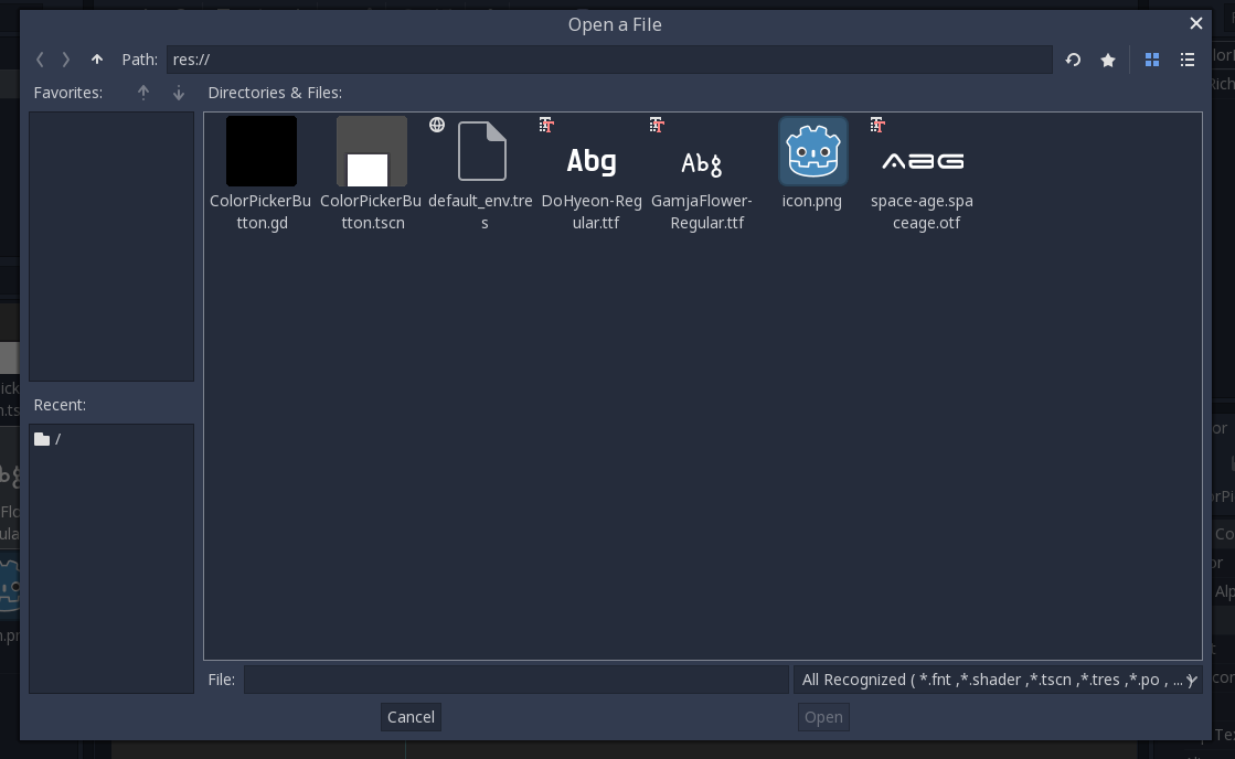
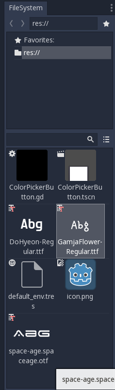
To clarify: there is proper font preview in the "Import Font" dialog after a font has been selected in the file browser. But this issue asks for (AFAIU) TTF/OTF font preview directly in the file browser, to be able to pick the right font more easily.
This brings the question to know what should be displayed, as we can't possibly display all letters of the latin alphabet on the thumbnail; maybe the letters 'Az' or something, written with the font?
akien-mga
on 19 Jul 2016
As a reference, this is how Windows displays fonts in the explorer:

 vnen
on 20 Jul 2016
vnen
on 20 Jul 2016
What about this way as Photoshop does.

 volzhs
on 20 Jul 2016
volzhs
on 20 Jul 2016
Since the editor uses FreeType, it should be relatively easy to generate such previous. Since it's for {Editor,}FileDialog, I guess the Windows style as shown by @vnen above makes the most sense.
akien-mga
on 28 Jun 2017
What do you think about this style of displaying the font samples?
I found the default file icon to be a little distracting, so I hid it for fonts. It's a work in progress, so I'd really appreciate any ideas or feedback!
 flashyincceo
on 16 Apr 2018
flashyincceo
on 16 Apr 2018
@flashyincceo looks good enough for me
Is it possible to have more character in the preview when the icon is large?
 zaniar
on 16 Apr 2018
zaniar
on 16 Apr 2018
@zaniar I appreciate the suggestion, but I'm not quite sure I understand the idea. Is it to have a longer font sample "Abcdef" vs. "Abc" for those fonts that don't completely fill the width of the icon?
flashyincceo
on 16 Apr 2018
@flashyincceo I think having more character will provide more useful preview of font. Not just "Abc" or "Abcdef", but A to Z, or more. That way we can see differences between fonts in a glance more clearly.
zaniar
on 17 Apr 2018
I personally think Abg is enough, let's you see a capital letter, an ascent, and a descent. This is not like the font selector of a word processor, it's just so you can distinguish the few fonts you might have in your project.
vnen
on 17 Apr 2018
 mhilbrunner
on 28 May 2018
mhilbrunner
on 28 May 2018
Related issues
 SleepProgger
·
3Comments
SleepProgger
·
3Comments
 RayKoopa
·
3Comments
RayKoopa
·
3Comments
 timoschwarzer
·
3Comments
timoschwarzer
·
3Comments
 mefihl
·
3Comments
mefihl
·
3Comments
 n-pigeon
·
3Comments
n-pigeon
·
3Comments
Most helpful comment
What about this way as Photoshop does.