Godot: Use different colors for the SMB (Solo, Mute, Bypass)
Master branch.
As #11453 was merged a little bit too fast, I wanted to point out some of my concerns:
I'm just not convinced by the new reset zoom, zoom-in and zoom-out icons, they are less nice than before.I'm probably the only one, so we can forget about it ^^The S in the audio solo icon is hard to read.Done- The audio icon should have different base color, this in a convention in audio engines, like it was before actually. Or at least the M, S and B letters be obviously visible. Both should be best.
cc @djrm
 groud
groud
All 15 comments
@groud do you have by any chance some screens? It would be easier to discuss :)
edit: Thanks!
 kubecz3k
on 21 Sep 2017
kubecz3k
on 21 Sep 2017
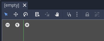
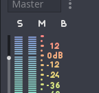
Sure. The new zoom related icons:
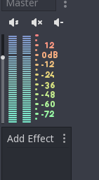
The audio buttons:
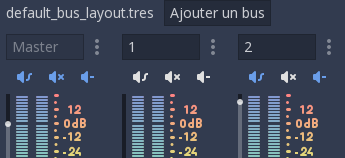
Before:
And a very old one (this icon change is older than #11453):
groud
on 21 Sep 2017
What I like about new zoom icons is the fact that they seems to be a lot smaller. However I don't think it's an argument in a favor of new icons, since old ones could be made smaller as well (without style change).
kubecz3k
on 21 Sep 2017
@groud i actually like the new zoom icons better, about the sound one, thery are hard to make, i will try to do some improvements but as far as i can tell they are better that simply S M B, that does not tell you anything, you may need to check the tooltip anyways.
 djrm
on 21 Sep 2017
djrm
on 21 Sep 2017
Well I find that the new zoom icons are far less good that the previous ones. The + and - are too small, and it's less understandable (in my humble opinion) than they are zoom related: the round shape make the icons look less "integrated" into the background thus it's hard to understand they will change the view size. Still that can be subject to a vote.
That being said the previous ones were not that good, maybe womething like that would be better:
https://thumb9.shutterstock.com/display_pic_with_logo/1512428/326304902/stock-vector-zoom-in-and-out-icons-326304902.jpg
And no, the icons for the sound are not more understandable than S, M, B (except for the mute one with is obvious). The Bypass is not ok, and the solo one needs a real S. I think for this one we should have a look to what is done with audio workstation (ableton, cubase, fruity loops...). From what I know I would recommend:
- A speaker icon for the "Active/Mute" status: with "waves" output when active and a 'x' (or nothing when muted)
- Having a 'S' icon for solo (with no speaker)
- Having either a 'B' icon or something inspired from that -> https://cdn2.iconfinder.com/data/icons/strategy-3/100/strategy-tactic-02-512.png
Also, the color is really important on those one I believe.
That being said i like the new snap icon, I saw you changed it :)
groud
on 21 Sep 2017
@groud the problem is i only have 16x16 pixels to work, i cant do wonders with that little space. I really think S icon means nothing or at least the same as (Speaker) S, Bypass well, thats actually hard to represent in an icon, so maybe speaker + B just so they look alike, also the zoom icons are not possible to do currently with 16 x 16 image or would be ridiculous. also the color think can be handled easily but has nothing to do with the icon itself.
By the way im currently doing some work with the icons and ive done this for the solo icon
i think the s is clearer but is as good as it can get, or at least that i can think of.
will try the same with bypass (just putting a b)
djrm
on 21 Sep 2017
A single 'S' for solo is the common representation in any music workstation you can find.
For the bypass I don't know, this is not a common feature.
But in fact I truely think the speakers are not necessary here, we know they are related to audio, they are to the top of an audio bus ! ^^ Maybe just keep it for the mute/active button :)
I can give it a try if you want :)
groud
on 21 Sep 2017
hm. we already know those are about sounds.
should we use speaker shape though?
just my 2 cents.
 volzhs
on 21 Sep 2017
volzhs
on 21 Sep 2017
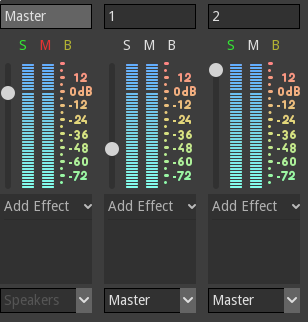
@groud researching a little bit about DSPs it seems that indeed, the defaults are just S, M or Solo, Mute, if thats the standard i think it can be helped. here are the more standard new icons
djrm
on 21 Sep 2017
Awsome, they look nice. Maybe to add to the suggestion, we could have something similar to Ableton:
instead of having a Mute button we have an "Active" (and maybe yellow) button pressed by default. But I think this may need to move this icon to the left.
Anyway that's not a priority. :)
By the way, as I may have insisted a bit on that, I just wanted to thank you for the whole job you've done over the interface. The editor looks great and modern now 👍 ! :D
groud
on 21 Sep 2017
What's the status here?
 akien-mga
on 8 Jan 2018
akien-mga
on 8 Jan 2018
For the zoom icon, nobody else than me complained about it, so I guess only the SMB colors for the buttons lacks. I update the issue title.
groud
on 8 Jan 2018
By now it's likely not critical for 3.0, so moving to 3.1 :)
akien-mga
on 10 Jan 2018
By now it's likely not critical for 3.0
Clearly it's not ^^
groud
on 10 Jan 2018
@groud For the remaining item (color of the S M B buttons), I'd say scratch your own itch as it's visibly not fixing itself :P
Almost anniversary ping :)
akien-mga
on 9 Jan 2019
Related issues
 mefihl
·
3Comments
mefihl
·
3Comments
 timoschwarzer
·
3Comments
timoschwarzer
·
3Comments
 mooseyfaith
·
3Comments
mooseyfaith
·
3Comments
 blurymind
·
3Comments
blurymind
·
3Comments
 ivanskodje
·
3Comments
ivanskodje
·
3Comments
Most helpful comment
@groud researching a little bit about DSPs it seems that indeed, the defaults are just S, M or Solo, Mute, if thats the standard i think it can be helped. here are the more standard new icons