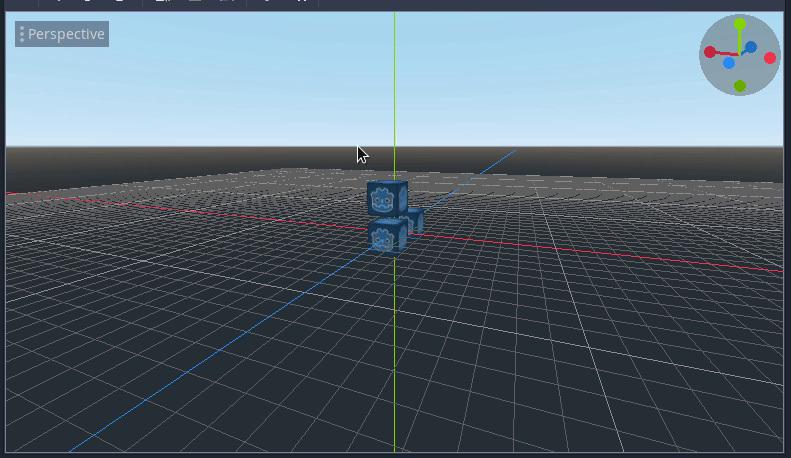
Godot-proposals: Add a rotation widget to the 3D viewport
I'm working on a rotation widget for the 3D viewport. It's mostly done and working but I could use some feedback on any extra features or the visual design for it (size, colors, etc.) since right now I just copied the Blender widget.
Describe the project you are working on:
Any 3D project can benefit form the change.
Describe the problem or limitation you are having in your project:
It's sometimes hard to tell the current camera orientation and/or it's hard to orbit the camera when using a touchpad.
Describe how this feature / enhancement will help you overcome this problem or limitation:
The rotation visualization helps the user tell the current camera rotation as well as changing to the predefined views by clicking on the different axes.
The 3D viewport camera can be orbited by left clicking on the widget, so laptop users should finally be able to use the viewport in a more sane way.
I also added an auto-orthogonal feature. Setting the any of the axis views also sets the camera to orthogonal mode, but when the camera is rotated it turns back to perspective. I can't really think of any drawbacks of this, but I'm open to suggestions.
Show a mock up screenshots/video or a flow diagram explaining how your proposal will work:
Describe implementation detail for your proposal (in code), if possible:
WIP pull request: https://github.com/godotengine/godot/pull/33098
If this enhancement will not be used often, can it be worked around with a few lines of script?:
It's just a UX improvement in the viewport that benefits all 3D projects.
Is there a reason why this should be core and not an add-on in the asset library?:
It's just a UX improvement in the viewport that benefits all 3D projects.
 JFonS
JFonS
All 12 comments
This will be very useful for trackpad 3d usage. Auto-ortho switching is also nice. Please add an option to be able to turn the widget off, for those of us that generally dislike viewcubes :)
 fracteed
on 27 Oct 2019
fracteed
on 27 Oct 2019
The PR looks great but it'd be nice if there could be a tooltip when hovering to indicate which axis is which. Especially in the case of x/z it's often frustrating to make sense of it.
If a tooltip/infotest is not technically possible then perhaps literally writing x/y/z in small font on the widget itself.
 asheraryam
on 27 Oct 2019
asheraryam
on 27 Oct 2019
@asheraryam the colors already match up with the colors of the XYZ axis in the Viewport itself. And those colors match up with the font color for the x, y, and z values in the inspector. Is that helpful enough?
Are you currently getting confused about which axis is which? Im wondering if there is more we can do.
 clayjohn
on 27 Oct 2019
clayjohn
on 27 Oct 2019
@clayjohn I've used the engine in a hobbyist (non-engine developer) capacity for a few hundred hours over the past 3 years and I still cannot visually differentiate between x and z (y is obvious because it's orthogonal to the sky horizon).
It's not a major issue worth spending a lot of time on, but if adding small text symbols to the widget is doable then it would be very welcome.
It could actually be because we use different engines at work so I got desensitized to the different color codings, so if no one else complains I guess just rule me out as an exception.
asheraryam
on 27 Oct 2019
Blender has visible axis names on the "positive" circles:

If you rotate it, the axis labels will stay where they are initially located, so you know the direction each axis points towards:

 Calinou
on 27 Oct 2019
Calinou
on 27 Oct 2019
@Calinou That would be quite lovely and helpful. 👍
asheraryam
on 27 Oct 2019
It would make it look better aswell so I agree
 MCrafterzz
on 29 Oct 2019
MCrafterzz
on 29 Oct 2019
I tried adding axis labels inside the small circles but it's tricky to get it right. I will keep working on it on my free time.
JFonS
on 30 Oct 2019
As I said, getting the characters centered is hard, but I updated my PR with what I have so far. If anyone wants to work on finding a combination of circle and character sizes that work fine, feel free.
BTW @Calinou, are there any drawbacks to adding a new editor font?
JFonS
on 30 Oct 2019
Someone pointed out on the PR that this widget covers the FPS info in editor, though - any ideas where to move the FPS, since the widget's probably there to stay?
 Zireael07
on 30 Oct 2019
Zireael07
on 30 Oct 2019
BTW @Calinou, are there any drawbacks to adding a new editor font?
I'd prefer if we could use one of the existing font files (default, bold, or monospace) for better visual consistency and lower binary sizes. Feel free to create a new DynamicFont instance with different size/spacing though.
Someone pointed out on the PR that this widget covers the FPS info in editor, though - any ideas where to move the FPS, since the widget's probably there to stay?
The FPS counter is known to report broken results (and fixing it might not be possible due to how the editor is rendered), so we might want to remove it entirely…
Calinou
on 30 Oct 2019
I updated the PR, here's how it looks now: https://streamable.com/p4sw4
JFonS
on 11 Dec 2019
Related issues
 wijat
·
3Comments
wijat
·
3Comments
 Torguen
·
3Comments
Torguen
·
3Comments
 SpyrexDE
·
3Comments
SpyrexDE
·
3Comments
 lupoDharkael
·
3Comments
lupoDharkael
·
3Comments
 regakakobigman
·
3Comments
regakakobigman
·
3Comments
Most helpful comment
I updated the PR, here's how it looks now: https://streamable.com/p4sw4