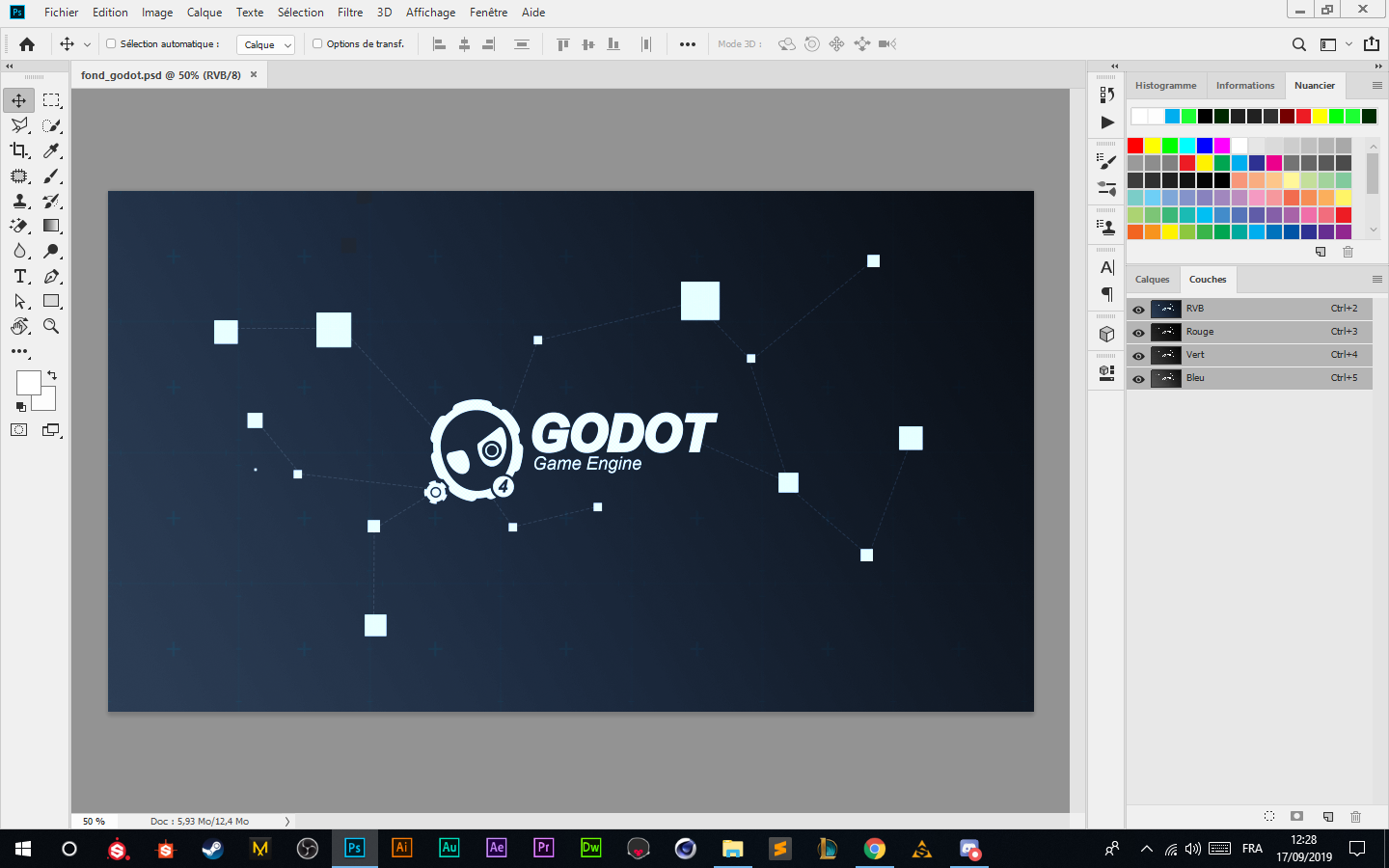
Godot-proposals: New Logo proposal for the Godot Engine 4 !!!
Hi there i realy love godot engine and make graphics so i tell my self hmm the current logo is not moderne or looking pro so i remake it !! iwould really appreciate your your opinion

 AngeDemo599
All 11 comments
I wouldn't mind slight changes to current logo but I pretty much like Godot's logo/mascot as is. Just my opinion.
 kkmzero
on 17 Sep 2019
kkmzero
on 17 Sep 2019
Looks amazing tbh, but we already got our beloved derpy robot as a logo. Awesome work anyways! :heart:
 Jummit
on 17 Sep 2019
Jummit
on 17 Sep 2019
Thanks for the effort, but we are not looking forward to change the Godot logo;.
 reduz
on 17 Sep 2019
reduz
on 17 Sep 2019
For reference (so this can be linked next time someone comes up with a logo, which happens every some months or weeks), logo is not up for discussing. This is an entirely subjective argument where agreement is impossible so, as the current logo is generally liked and is easy to recognize and associate to Godot, it will not be modified.
reduz
on 17 Sep 2019
This is an entirely subjective argument
I disagree, there are definitely some objective (as in measurable) metrics (e.g. color theory, color symbolism, colors associations in different cultures, comparison to current and past trends, memorability, complexity, similarity to competitors and probably tons of more).
For example I read quite a few times on reddit that Godot logo doesn't instill professional feel (as in targeted at serious business, not only children or beginners). I would bet that after doing a large survey, presenting the Godot logo (along other logos) to managers of various tech companies, tech investors and similar folks, they would overwhelmingly agree.


^ Godot logo is playful, emotional, colorful (compared to competitors), slightly "derpy" (similar to logos of puppies or other pets). To summarize, it's toy-like (as in literal toys for children). I am not saying it's a bad logo on its own, I like the design. But I don't think Godot is targeted only on children and hobbyists, as logo suggests, I thought they (the team) wanted Godot to be a real competition to Unity and other professional game engines.
The logo in OP in my opinion does feel more professional, mature, clean, precise, signaling viability for "serious" businesses.

logo is not up for discussing
I think this closing is rushed and doesn't really feel "open-sourcy" where community (so discussion) should be of paramount importance.
Edit: Updated Godot logo image to current one.
 mnn
on 19 Sep 2019
mnn
on 19 Sep 2019
@mnn The Godot logo you displayed in your comment is the Godot 2 logo, which is an older design. The new design is simpler and scales down better.
I think this closing is rushed and doesn't really feel "open-sourcy" where community (so discussion) should be of paramount importance.
Branding (names, logos, …) tend to be a sensitive subject in open source software. This is partly due to trademarks, but also because it's a very subjective thing.
 Calinou
on 19 Sep 2019
Calinou
on 19 Sep 2019
@Calinou Valid point, I have updated my post. I just grabbed first image what DDG returned for "godot logo" query. Not sure if DDG is slow to update or if it is marketing/SEO problem. I already addressed subjectivity and that impressions, however subjective, may be sufficiently universal in large groups of influential people (e.g. those approving use of tech).
mnn
on 19 Sep 2019
The logo in OP in my opinion does feel more professional, mature, clean, precise, signaling viability for "serious" businesses.
There are few issues with that particular logo in my opinion (note please that I'm not designer)
- The logo should be simple as possible, because after all it will be used as icon as well, thus it must look good even in low resolution. Those small components in that logo won't do any good in this regard.
- It's not symmetrical and looks squished
- I wouldn't be afraid of colors. Flat design is not always the best choice but compared to Unity or Unreal logos, Godot's logo look at least a bit interesting
- I don't think there is a valid point in displaying version of engine in the logo. Engine is engine, you have it in some version, logo does not need to inform you about version.
- There is plenty of unused space, which again might cause problems when it comes to low resolution (like in case of icon)
- Keeping some history of logo is good so customer knows that he/she is not dealing with something completely different (product). Slight changes might be good, complete overhaul at this point - not so much.
Just my personal opinion for the sake of discussion.
kkmzero
on 19 Sep 2019
6. Keeping some history of logo is good so customer knows that he/she is not dealing with something completely different (product). Slight changes might be good, complete overhaul at this point - not so much.
I second that.
 volzhs
on 19 Sep 2019
volzhs
on 19 Sep 2019
There are few issues with that particular logo in my opinion (note please that I'm not designer)
Not designer myself too, but working with graphical stuff frequently (front-end). I am not saying I love the proposed logo, only that in some regards it is better than the current one. My reaction was mostly to the general rejection of the topic and closing of this issue.
I agree with several of your points (too complex, version not needed, recognition, to smaller degree space usage). On others, not so much. I don't think there is anything wrong asymmetrical logos. Problem with color in this situation is the perception relative to competition - Godot is the most colorful which IMO creates a negative assumption that it is the least mature (which is actually probably true, but it isn't something a logo should communicate). I think biggest problem is not the use of color, but too much colors (blue and black), a unicolor variant might be better.
Thinking about the original logo, single color (black or blue) variant with possibly removed smile (=straightened mouth); and less cute eyes might be worth a try.
mnn
on 19 Sep 2019
The logo in OP in my opinion does feel more professional, mature, clean, precise, signaling viability for "serious" businesses.
I think that's a problem with a lot of brands nowadays, they try to hide their personal touch for nothing. Godot's current logo has emotions. Unfortunately expressing emotions is deemed as a weakness nowadays which explains the need to "look like everyone else". That's one of the reasons why I've chosen Godot, because you don't need to pretend (but mostly because it's open-source). 🙂
We should also remove the possible stigma related to game development being "childish". In fact kids are much more emotionally intelligent than adults until they experience what is deemed to be good or bad based on the cultural influence, while in fact it may be neither.
We also have to be honest in the fact that it's a game engine which is not serious by definition. By seriousness I mean that real-time systems can be classified as soft (non-serious) or hard (serious). Video games are soft real-time systems. In contrast, avionic software is mostly hard real-time systems which are serious as your survival depends on it (see this answer on StackOverlow). That's only my interpretation linked to the context of discussion though.
 Xrayez
on 1 Dec 2019
Xrayez
on 1 Dec 2019
Related issues
 aaronfranke
·
3Comments
aaronfranke
·
3Comments
 PLyczkowski
·
3Comments
PLyczkowski
·
3Comments
 Torguen
·
3Comments
Torguen
·
3Comments
 sprite-1
·
3Comments
PLyczkowski
·
3Comments
sprite-1
·
3Comments
PLyczkowski
·
3Comments
Most helpful comment
For reference (so this can be linked next time someone comes up with a logo, which happens every some months or weeks), logo is not up for discussing. This is an entirely subjective argument where agreement is impossible so, as the current logo is generally liked and is easy to recognize and associate to Godot, it will not be modified.