Gocd: [PipelineConfig] UI for Pipeline Level Settings
Related to Epic: #6362
This issue is for the UI only. API calls will be stubbed out.
UX issues
- Validation for pipeline name happens too late
- Provide better (help) text for fields:
- Automatic Pipeline scheduling
- Cron timer specification
- Pipeline locking
- Show a consolidated view for all environment variables defined everywhere in the Environment, Pipeline, Stage, Job
Notes
After a pipeline is saved, the pipeline name won't be editable. Making the pipeline name editable is desirable, but will be out of the scope of this story.
After a pipeline is saved, one option to show the UI could be like:
 akshaydewan
All 5 comments
Current WIP screenshots:
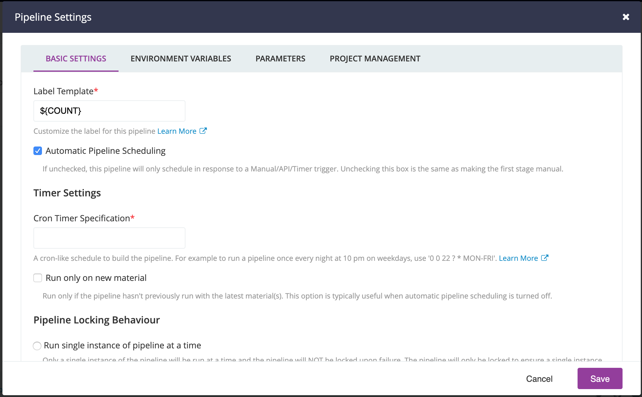
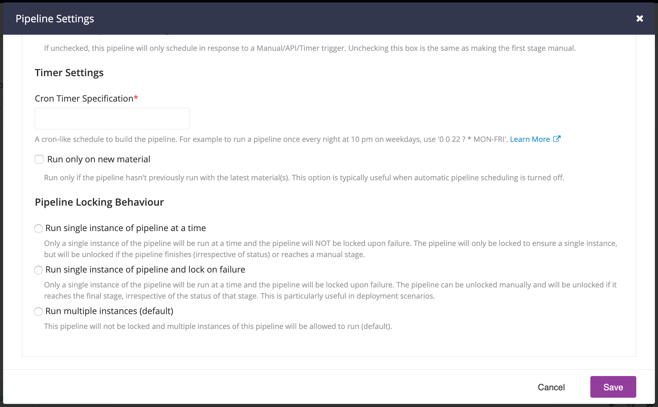
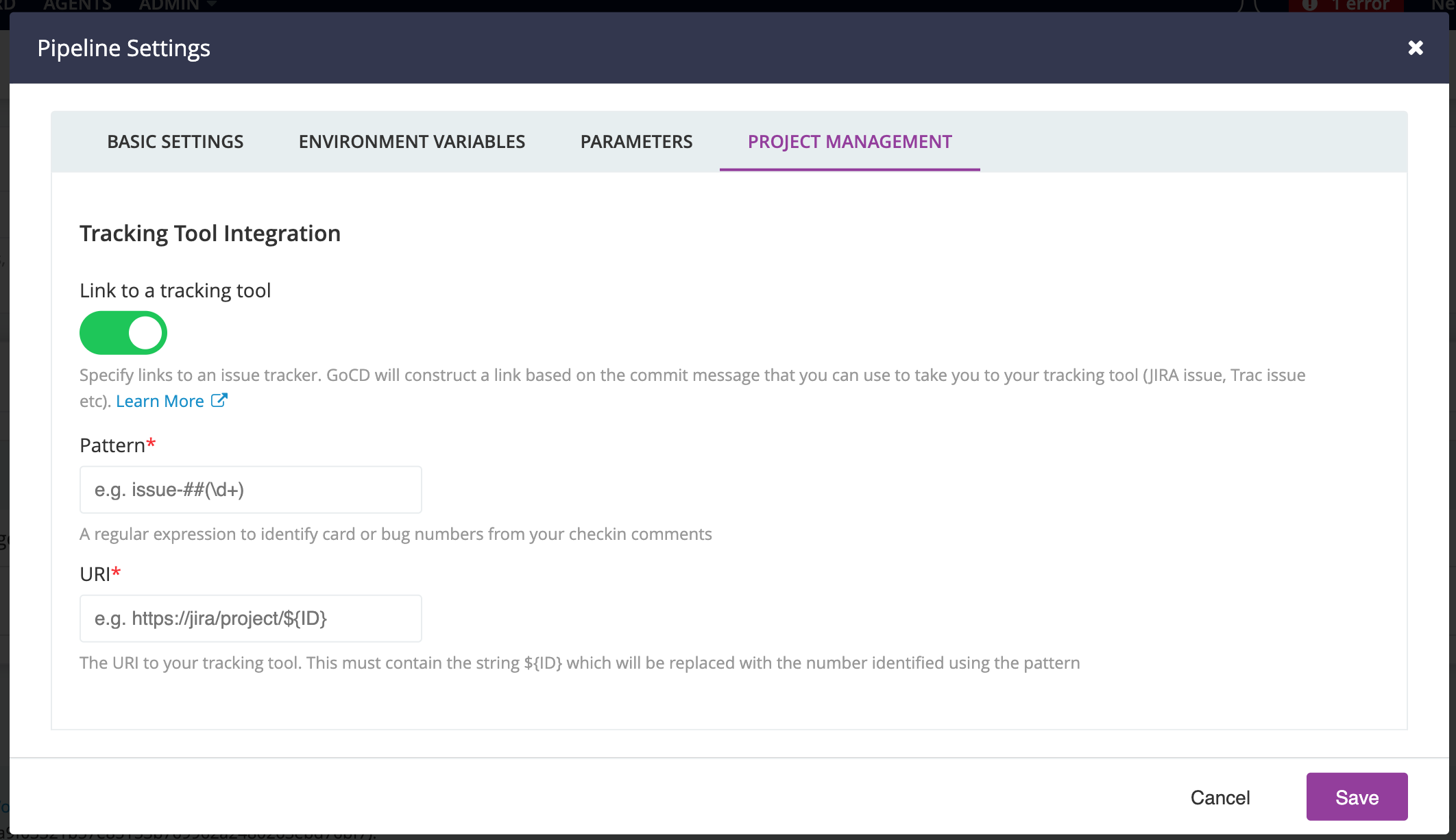
- The helpText is displayed below the input field instead of the (?) button that showed a tooltip in the old page
- The labels still need to be made user-friendly
- The styles are the default ones applied to input components, but some of them look inconsistent, such as the space between the checkbox label and its helpText. This needs to be fixed, but will likely affect all pages using the input fields.
akshaydewan
on 29 Aug 2019
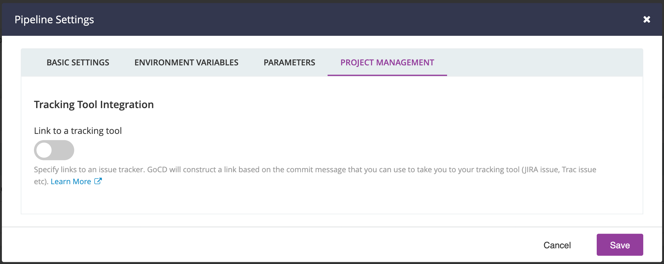
The Env Variables and Parameters sections are similar and straightforward. Here's the Project Management section:
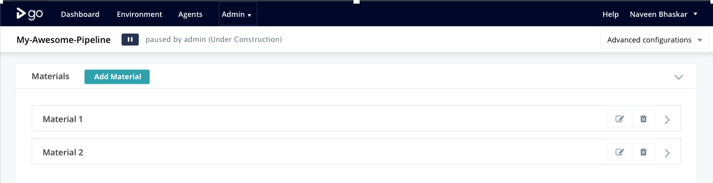
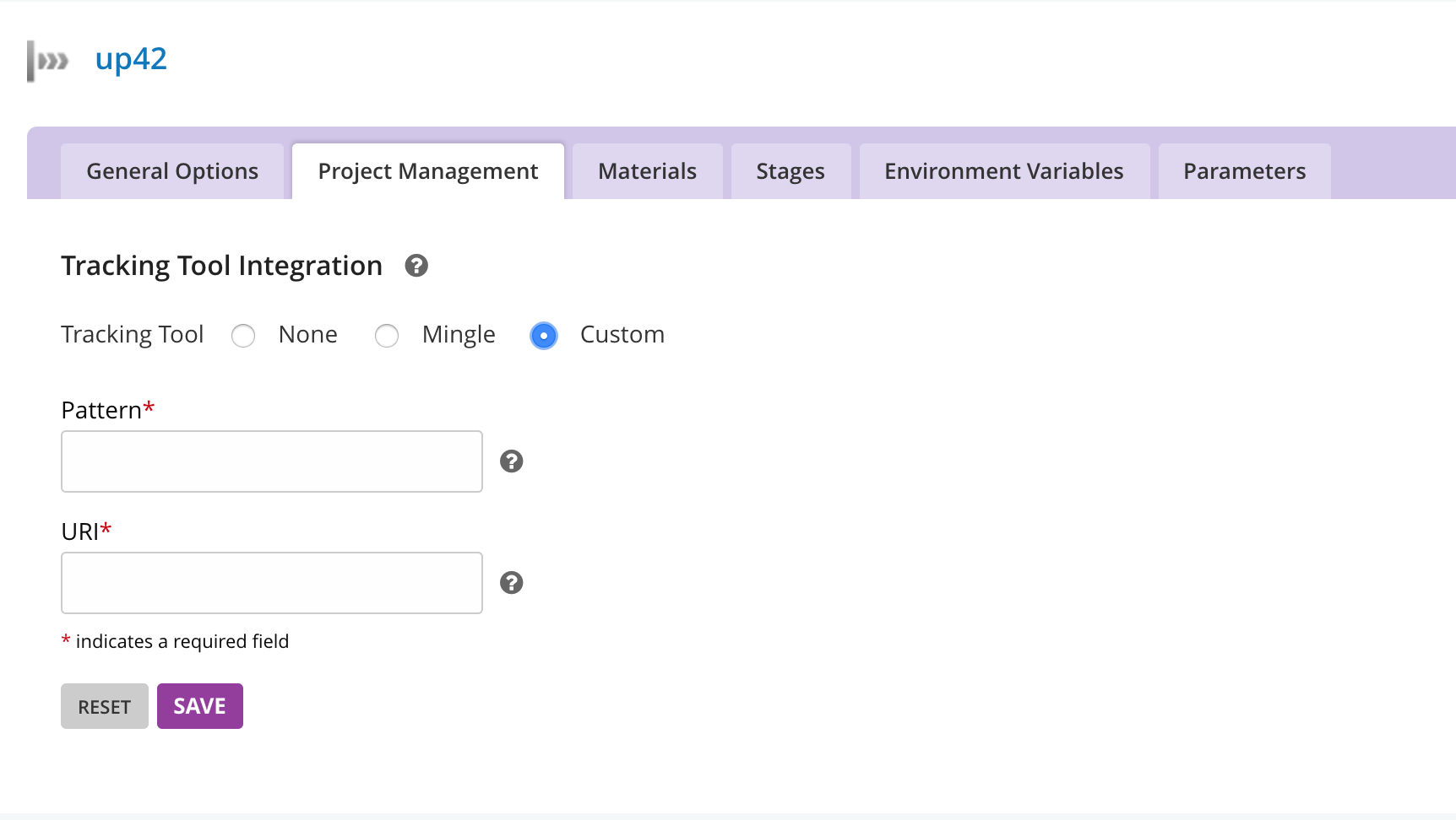
For reference, the current screen looks like this -
- Removed the Mingle section
- Using a Switch instead of the radio. When the Switch is "on", the form will appear
- Added placeholder text to the text inputs
- One problem is that the size of the modal changes when the form appears/disappears when the Switch is toggled. This is jarring to look at.
akshaydewan
on 3 Sep 2019
@arvindsv @vrushaliwaykole @viraj2712 @GaneshSPatil @streisguth Any feedback so far on these screens?
I think some of them look a bit crowded because of the help text at the bottom of the fields. In our user interviews, we didn't see many users clicking on the (?) button to reveal the tooltip, so I put them at the bottom.
I think with proper margins and padding, we could make it look less crowded.
akshaydewan
on 3 Sep 2019
Even though it might be crowded, I _much prefer_ the explanations. They're grey and people will learn to ignore them, once they learn it. There is some space right after the name of the label ("Pattern *" and "URI *") which could be considered too. However, if there is a line wrap, it's going to mess up the formatting.
Overall, I think it looks nice and don't mind the verbosity.
 arvindsv
on 3 Sep 2019
arvindsv
on 3 Sep 2019
This issue has been automatically marked as stale because it has not had activity in the last 90 days.
If you can still reproduce this error on the master branch using local development environment or on the latest GoCD Release, please reply with all of the information you have about it in order to keep the issue open.
Thank you for all your contributions.
![stale[bot] picture](https://avatars.githubusercontent.com/in/1724?v=4&s=40) stale[bot]
on 1 Apr 2020
stale[bot]
on 1 Apr 2020
Related issues
 GaneshSPatil
·
3Comments
GaneshSPatil
·
3Comments
 rduartes
·
6Comments
rduartes
·
6Comments
 dwijnand
·
7Comments
dwijnand
·
7Comments
 chriswhelix
·
5Comments
chriswhelix
·
5Comments
 rschneiderman39
·
5Comments
rschneiderman39
·
5Comments
Most helpful comment
Even though it might be crowded, I _much prefer_ the explanations. They're grey and people will learn to ignore them, once they learn it. There is some space right after the name of the label ("Pattern *" and "URI *") which could be considered too. However, if there is a line wrap, it's going to mess up the formatting.
Overall, I think it looks nice and don't mind the verbosity.