Go: x/pkgsite: Design Changes Harm Readability
(I scanned through issues with go.dev: and didn't see anything like this, forgive me if I missed any.)
What is the URL of the page with the issue?
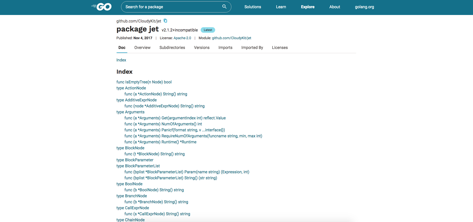
https://pkg.go.dev/github.com/CloudyKit/jet?tab=doc
What is your user agent?
Mozilla/5.0 (Macintosh; Intel Mac OS X 10_13_6) AppleWebKit/537.36 (KHTML, like Gecko) Chrome/80.0.3987.122 Safari/537.36
Screenshot
What did you do?
Visit the page
What did you expect to see?

What did you see instead?
A variety of style changes, mainly font-related, that in my opinion (stated as such) are not improvements, and which make the documentation harder to read.
- The existing font stack for godoc gives me Helvetica Neue for most text, and Menlo for the code/monoscape stuff (I am on a Mac). To me, Roboto and Source Code Pro are not as readable, and are a jarring change. Work Sans is actually not bad and possibly an improvement for where it's used.
- In the Index up top, (shown in screenshot) the fonts are bigger (~4px?) which fits less on the screen, makes all of the text seem higher up the importance hierarchy, and goes counter to its purpose as a summary/definition-overview of the interface of the package.
- In the Index, we lost the bullet points next to the methods. They are "plain", sure, but they made the Index more structured, made it easier to separate the levels when you scan through with your eye.
- The content width got significantly larger, from 698px in my browser to 960. In my opinion this is too wide to be easily readable. Compare to these GitHub Issues at 639, Google's homepage snippets at 600, Medium at 680, SwiftDoc.org at 847, even the fairly wide GitHub readmes at 882! I get that these exact numbers are subjective and probably related to my screen size and various other factors, but the point is that it's a lot bigger, and the increased width hurts readability.
- In the main body of the docs, the methods are the same size as the types. In existing godoc, types are 24px and methods are 18px, so when you're scanning through it's easy to visually separate them. In pkg.go.dev they're both 24px.
- Fonts are generally just larger, so between that and the content size increase the page feels like it's shouting at me in comparison to the old one.
Suggestions
Again, these are all my opinions, but since you are asking for feedback, I would suggest:
- Please return the font stack to use Helvetica Neue and Menlo where Godoc used it.
- Please reduce the content width closer to the existing Godoc; if it needs to increase a little I understand, but even ~800px would be much better than 960. If you need to keep the overall content width because of other panes in the tab bar, some horizontal padding on the doc pane would work fine.
- Please return the bullet points next to methods in the Index.
- Please reduce font sizes, perhaps in general, but specifically the Index font size and the sizes of method signatures in the main body of documentation. A general review to ensure that the typography is communicating the hierarchy of data might not be a bad idea.
In closing, godoc.org is fantastic! I would suggest we slavishly copy it unless the Go Team is getting a lot of requests to change it (which you might, I don't know).
 tooolbox
All 3 comments
/cc @fflewddur @spf13
 julieqiu
on 16 Mar 2020
julieqiu
on 16 Mar 2020
I am having the same problem. I always try to skip the new site and now I am afraid it will replace the documentation site.
Note the comparison below have a zoom on the new website of 80% instead of 100% to at least have some margin on the sides. (With 100%)

I am not a design expert so it is hard for me to know what the possible solutions are. Here are some of the notes I believe makes my experience worse in the new website:
- Title was easier to read and the biggest text on the site. Also it have margins around.
- In the previous there was one overview. In the new there are two Overview sections and another two overview icons. This also by not being in the overview sections. I don't understand what is this and how all this overviews are related.
- Text was easier to read. In my screen the default paragraph ended being render in something like 50-70 characters per line. The new one have larger lines. Maybe 100 characters per line. Most of the documentation I read is with a more fixed width.
- The new design feels more aggressive. I spent hours looking at this docs. The previous one was softer in my eyes.
- I default the new website to 80% zoom in the browser. Does reduce my need of scrolling.
- Before all the doc was in a single document. So Ctrl+F and search across all package documentation was useful. For example in net/http I was able to find a httptest library subfolder. Right now the documentation feels split, meaning that I might need to click double the times.
- The github url is repeated twice now. Both around the name of the package. The previous one had the import line, that was useful some times to copy and paste.
- Before things like when was published, the license, version was info collected from github. Right now it is nice to have so much info here. But it does not show neither the stars, forks, or issues. So I need to go to github any way, making all this new info for me useless.
- The documentation site feels like the rest of the site. It is hard to distinguish from the rest. Before the documentation was easily identifiable.
- This is more about author UX. Before I was able to test documentation site by running my own godoc server and see if everything was ok. Right now I can still use the old one, but once that is remove... If I have some mistake in the doc: do I need to release a new version without even previewing?
Hope it helps.
 guillermo
on 20 Mar 2020
guillermo
on 20 Mar 2020
A preview of the redesign is now available on beta.pkg.go.dev. Give it a try, and feel free to file a new issue with any other suggestions!
Closing this issue for https://github.com/golang/go/issues/41586.
julieqiu
on 29 Oct 2020
Related issues
 gopherbot
·
3Comments
gopherbot
·
3Comments
 enoodle
·
3Comments
enoodle
·
3Comments
 mingrammer
·
3Comments
mingrammer
·
3Comments
 rakyll
·
3Comments
rakyll
·
3Comments
 ashb
·
3Comments
ashb
·
3Comments
Most helpful comment
I am having the same problem. I always try to skip the new site and now I am afraid it will replace the documentation site.
Note the comparison below have a zoom on the new website of 80% instead of 100% to at least have some margin on the sides. (With 100%)
I am not a design expert so it is hard for me to know what the possible solutions are. Here are some of the notes I believe makes my experience worse in the new website:
Hope it helps.