Gnome-shell-extension-gsconnect: 'Display mode' label in the hamburger-menu
Hi!
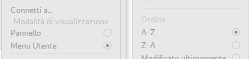
I've just noticed a 'weird' GUI disposition for the 'Display Mode' label in the hamburger-menu.
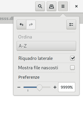
In the picture below you can see how the 'Sort' label is shown in the nautilus 3.30-4.
[EN] -> [IT]
Sort -> Ordina
Display Mode -> Modalità di visualizzazione
In nautilus "Sort" is like an inactive list-item with a separator above.
I better appreciate your approach (although some additional padding would have been nice :P), but maybe it's less 'gnomish' than nautilus's...? :(
I'd prefer to suggest Soriano to change his hamburger-menu indeed, but then I know I wouldn't stop there, since I'd change and merge both popover-menus...
I tried to change yours, but I can't open the menus.ui file using Glade due to some different gtk+ version.
So... Up to you, guys. I wanted to call your attention on this. :)
 amivaleo
All 8 comments
Heh, that's interesting. the problem is partly the length of the Italian translation — in the English rendering, "Display Mode" is actually a label on a separator, and the separator lines are (more) clearly visible on either side. But because "Modalità di visualizzazione" is such a long string, it crowds out all of the separator completely and kind of kills the effect:
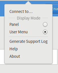
I definitely don't love Nautilus' take on menu-section labeling. Personally I'm only kind of so-so on the GSConnect version, too... especially because it's _centered_. Yuck. (And the long-string problem where the separator disappears is another whole issue of its own.)
 ferdnyc
on 31 Dec 2018
ferdnyc
on 31 Dec 2018
(It's also worth noting that the English version could very easily have ended up with the same disappearing-separator problem — the only thing that saves it is how much longer "Generate Support Log" is than any of the other menu strings, because it ends up defining the menu width.)
ferdnyc
on 31 Dec 2018
Yep, I already saw this menu in english and I noticed the separator. "Modalità di visualizzazione" (the v should be changed to a capital V, maybe 🤔) is the literal translation for "Display Mode", I can't think at anything else which could suit. 🤷♂️
I prefer your style here. It's weird that a core-app like nautilus has such a messy menu(s). I'm tempted to tag csoriano and start talking about this. You know... If nobody with a much better expertise has come to a better idea for such relevant software, nobody will surely consider any suggestion from an unknown newbie. 🤷♂️
So... Dunno.
amivaleo
on 31 Dec 2018
Honestly, I don't feel that changing Nautilus' menu to have a centered-on-a-separator-line "Sort" label would be an improvement there, either. There's plenty of room for improvement (on the Nautilus side), IMHO, but that wouldn't be my first choice for _how_ to improve that menu layout.
...Really, labels in menus have remained a poorly-solved problem for most of the past three decades. Not holding my breath that anyone is going to finally come up with a good solution anytime soon.
ferdnyc
on 31 Dec 2018
"my first choice"
Who said it would be the first thing I'd do? :D
I'd completely redesign both menus to one single compact menu. Just to give an idea, something like:
But... yeah, " Not holding my breath that anyone is going to finally come up with a good solution anytime soon". I think the same.
amivaleo
on 31 Dec 2018
I tried to change yours, but I can't open the menus.ui file using Glade due to some different gtk+ version.
This isn't actually a Glade file, it's a GMenu XML model. All of the items in menu, padding, separators, etc are actually all drawn by Gtk automatically. Unfortunately there's not much I can do about how the separator is rendered, since that's probably defined by your theme in CSS.
You could submit a pull request for a changed menu, but it would require building the popover from scratch and probably hooking up all the GActions manually. It would allow you to define the padding and separator rendering though.
 andyholmes
on 31 Dec 2018
andyholmes
on 31 Dec 2018
I use Adwaita. :3
Anyway, I think this issue can be closed. It's not a proper issue indeed. I wanted you to notice that.
This is something that has to be chosen from the 'bosses' in order to standardize the UI design.
Andy but... You don't like holidays, don't you? :D
It's ~10:40 pm here. Less than 2 hours before the year ends...
Go and have fun! :D
amivaleo
on 31 Dec 2018
:laughing: this is fun!
andyholmes
on 31 Dec 2018
Related issues
 jorgecodecom
·
6Comments
jorgecodecom
·
6Comments
 danieldeng2
·
4Comments
danieldeng2
·
4Comments
 neumannjan
·
3Comments
neumannjan
·
3Comments
 aia832003
·
6Comments
aia832003
·
6Comments
 ricvelozo
·
4Comments
ricvelozo
·
4Comments
Most helpful comment
:laughing: this is fun!