Gnome-shell-extension-gsconnect: [DEVEL] Messaging interface
The Gnome Shell (GMenu, mostly) interface has gotten a lot of love in #205, and has come a long way for it, so I wanted to open a conversation (post-v15, I'm thinking) about the SMS plugin's contacts window, which is feeling sort of "legacy" at this point, especially compared to the rest of the (updated & refreshed) UI.
First, one observation and one question:
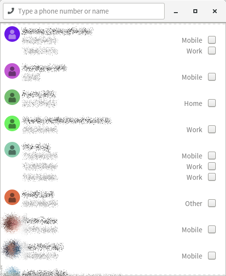
Observation: The packed-too-tight header bar makes it _really_ hard to move the window
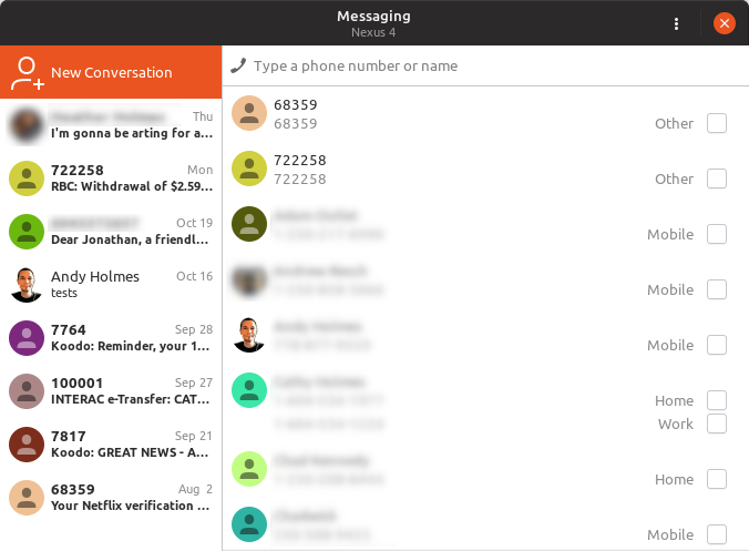
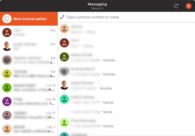
There's no place to grab for dragging. I'm thinking the text entry widget should have spacers on both sides, to provide a little titlebar-handle real estate for the window.Question: Why are contacts selected using _checkboxes_?
I'm _guessing_ the idea was, originally, that multiple contacts would be selectable for group texting... but that doesn't actually exist as a feature, does it? (I know it doesn't work on my phone, but I'm on a CDMA network and I know legacy SMS can be weird there, compared to GSM.)If there's no ability to multi-select contacts, then those checkboxes just don't make any sense, and it'd be way more user friendly to just make the entire row clickable from the start of the number to the end of the label.
Actually, I lied, a second observation:
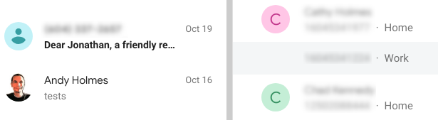
- Observation: The right-justified elements are _waaay_ too far away from the associated numbers.
They're very hard to tie together visually, given the width of the window. (Which is excessive, for the purposes of a contacts list, though it's a good size for the conversation interface.) I imagine if my contacts had more phone numbers, it'd start to get hard to track which label/checkbox corresponds to which number.
 ferdnyc
All 12 comments
Huh, I guess multi-recipient _was_ a feature in v12!* I never used it (group texts are the devil), so I completely forgot. :laughing: But if that feature's no longer there (unless it's planned to come back?), definitely time to re-think the checkboxes.
* – (I'm currently running v12 again, hand-spoofed as v13 in metadata.json, so that I'll be offered the v14 upgrade once it's approved.)
ferdnyc
on 1 Nov 2018
The packed-too-tight header bar makes it really hard to move the window
This is true, it's not super bad but a usability issue. My thought here are all mixed between the three points, so keep reading ;)
Why are contacts selected using checkboxes?
The right-justified elements are waaay too far away from the associated numbers.
You pretty much got it here. SMS technically doesn't support "multi-recepient" per se, it just does a batch send and receives replies like normal. Even Android does this if you aren't using MMS, which does support multi-send, but we can't send MMS (yet). At some point we might add a special batch send window if anyone wants this.
I left in the checkboxes when I rewrote, because it was the best visual cue of where to click, since the alternative is a listbox inside a listbox which rely on hovering (not really touch friendly). I see now, that Android Messages now just says "Multiple" if applicable and has an intermediate dialog with checkboxes. That's just ugly, but I get why they caved and did it.
KDE Connect has gone for a two-panel view with a singleton window, more like what you'd expect from the desktop (and along the lines of an IRC client) with conversations in place of rooms. That would have it's own quirks to address, but would avoid a lot of other "what to do we here" scenarios and probably save some memory with all those avatar pixbufs.
So here's my thoughts on a starting point:
- Header bar
- There's definitely a revealed search entry pattern in Gnome and the HIG we can use to clear up the headerbar...
- And/or that could just be moved to above a "contacts/conversations sidebar"
- One thing I favour is re-using recognizable patterns, even if they don't come from Gnome, which is why the current UI borrows from Android
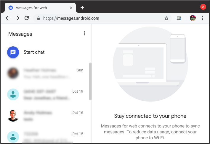
- There's a lot of prior art here we can look at, especially Google's new Messages from the browser thing, and we could even choose a dynamic layout based on window size (although that might get complicated).
KDE Connect (beta)
Fractal:
Messages (Web)
Messages (Android)
 andyholmes
on 2 Nov 2018
andyholmes
on 2 Nov 2018
Hey Andy!
I love GSconnect, and it has made my recent switch from windows to Ubuntu much more sweet!
But the SMS feature is totally confusing, not to speak of buggy.
IMHO SMS feature is by far the part that needs the most work. All the more, as it seems to be the most important feature for most ppl.
The artworks you show would be a great enhancement, and would be easy to use even for non tech savvy people.
Speaking of confused: I read here on Github, followed the releases, read change logs, but i still dont know: Is there a feature, where i can read the SMS that i have on the phone? In Join or other apps the SMS get synced and mirrored from phone to PC.
But with GSconnect, i only see the contacts.. And i can not see any SMS when i click on any contacts, no matter if i got a SMS after i Setup GSconnect or before.
I will uninstall everything and set it up again when the V15 is out, and report if the problem is solved..
Maybe a detailed guide on SMS plugin (features, limitations, what is needed, possible sources of errors, how contacts are handled, etc.) would help a lot for us new users!
Anyway, thanks for all your work! I have never seen a small FOSS project here on Github with a dev so on fire like you! Just amazing!
 Stele77
on 4 Nov 2018
Stele77
on 4 Nov 2018
Thanks for the kind words!
Right, the current state of SMS is that you can select a contact and send SMS, and if you receive an SMS when that window is open it should be displayed in that window. You can also "quick reply" if you hover the notification when it first pops-up.
SMS history and Contact sync is an experimental feature (for GSConnect and KDE Connect), and requires either building the Android app from KDE Connect's git repository or using a build from their nightly server.
However, if you use the Android app from either of these sources, you will need to unpair and uninstall the current app, before installing the experimental Android app since it won't be signed like the stable Play Store versions. You will have to do the same if reverting to the stable Play Store version.
Work is ongoing in both projects, and the behaviour is sometimes not well defined so it will remain an experimental feature until upstream KDE Connect considers it stable and we can be sure of how the Android app will behave.
andyholmes
on 4 Nov 2018
@ferdnyc Another thing I realized when redoing the GMenu UI, is the messaging UI has no Atk/accessibility support, so we should try and tackle that at the same time. Maybe we can find someone who actually uses those facilities to help us test that stuff.
andyholmes
on 5 Nov 2018
I've started a local branch for this and apparently "past me" was planning on this happening because a lot the code is self-contained and easily moved around. I'll try and get things mostly in place before I push the branch here, so there isn't an ugly mess of merges and reversions, then we can start picking at the details.
I assume the two-pane approach is not in dispute? Something we do have to deal with is whether we're merging multiple device conversations and/or contacts. Simon says (aha) that KDE Connect is running their contacts through the KContact framework so those are being merged automagically, but their SMS history is per-device.
I think trying to run Contacts through libfolks will be a problem given how we have to use a Python shim just to read them, but I may ask nielsdg (GNOME Contacts) if he has any ideas about this, or if he is interested in upstream support for using KDE Connect as a provider in GNOME Online Accounts or GNOME Contacts.
andyholmes
on 6 Nov 2018
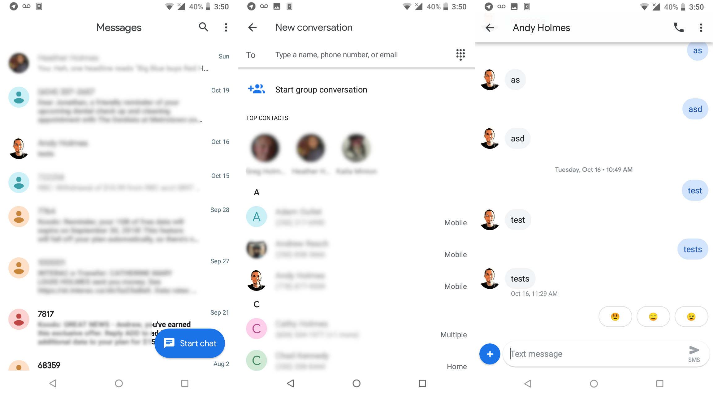
Here's an update, I've really only had bits of time the last few days but here it is (the conversation view remains the same):
I think Google's web UI is actually pretty good. They do the multiple phone number's thing like so:
(as you can see I receive dental appointments for someone named jonathan, but they're really good test messages so I'm not in rush to do anything about it...)
I think that should solve the spacing problem, and the approach to selection is actually the same we use for messages, using only a single avatar and then grouping the numbers in an invisible box.
This has also been a (necessary) opportunity to strip out a lot of the legacy SMS stuff, but once I get it about 90%, I'll push my local branch so we can pick at the details.
andyholmes
on 9 Nov 2018
- There's a lot of prior art here we can look at, especially Google's new Messages from the browser thing, and we _could_ even choose a dynamic layout based on window size (although that might get complicated).
Which, it turns out, is exactly what Android Messages' web interface does. If you pop a Messages tab out into its own window and play with the width, once it gets narrow enough the two-panel structure reconfigures itself into an interface that functions _very_ close to the Android Messages phone interface. Which makes me think:
- I'd bet any amount of money that the Android Messages Android app would use a two-panel layout on a tablet screen, same as the desktop
- They're probably sharing layout/styling between the web interface and the app, within reason anyway. That feels like a fairly Google sort of thing, to just have the same shared design at the heart of both interface implementations. (Or maybe I'm giving them too much credit, and they're just as bad about unnecessary code duplication as all the rest of us.)
Now, whether we could (easily) do the same... I dunno. It's pretty damn simple in CSS, responsive design makes all of that stuff relatively painless. But that's on the _web_. Gtk3 supports CSS for styling, sure, but can you even do media queries to restyle based on window size? A quick Google for things like "media query gnome 3' and "gnome shell media query" turned up a lot less info than I'd hoped, which makes me worry that the answer is a big "nope".
(One of the few hits: this... overview* of responsive web design technologies, posted on the Gnome wiki... but that was in 2013, and I _think_ It's just discussing HTML rendering in the browser, not native UI. (The entire document fails to ever _actually_ relate any part of itself to Gnome in any way, but the wiki path implies it's browser-focused.)
_Without_ media queries, an interface like that takes a bit more work. Though, if it could be worked out in such a way that we were able to fake it by just watching the width of the window, then swapping out one collection of CSS rules for a different collection en masse, each time that value crossed a boundary... that shouldn't be too hard to implement. The trick would be making sure (or even figuring out whether it's possible) to have all of the reconfigurable aspects of the layout defined exclusively in the CSS, so the only styling applied in the code is assigning appropriate classes so they can be used as selectors in the CSS rules.
* – ["overview"]: Read "rambling, unstructured brain dump". And yes, I am fully conscious of the irony there, when I describe someone _else's_ words that way.)
ferdnyc
on 10 Nov 2018
:D All good thoughts nonetheless. After discovering I'd sort of planned this by separating a lot of the different widgets/stack pages, I think it probably is possible even if it's done in Gtk in response to allocation signals, etc. A pop-out button also wouldn't be too hard.
One thing I'm in the process of stripping out, that would have to be rewritten, is the code used to search open windows for active conversations. This was the old hacky code that was used to regex phone numbers from notifications, loop through open windows for a match and then "inject" a message into it to fake two-way conversations.
The biggest problem with a lot of these situations are the assumptions you have to make during usage, which could be rare, such as:
- is the device still connected
- has the user arbitrarily disabled the SMS plugin
- do they have the new contacts plugins enabled, desktop contacts enabled (libfolks) or are we faking it by collecting incoming information, is that the same for all devices (and did they again, arbitrarily disable any of those during usage)
- are the local plugins enabled, but not the remote plugins (impossible to tell actually)
- is the scrollable message list not "at the bottom" and we're about to make it jerk all the way down by adding a message ("scroll back" for more messages relies on assumptions here too)
- are we awaiting confirmation that a message has _actually_ been sent by Android
- (how) are we going to handle multiple recipients for SMS, or will we wait for (possible) MMS support to do it properly
- given popped-out conversations, are there two open windows for different contacts that share a number (eg. my parents share a cell, but have different e-mails and different contact entries)
^ These are all headaches I've had already :stuck_out_tongue_closed_eyes:
andyholmes
on 10 Nov 2018
I'm not quite ready to push a new branch, but I just posted this in another issue, so you're welcome to give it a try if you want (v16 + new UI - old hacks):
[email protected] [Newer version available in PR #332]
andyholmes
on 14 Nov 2018
See PR #332 for notes and code.
andyholmes
on 14 Nov 2018
Alright, I think I'm all done with the new UI for now. Once I get some testing I'll merge it in.
andyholmes
on 18 Nov 2018
Related issues
 AngusLogan02
·
4Comments
AngusLogan02
·
4Comments
 Noobsai
·
4Comments
Noobsai
·
4Comments
 neumannjan
·
3Comments
neumannjan
·
3Comments
 jorgecodecom
·
6Comments
jorgecodecom
·
6Comments
 sk0gen
·
4Comments
sk0gen
·
4Comments
Most helpful comment
Here's an update, I've really only had bits of time the last few days but here it is (the conversation view remains the same):
I think Google's web UI is actually pretty good. They do the multiple phone number's thing like so:
(as you can see I receive dental appointments for someone named jonathan, but they're really good test messages so I'm not in rush to do anything about it...)
I think that should solve the spacing problem, and the approach to selection is actually the same we use for messages, using only a single avatar and then grouping the numbers in an invisible box.
This has also been a (necessary) opportunity to strip out a lot of the legacy SMS stuff, but once I get it about 90%, I'll push my local branch so we can pick at the details.