Gnome-shell-extension-gsconnect: [DISCUSSION] GNOME Shell UI - Usability & Accessibility
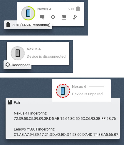
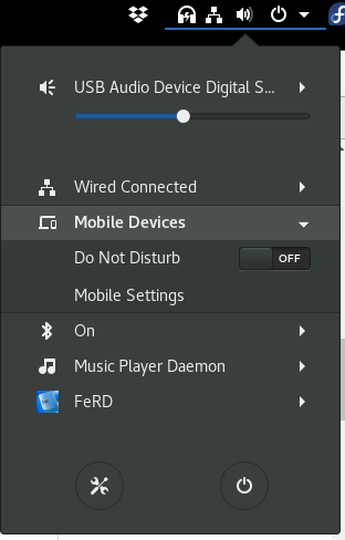
The current menu has a circle green battery indicator.
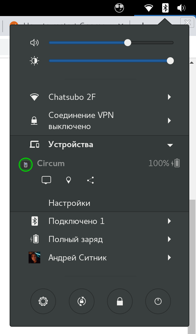
In settings, I can also enable gray text with battery level.
I think that this circle round indicator doesn’t fit other GNOME styles. If somebody shares my thoughts here are possible solutions:
- Make circle gray (use system color) to fit the color scheme.
- Hide circle indicator if text indicator is enabled (anyway it is strange to show the same thing in two different places)
 ai
ai
All 31 comments
The main difference between the two is that the circular icon is button that can connect, pair or open settings. To remove that, at least connecting and opening settings should probably be put elsewhere in the menu somehow.
 andyholmes
on 25 Sep 2018
andyholmes
on 25 Sep 2018
@andyholmes we can keep the behaviour, just remove the green circle around the circle button.
Or even instead of a button have the same behaviour on click on phone name. Bigger click area, better UX :).
ai
on 25 Sep 2018
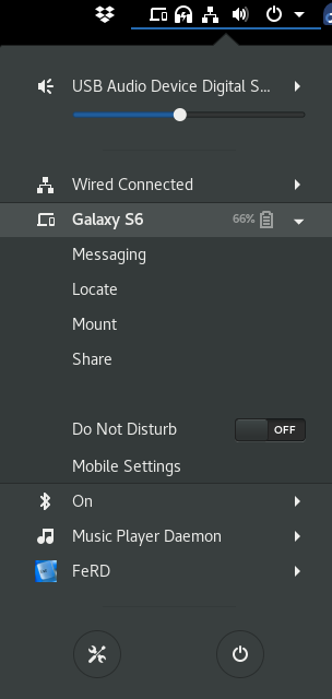
The circle around the button is also the level and charge state, goes from green to red, filled in when charging:
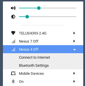
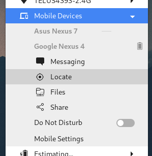
In the indicator menu, it's not really a problem since there's lots of room. In the user menu I think the more Gnome way is to just use a text menu where each device gets a submenu like bluetooth:
andyholmes
on 25 Sep 2018
Agree. My concern is also only about user menu (many with WiFi and other laptop settings).
Indicator menu looks great.
ai
on 25 Sep 2018
I really appreciate the green-to-red icon in both the App Indicator and User Menu -- though I understand wanting to conform menu-wise. Perhaps keep it as an option?
 eode
on 28 Sep 2018
eode
on 28 Sep 2018
Thanks, I appreciate your opinion. Just describe a little more why I want this to be a discussion, consider the Shell currently has four options with two related properties:
- panel/menu display mode
- show offline + "connected" property
- show unpaired + "paired" property
- show battery
Any time one changes all six have to be queried. If two change at nearly the same time it doubles (12), so each added option means there is a possible exponential increase for each that could change.
In a separate process (like the GSConnect service) this really isn't a big deal because "our" problems don't affect other applications, but the Shell UI of GSConnect has to do this in the main thread of Gnome Shell.
An idea, that might be difficult, but a better compromise is to have it more controllable by CSS. Much of the sizing is being moved to stylesheet.css, which means themes can make pretty big changes for "compact" variants. Below is what happens when the device icon is shrunk to half, then 0px, which unfortunately only saves horizontal space.
andyholmes
on 29 Sep 2018
@andyholmes by the way, we already have an option “Show Battery Icon”. We can hide circle on this option since it enables a different battery indicator and we don’t need a circle indicator anymore.
ai
on 29 Sep 2018
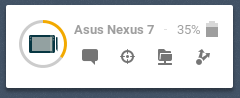
The circular widget provides three functions in addition to the battery status, while the simpler widget only display the battery status and can only be present when the device is connected, paired and has the battery plugin enabled:
Re-using a widget like this is pretty efficient since it's a three-way fork before the widget is rendered. Those actions would have to be replaced, otherwise it's impossible to reconnect or pair a device from the Shell and the devices might as well not be shown at all.
If they were replaced with separate widgets, each of those would then need to be watched and redrawn whenever the device status or preferences are changed. If an existing widget were used, it would have to be one that is always present, and it would have to be obvious that it was at least a button.
andyholmes
on 29 Sep 2018
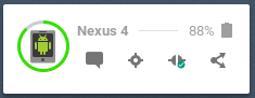
We can remove circular battery level and keep phone icon.
But when I started to think about it, I found that maybe it is a good reason to rethink UX? I see 2 problems with using the battery widget like a button:
- It is not obvious that the battery level is clickable. I just know it only from this issue.
- It is not obvious what click will do depends on the state.
- This type of UI is not touch-screen friendly (no hover style and tooltips there).
I know that you as heavy extension users, know how it works and it is obvious for you. But what I like in GNOME, that it tries to be clear, simple and also stylish and keep visual consistence.
ai
on 29 Sep 2018
I should be clear I'm definitely open to ongoing discussion, even if it seems like I'm being resistant. However, any solution has to really improve the situation and work for everyone without a performance cost. There's some history below you can skip if you want.
Removing the circular battery level doesn't really make it more obvious that it's a button, it just removes the battery level and also means the "unpaired" and "disconnected" circles make less sense. So removing those doesn't really improve the situation, they just remove information. This is kind of hard to fix because each theme has it's own button style and users recognize widgets as buttons when they have that same style.
It's probably not obvious that the button opens the preferences when the device is connected & paired, but it should be more obvious when the device is offline or unpaired that it will pair or reconnect. The device icon could be replaced with a "connect" or "pair" icon, but I've never seen icons that really "look like" the action.
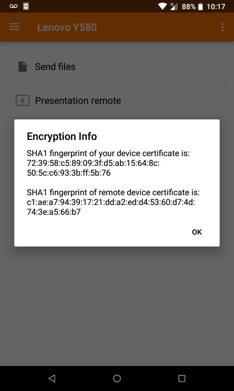
It's actually for the "touch-input" reasons you describe that Gnome Shell doesn't have tooltips at all, and GSConnect has to implement those. Most of the icons should be obvious without a label, but you can see in the Pair tooltip the SHA1 fingerprint won't fit in the User Menu and the battery estimate is pretty big, too.
So here's what I think has to be there:
Actions for Connect, Pair & Open Preferences
Maybe Open Preferences can go, but being able to reconnect or pair is basic functionality. The SHA1 fingerprint must also be available because it's the only way to verify a device's identity.
Battery level
Even though this is an optional plugin and some devices might not even support it, it's probably the most often used feature. The time estimate is okay in a tooltip where some users might not see it, because it's just a guess and not as important.
The menu has to deal well with "overflow"
This is probably going to be a bigger issue later, if the option to edit the menu is implemented. Right now the action buttons usually fit, but there are some cases where they just get cut-off in the User Menu or make the Panel menu giant.
Boring History
I was actually being optimistic when I said _"Any time one changes all six have to be queried"_.
A long time ago during gnome-shell-extension-mconnect, there was a discussion about Panel vs User Menu. Some people liked indicators because that's what indicator-kdeconnect used, but others thought it was clutter and not Gnome-like. The only solution that made most happy was to add an option. Now both widgets have to exist and be checked, meaning each change usually means 6x2 checks.
Later when I added the circular button, it was meant to replace the simpler icon completely, but I forgot to remove the option before I released it. Because reading a setting that doesn't exist will crash Gnome Shell, it means I have to keep that option forever or phase it out slowly over several releases.
In both those cases, I guess it's okay since there seems to be a lot of people using both options. But adding more options is technically hard to reverse, upsets people if they're removed and has a performance cost that affects Gnome Shell as a whole.
andyholmes
on 29 Sep 2018
Thanks, that was actually pretty informative.
I think your thought on not adding a new option is probably correct. But wow.. ..crashes gnome shell, eh? ..and a new config setting affects GS as a whole? :-(
Just so you know, this is how my UX went:
- Noticed the new icon up top, saw the new menu item, clicked.
- I saw a button.
- The text said the device wasn't paired.
- The red on the button indicated the device was unhappy, which matches the "Unpaired" text.
- I clicked on it to find out more.
- It didn't seem to do anything at first.
- It tried to pair, which was a surprise, but not too unwelcome.
- I didn't even notice the tooltip until after I'd clicked.
- The KDE Connect App didn't mention hashes at all.
- The tooltip didn't inform me that I should be doing some kind of comparison.
- Devices paired fine.
- Everything works smoothly
- Except that there's no feedback if I try to use a feature that's not approved on the phone
- Configuration options were very clear.
- Device image slight background change when charging wasn't very clear. Thunderbolt overlay?
I think the discovery that the button is clickable is very easy. It is also definitely a noticeable spot of color where there is none -- I like this, but understand some might prefer the conformity of going with the default greys. A difficulty presented then becomes making the 'unpaired' icon still look like it needs attention, though.
In any case, I think the button could be made consistent in one swell foop if it's re-imagined as a 'device' button, having the following traits:
Device button:
- Button itself presents as much info as compactly as possible. I think it does a great job of doing this as-is, except that the 'charging' indication subtle background change isn't very clear. A lightning-bolt overlay or more distinct bg change might be nice.
- Clicking on it always brings up a detailed current-status/config of the device
- Pairing is done there, and the button has explanatory text.
- Status/Config includes the current connection status -- unpaired, pairing, disconnected, or connected.
- If unpaired or pairing, both local system and phone's hashes are displayed
- If pairing, instructions like "Use phone to respond to pairing request"
- Sadly, the KDE Connect app doesn't show fingerprints by default when receiving a pairing request.
- Below this status are the config options
- Not visible or greyed if not paired.
- Bringing up the current status / config for the device is pretty quick. This beats the current situation, where pressing the button may not do anything for a while (for example, when my phone is locked and the pairing request takes longer). I don't think the 'button pressed' visual is enough.
What I like about it is that the Device Button is effectively a miniature info display for the device. Clicking on it simply provides more options. Conceptually, it fits nicely. Also, by moving the pairing to this window (it already works there, but having that be the method), you also account for users who have no tooltips -- the hashes can be visible in the window.
eode
on 2 Oct 2018
I think your thought on not adding a new option is probably correct. But wow.. ..crashes gnome shell, eh? ..and a new config setting affects GS as a whole? :-(
This actually true of GSettings even in C; a programmer error is fatal. The difference with extensions is they aren't run "by" or "in" Gnome Shell, they are it. So when you're writing an extension you're rewriting Gnome Shell.
The KDE Connect App didn't mention hashes at all
In the KDE Connect app this information is available under the main menu as "Encryption Info". I've never heard of anyone ever actually being spoofed with KDE Connect, but it wouldn't be that hard (if you aren't checking the hashes).
The deviceName is totally arbitrary; it's really just for displaying to users. The deviceId (in every implementation but GSConnect) is just the hostname of the device, not displayed anywhere by any implementation, and it's easy to change your hostname and deviceName to match the expected values of another device.
If you're already paired & confirmed, that's fine because the certificate verification will fail and GSConnect will notify you with network details about the fraudulent device. But if this happened _after_ a device is discovered, but _before_ pairing, you could easily be fooled into thinking the device was yours when it's not. Actually, just changing the deviceName could confuse you, but there would appear to be two different devices with the same name, so at least it will look suspicious.
I clicked on it to find out more.
It didn't seem to do anything at first.
This is kind of unavoidable, to a degree. There's really no way to tell if a device has received any packet, although there could probably be some indication of the 30s timeout before the request is invalidated.
Except that there's no feedback if I try to use a feature that's not approved on the phone
This is sort of related to the above. Devices report what packets they can respond to, but not whether they've received it or actually will respond to it. It's a tough situation because you can end up in a circular trap with a device reporting they won't send packets based on what the other device reports it won't receive (and vice-versa), making the situation unchangeable.
Probably it would require a secondary list of what packets/plugins are enabled, but that requires protocol changes in every client, so it would have to be discussed upstream. I think there's already an upstream issue about it, but I doubt it's a priority.
A lightning-bolt overlay or more distinct bg change might be nice.
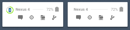
I think this might be possible. I tried it once originally with a charging overlay, but it requires some extra work to respect the theme's colors, there's not guarantee those colors represent the actual icon's colors, and even then there's no guarantee the actual icons has a blank space for it:
I guess a more prominent background change is possible, but it would be a lot more color. I think we could probably come up with a better indication that's theme independent and not too jarring.
Clicking on it always brings up a detailed current-status/config of the device...you also account for users who have no tooltips
Not visible or greyed if not paired.
I like the convenience of just clicking it to do what you want, but this is probably the best compromise and it means the button only does one thing. It would mean you'd have to open that window anytime your device was disconnected though.
I think configuration options should be available before pairing though, since it allows you to secure actions or data before the device has a chance to use them.
andyholmes
on 2 Oct 2018
In the KDE Connect app this information is available under the main menu as "Encryption Info"
nod I just think it should be prevalent, as it's fundamental to the process. even though that confirmation is optional on the user's behalf, confirming should be encouraged. But, of course, that's not on you, that's on the KDE Connect App -- you're clearly trying to make it obvious in gsConnect.
This is sort of related to the above. Devices report what packets they can respond to, but not whether they've received it or actually will respond to it. It's a tough situation because you can end up in a circular trap with a device reporting they won't send packets based on what the other device reports it won't receive (and vice-versa), making the situation unchangeable.
Ah. I think I'm used to higher-level protocols, where you would do something like:
// (to phone):
{"query": "services"}
// (from phone):
{"query response": {"services": {
    "sms": true,
    "notifications": true,
    // yadda yadda
}}}
The few times I've done low-level stuff, it's been pretty similar, sending a byte or int that indicates a specific query, and then receiving back some kind of structured data, but ultimately the same "What've you got?" "these services" query.
Fairly obviously, though, I have no clue how the KDE Connect protocol is written nor do I have any idea about it's restrictions. Heheh.
I think configuration options should be available before pairing though, since it allows you to secure actions or data before the device has a chance to use them.
Hrm, good point. The other secure option would be to default them all to off and require enabling.. ..yeah, you're probably right about that.
I've never actually had to reconnect, I though that was done transparently. I've completely had the phone off, and it just disappears from the menu, then when I turn the phone back on, it's available again. What causes the need to explicitly reconnect?
eode
on 2 Oct 2018
Re: device<->device config loop: too bad, though -- that could be fairly simple to prevent, using ANDed mutual desired states -- or, as sets (whoever initiated pairing is 'a'):
# a wants:
['notifications from a', 'notifications from b', 'battery from b', 'mouse control from b']
# b wants:
['notifications from a', 'notifications from b', 'battery from b']  // mouse control currently inactive

# Either side can AND the flags (or union the sets) and get the mutual state:
['notifications from a', 'notifications from b', 'battery from b']
Whenever there's a config or service change, the side that changed sends the new desired state.
..of course, there are always complexities, and workarounds, and previous workarounds that prevent new workarounds, etc. ..and, of course -- finding a way for the humans to agree!
eode
on 2 Oct 2018
Fairly obviously, though, I have no clue how the KDE Connect protocol is written nor do I have any idea about it's restrictions. Heheh.
It's fairly straightforward, but maybe oversimplified. It's just that devices report what packets they may send/receive, but not whether they will handle them. I think in principle this was only expected to be a one time identification thing. So you may notice if you change the phone's name it won't actually change until next disconnect and re-identify. This is complicated by the fact that the standard connection process is "I identify to you a UDP packet, you respond by opening a TCP channel and write your identity". But whether you are sending/receiving the UDP packet can determine if you should "know" already who the other side is. There is WIP for mDNS/avahi support, but I think this is blocked in many networks, so we'll have to see how well that actually works out.
I've never actually had to reconnect, I though that was done transparently. I've completely had the phone off, and it just disappears from the menu, then when I turn the phone back on, it's available again. What causes the need to explicitly reconnect?
This is also a bit weird, and it's really the only case I sort of break protocol. Any time you receive a UDP packet or an incoming TCP connection you're supposed to assume the current connection is dead, close the existing channel (without registering a disconnect) and hot-swap in a new one. However, if GSConnect receives a UDP packet but already has a channel, it will not close it since UDP packets can be very frequent and hot-swapping connections is...well tricky, risky and you might miss packets while doing it.
Since connections have a 30s keepalive, this can mean a connection can be dead and not reconnectable for a short time, but I think it's safer in the long run. Basically whenever the _Shell_ extension loads (login or unlock) it will send a UDP packet directly to each known device (instead of a broadcast. This is what the reconnect button does as well. The server itself sends broadcasts when the network status changes, new devices are added to the network (not sure that actually works) and on startup (or obviously the refresh button).
Usually dropped connections are Androids fault (phone is asleep, battery saver activated, flakey wifi, frequency hopping, etc), but those situations are also when Android can't automatically send UDP packets or is so slow to accept connections that they time out. This is really noticeable with sshfs when the screen if off. Usually when you turn your phone screen on or "focus" the app, a UDP packet should be sent and connections pick up.
Things get more complicated and flakey when bluetooth is enabled. A LAN broadcast followed by a bluetooth broadcast will clobber all existing LAN connections and bluetooth is even worse when the phone is not responding quickly. Additionally you can do one at a time or Bluez will return an error and possibly kill the connection that just clobbered the LAN connection.
Hmm, I guess I didn't realize how complicated this is to explain. I guess in short, it's usually Android's fault when connections drop, but the protocol is not ACK based (symmetrical) and there's a 30s keepalive so we often don't know for awhile. Even when we do know, we don't try and reconnect every time we know we've disconnected, because it basically makes it impossible to ever remove, delete or disconnect a device on purpose.
andyholmes
on 2 Oct 2018
Re: device<->device config loop: too bad, though -- that could be fairly simple to prevent, using ANDed mutual desired states -- or, as sets (whoever initiated pairing is 'a'):
Ah, I see what you mean. I think the problem here is that some packets have a specific direction (foo/foo.request) and some are unidirectional (bar<->bar). Probably the only way to do it backwards compatible is to have a second list. Right now there's outgoingCapabilities and incomingCapabilities; I think enabledCapabilities could cover the other case. Of course a device can't be allowed to enable a remote capability for security reasons, but you could at least auto-load local plugins.
andyholmes
on 2 Oct 2018
Yes, it definitely shouldn't be able to enable options on the other side -- a device could only announce what it has enabled, the assumption being that the other side should be able to figure things out from there.
The combination of the two provides some nice UX, in that any impossible capabilities can be excluded, and any possible-but-disabled ones can be shown as disabled by the other side.
I suppose all that's moot, though, since it's not in the protocol anyways.
Back to the issue at hand, though, am I correct that the best compromise would be:
- Keep the big button
- Sadly, the button has color removed for a more native theme, if that works visually with all the info that needs to be presented
- Button has stronger indication that it's charging, if doable (very transparent 'zap' overlay, or greater bg color shift)
- Button activates the device dialog
- Hashes are visible in device dialog
- "click to pair" or similar in device dialog
- clicking to pair has some kind of ongoing-ness to it, indicating something's happening
..is that about what we got to? I suppose that's a lot for an issue titled "GNOME-style for battery indicator". ..shows you packed a lot of thought and action into that button!
eode
on 2 Oct 2018
I've been playing a bit with this. I think with a bit of work the user menu can be redesigned to only use native styles and widgets. Although, with offline devices like above, there's no button in the "Gnome" style I can think of any more obvious than the battery circle. In that case those might just be excluded by default.
I think using sections looks okay, but the icons seem out of place so I might drop those here.
andyholmes
on 18 Oct 2018
😍😍😍
ai
on 18 Oct 2018
@ai Sorry for the totally out of discussion question. :smile: But what is the font and icon theme used in your screenshot? Looks really pleasing..
 Thisuu
on 23 Oct 2018
Thisuu
on 23 Oct 2018
@Thisuu standard Adwaita with Suru++ icon set
ai
on 23 Oct 2018
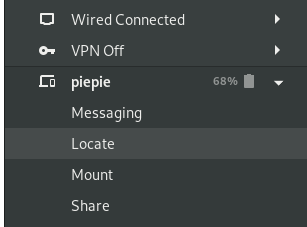
At this point much of the code for the menu rewrite has now been merged into master, but there are some quirks. For now at least, the whole graphical device/battery widget has been removed. This has some other side-effects that followed naturally, but might not be ideal right now.
- Pairing
- An outgoing pair request can only be made from the settings window
- Unpaired devices are therefore not shown in GNOME Shell
- The only way to view the encryption information is in an incoming pair request notification
- Connecting
- Devices can only be manually reconnected from the settings window
- Disconnected devices are therefore also not shown
- Reconnecting to known devices is therefore handled automatically by the service, on a 5s loop. Testing indicates this works pretty reliably, but there may be issues if/when bluetooth is merged upstream.
- General UI
- User Menu mode exclusively uses text menu items, which could in some cases take a lot of vertical space, however the submenu scrollbar does handle that.
- Panel mode still uses icon buttons, but that may change to text items as well
- There's not well defined Atk/Accessibility states for this mode, which affects #240
- The submenu code here is even flakier than before, but there don't see to be any fatal problems
- Since the battery widget is only the "42% [_]" style, it might make sense to drop the tooltip completely and with it the time estimate
I'm sure there's more I'm forgetting, but that's a good overview of what's changing in v14. I'm going to retitle this thread as a devel/discussion thread so we can continue without losing what's been discussed already. I'm sure there will be more to talk about and usability issues to address, especially wrt accessibility and touch-input users.
andyholmes
on 30 Oct 2018
This really looks pretty good. Thanks for all your work on this, you're
really producing a good tool, and it puts Gnome easily on par with KDE in
this regard. Actually, I strongly prefer your interface.
On Mon, Oct 29, 2018, 8:53 PM Andy Holmes <[email protected] wrote:
At this point much of the code for the menu rewrite has now been merged
into master, but there are some quirks. For now at least, the whole
graphical device/battery widget has been removed. This has some other
side-effects that followed naturally, but might not be ideal right now.
- Pairing
- An outgoing pair request can only be made from the settings window
- Unpaired devices are therefore not shown in GNOME Shell
- The only way to view the encryption information is in an incoming
pair request notification
- Connecting
- Devices can only be manually reconnected from the settings window
- Disconnected devices are therefore also not shown
- Reconnecting to known devices is therefore handled automatically
by the service, on a 5s loop. Testing indicates this works pretty reliably,
but there may be issues if/when bluetooth is merged upstream.
- General UI
- User Menu mode exclusively uses text menu items, which could in
some cases take a lot of vertical space, however the submenu scrollbar does
handle that.
- Panel mode still uses icon buttons, but that may change to text
items as well
- There's not well defined Atk/Accessibility states for this
mode, which affects #240
https://github.com/andyholmes/gnome-shell-extension-gsconnect/issues/240
- The submenu code here is even flakier than before, but there
don't see to be any fatal problems
- Since the battery widget is only the "42% [_]" style, it might
make sense to drop the tooltip completely and with it the time estimate
I'm sure there's more I'm forgetting, but that's a good overview of what's
changing in v14. I'm going to retitle this thread as a devel/discussion
thread so we can continue without losing what's been discussed already. I'm
sure there will be more to talk about and usability issues to address,
especially wrt accessibility and touch-input users.—
You are receiving this because you commented.
Reply to this email directly, view it on GitHub
https://github.com/andyholmes/gnome-shell-extension-gsconnect/issues/205#issuecomment-434133173,
or mute the thread
https://github.com/notifications/unsubscribe-auth/ACXHzx1sYbMYyEtzw13SLpnIQT9jNL_Kks5up6LzgaJpZM4W3QQj
.
eode
on 1 Nov 2018
I'll just pop this in here since it seems to be related to this discussion/development. (But let me know if you'd prefer I create a new issue and I'll employ GitHub's long-overdue "Open new issue" comment-menu option to migrate it.)
When running with the code currently in the master branch, if my phone is offline everything looks as expected:
But when it's connected, I have an empty row in the menu between the phone options and the extension options:
 ferdnyc
on 1 Nov 2018
ferdnyc
on 1 Nov 2018
I don't think the GSConnect logo should be used for the panel icon. It looks extremely out of place doesn't match _any_ icon set. Ideally, this should be a stylised icon of a phone or something similar. Keep logos out of people's desktops!
 Snuggle
on 19 Nov 2018
Snuggle
on 19 Nov 2018
I don't think the GSConnect logo should be used for the panel icon.
Sorry, but that is not the icon distributed with GSConnect:

Source:
You should either use a different icon theme or file an upstream bug report with your theme developer.
andyholmes
on 19 Nov 2018
Oh, my mistake. It seems to be an issue specific to the Papirus icon theme. I don't know why they added their own icon, it looks hideous, in my opinion. It appears some people disagree.
For anyone who has a similar issue, just delete the icon and reload icon pack.
[Edit]
Or alternatively you can use this script to patch this issue: https://pastebin.com/LvD2hRWd
https://github.com/PapirusDevelopmentTeam/papirus-icon-theme/issues/1132
Thank you, @andyholmes!
Snuggle
on 19 Nov 2018
Wait. Wait, wait, wait.
They replaced the standard icon because the phone+laptop is "very specific", and they don't like that because some users don't use laptops??!!
:man_facepalming: Cue xkcd 258

(For the record, I use GSConnect exclusively on my HP desktop tower machine, connected to a 24" rotatable 1920×1200 LCD monitor. I've somehow managed to survive the resulting existential crisis triggered by looking at an icon showing a _laptop_. (The horror!)
ferdnyc
on 24 Nov 2018
@ferdnyc Their replacement is horrible and doesn't match any of my other icons, _in the same Papirus icon pack. _It's a _logo_, not an icon. It makes me feel like my desktop is owned by Microsoft Corp. or something.
I use my desktop, a laptop and a phone and I love the default GSConnect icon. I don't care that it's not a desktop – laptops are much more visually distinctive for _a computer_. Disregarding how much more popular laptops are, too.
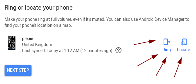
As a design-related issue, I was in class a couple days ago and was showing off the awesome that is GSConnect to some of my friends. I tapped on Locate, assuming it would come up with a GPS map or a prompt or something*.
_Insert my phone blaring an alarm tone at the sound of a billion decibels._
Please, for safety reasons, add a confirmation prompt when someone clicks Locate on their phone.
Also, adding a choice of being able to locate using the Google's Find-My-Phone GPS map would also be pretty handy. A link to: https://www.google.com/android/find
*(Note: Google uses "Locate" for GPS and calls the ringing function "Ring". This is one of the reasons I didn't expect my phone to suddenly go off in a classroom. Oops.)
Snuggle
on 24 Nov 2018
(I've just added a wiki page with a list of GNOME design references - appealing to these is the best way to change my mind about something :wink:)
Please, for safety reasons, add a confirmation prompt when someone clicks Locate on their phone.
If you mean the device that you are asking to ring, I'm not sure that's possible. The main purpose is like older cordless phones; to find you phone if you've lost it in your house, so a confirmation dialog would essentially break that function.
If you mean the device sending the request, I think it would be better to just change the text to Ring, since a dialog would contradict the _"Principle of non-preemption"_ in the GNOME Shell Design Principles. You could ask upstream KDE Connect to implement this in the Android app, though.
Changing the icon is possible, but there are very few phone/mobile icons in the standard icon set. This means we'd probably be using an icon that would not look very nice many users and won't be themed. I'll try and remember to ask Tobias Bernard who works at Purism, since he told me he had some work-in-progress icons for the Librem phone.
I've created a separate issue for this to track it as #356, since it's pretty specific
Also, adding a choice of being able to locate using the Google's Find-My-Phone GPS map would also be pretty handy.
This is a little tougher and it's been asked before. Any GPS functionality would definitely have to be implemented as part of the protocol, so you should file a request (or contribute!) upstream, but here some thoughts on this:
- Currently all data exchange in KDE Connect is device <-> device over a secure LAN connection.
- Many users get KDE Connect from F-Droid, don't use Google Services, worry a lot about privacy, etc.
- Data that has to be shared with or relies on Google services is probably not going to be implemented by either project for that reason.
- KDE Connect is available for Android, Sailfish OS, Plasma Mobile and probably Purism's phones eventually, so using Google services probably isn't going to be that useful anyways.
- Most devices are connected over LAN making this data pretty unhelpful since standard WiFi ranges and GPS accuracy are pretty close.
- Accurate location data is difficult to get on devices without a GPS device (GNOME Shell, KDE Plasma, elementary OS, basically all desktops running KDE Connect)
- If it's just a link to a Google page anyways, there's not much benefit to having it the main UI
andyholmes
on 24 Nov 2018
I'm going to close this one up, since the original issue has been addressed and any other discussion points should probably get their own issues.
andyholmes
on 13 Dec 2018
Related issues
 amivaleo
·
4Comments
amivaleo
·
4Comments
 daleosm
·
6Comments
daleosm
·
6Comments
 danieldeng2
·
4Comments
danieldeng2
·
4Comments
 ricvelozo
·
4Comments
ricvelozo
·
4Comments
 paulo8448
·
4Comments
paulo8448
·
4Comments
Most helpful comment
Oh, my mistake. It seems to be an issue specific to the Papirus icon theme. I don't know why they added their own icon, it looks hideous, in my opinion. It appears some people disagree.
For anyone who has a similar issue, just delete the icon and reload icon pack.
[Edit]
Or alternatively you can use this script to patch this issue: https://pastebin.com/LvD2hRWd
https://github.com/PapirusDevelopmentTeam/papirus-icon-theme/issues/1132
Thank you, @andyholmes!