Glimpse: Main app icon: bad contrast on dark backgrounds
Describe the bug
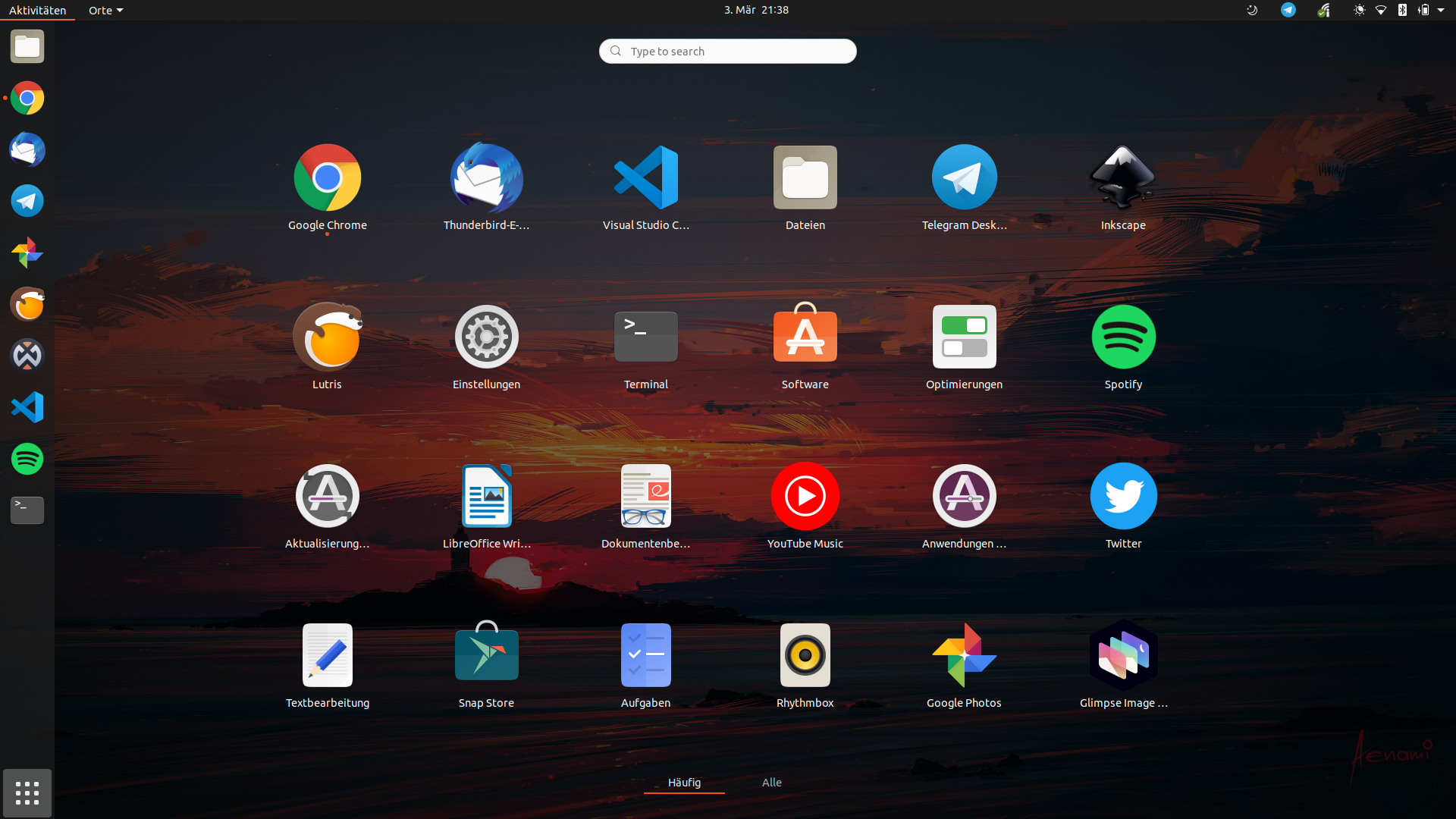
The app icon's shape becomes invisible on a dark background
To Reproduce
Steps to reproduce the behavior:
Open gnome shell and search for the Glimpse editor
Expected behavior
A soft highlight of the baseplate could help
Screenshots
Desktop (please complete the following information)
Ubuntu - gnome shell 3.35.91
 Feichtmeier
All 41 comments
cc @jaames the original creator of the logo as they may have design guidance on this.
Also for reference: https://github.com/glimpse-editor/branding
 TrechNex
on 4 Mar 2020
TrechNex
on 4 Mar 2020
Cool!
The app icon itself looks gorgeous. It's just that a border is missing
Feichtmeier
on 10 Mar 2020
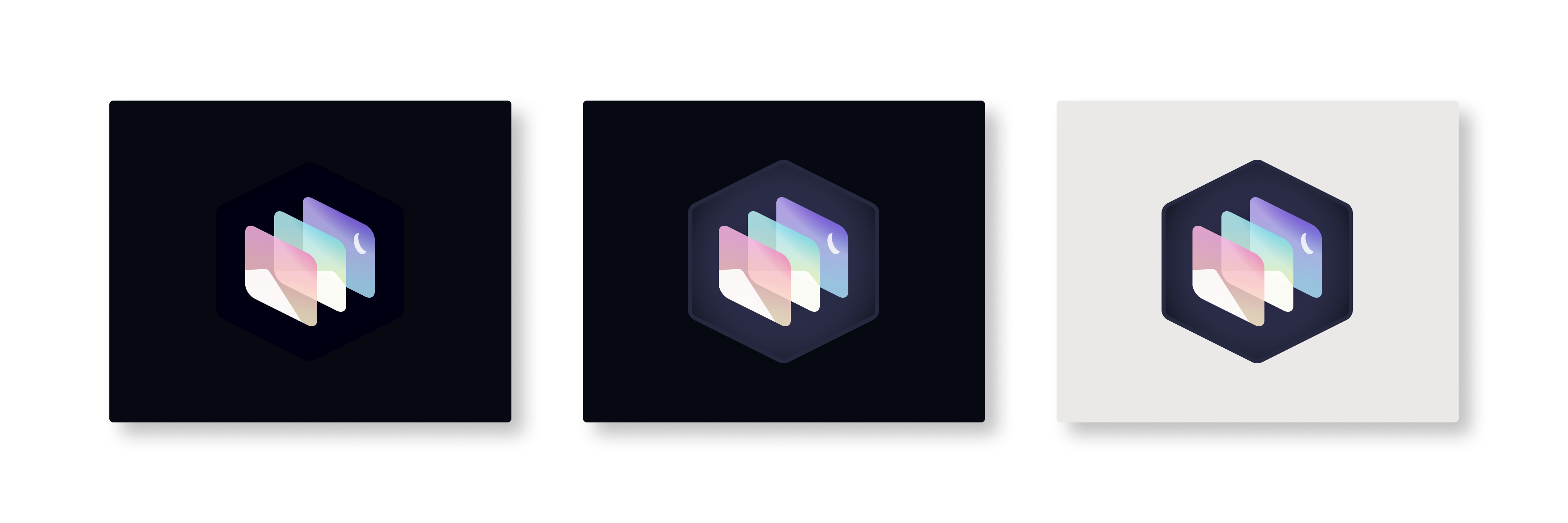
@jaames I gave this a try, but I saw no solution, at least for now, other than alter the hue of the exagon a bit and give it a lighter border with a circular radial inside for better contrast. Here's what I came up with:
- Left: jaames original design on a very dark background.
- Center: My proposal on the same very dark background.
- Right: My proposal on a lighter background.
_Open the image on another tab for full, detailed resolution. Source SVGs and PNGs included below_
 cristianovitorino
on 24 Mar 2020
cristianovitorino
on 24 Mar 2020
If you do decide to go for it, I'll need an SVG version to make icons from before the end of this week if you want it in 0.1.4.
I think it would be great to fix this problem right before Ubuntu releases its latest LTS, and we can fix our website so we use the dark background logo instead of the inverted one.
(If that's not possible don't worry, as 0.1.6 is due out in early May)
TrechNex
on 24 Mar 2020
If you do decide to go for it, I'll need an SVG version to make icons from before the end of this week if you want it in 0.1.4.
It's provided on the link on the bottom. Do you need the logo alone specifically without the background? I can provide that alone in a heart bit.
Should we wait for @jaames feedback or are you ready to greenlit the proposal?
cristianovitorino
on 24 Mar 2020
Correct, I would need it minus the background. Not only would I be using the SVG directly, but I also need to generate PNG images of specific sizes.
I'll give @jaames a few days to look over it. If we don't hear anything I'll greenlight it, but will run it past other governance team members first.
TrechNex
on 24 Mar 2020
If you need help on how we did it last time, we actually have a branding repo that this also needs to go into @cristianovitorino https://github.com/glimpse-editor/branding
TrechNex
on 24 Mar 2020
If you need help on how we did it last time, we actually have a branding repo that this also needs to go into @cristianovitorino https://github.com/glimpse-editor/branding
Gotcha! Feel free to assign this issue to me if you want and move it on the Kanban board. I can do the heavy lifting of the link/size variation if needed be, or do you have an automated way of doing that? If it falls to me, as it takes a bit more time and effort I rather wait for governance to approve first. Let me know of the decision and if jaames is OK with it and have feedback to offer.
Here's the SVG of the logo alone:
Glimpse Logo.zip
cristianovitorino
on 24 Mar 2020
And if aproved, gimme a few extra hours so I can do some quality of life improvements before doing the size variation and preparing the PR. Very small things, like raising the radial by some small percentage and finding a sweet spot. I went through 7 iterations to get to the current result, but it could benefit from final tweaks and revision to avoid any problems when it goes into production. Also produce a accurate, complete color palette for reference on the README.md.
cristianovitorino
on 24 Mar 2020
@jaames I gave this a try, but I saw no solution, at least for now, other than alter the hue of the exagon a bit and give it a lighter border with a circular radial inside for better contrast. Here's what I came up with:
* **Left:** jaames original design on a very dark background.

* **Center:** My proposal on the same very dark background.

* **Right:** My proposal on a lighter background.
_Open the image on another tab for full, detailed resolution. Source SVGs and PNGs included below_
The one in the middle looks fine for me.
Alternatively you could add a "1px" stroke outline to the existing logo with something like #cccccc
Feichtmeier
on 24 Mar 2020
The one in the middle looks fine for me.
Left is the original from jaames. Center and right is my solution, they're the exact same logo but in different backgrounds, demonstrating that it works on darker and lighter backgrounds.
Alternatively you could add a "1px" stroke outline to the existing logo with something like
#cccccc
Tried that, looks horrible :joy: Plus any outlining should preferably inherit from the established palette. And the current logo palette doesn't give room for neutrals in order to work with all kinds of backgrounds. Also adding a contrasting outlining such as #cccccc to this kind of logo would "box it", changing it's fundamental style.
I went through 7 iterations, what you see is the best I could came up with at the moment.
cristianovitorino
on 24 Mar 2020
You could try doing it as a semi-transparent diffuse around the logo itself? That way the original colour palette could be preserved.
Although tbh I don't dislike the idea that's already been presented here. :)
TrechNex
on 24 Mar 2020
You could try doing it as a semi-transparent diffuse around the logo itself? That way the original colour palette could be preserved.
Although tbh I don't dislike the idea that's already been presented here. :)
Already tried that. Looks like s**t :joy:
But that's not my call to make. Gimme a few minutes, I'll post the iterations. Judge for yourselves.
cristianovitorino
on 24 Mar 2020
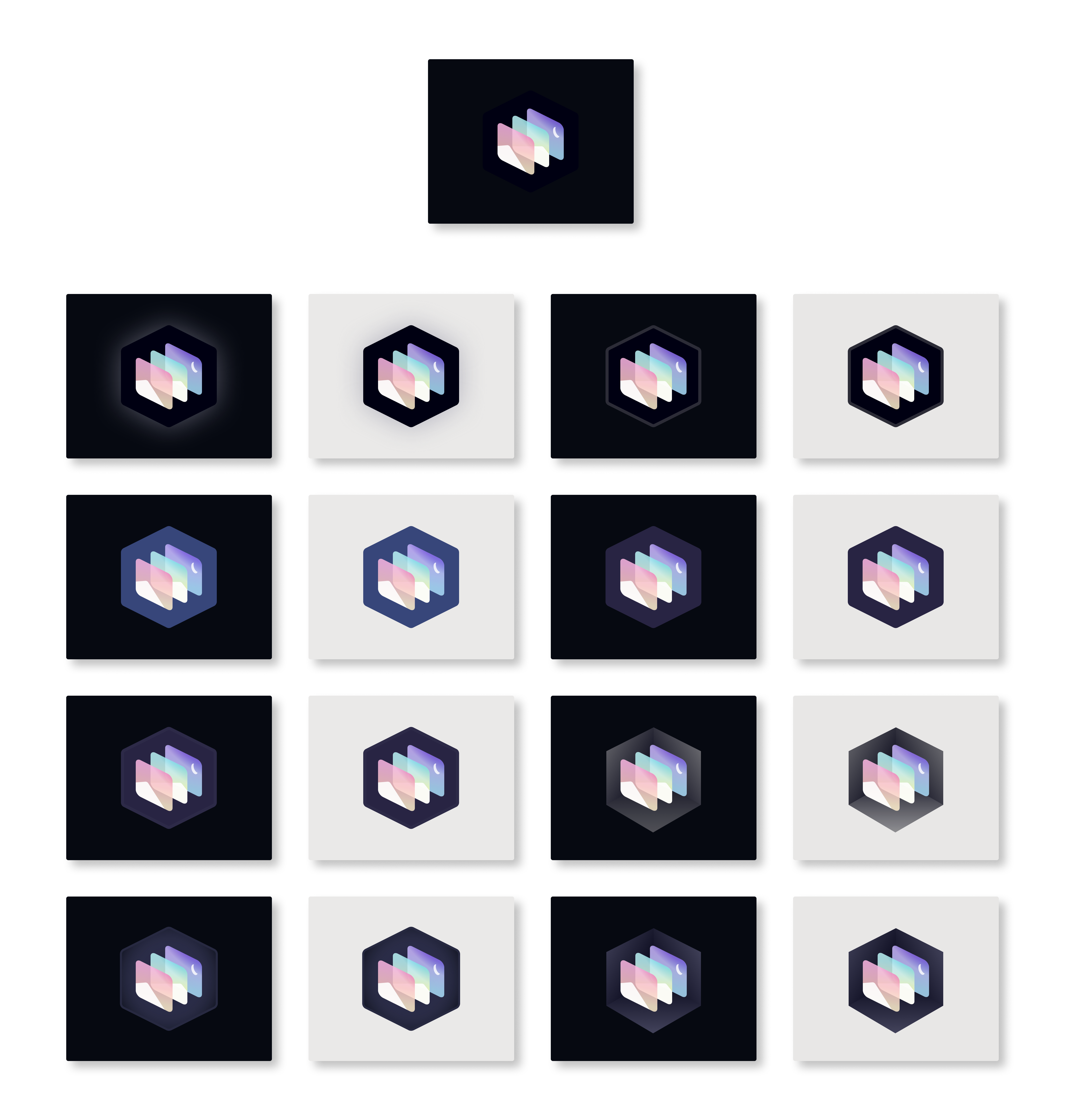
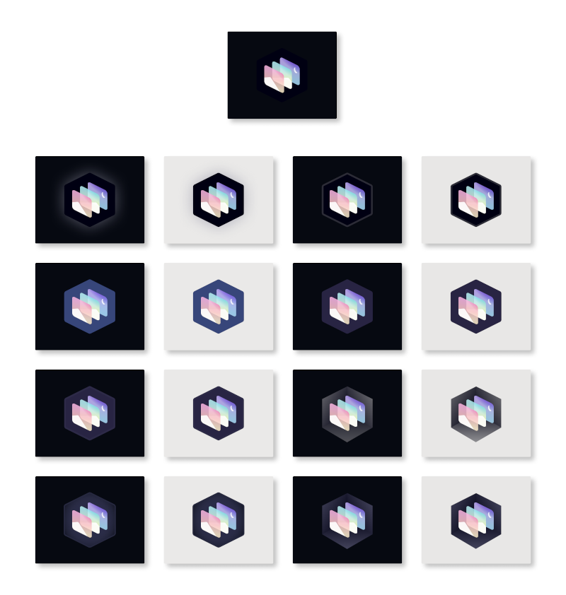
Here. It's important to open them both on new tabs to compare visibility on different scales. A logo should look good on small and large scales. The diffusing suggested by @TrechNex is not that terrible, but it's so cheap and bland. But again, not my choice to make.
Big scale
Small scale
cristianovitorino
on 24 Mar 2020
I'm concerned that the colours look slightly off in all of them if you compare to what's on the website & in peoples' app launchers already. Did you use the SVG files provided in the branding repo linked above and use the color codes in the README.MD there?
TrechNex
on 24 Mar 2020
Hey! Sorry for not responding sooner, I got a bit sidetracked with the whole covid-19 thing that's been going on. ':)
My initial reaction is that I'm not really sold on changing the background color to a slightly lighter grey. It feels like there would still be contrast issues, just against slightly lighter colors instead.
Honestly rather than having another variant of the logo maybe the solution is as simple as wrapping the icon in a thick-ish white border, like a sticker?

We could of course try adding some shading to the background too, but personally I prefer not to have lots of different logo variants since it muddies branding a bit.
(PS, @cristianovitorino you might wanna check your color profile settings, those colors seem a bit washed out compared to what's in the branding repo!)
 jaames
on 24 Mar 2020
jaames
on 24 Mar 2020
I'm concerned that the colours look slightly off in all of them if you compare to what's on the website & in peoples' app launchers already. Did you use the SVG files provided in the branding repo linked above and use the color codes in the
README.MDthere?
That's the idea, the hexagon BG is a strong dark blue nearing the absolute black on the shade spectrum, that's why this issue was opened, it doesn't work in dark hued BGs or black BGs. You need to move it up in the shading spectrum so it's not confused with a dark or black background.
I've used the SVG yes, not the color palette. As my worry was with keeping the max of the style of the current logo and make it work on darker and lighter backgrounds.
But I can play around with the README.md and a website screenshot. But I may only be able to do that tomorrow. If I can I'll give it a shot today, not garanteed.
cristianovitorino
on 24 Mar 2020
Honestly rather than having another variant of the logo maybe the solution is as simple as wrapping the icon in a thick-ish white border, like a sticker?
I thought about that, but it would change the logo personality and I didn't want to disrespect your design.
cristianovitorino
on 24 Mar 2020
tbh I'm fine with the white sticker-like border. Although that could be my aversion to change talking. We've had a lot of positive feedback around the current logo
TrechNex
on 24 Mar 2020
We could of course try adding some shading to the background too, but personally I prefer not to have lots of different logo variants since it muddies branding a bit.
These are proposals side by side (one in a dark BG, one in a light BG), not variants, in case you're talking about my images, sorry and ignore if I'm mistaken.
(PS, @cristianovitorino you might wanna check your color profile settings, those colors seem a bit washed out compared to what's in the branding repo!)
Not at all, my monitor is well calibrated and ready for color work. It's intentional. As I said in the previous comment (take a second look at that, I think we posted almost at the same time) the original hexagon is deep dark blue, there is no easy escape from that other than "hue it up" a notch so it can work in dark and lighter BGs, it's no a easy task. Or, change the logo personality and throw a white outline like you did, I didn't want to do that, looks like a sticker like you said. It's simpler indeed, cheap tho, I went the hard way :joy: But if that's the direction everybody wants I'm cool with that, looks good and takes les time to implement.
cristianovitorino
on 24 Mar 2020
Coolio. @jaames would you be able to get some new SVGs in the branding repo some time this week? If so I can add this change in 0.1.4 and it'll roll out across all our Linux/Windows builds for that release after I've updated all the relevant icon packs, etc
TrechNex
on 24 Mar 2020
If not, don't worry as I can push it out to 0.1.6 (due in May) instead.
TrechNex
on 24 Mar 2020
@TrechNex If that's the final decision feel free to unassign me, leave the path open for jaames.
cristianovitorino
on 24 Mar 2020
No worries. Thanks for helping us with this @cristianovitorino, we will still need your design expertise with other icon fixes through the application.
282 for example needs variations on this logo for preview icons and it looks like you're well placed to have a crack at that. :)
TrechNex
on 24 Mar 2020
No worries. Thanks for helping us with this @cristianovitorino, we will still need your design expertise with other icon fixes through the application.
My pleasure : )
282 for example needs variations on this logo for preview icons and it looks like you're well placed to have a crack at that. :)
Shouldn't we focus on #285 instead? As you mentioned on #282.
If jaames is not gonna work on that, I would like to tackled that yeah. EDIT: Only now I saw that he mentioned that he would like to work on that, so I'll just wait for instructions, let me know if you need me there or somewhere else.
cristianovitorino
on 24 Mar 2020
Closing as work on this is complete.
TrechNex
on 27 Apr 2020
Nice, thank you very much @TrechNex
Feichtmeier
on 28 Apr 2020
Reopening issue after discussion on Matrix. cc @cristianovitorino and @jaames
The sticker border solution is sufficient, but we can probably do better :)
TrechNex
on 17 May 2020
The main problem with the sticker-like thin white border solution is that it's thin, and well, looks like a sticker. The real problem appeared after it was implemented project wide, website, etc, the thin white border looks aliased (stairway effect) on small resolutions, even on 1440p screens, when the logo is scaled to a smaller size. The "sticker" style is more of a aesthetic thing, and not a priority per se, but the visibility of the logo on small scales and small resolutions is a real problem.
cristianovitorino
on 17 May 2020
@jaames Help me here buddy. Need your input.
cristianovitorino
on 17 May 2020
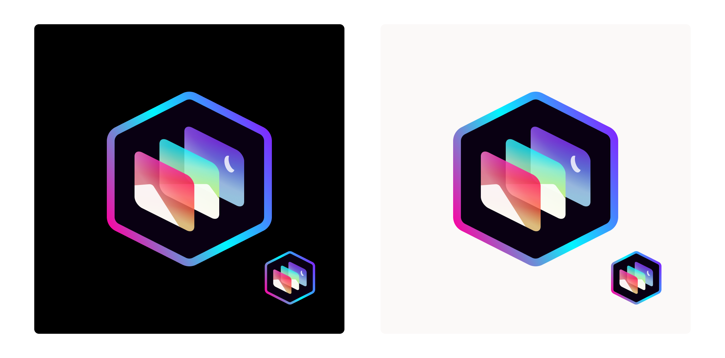
Let's start the iteration process again shall we? How about this:
I took the palette medians and applied it to a thicker border in the lens angle and direction.

cristianovitorino
on 17 May 2020
imo, the colors on that are very cold, what if it was made a bit more vibrant/warm?
 LunaTheFoxgirl
on 17 May 2020
LunaTheFoxgirl
on 17 May 2020
@Member1221
imo, the colors on that are very cold, what if it was made a bit more vibrant/warm?
What do you mean?
- The whole logo?
- The last proposed border?
- The inner lenses elements?
Perhaps something like this? I extended the radial length of the top primary colors on each lens element and made the "rainbow" border with a wider color spacing but slightly thiner, so it can be visible in small scales, just right before becoming an icon, but large enough that shouldn't bother when in large scales. I've made everything warmer.
On the small version, anything smaller than that, applied project wide to represent the project, will have a problem with smaller resolutions. Only solution there to go even smaller scales, in this particular iteration proposal, is increasing the border size, but this can be distracting and look wrong, as exemplified by my previous attempt above.
BTW, this approach is already not ideal for resolutions smaller than 1080p on _screens_ above 20". In resolutions smaller than 1080p and with screens below 20" it should be fine.
cristianovitorino
on 17 May 2020
I guess I meant the color warmth? Some of these terms is a bit confusing to me. But like, the color of the log from before looks really cold and lifeless compared to if it got some warmth added to it. Vibrancy just made the cold colors stand out more
LunaTheFoxgirl
on 17 May 2020
I guess I meant the color warmth? Some of these terms is a bit confusing to me. But like, the color of the log from before looks really cold and lifeless compared to if it got some warmth added to it. Vibrancy just made the cold colors stand out more
"Cold" and "Warm" are commonly OK terms to use, so is "Dark" and "Bright", just make sure you know what you're referring to.
What I understood from your statement previously is that you wanted more hue saturation. And that's what I did on my previous attempt.
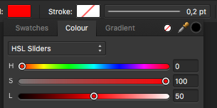
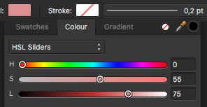
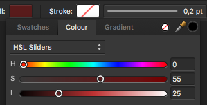
- Hue values in HSL goes from 0 to 360, or from red to red on a full color spectrum.
- Saturation values goes from 0 to 100.
- Light values goes from 0 to 100.
These are some common conventions that you can use to play around with Color Theory:
- For brightness: Keep Saturation around 100 and Light around 50.
- For lighter/pastel: Keep Saturation below 50 and Light above 50.
- For darker/shadows: Keep Saturation above 50 and Light below 50.
- For neutrals: Keep both Saturation and Light at 50.
- "Warmth" is quite subjective, IMO it would be something like (let's say, red):
- H: 0
- S: ~50-75 - Intensity of the warmth - Above 75 is "Hot" or "Bright" territory for me.
- L: 50
I'll do a "warm" version and compare it side by side with the "bright" one above.
_P.S.: Black and White are not colors, they don't have hues, they're either the presence or absence of light._
_P.S.2: For full work on the rewrite I'll need to wait for my PC parts to arrive, so I can at least help here while I wait. I just can't do complex things as Figma starts to freeze on me on this ancient Mac LOL A single logo is fine._
Update 1
Top: H: %, S: 100, L: % (Full brightness/Hot).
Bottom: H: %, S: 67, L: % (Warmth). I decided for a median on the "warmth" spectrum. I can make it less or more warm if you want/like this direction.
I also had to decrease transparency on both proposals and widen the radial, since that played a significant role on the temperature of the colors.
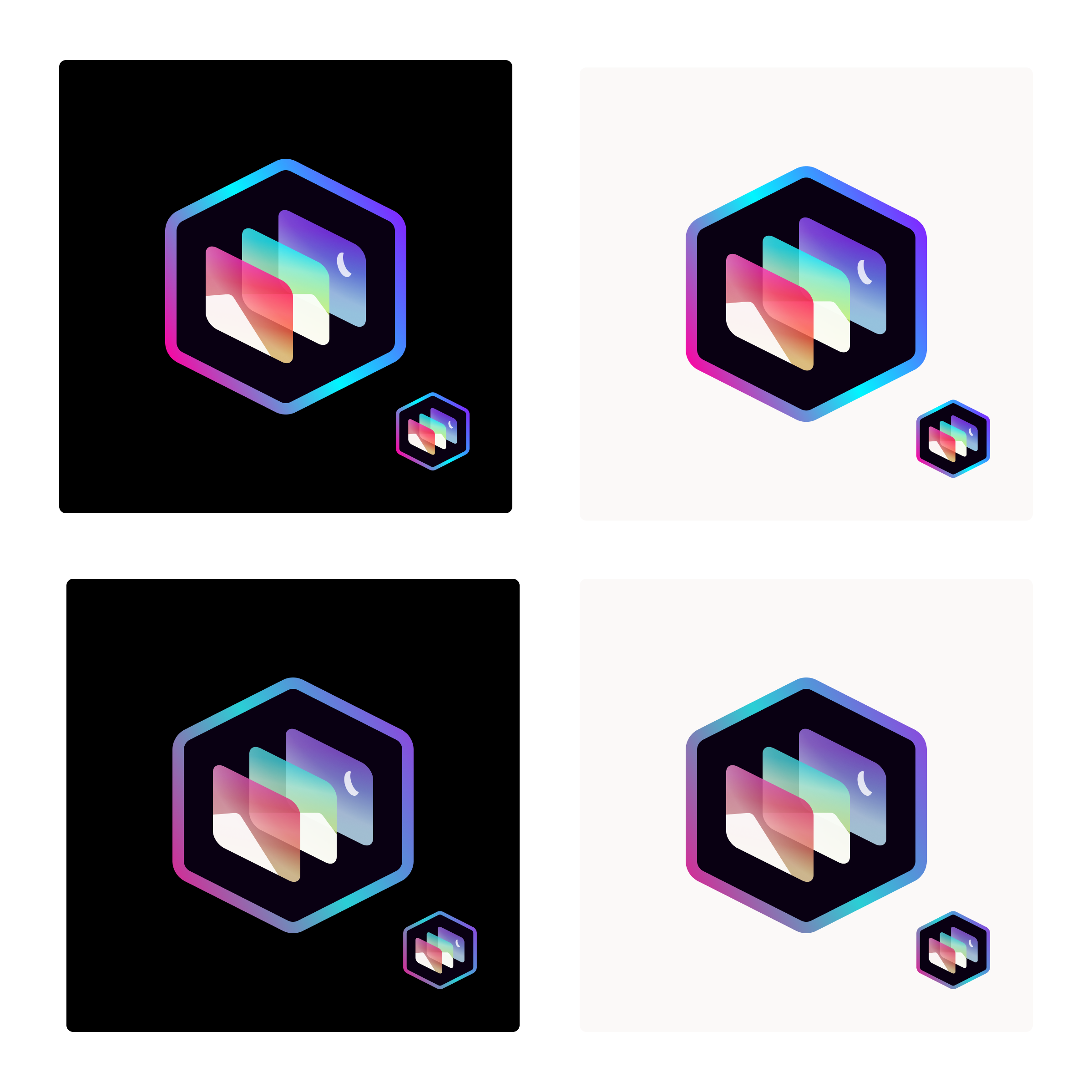
Update 2
Here's a different approach from the first attempt
I just altered the radial transparency and made the colors a bit more warm on the right, also a slightly less thinner border. Left is the original attempt.
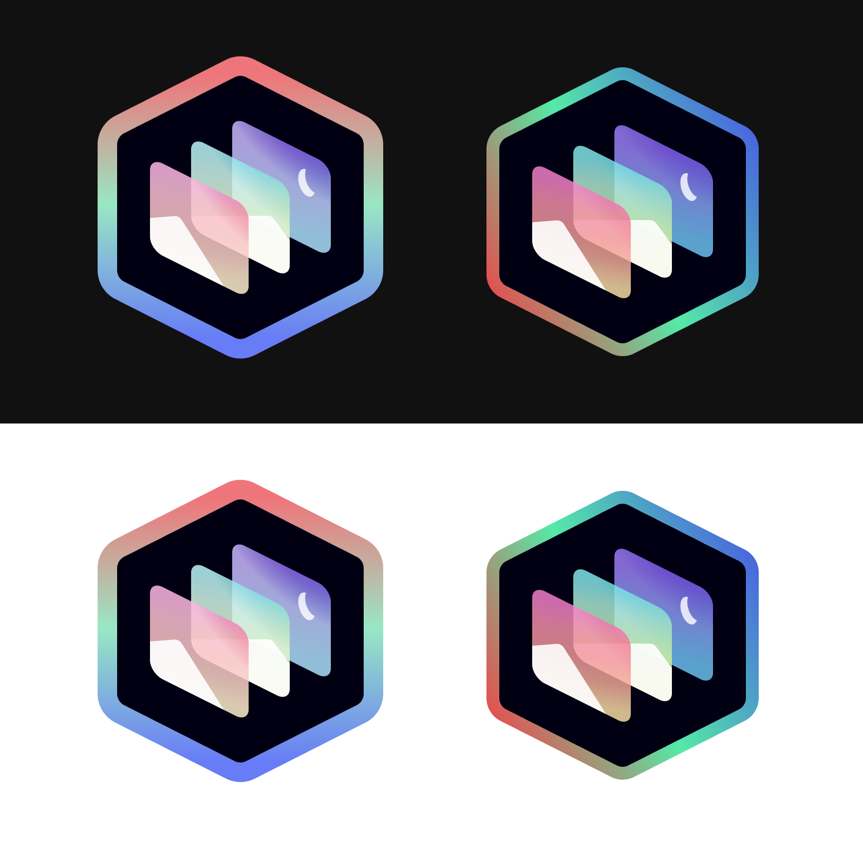
cristianovitorino
on 18 May 2020
More iterations. The first one is a mockup from @jaames (that he used for other purposes) that I'm using as inspiration.
A important thing I've noticed, at least at a 2560x1440p resolution on a 24" monitor (good quality, color accurate), that any line below 20-15 pixels looses visibility and is useless when scaled down. This is not a problem for high PPI mobile screens, but it is for commonly used monitors, that are usually at 1920x1080p on 21,5" and above.
And because we don't have any kind of technical statistics about Glimpse's user base, we don't know what resolutions our target audience is running, so to be safe we either need a colored hexagon background or a thicker white or colored border.
Jame's mockup

Another iteration from me

Line thickness VS Resolution problem
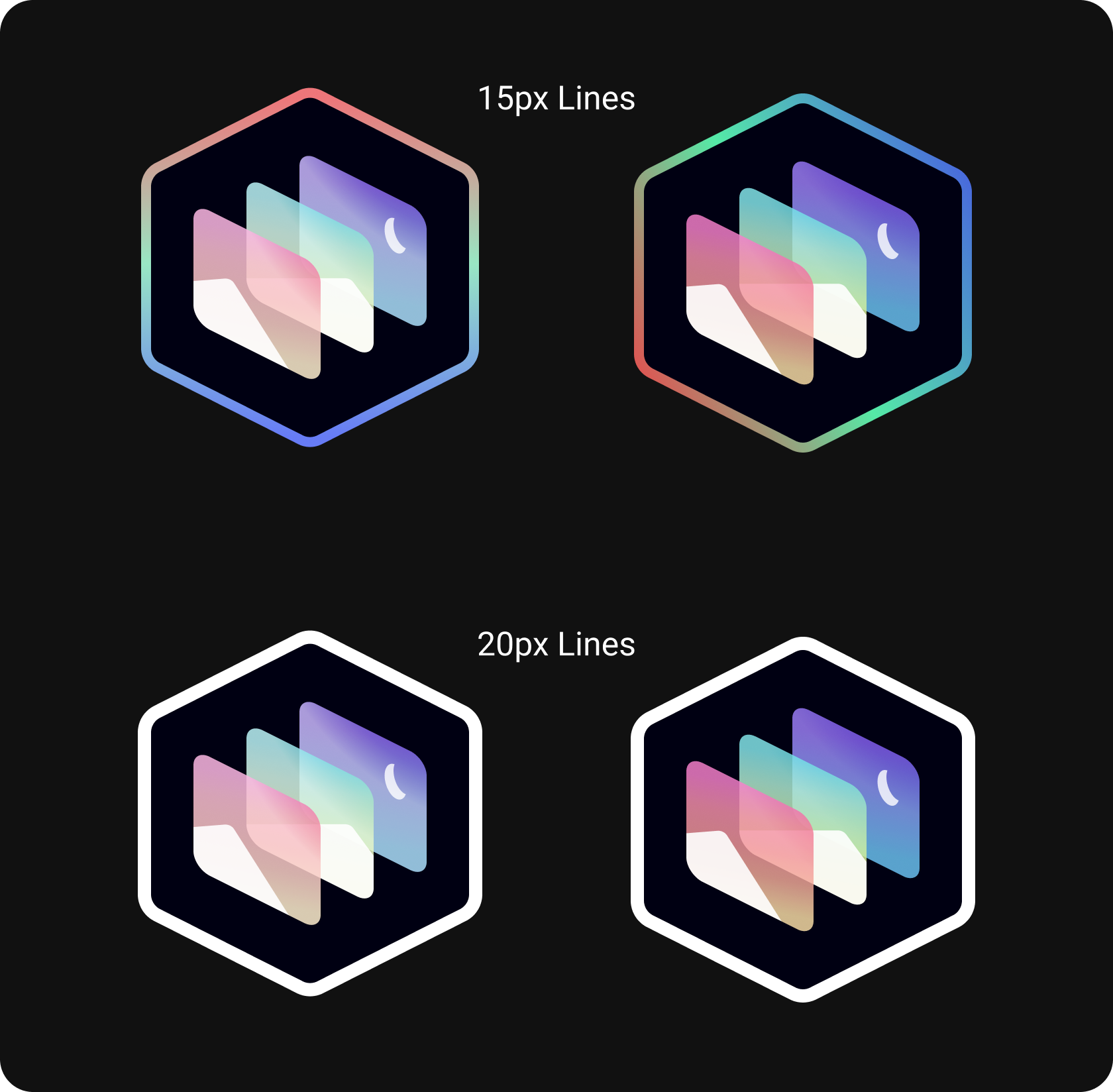
Scaling problem proposed solution

Jame's current design (used in the project), but with a 20px border.
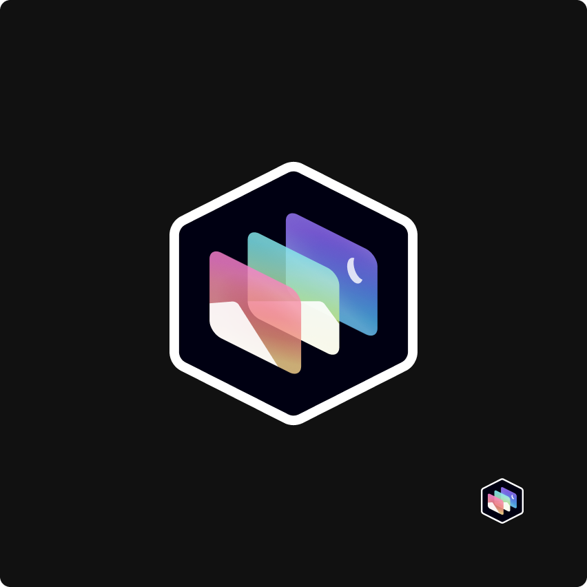
cristianovitorino
on 23 May 2020
Another iteration from me
The blue and orange ones here look super hot, but not sure about readability which is a shame
Scaling problem proposed solution
The white outline reads better to me here
Also, I think if we're going to fix the outline, where possible it would be a good idea to make sure it's pixel-hinted for the sizes the icon is going to be rendered at
jaames
on 23 May 2020
The blue and orange ones here look _super_ hot, but not sure about readability which is a shame
Yeah I noticed, just throwing things at the wall, see what sticks, what works, what doesn't.
The white outline reads better to me here
Also, I think if we're going to fix the outline, where possible it would be a good idea to make sure it's pixel-hinted for the sizes the icon is going to be rendered at
Yup.
cristianovitorino
on 23 May 2020
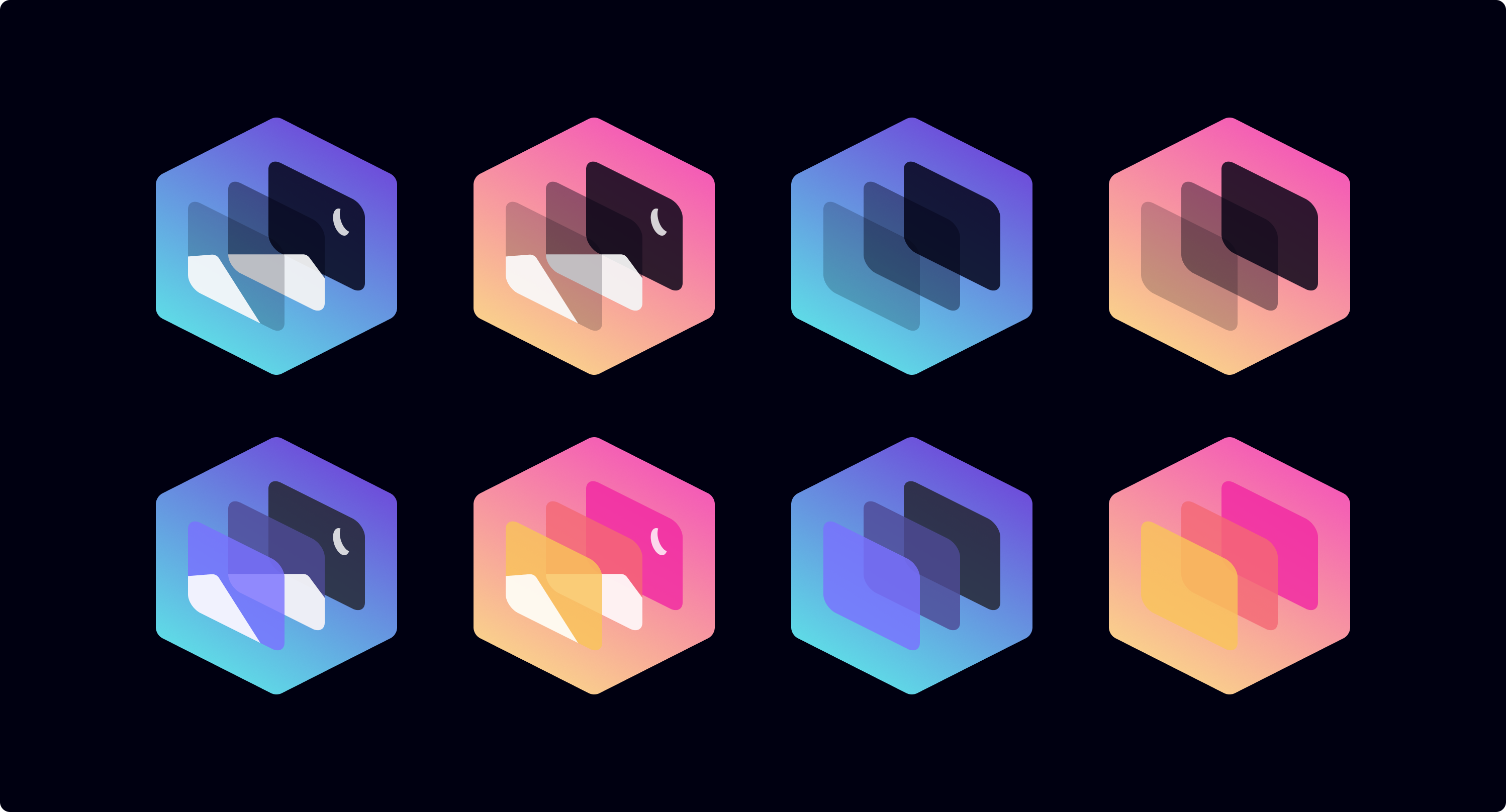
OK panting after running from Color Theory demons here's another round of ideas:
- Top row LEFT has 10 | 30 | 100 % transparency, front to back.
- Top row RIGHT has 10 | 30 | 100 % transparency, front to back + no particles (plain tiles).
- Bottom row LEFT: Color median.
- Bottom row RIGHT: Color median + no particles (plain tiles).
cristianovitorino
on 24 May 2020
@estatra Could you raise a new issue with your design suggestions please? For 0.2.0 I believe we'll be going with the "sticker" logo, but the concepts you came up with here could be used in a future release (for example, 0.3.0) :)
That would then allow me to close this issue as done.
TrechNex
on 27 Jun 2020
@TrechNex Done. #413
cristianovitorino
on 27 Jun 2020
Related issues
 chris-short
·
3Comments
TrechNex
·
9Comments
chris-short
·
3Comments
TrechNex
·
9Comments
 Vectornaut
·
5Comments
TrechNex
·
6Comments
Vectornaut
·
5Comments
TrechNex
·
6Comments
 sketchbuch
·
3Comments
sketchbuch
·
3Comments
Most helpful comment
Let's start the iteration process again shall we? How about this:
I took the palette medians and applied it to a thicker border in the lens angle and direction.