Glimpse: Replace "icon theme" logo in Preferences window
Describe the bug
This logo currently has Wilber embedded in it, so we should replace it with a more vanilla alternative in each icon pack.
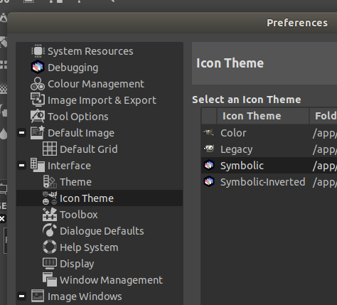
 TrechNex
All 32 comments
Maybe we need to get some symbolic icons made of the glimpse logo? cc @jaames
 LunaTheFoxgirl
on 10 Feb 2020
LunaTheFoxgirl
on 10 Feb 2020
Linking to #282, as if that's the route we go down we should fix both issues at the same time :)
TrechNex
on 10 Feb 2020
Perhaps we need to make a Tango Icon version of the Glimpse Logo to match the legacy themes. (examples: https://commons.wikimedia.org/wiki/Tango_icons)
 creepertron95
on 10 Feb 2020
creepertron95
on 10 Feb 2020
I'd be down to make some more neutral icons to replace any instances of Wilber, if needed. It would be helpful if somebody compiled a list of all the places where they show up though.
I can also create some variants of the Glimpse logo to match legacy themes, personally I think it's a good idea to keep things consistent. :)
 jaames
on 10 Feb 2020
jaames
on 10 Feb 2020
Here is some helpful links related to the Tango icon guidelines.
https://web.archive.org/web/20190312212304/http://tango.freedesktop.org/Tango_Icon_Theme_Guidelines
creepertron95
on 11 Feb 2020
We're not aiming to match Tango, so it should not really be a thing we focus on.
LunaTheFoxgirl
on 12 Feb 2020
I want to give this a try, but I rather wait for governance decision on #323 so I can safely work on this if @jaames is OK with it.
Also I want to propose a new, improved, bug fixed icon set for the current production, but it takes time and we need to solve this two issues first.
EDIT: Only now I saw that @jaames is on the case. I'll wait instructions.
 cristianovitorino
on 24 Mar 2020
cristianovitorino
on 24 Mar 2020
@cristianovitorino oh it's chill, feel free to go for it if you have any ideas! :)
jaames
on 24 Mar 2020
@cristianovitorino oh it's chill, feel free to go for it if you have any ideas! :)
I'll give it a go : )
BTW, are you interested in the new icon set proposal? If you're not gonna work on something similar, I'm eager to take that role and fix those aberrations and improve the metaphors, in the near future. Hopefully they will also serve the UI Rewrite. Gonna need your blessings tho.
cristianovitorino
on 24 Mar 2020
@TrechNex @Member1221 Should I remove all the Wilber PNGs altogether from everything and replace them with the Glimpse logo? If that's the case I need to wait for @jaames to finish tweaking the current logo and in turn tweak them further for very small sizes as the white outline will become noise at those scales depending on the user's monitor/screen resolution.
Otherwise I'll focus on the Icon Theme icon only for now.
TrechNex feel free to assign me to this issue and move it on the Kanban board.
cristianovitorino
on 25 Mar 2020
I keep the Wilber icon files around for compatibility and just swap in references to our own replacements. :)
For icons that have Wilber's face embedded in them we would need similar-looking replacements for them in each icon pack.
Having our logo used as a preview for each theme is one of those things that'll be a nice touch. In 0.1.4 it'll have to look messy, but in 0.1.6 we can bring in the new designs you produce.
TrechNex
on 25 Mar 2020
I have some questions:
1. So, you want me to keep the styles? Like these ones? But just Glimpse instead of that Wilber, keeping the style?


2. And what about this one? Should I just leave it? Or do you want me to give it free go?

3. Should this follow the same principle as in question 1.? That's why I asked if you guys wanted replacement across the board. Wilber is everywhere :joy: Is this what you meant with:
Having our logo used as a preview for each theme is one of those things that'll be a nice touch. In 0.1.4 it'll have to look messy, but in 0.1.6 we can bring in the new designs you produce.

Because I was thinking in creating something new altogether, a new metaphor for the icon theme previews, respecting their overall feel and styles. I can go "Glimpse'em all but respec their style" or go new and fresh but respecting the style. I don't plan on messing with the already placed Glimpse ones.
cristianovitorino
on 25 Mar 2020
For now, it's a case of "fix what's there". Imho We can start getting a bit more radical with new icon/UI paradigms once we've finally exorcised Wilber and have our own documentation instead of relying on upstream's
TrechNex
on 25 Mar 2020
There's also nothing stopping us creating our own icon packs and UI themes of course, but those should be new Github Issues :)
TrechNex
on 25 Mar 2020
For now, it's a case of "fix what's there". Imho We can start getting a bit more radical with new icon/UI paradigms once we've finally exorcised Wilber and have our own documentation instead of relying on upstream's
Let me double check if I understood: I should leave Color and Legacy alone and swap Wilber for Glimpse on Symbolic and Symbolic-Inverted?
For reference, what jaames said earlier:
Is that the icon updates? Shouldn't need to wait for me there, there's only gonna be minor branding tweaks :)
(although where possible it's probably best to replace them with something neutral that doesn't reference our logo at all)
There's also nothing stopping us creating our own icon packs and UI themes of course, but those should be new Github Issues :)
That's what I was talking about on the Matrix channel, I really want to work on that when I'm able to! Our very own Icon Pack! I want to make it awesome so it could perhaps aspire to be the default someday : ) And be useful and easily tweakable for the UI Rewrite too.
cristianovitorino
on 25 Mar 2020
To answer the questions directly.
- Yes. Keep the styles, but swap in the Glimpse logo instead of Wilber's face. The logo should match the style of other elements in the same icon.
- Please don't change things like this yet on existing icon packs. Feel free to make another Github Issue and we can size/prioritize it for when we have the things in place to support it. :)
- Exactly. The difference here is that you'd change the logo to match the style of that icon pack (but in practice the icon will look the same for application launchers, the main icon and inside the Help > About window)
TrechNex
on 25 Mar 2020
I do share your enthusiasm btw on point 2. I got very excited about including a third party icon pack, but then upstream changed the way the GUI was arranged and how it behaved and it immediately deprecated it.
For this reason it may be tricky to make big UI/Design changes while we are still "soft forking". A lot of that kind of thing ends up getting pushed out to the UI rewrite, then we bring it back in if we can see a way of adapting the idea.
TrechNex
on 25 Mar 2020
To answer the questions directly.
Thank you.
- Yes. Keep the styles, but swap in the Glimpse logo instead of Wilber's face. The logo should match the style of other elements in the same icon.
Gotcha!
- Please don't change things like this yet on existing icon packs. Feel free to make another Github Issue and we can size/prioritize it for when we have the things in place to support it. :)
I'll never touch that even with a 10 foot pole don't worry : ) I don't want to alter o deal with anything legacy to be honest, I'm enthusiastic about making our own Icon pack instead of meddling into ancient work.
- Exactly. The difference here is that you'd change the logo to match the style of that icon pack (but in practice the icon will look the same for application launchers, the main icon and inside the Help > About window)
Should I strictly follow https://github.com/glimpse-editor/branding here? I'm trying to measure my degree of freedom to make the adaptation.
cristianovitorino
on 25 Mar 2020
I don't think it's possible to strictly follow the branding guidelines with these tasks tbh :sweat_smile:
So long as it clearly resembles the Glimpse logo and doesn't look out of place for that icon theme, anything goes. I'm not expecting red, blue & green windows inside the icon for the Symbolic themes for example :)
TrechNex
on 25 Mar 2020
I don't think it's possible to strictly follow the branding guidelines with these tasks tbh
So long as it clearly resembles the Glimpse logo and doesn't look out of place for that icon theme, anything goes. I'm not expecting red, blue & green windows inside the icon :)
You have no idea how this makes me happy LOL No chains! Don't worry I'll not go wild I promise : )
cristianovitorino
on 25 Mar 2020
Fair! There's also no rush as this will be added with 0.1.6 (scheduled for early May 2020). :)
Hopefully after the High Contrast themes are added in 0.1.4 you can see what you have to work with.
TrechNex
on 25 Mar 2020
I do share your enthusiasm btw on point 2. I got very excited about including a third party icon pack, but then upstream changed the way the GUI was arranged and how it behaved and it immediately deprecated it.
I can't wait for us to be free from upstream.
Can I make an Icon Pa- "No, upstream breaks it." Can I tweak the UI for - "No! Upstream!" Can I - "Just chill dude" hahaha.
For this reason it may be tricky to make big UI/Design changes while we are still "soft forking". A lot of that kind of thing ends up getting pushed out to the UI rewrite, then we bring it back in if we can see a way of adapting the idea.
OK. Crossing my fingers. I want to get our custom icon pack rolling. Gonna work on it regardless, and leave it ready to play ball.
cristianovitorino
on 25 Mar 2020
Fair! There's also no rush as this will be added with 0.1.6 (scheduled for early May 2020). :)
Hopefully after the High Contrast themes are added in 0.1.4 you can see what you have to work with.
Alright, will see what they got.
cristianovitorino
on 25 Mar 2020
Thank you very much for taking the time to answer my questions man, appreciate it.
And get some sleep mate. I'll call it a day and play some videogames and get me some rest myself.
cristianovitorino
on 25 Mar 2020
In 0.1.4 release I'm using some of the auto-generation capabilities of the app itself to fix the icon pack preview images and app launcher behaviour.
We will still need to fix icons that have embedded Wilber's face in them though.
TrechNex
on 28 Mar 2020
I think I can probably do this in a fairly straightforward way with Inkscape. Will add previews shortly.
TrechNex
on 28 Mar 2020
I think I can probably do this in a fairly straightforward way with Inkscape. Will add previews shortly.
Sorry I'm too slow : ( Hands full at the moment. But if you can kinda do this in a straightforward manner, that's great!
cristianovitorino
on 28 Mar 2020
It's okay! tbh my efforts are probably going to end up looking a bit "janky", so they'll need refining by someone who knows what they're doing for 0.1.6.
But I think finally killing off Wilber in the existing icon packs will be a cool thing to include in the 0.1.4 release :)
TrechNex
on 28 Mar 2020
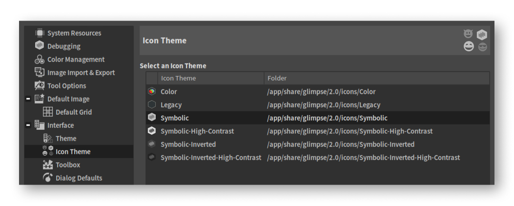
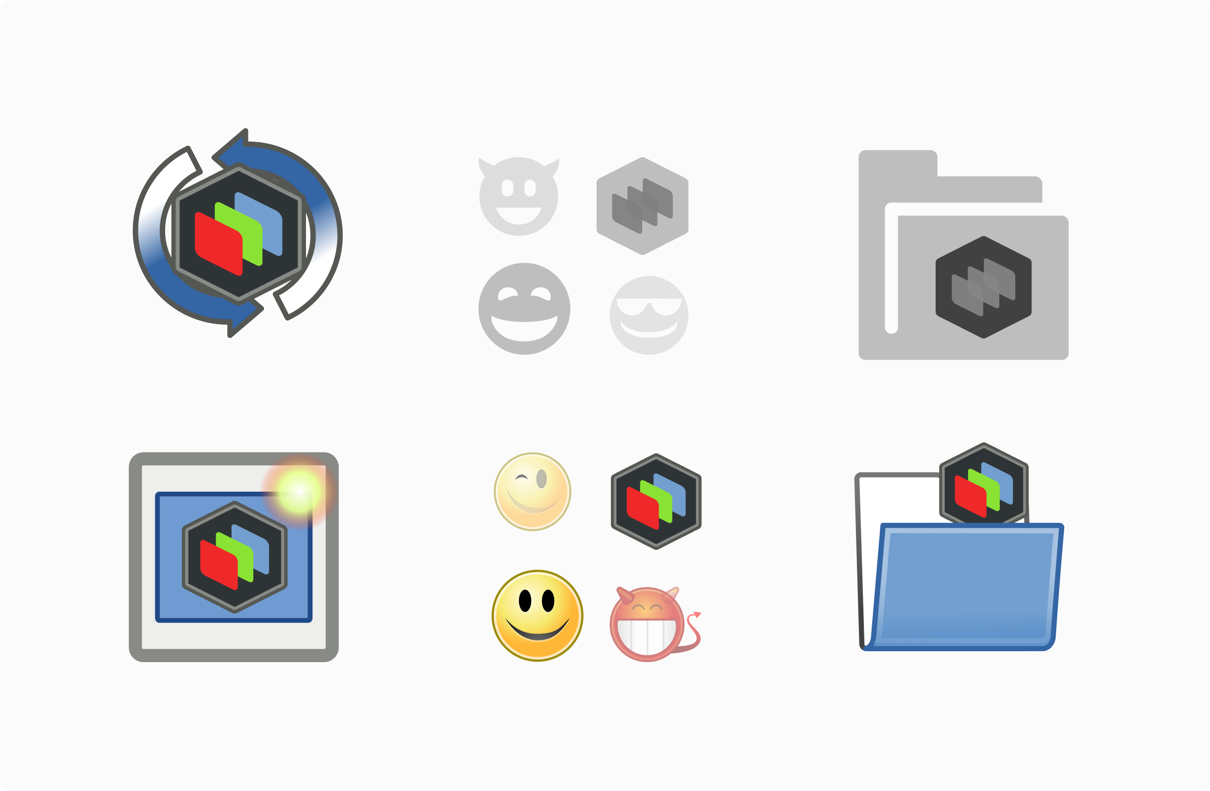
I followed @TrechNex instructions as closely as possible. For that, I had to unearth the long dead and ancient Tango HIG at Wikipedia and Web Archive just to conform some of the icons and match them to the themes they were associated with, to mitigate color clashes and style inconsistencies. We need to ditch those sets on the rewrite for sure, they're deprecated. The monochromatic versions was really fun to think about and iterate. If something needs change, let me know how to improve. I need feedback before generating the PNGs and preparing a PR, and also I need to do a quick report as I've found some inconsistencies inside the project relating to icons.
The "true", current, full color logo I suggest reserving for our own future icon pack.
Click on the images to see their full size

cristianovitorino
on 2 Apr 2020
@cristianovitorino They're looking great, especially considering the rather dated aesthetic style! I like how you simplified the logo to remove the mountains and moon :)
jaames
on 2 Apr 2020
@cristianovitorino They're looking great, especially considering the rather dated aesthetic style! I like how you simplified the logo to remove the mountains and moon :)
Thanks man, appreciate it. I wanted to make the adaptation respecting your work. But the inner details unfortunately had to go because of the small scale visibility.
Yeah, the Tango HIG was... unique for it's time :smile: I remember it being what Adwaita is today at the time, the best default we could get. But man it aged...
cristianovitorino
on 2 Apr 2020
cristianovitorino
on 4 Apr 2020
Related issues
TrechNex
·
9Comments
 pipboy96
·
6Comments
pipboy96
·
6Comments
 Vectornaut
·
5Comments
Vectornaut
·
5Comments
 kofa73
·
6Comments
kofa73
·
6Comments
 TheEvilSkeleton
·
5Comments
TheEvilSkeleton
·
5Comments
Most helpful comment
I followed @TrechNex instructions as closely as possible. For that, I had to unearth the long dead and ancient Tango HIG at Wikipedia and Web Archive just to conform some of the icons and match them to the themes they were associated with, to mitigate color clashes and style inconsistencies. We need to ditch those sets on the rewrite for sure, they're deprecated. The monochromatic versions was really fun to think about and iterate. If something needs change, let me know how to improve. I need feedback before generating the PNGs and preparing a PR, and also I need to do a quick report as I've found some inconsistencies inside the project relating to icons.
The "true", current, full color logo I suggest reserving for our own future icon pack.
Click on the images to see their full size