First I'd like to thank you guys for starting this project! It looks very promising! :)
A few ideas on UX:
Tool icons:
- A bit more spacing between them.
- Some of the icons that are next to each other are too similar in shape. (Especially all the
transform tools) - With so many icons on the tool dock, it might be an idea to have a slight division between
some of the categories to make it less overwhelming.
- Default opening mode for the toolbar should be 1 or maximum 2 columns. More than that
looks also overwhelming.
- Default opening mode for the toolbar should be 1 or maximum 2 columns. More than that
Main Menu:
- Skip the icons. They only add clutter.
- Tools menu is superfluous.
Dialog boxes:
- Light footprint icons (outline or simple line style) Now there are 3 different styles at the same
time. - Text _or_ icons as dock identifier. Preferably not both.
- Light footprint icons (outline or simple line style) Now there are 3 different styles at the same
Overall: Skip all borders where possible.
Here's a light version of a theme I was in the midst of making for gimp 5 years ago, but due to lack of skills and documentation I couldn't move it to deployment. It shows in my opinion that the original gimp ux has a lot borders, icons and other unnecessary decorative elements which distracts from the main focus, the canvas.

If this is not the place to post it, please forgive me, I'm new to Github.
I hope I'll be able to make some themes when Glimpse moves forward and have figured out what it wants to be.
Good luck!
 Ratatoskr1
All 14 comments
Thanks for suggesting these things! It's likely if we choose to pursue it that this would be broken down into several smaller work tickets, but we'll do that at some point in the future.
I tend to agree with what you have said here. In Glimpse 0.1 for example we removed the decorative toolbar headers and the giant pair of eyes from the main window to make the interface less distracting. I think continuing those efforts is the logical next step. :)
 TrechNex
on 31 Oct 2019
TrechNex
on 31 Oct 2019
Great to hear! I believe those efforts alone will make Glimpse quite a bit more approachable.
This guy in the link below has made some superb icons for the toolbar, which I also used in my skin. Maybe something to look into.
https://www.deviantart.com/android272/art/Flat-GIMP-icon-Theme-V-2-1-375010811
Ratatoskr1
on 31 Oct 2019
while we're on it, please use more "standard" shortcut, it's based on photoshop shortcut. i think it's necessary since people are already used to it, and many other manipulating image programs are using the same shortcut. it just make sense to use "photoshop" shortcut instead of gimp default...
 fikrillah
on 24 Nov 2019
fikrillah
on 24 Nov 2019
Any chance we could get a modern GNOME headerbar design? That would be a killer feature over GIMP's dated UI for me.
 JaneSmith
on 24 Jan 2020
JaneSmith
on 24 Jan 2020
We are discussing such for the UI rewrite @JaneSmith but that's still in the planning stages :)
 LunaTheFoxgirl
on 24 Jan 2020
LunaTheFoxgirl
on 24 Jan 2020
Linking to #301 and #303
TrechNex
on 21 Feb 2020
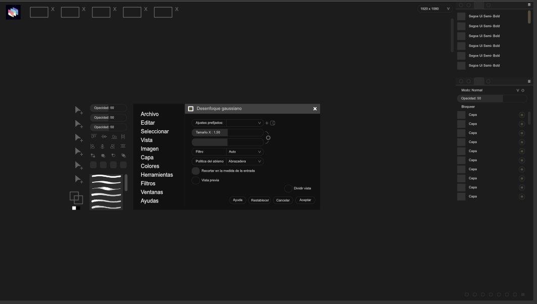
I will contribute the idea for the new Glimpse UX. Because Gimp has ignored me. But I respect your decision. Here take advantage of the details.
Mine contribute to improve more elegant and minimalist design ... for people can see well and easy to read. Accessibility is very demanding for me !! The tools is ideal that is within right click context menu to work faster and modify the parameters of penciles.
Why do I want to do that?
Of course there are many people using the 12-inch monitor as a tablet and laptop, there is no space to work as easy and comfortable.
The bar list is also in context menu but there is a cooler and more professional design. Soon I will make a video or gif to understand much easier.
Sorry for english
 malabo1990
on 24 Feb 2020
malabo1990
on 24 Feb 2020
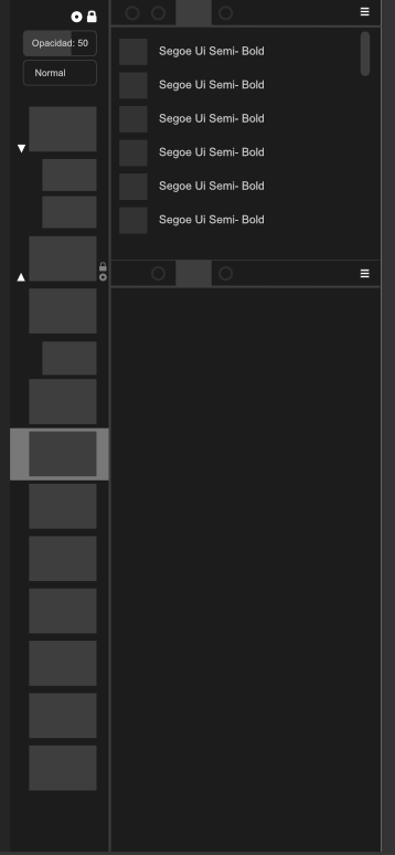
I talk about layers ... I have my experience with several software, it always bothers me a lot to work so hard for a small space ... I have a crush on Pixelmator Pro has excellent layers that everyone can see. This tool is very very active.
Very advantages for graphics tablet.
malabo1990
on 24 Feb 2020
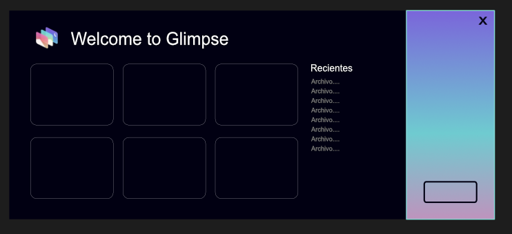
The design is still very ugly but I think it is much clearer and cleaner!
I think also for another export screen, something similar.
malabo1990
on 24 Feb 2020
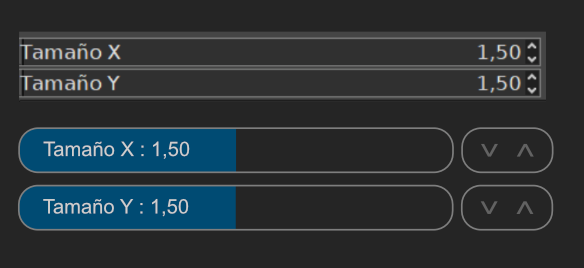
I think it's much better
malabo1990
on 25 Feb 2020
@malabo1990 we have two development efforts happening. One is the fork, the other is a new image editing program.
Some of those changes will be possible with the fork, but not all. The people coding the new program will also look over your pictures, and it could be that creates new ideas.
Thank you for your efforts. They are much appreciated. :)
TrechNex
on 25 Feb 2020
I will contribute the idea for the new Glimpse UX. Because Gimp has ignored me. But I respect your decision. Here take advantage of the details.
Mine contribute to improve more elegant and minimalist design ... for people can see well and easy to read. Accessibility is very demanding for me !! The tools is ideal that is within right click context menu to work faster and modify the parameters of penciles.
Why do I want to do that?
Of course there are many people using the 12-inch monitor as a tablet and laptop, there is no space to work as easy and comfortable.
The bar list is also in context menu but there is a cooler and more professional design. Soon I will make a video or gif to understand much easier.
Sorry for english
gimp devs don't ignore you, they just don't have enough devs and time to work on all of your demand. gimp devs know what they are doing. i believe they are working on something that is more important. so, your request is not really matter to them, since what they actually need is more devs to work on the code.
also i believe gnome has it's own design guideline, gimp devs just can't ignore that and make completely new ui
fikrillah
on 26 Feb 2020
I think we all accept that free software projects have constrained resources, and have to allocate them based on what they view as priorities.
Judging from what I saw on social media, he is correct that certain upstream developers could have been more courteous. One of the ways our project differentiates itself is being friendlier to newcomers and more open to new ideas.
It is also worth remembering that our priorities are different because we're focusing primarily on branding and UX. I don't know how many of the ideas we will end up using in this thread (it could be few, or it could be many) but they're all given consideration. :)
TrechNex
on 26 Feb 2020
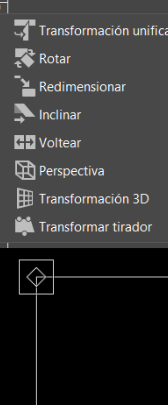
I don't like this gimp classic because it always happened to me I don't see well when many colors appear
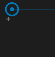
I budget my idea that it can work daily and needs a more pleasant and faster ux.
you need a more striking color
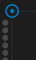
this letter "+" that the toolbox warp group can add. It seems very original.
malabo1990
on 26 Feb 2020
Related issues
TrechNex
·
6Comments
 EndrII
·
7Comments
TrechNex
·
9Comments
EndrII
·
7Comments
TrechNex
·
9Comments
 HumanG33k
·
3Comments
HumanG33k
·
3Comments
 jonathancast
·
3Comments
jonathancast
·
3Comments