Glimpse: Make the Toolbox more accessible
Seriously, the design of it irritates me as you have to effectively guess what does what. I spent about 5 minutes yesterday on the mainline trying to figure out which one is Warp Transform, and I'm definitely a lot more well off than most, so I fear to think how much trouble others have. You basically have to play memory games.
I would definitely switch forks (at least more quickly) if the Toolbox were less...confusing, to say the least.
 no-boot-device
All 22 comments
It’s something that has been talked about on matrix. It’s definitely something to look in to at some point, as I myself also can’t find around in the toolbox.
@BrainBlasted @TrechNex what do you think?
 LunaTheFoxgirl
on 16 Aug 2019
LunaTheFoxgirl
on 16 Aug 2019
I agree it needs work, though not sure we shoud do design changes for the 0.x series. This would be something for the rewrite/hard fork stage.
 BrainBlasted
on 16 Aug 2019
BrainBlasted
on 16 Aug 2019
I think the easiest fix for this is adding the old colored icons back and putting seperators between categories in the toolbox, like have a group with the selection tools, one with the layer transform tools, one with drawing tools and one with patching tools.
 MartijnBraam
on 22 Aug 2019
MartijnBraam
on 22 Aug 2019
This may be relevant.
 GarkGarcia
on 26 Feb 2020
GarkGarcia
on 26 Feb 2020
I think the easiest fix for this is adding the old colored icons back and putting seperators between categories in the toolbox, like have a group with the selection tools, one with the layer transform tools, one with drawing tools and one with patching tools.
As mentioned by jaames in #301 , the category separators are probably the way to go, since relying solely on color to differentiate categories is not exactly accessibility compliant.
GarkGarcia
on 26 Feb 2020
Hi. I am working to improve icon for glimpse for such a good software ... We will see color later, I need to finish all for all I can experiments with these colors ideal for people with low vision ... I am a person with disabilities visual ... I think you have more advantages for more efficient help accessible.
I have software that allows you to change the color as simulation colorblind that is very useful
We better talk at # 301 so I can concentrate much easier.
Thank you. YES GLIMPSE !!!
 malabo1990
on 26 Feb 2020
malabo1990
on 26 Feb 2020
To keep you guys updated on the discussion at #301:
To be honest, I don't think separating icons by category would work. The arrangement of the icons depends on the width of the toolbox (which is configurable by the user), so icons of different colors could end up in the same row.
If we went the _visual separator_ rout a similar problem arises: we don't have precise control over the width of the toolbox, so icons of different categories could end up in the same row, making it impossible to separate them in rectangular boxes without potentially introducing some awkward white-space.
In my option, there's two ways we could go about this:
Fix the width of the toolbox. Most visual editors do that anyways.
Abandon this idea altogether. Frankly the issues we have with the toolbox right now doesn't have much to do with theming. Beside, I've never seen a visual editor that separates tools by category in the toolbox. If the user wants to do so, he's free to use a custom icon theme as customize the toolbox to his taste.
I think there are two things we should focus on to fix this issue:
Redesigning some icons to make them more intuitive.
Decluttering the toolbox. There are frankly too many tools on the toolbox. I'm not saying we should remove those tools, I'm just proposing we redesign the way the user access them.
GarkGarcia
on 1 Mar 2020
Eh, perhaps not.On Mar 1, 2020 4:07 AM, Gark Garcia notifications@github.com wrote:STUPID SIDENOTE: This issue should be renamed Make the Toolbox great again.
—You are receiving this because you were mentioned.Reply to this email directly, view it on GitHub, or unsubscribe.
BrainBlasted
on 1 Mar 2020
Eh, perhaps not.
I suppose I didn't make it clear that this isn't, by any means, an endorsement of Trump's policies. Just a meme. Sorry for the _off-topicness_ of it all.
GarkGarcia
on 1 Mar 2020
I think given the changes in 2.10.18 that @MartijnBraam's approach is probably the right one.
We've brought back the "Color" icon pack in 2.10.12, and when we rebase on 2.10.18 we'll also have their new high contrast icon packs. In addition, that release introduces Photoshop-style icon grouping.
The work we will need to do is figuring out if we want to follow their defaults or set our own. :)
(Also, please avoid jokes about politics and religion. You're just setting yourself up for trouble if you go down that route! 😅 )
 TrechNex
on 1 Mar 2020
TrechNex
on 1 Mar 2020
We've brought back the "Color" icon pack in 2.10.12, and when we rebase on 2.10.18 we'll also have their new high contrast icon packs. In addition, that release introduces Photoshop-style icon grouping.
Cool! What about the suggestion of altering the _Color_ icon pack to fit our logo's color scheme? @jaames made a cool prototype in #301. Also, what do you mean by _Photoshop-style icon grouping_?
The work we will need to do is figuring out if we want to follow their defaults or set our own. :)
Following Adobe's defaults looks like a good idea to me. That could make Glimpse more appealing for photographers and graphical designers who were never exposed to GIMP or free software in general.
(Also, please avoid jokes about politics and religion. You're just setting yourself up for trouble if you go down that route! 😅️)
Sure, that comment was inappropriate. Again, sorry for the inconvenience. I've removed it so we don't waste any more time discussing it.
GarkGarcia
on 1 Mar 2020
Continuing the discussion from #302
My take is that shape and or compartmentalization takes precedence over color when we're talking about accessibility in general, but especially for color blindness. I'm not entirely sure how to approach this, but I do have suggestions.
How about box grouping instead of just color grouping? Separation by group boxes with titles saying what the group is about, and of course, better, less confusing icon metaphors than the current ones.
When I make games, I always prioritize shape and compartmentalization over color for example, you have to do extra hard work to make it work, but it does pay off in my opinion, as form, distiction, detection and diferentiation is obvious, straight to the point, and can work even if someone would have, hypothetically, black and white vision for example.
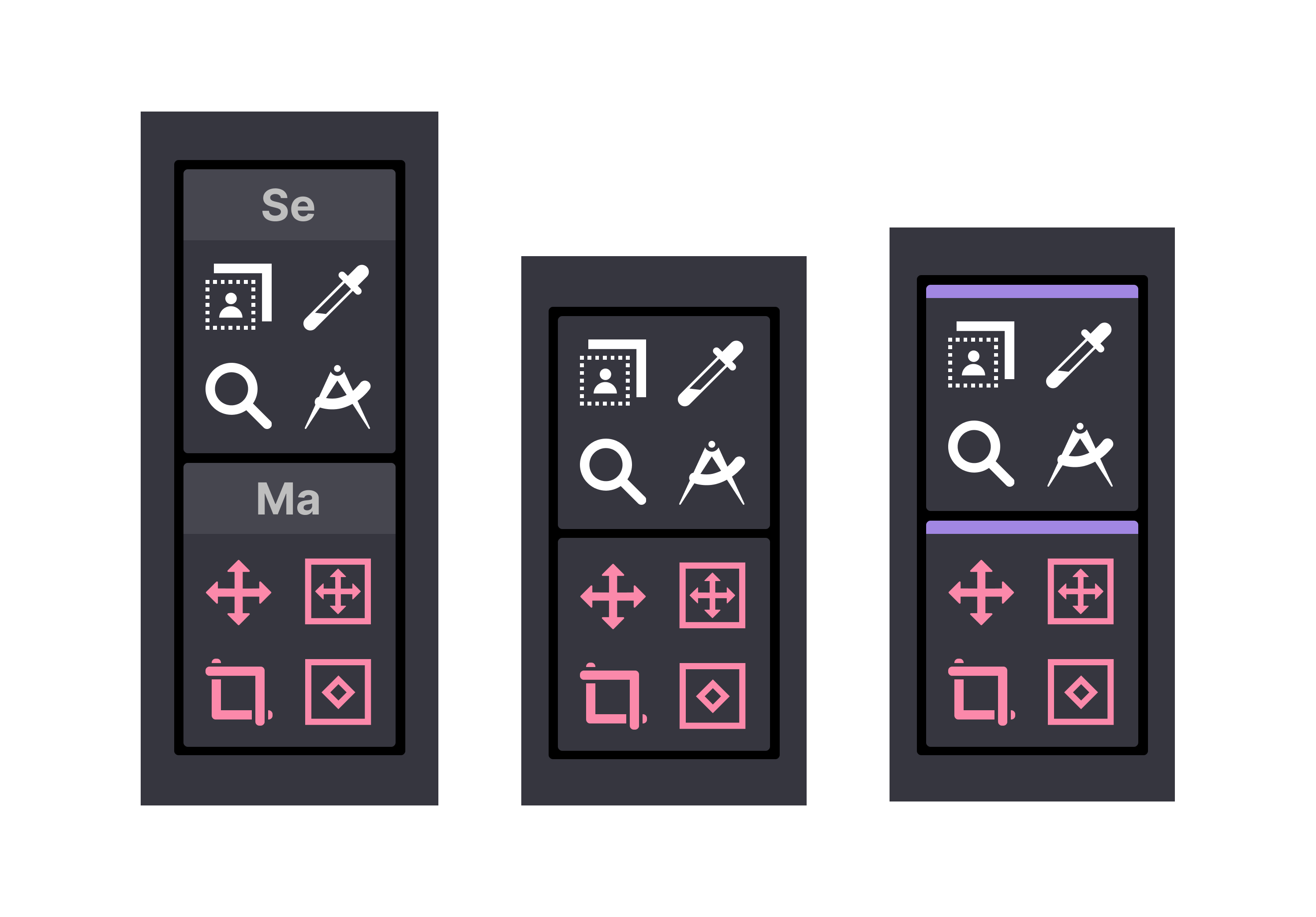
As a quick example to demonstrate this, I'll display a tentative design of four rows of two different groups of the previously proposed ones. Each group is identified by the group's initials, in the example below "Se" for "Selection Group" and "Ma" for "Manipulation Group". Initially I wanted to type the entire group name but it's impossible to read at that size, so I opted for the initials. Maybe a tooltip on hover could reveal the entire group name? Not fully happy with this, but it's what I could came up with for now.
As reference I chose to classify the groups in the following format:
- Selection
- Manipulation
- Design
- Treatment
- Alignment
Also proposing improved icon metaphor while at it, as the standard GNU Image Manipulation Program ones annoys me to no end. I find them a bit confusing, not very obvious. And, the current icons have no size consistency between then, that's very weird. Also proposed a fix.
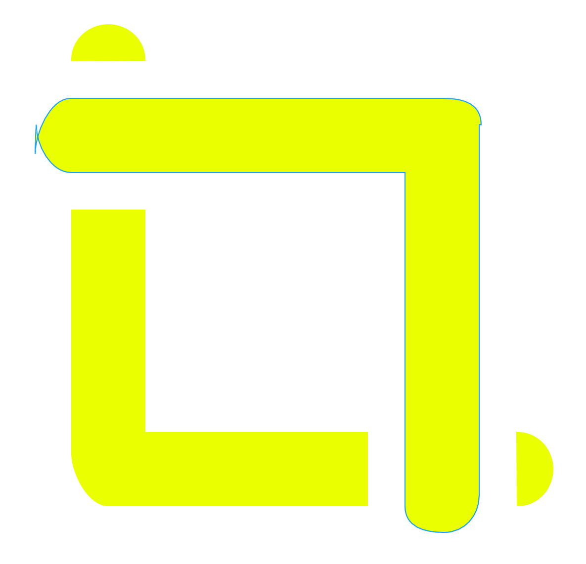
I also noticed bad/wrong curved nodes on the crop tool icon, with curves extruding where they shouldn't, and misaligned rounding, I had to redo this icon too because of these mistakes.
I followed in @jaames steps with the color palette and mockups.
My suggestions:
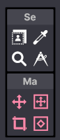
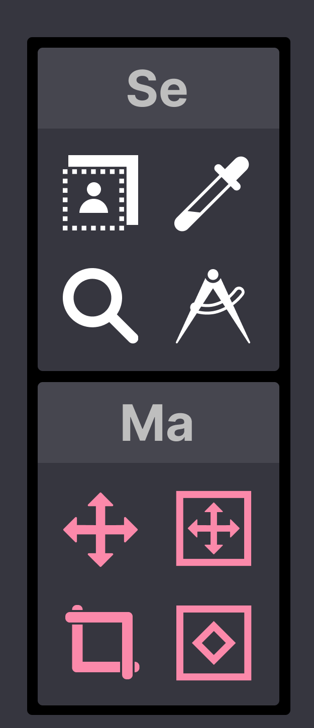
Mistakes I've found on the crop tool icon:
@jaames prototype as reference:

 cristianovitorino
on 1 Mar 2020
cristianovitorino
on 1 Mar 2020
[image: image.png]
¿What is?
El dom., 1 mar. 2020 a las 23:39, Cristiano Vitorino (<
[email protected]>) escribió:
Continuing the discussion from #302
https://github.com/glimpse-editor/Glimpse/pull/302My take is that shape and or compartmentalization takes precedence over
color when we're talking about accessibility in general, but especially for
color blindness. I'm not entirely sure how to approach this, but I do have
suggestions.How about box grouping instead of just color grouping? Separation by group
boxes with titles saying what the group is about, and of course, better,
less confusing icon metaphors than the current ones.When I make games, I always prioritize shape and compartmentalization over
color for example, you have to do extra hard work to make it work, but it
does pay off in my opinion, as form, distiction, detection and
diferentiation is obvious, straight to the point, and can work even if
someone would have, hypothetically, black and white vision for example.As a quick example to demonstrate this, I'll display a tentative design of
four rows of two different groups of the previously proposed ones. Each
group is identified by the group's initials, in the exemple below "Se" for
"Selection Group" and "Ma" for "Manipulation Group". Initially I wanted to
type the entire group name but it's impossible to read at that size, so I
opted for the initials. Mybe a tooltip on hover could reveal the entire
group name. Not fully happy with this, but it's what I could came up with
for now.As reference I chose to classify the groups in the following format:
- Selection
- Manipulation
- Design
- Treatment
- Alignment
Also proposing improved icon metaphor while at it, as the standard GNU
Image Manipulation Program ones annoys me to no end. I find them a bit
confusing, not very obvious. And, the current icons have no size
consistency between then, that's very weird. Also proposed a fix.I also noticed bad/wrong curved nodes on the crop tool icon, with curves
extruding where they should't, and misaligned rounding, I had to redo this
icon too because of these mistakes.I followed in @jaames https://github.com/jaames steps with the color
palette and mockups.My suggestions:
[image: toolbox-idea-small]
https://user-images.githubusercontent.com/57003922/75635126-59801180-5bf2-11ea-80f8-0d5766750af8.png[image: toolbox-idea]
https://user-images.githubusercontent.com/57003922/75635124-5422c700-5bf2-11ea-99f5-ae180fd64b5b.pngMistakes I've found on the crop tool icon:
[image: icon-with-mistakes]
https://user-images.githubusercontent.com/57003922/75634591-f68c7b80-5bed-11ea-9098-01200b9bc6df.png—
You are receiving this because you commented.
Reply to this email directly, view it on GitHub
https://github.com/glimpse-editor/Glimpse/issues/88?email_source=notifications&email_token=AFQT2BZF6MD3BILPTKS23ZTRFLPZFA5CNFSM4IMCHH22YY3PNVWWK3TUL52HS4DFVREXG43VMVBW63LNMVXHJKTDN5WW2ZLOORPWSZGOENNNGCI#issuecomment-593154825,
or unsubscribe
https://github.com/notifications/unsubscribe-auth/AFQT2B6LN2DQG5KEYOQ7RULRFLPZFANCNFSM4IMCHH2Q
.
--
Imagina diferente
Diseñador
malabo1990
on 2 Mar 2020

malabo1990
on 2 Mar 2020
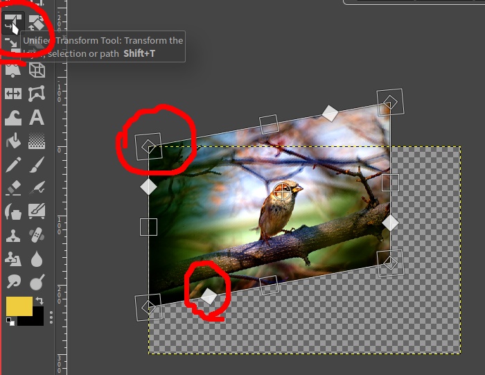
@malabo1990 Unified Transform Tool. Direct metaphor, clearer, straitgh to the point, correlation of what you're doing.
cristianovitorino
on 2 Mar 2020
I fixed and improved some icons of my previous mockups. I also introduced two more options aside from the label one:
- Just a simple box division.
- A new UX concept: ability to move the group around to the user's preferred position by dragging the purple handle attached to the group box.
cristianovitorino
on 2 Mar 2020

malabo1990
on 2 Mar 2020
@malabo1990 Can be confused with Cage Transform, Select by Color and Handle Transform. Consistency and diferentiation is needed, considering a rewrite. Metaphor rewrite needs iteration and group discussion.
Please don't worry or focus too much on the mockup icons, they are incomplete proposals. I find it more productive to iterate, do discussion and criticize the icons when the style guide is ready and the full icon set rewrite is on course. These are proposals for the toolbox issue, not focused on icons.
The icon rewrite on this proposal is a bonus, since I was already working on the toolbox improvement suggestion.
cristianovitorino
on 2 Mar 2020
@cristianovitorino Awesome work!
I completely agree with you in almost everything, but I don't fancy naming icon groups. It would be cool if the box groups could be customized, that is, if the user could add/remove icon from each individual box. Named groups would complicate the implementation of such feature.
Besides that, since the size of the icons is user-configurable, the name of the box could maybe get a bit too small. That's secondary though.
All in all, I just don't think naming the boxes is necessary. As long as we group things in a cohesive manner the user should find his way around things with relative ease.
GarkGarcia
on 2 Mar 2020
@cristianovitorino Awesome work!
I completely agree with you in almost everything, but I don't fancy naming icon groups. It would be cool if the box groups could be customized, that is, if the user could add/remove icon from each individual box. Named groups would complicate the implementation of such feature.
Oh I see your angle, makes sense. The mockup in the middle would be a better candidate then. But how color would be handled in such situations? Or we're gonna drop the color thing? Maybe the groups would have a standard color rule that any icon that got swapped in would accquire that color?
Besides that, since the size of the icons is user-configurable, the name of the box could maybe get a bit too small. That's secondary though.
Yeah I noticed that even when making the mockups, hence the initials method, but as you said, if resized to very small, even that would be useless.
All in all, I just don't think naming the boxes is necessary. As long as we group things in a cohesive manner the user should find his way around things with relative ease.
Plus the customizable groups (icon swapping) as you suggested, to better suit the user's workflow. I like that : )
cristianovitorino
on 2 Mar 2020
Oh I see your angle, makes sense. The mockup in the middle would be a better candidate then. But how color would be handled in such situations? Or we're gonna drop the color thing? Maybe the groups would have a standard color rule that any icon that got swapped in would accquire that color?
I hadn't considered how colors would be handled.
As you said, we could make it so that each box has a particular color, but that would limit the user ability's to customize the icon appearance of individual icon. I think it's quite a reasonable compromise as long as the user is able to customize the color of each box.
Another alternative is to simply tint the icons in the standard icon theme according to the standard groupings. That way, if a user wants to customize the groupings he can simply opt-out of the standard icon theme (or live with icons of different colors in the same box).
I definitively don't think we should drop the color thing. I'd like to hear everybody's take on this _box-grouping_ idea.
GarkGarcia
on 2 Mar 2020
Addendum
About the color proposal and If color blindness is a angle to tackle
I think we should either go with full light or dark high contrast icons for everything by default, or code a _color blindness profile_ for the user to choose from, aside from the standard color ones, those are only useful for people that are not color blinded.
_If the accessibility issue is more focused on the UX problem, please ignore this addendum. The focus should be on the geometry, shape and placement of the the toolbox_
cristianovitorino
on 30 Mar 2020
Related issues
 Vectornaut
·
5Comments
Vectornaut
·
5Comments
 ghost
·
7Comments
ghost
·
7Comments
 HumanG33k
·
3Comments
TrechNex
·
6Comments
HumanG33k
·
3Comments
TrechNex
·
6Comments
 jonathancast
·
3Comments
jonathancast
·
3Comments
Most helpful comment
I agree it needs work, though not sure we shoud do design changes for the 0.x series. This would be something for the rewrite/hard fork stage.